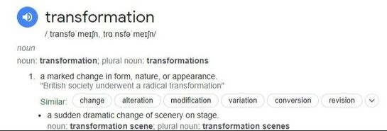
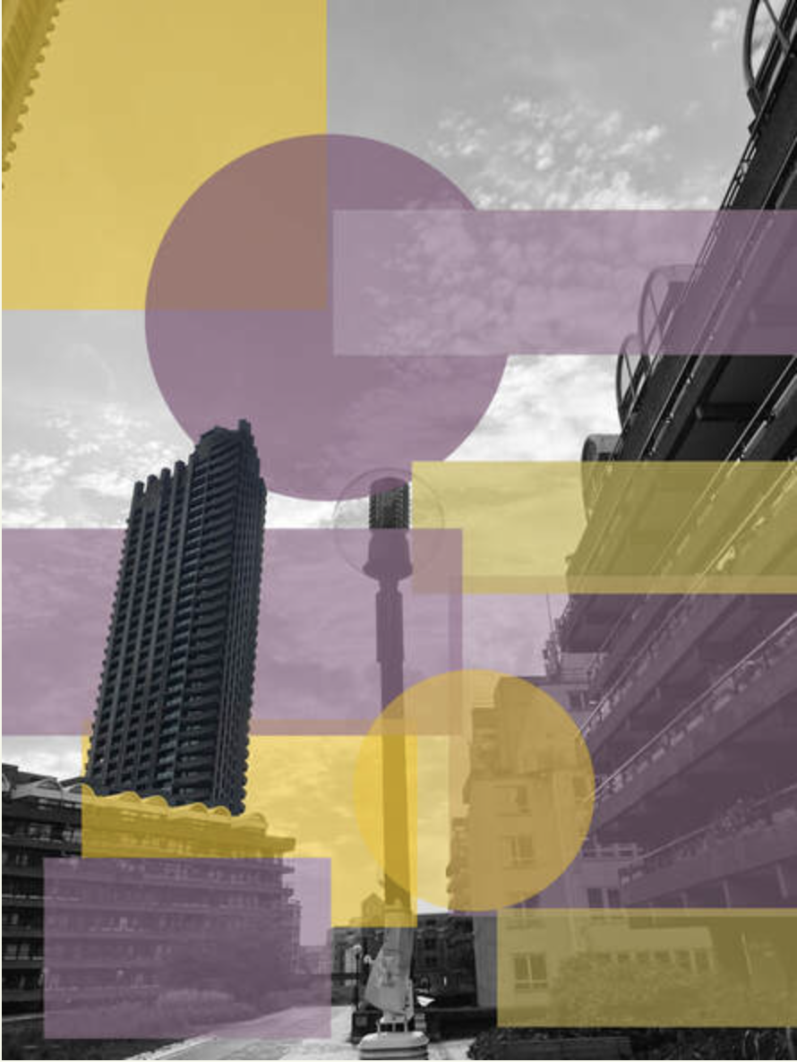
Chosen word: Transformation
|
I have chosen the word Transformation for my response. I am excited by what this word can inspire in terms of the transformation, creating a 'marked change in form, nature and appearance' of subject matter. To begin I really want to keep an open mind as to how portraits, landscapes and ideas can be transformed as well as the use of technology and physical techniques to transform taken images. I am also intrigued by how the idea of transformation could engage the viewer in viewing an image, working out how ideas and images have been transformed and how the eyes and brain react to the transformation.
|
|
Three artist/strand responses
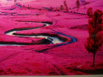
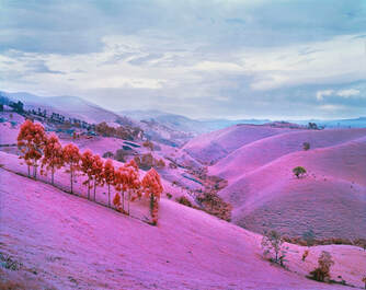
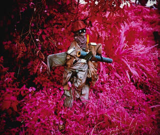
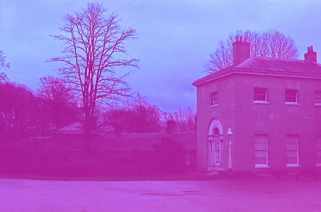
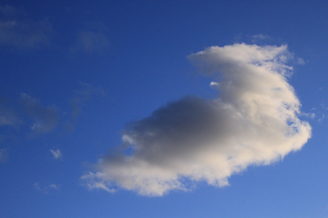
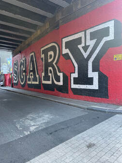
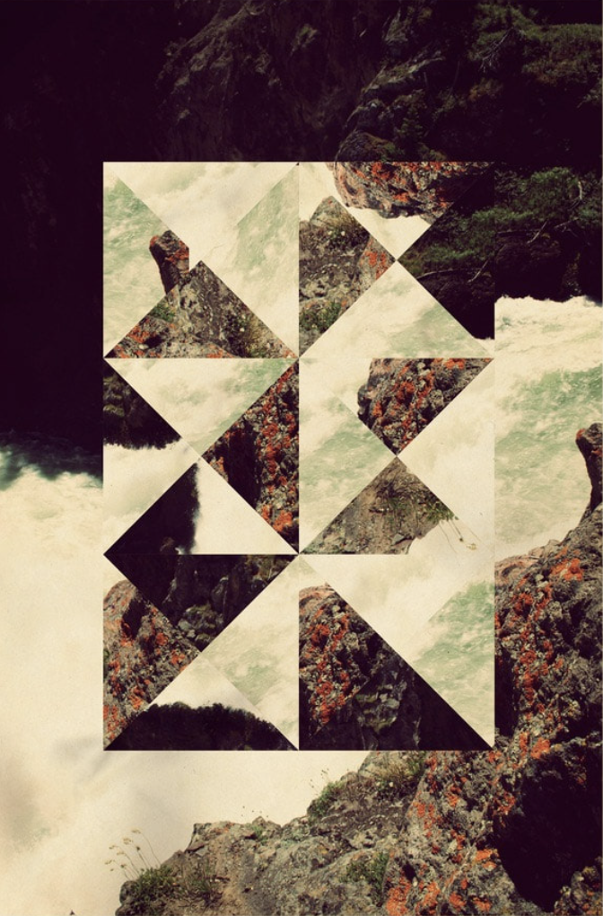
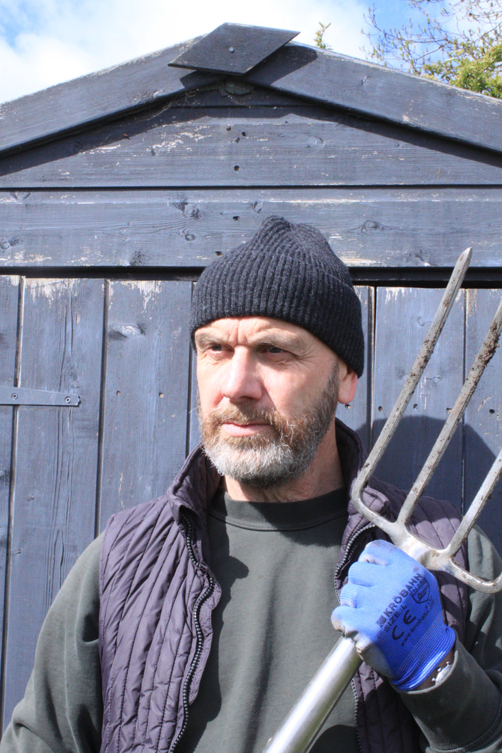
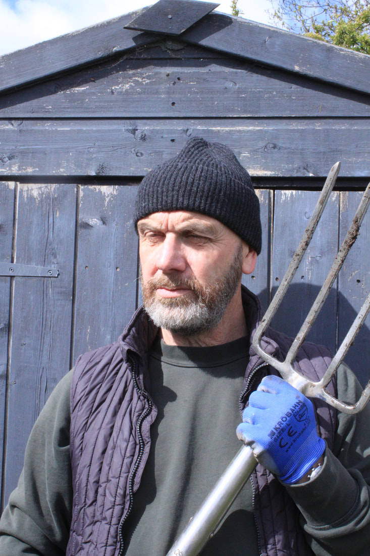
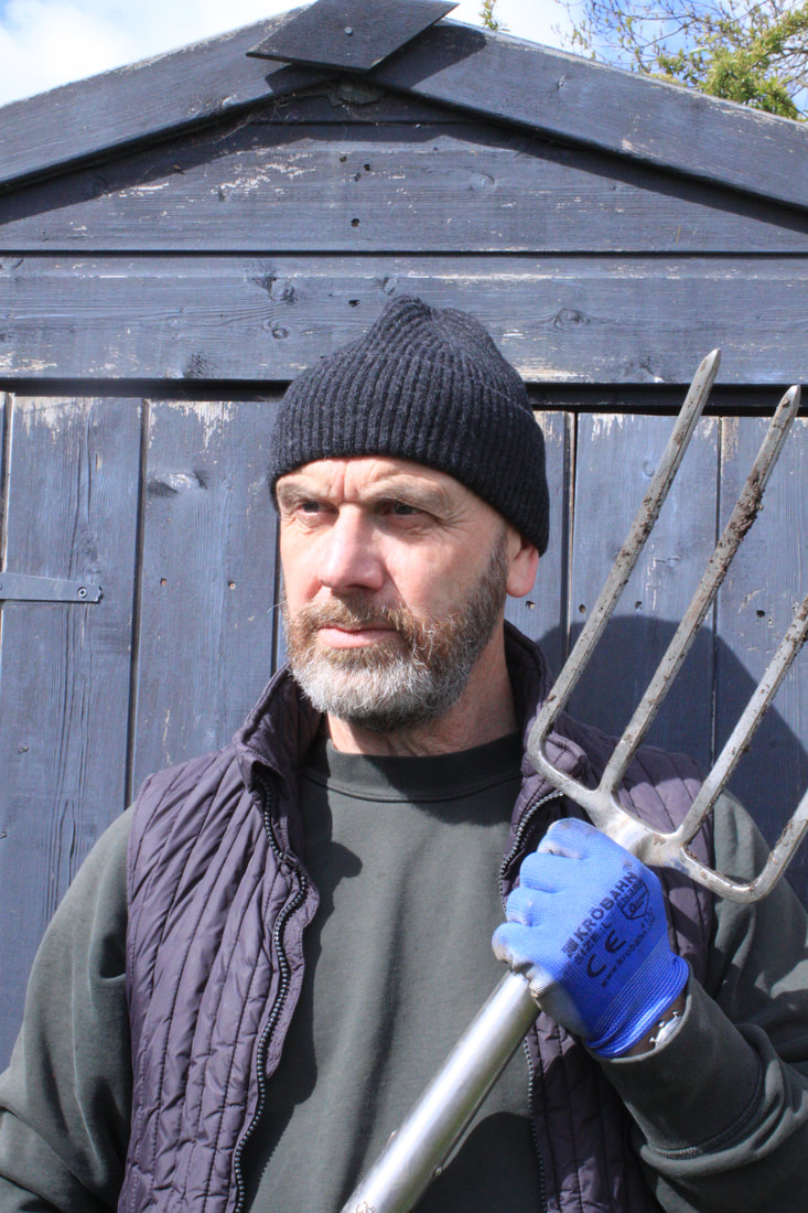
Artist 1 - Richard mosse
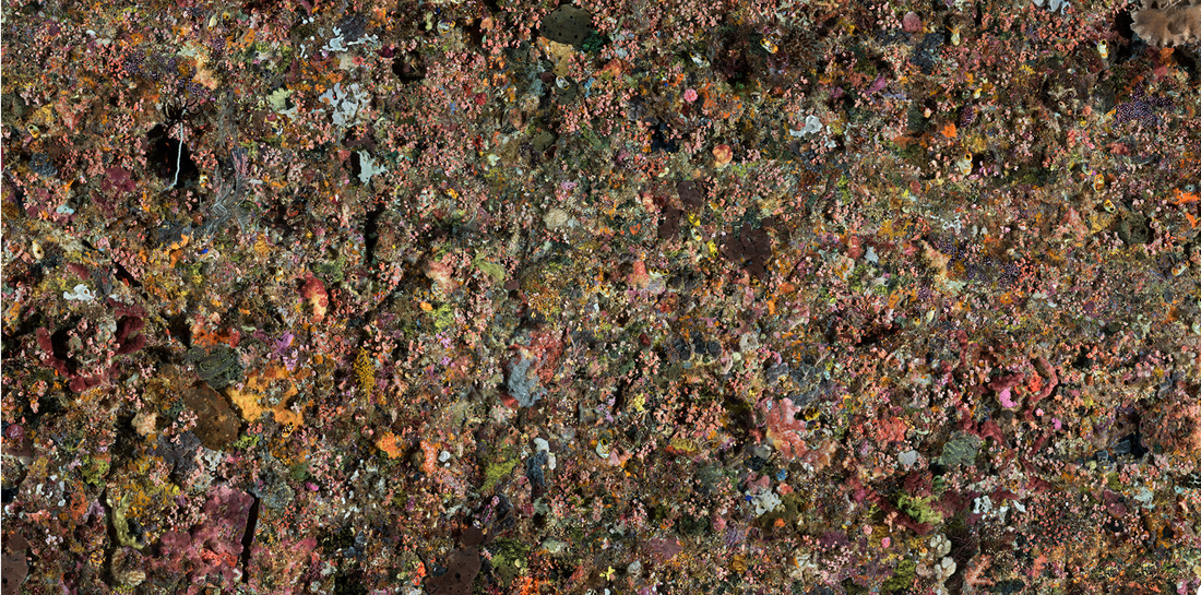
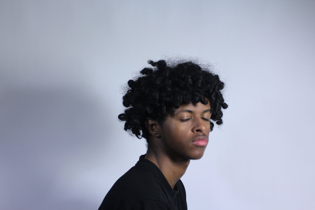
Richard Mosse is an artist who seeks to heighten and extend the language of documentary photography to draw attention to overlooked yet urgent stories, working to create immersive and visually rich photography. Throughout these examples Mosse uses a special film, previously used by soldiers to change the green area to a bright pink/purple to easier locate enemy soldiers in a natural landscape. This use of film really creates a surreal effect altering hues of green to opposite colour wavelengths whilst maintaining other colours. Whilst there are very familiar elements to the landscapes with trees, mountains, rivers etc the colour totally changes the viewers response. The effect of the work makes these once familiar landscapes seem strange and other worldly. They could be perceived to be hostile through their unfamiliarity and alien nature.
|
|
|
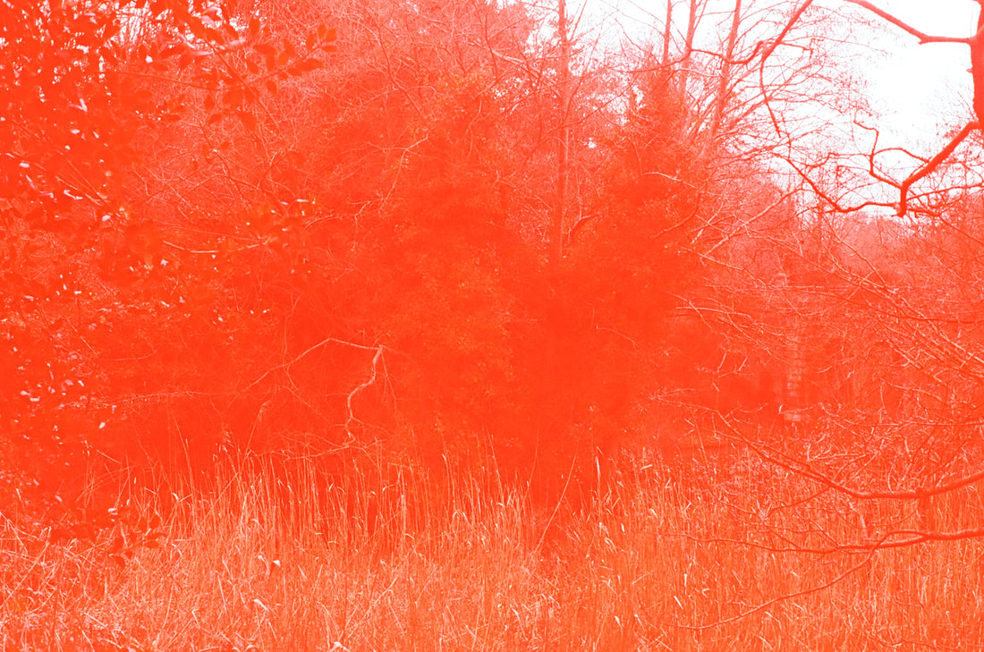
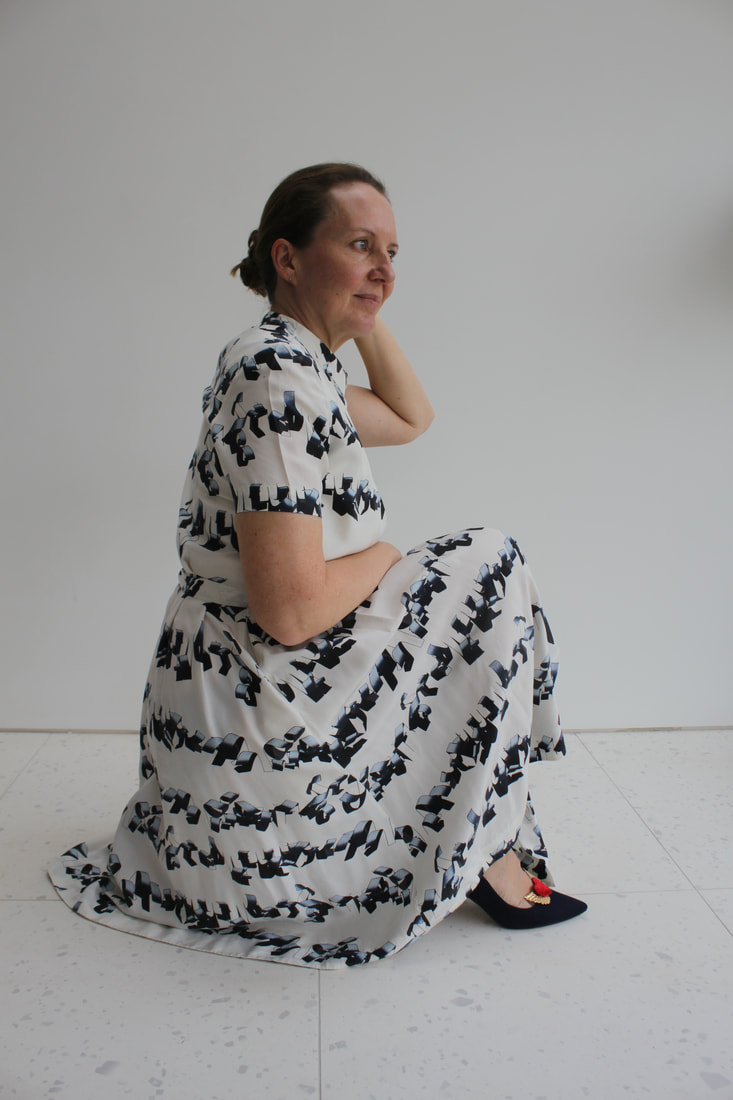
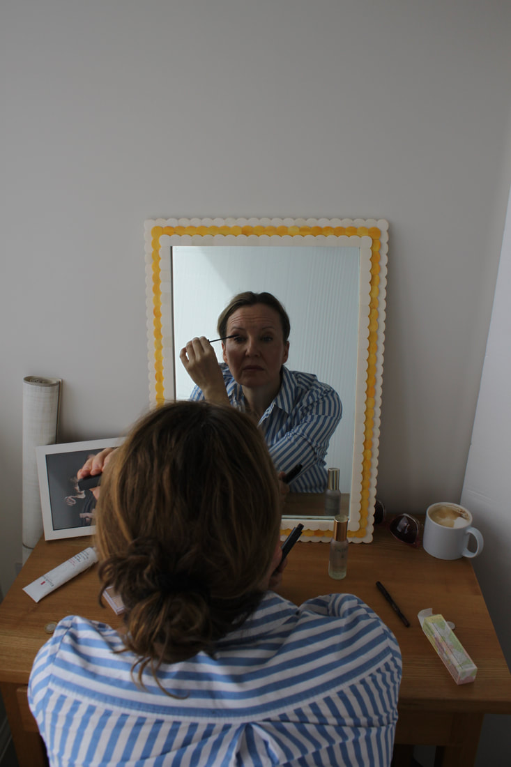
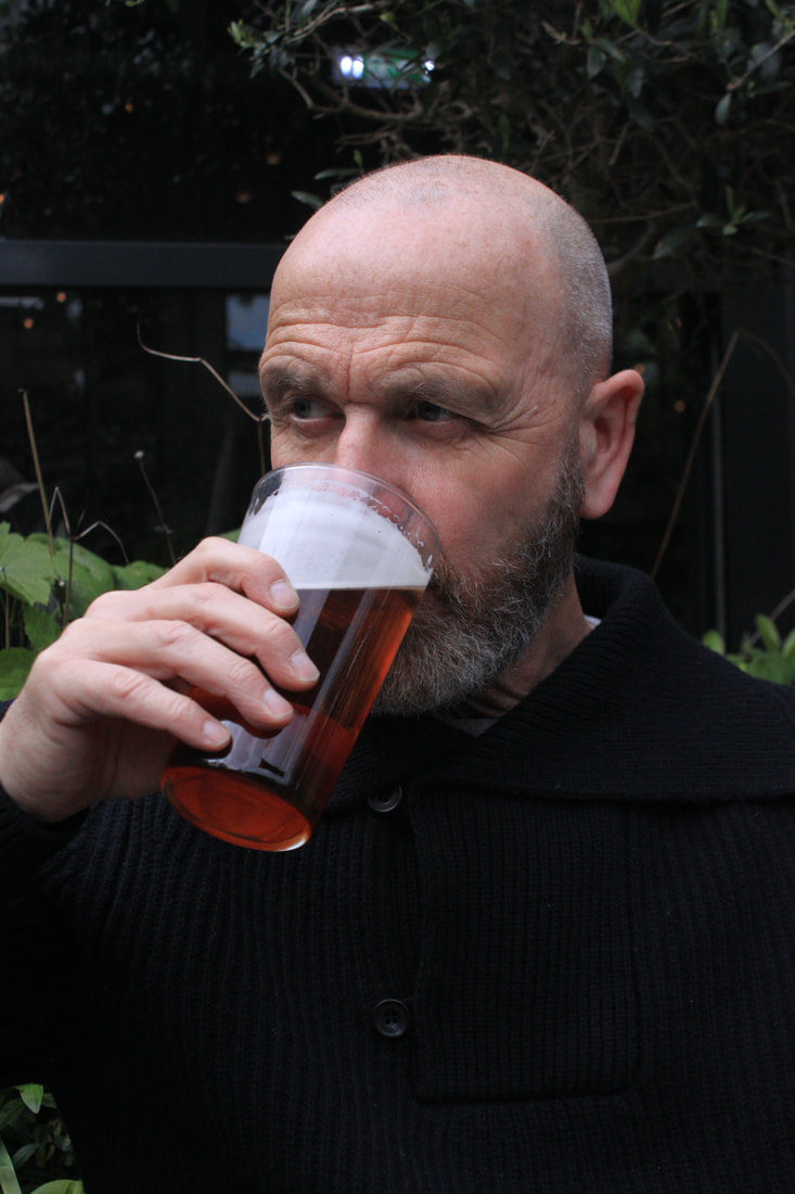
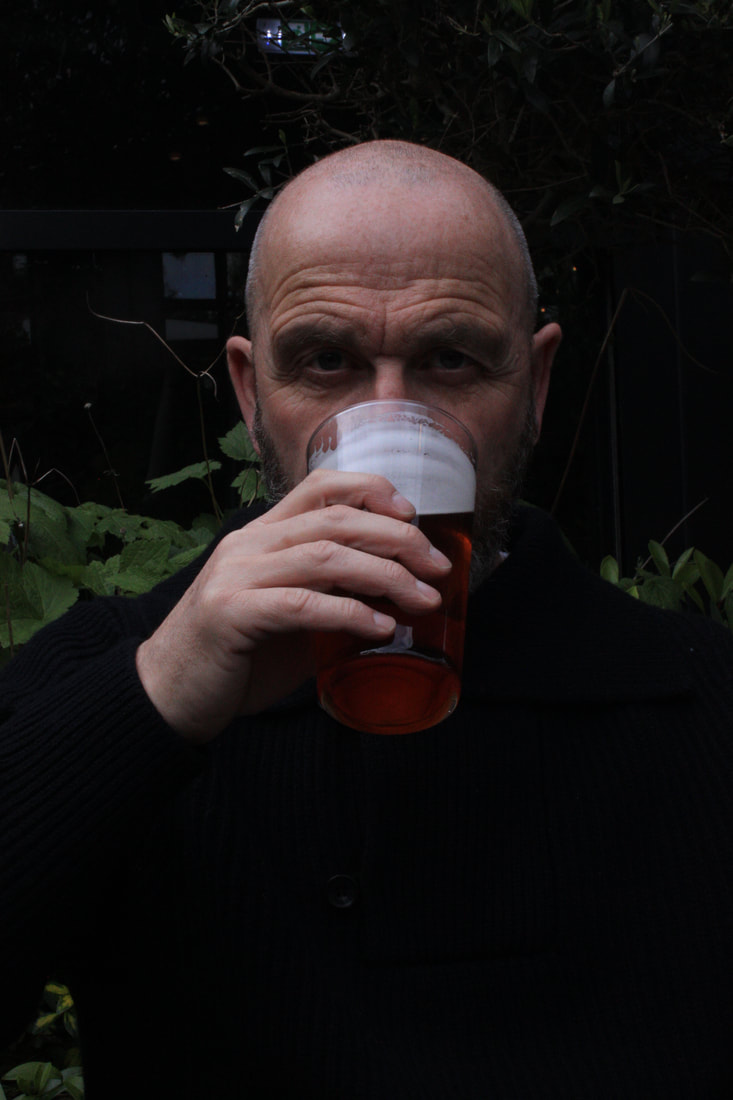
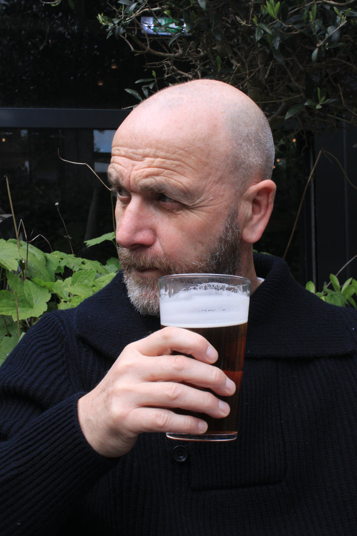
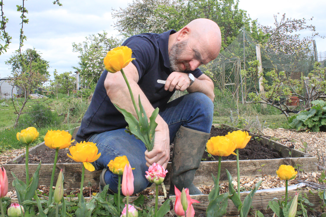
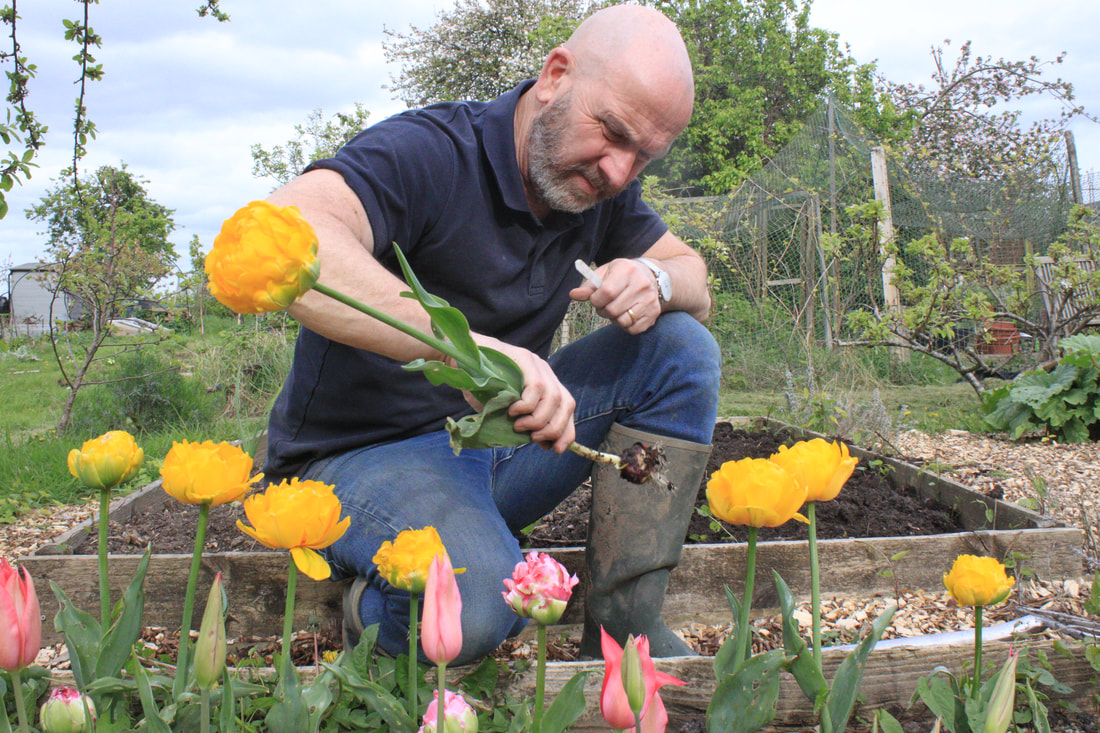
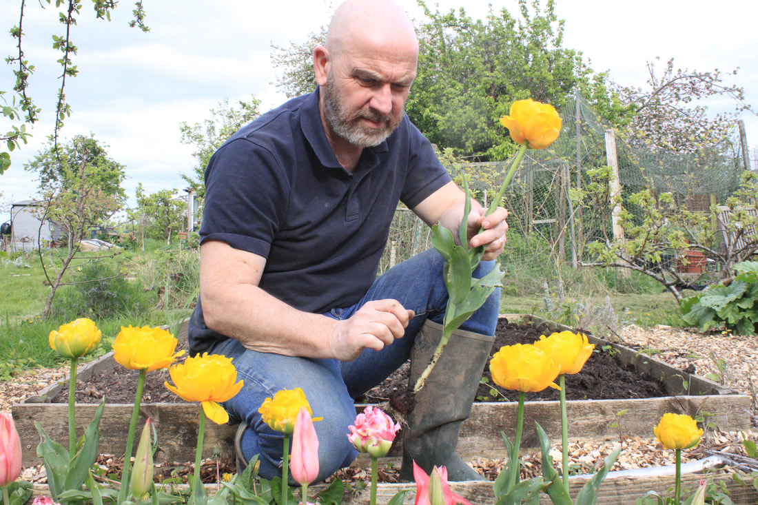
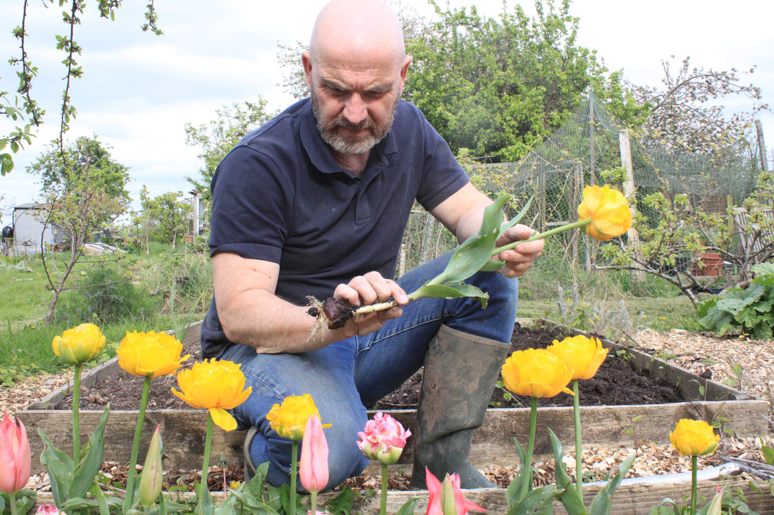
My response:
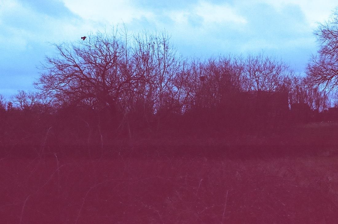
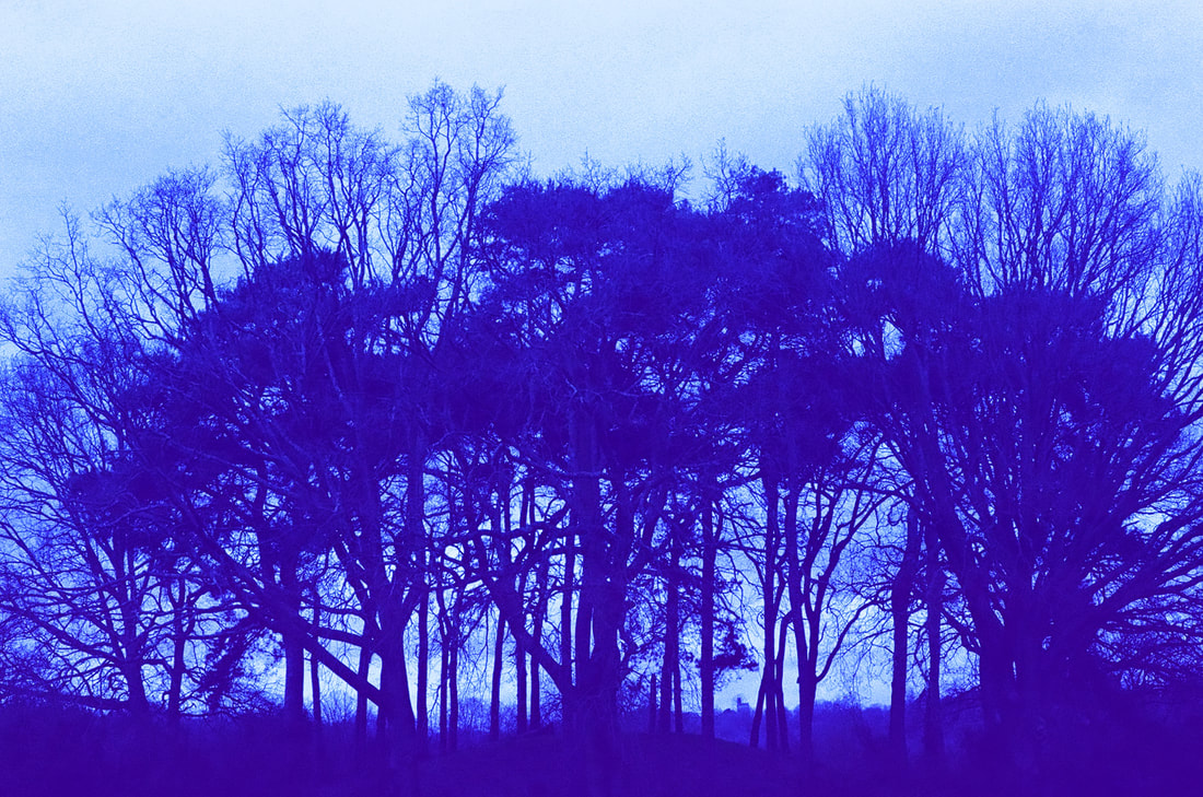
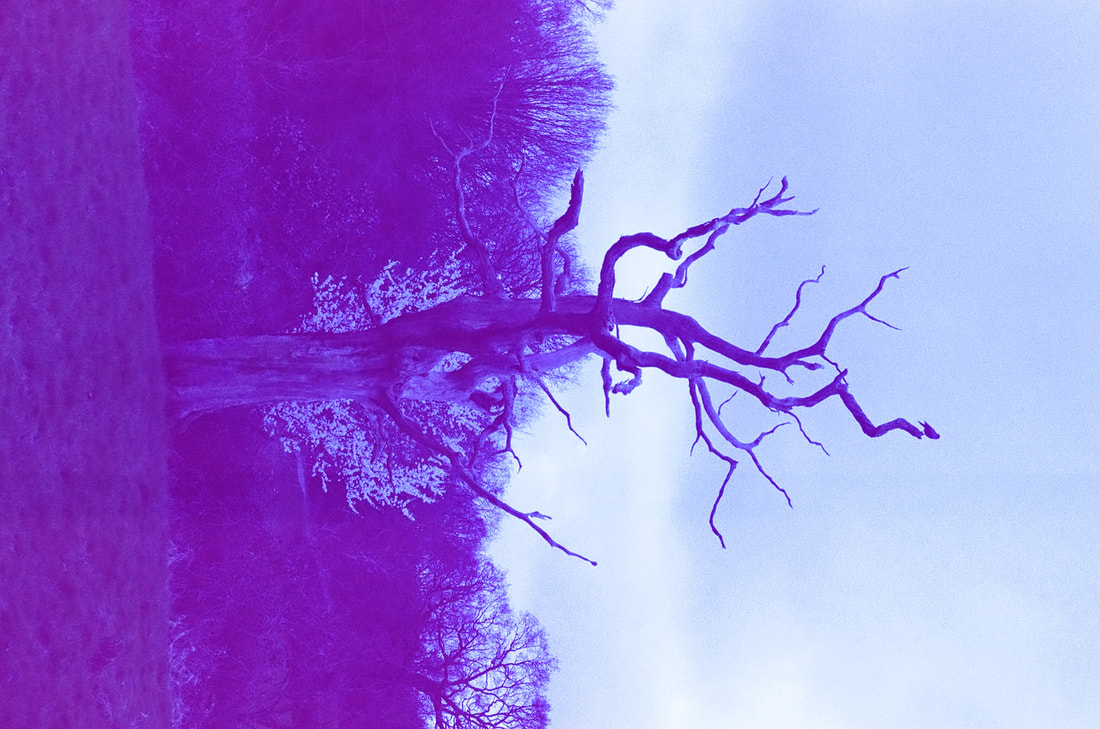
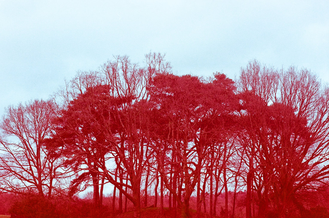
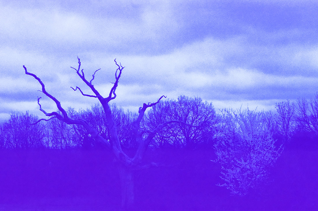
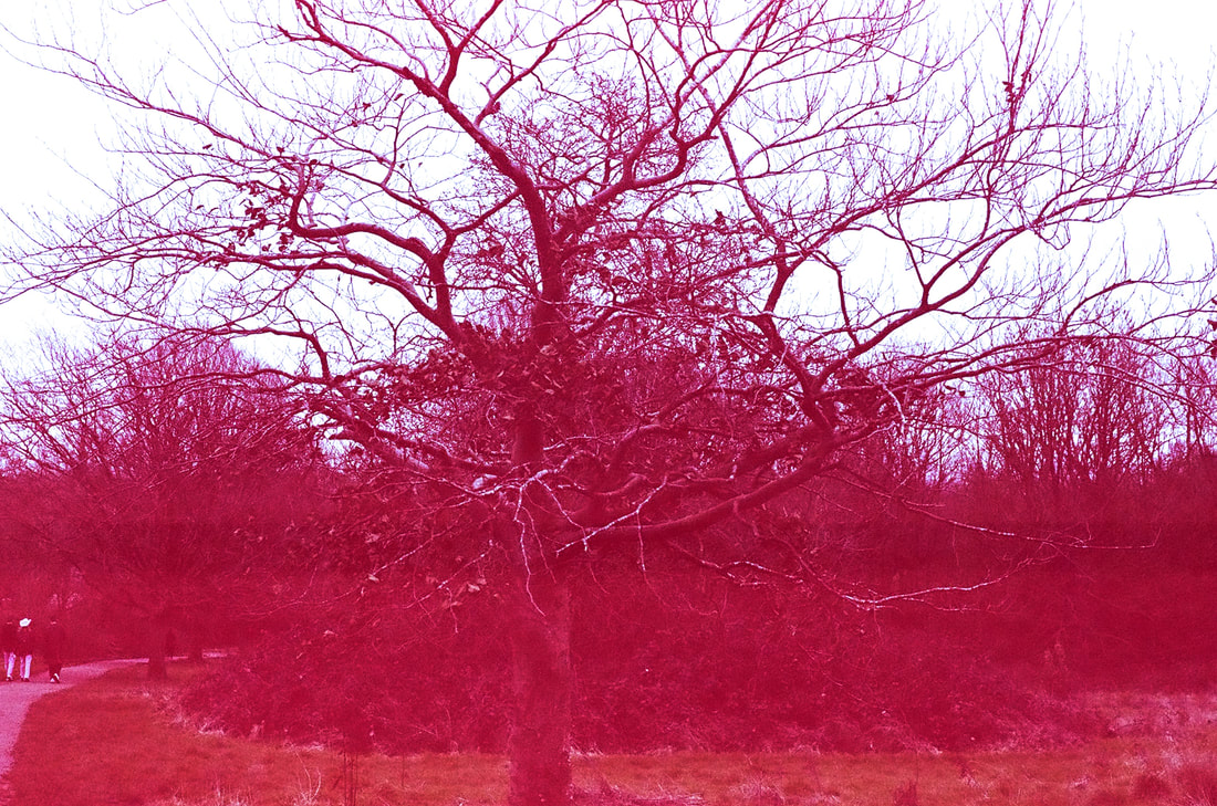
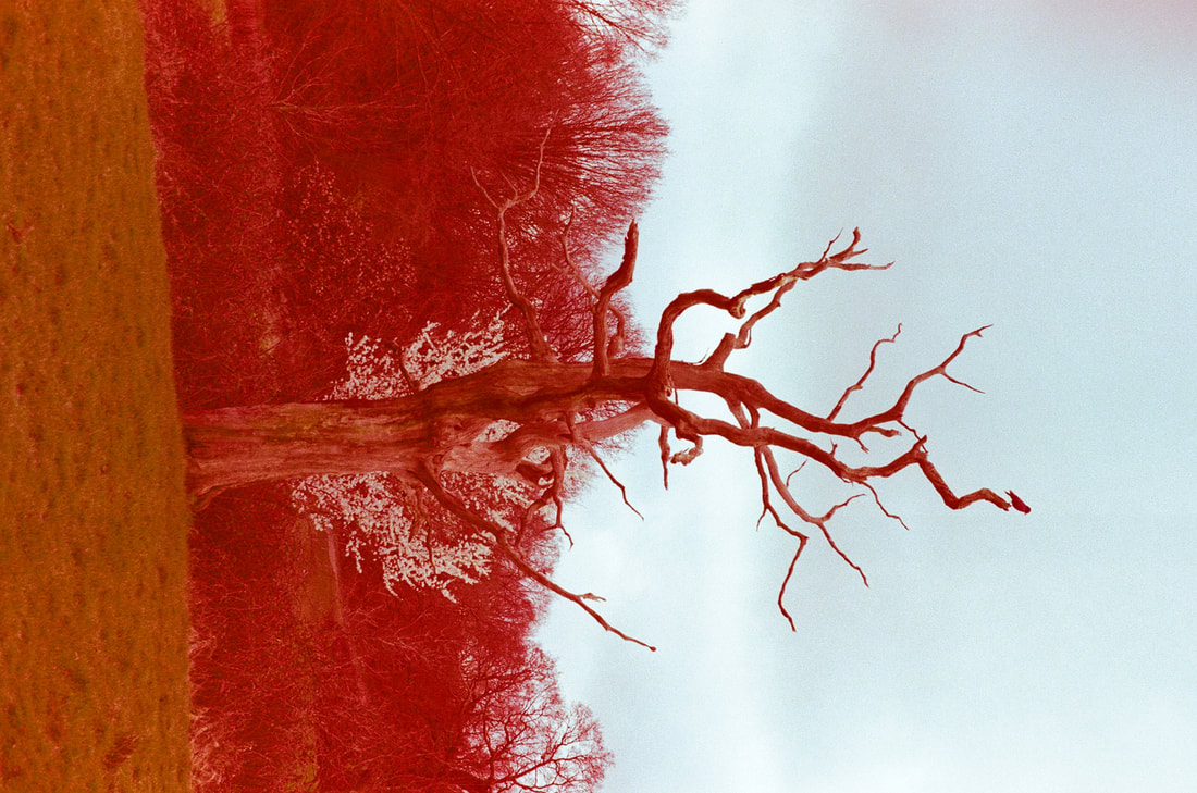
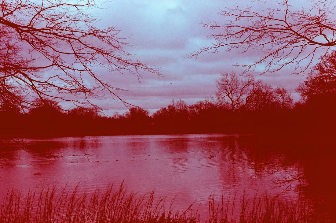
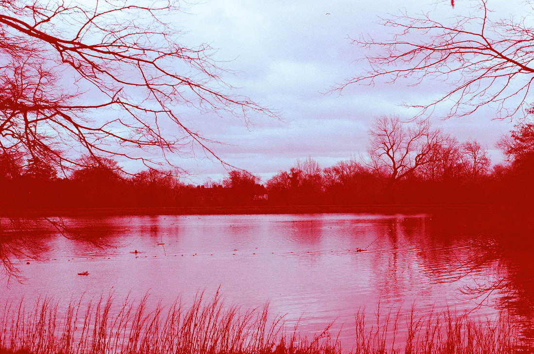
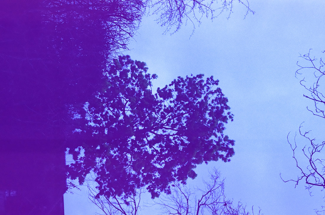
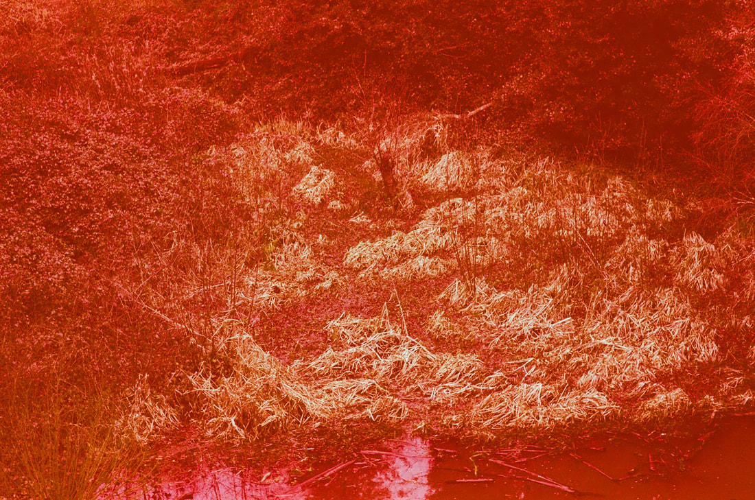
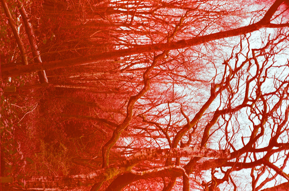
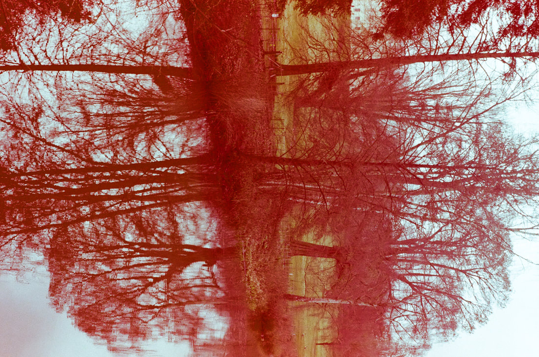
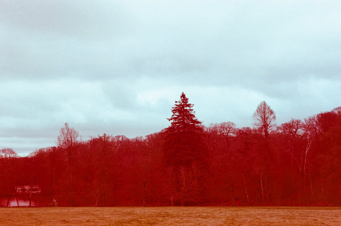
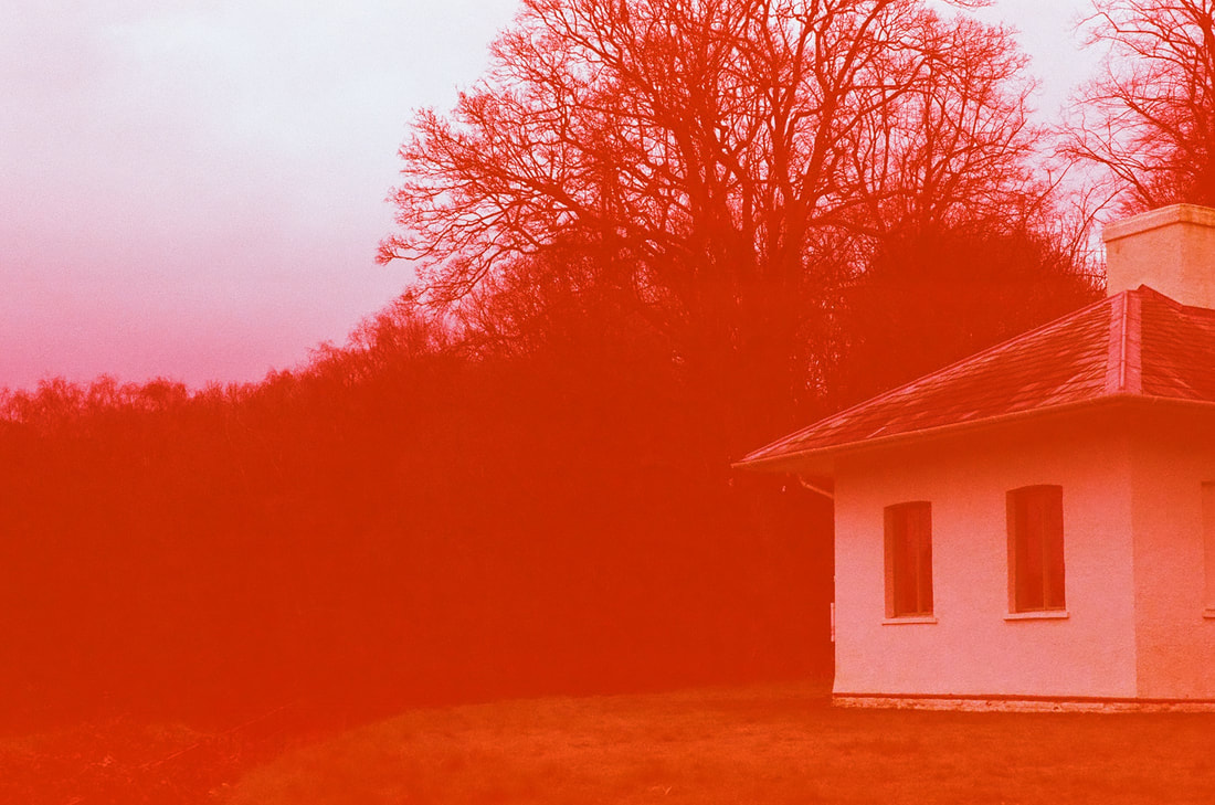
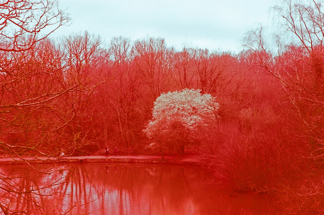
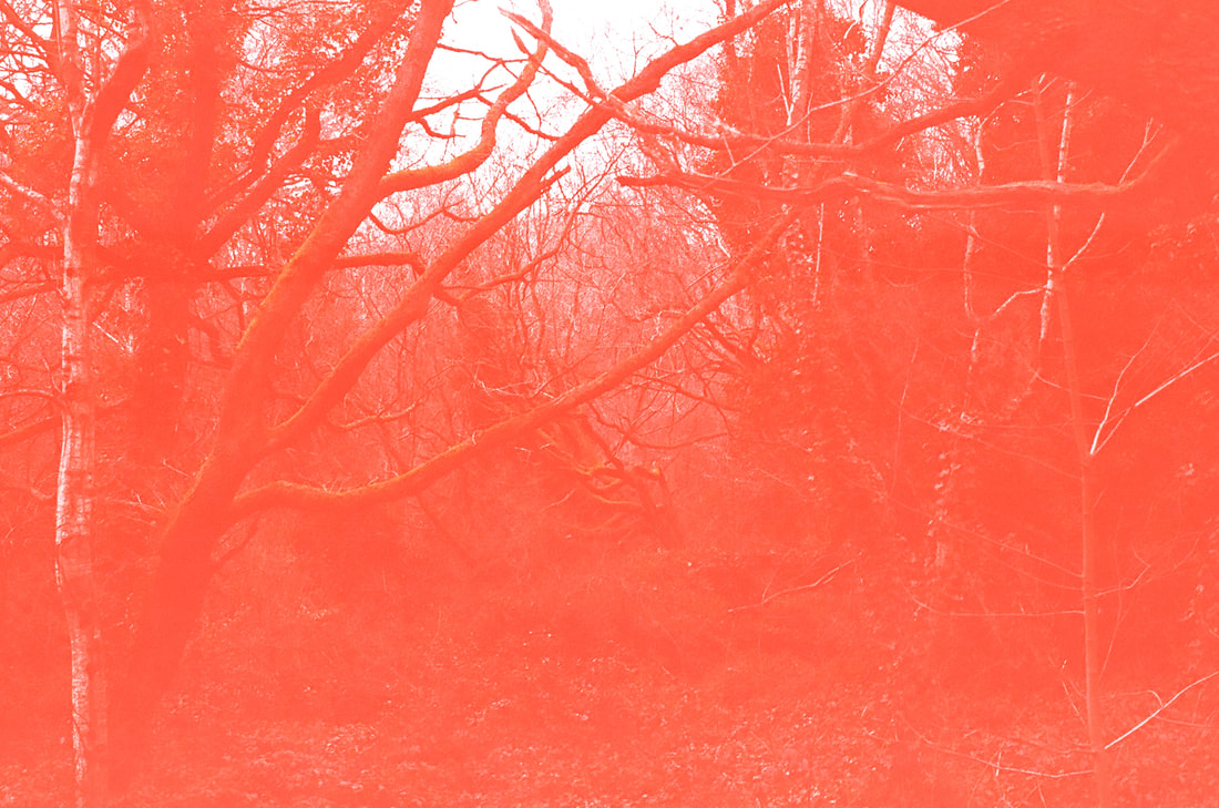
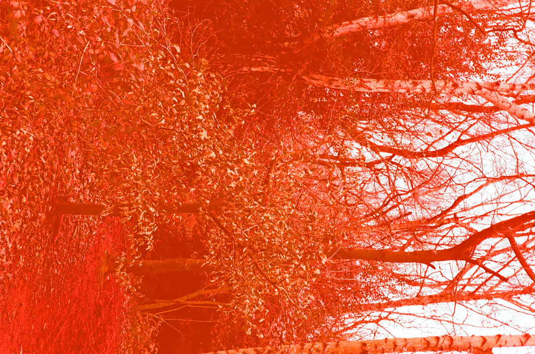
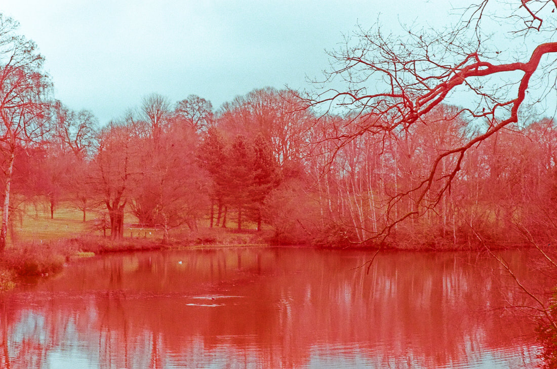
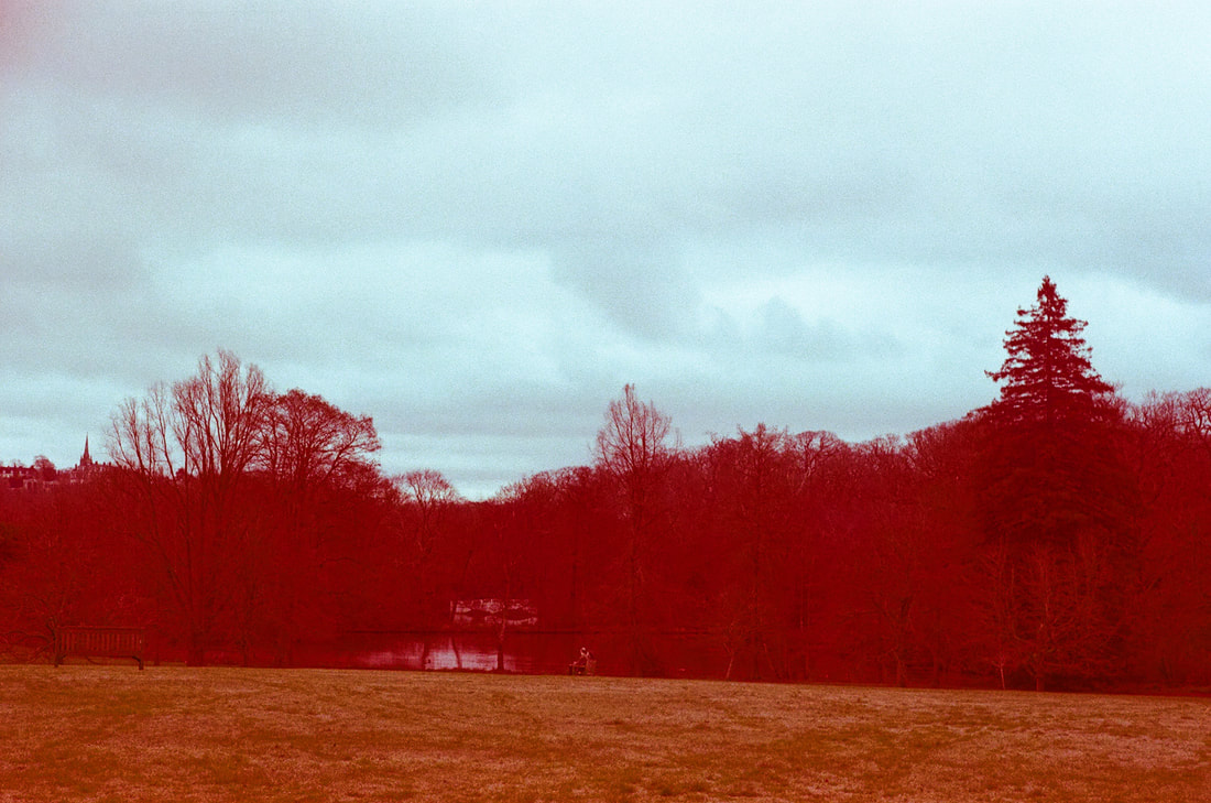
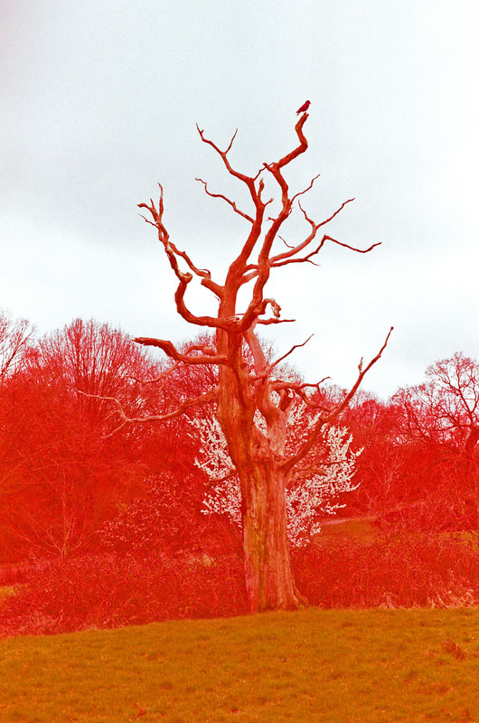
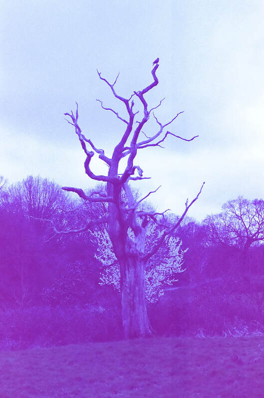
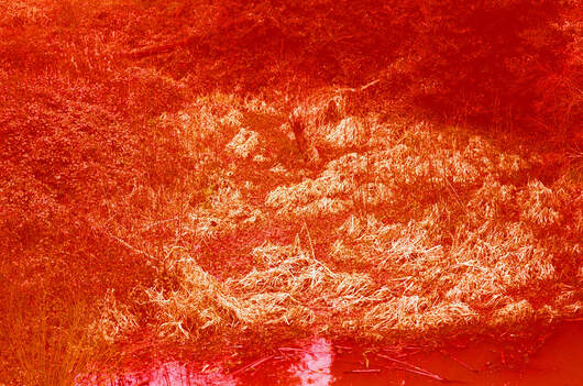
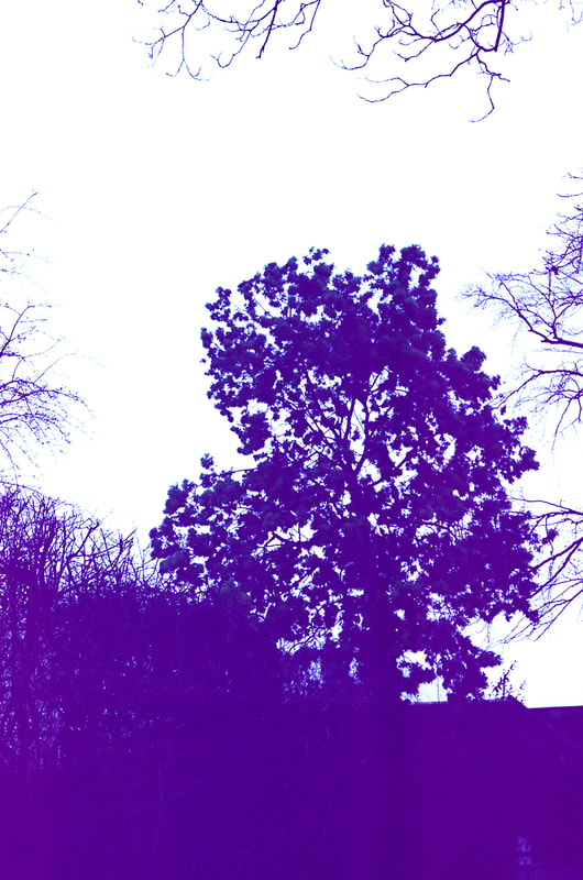
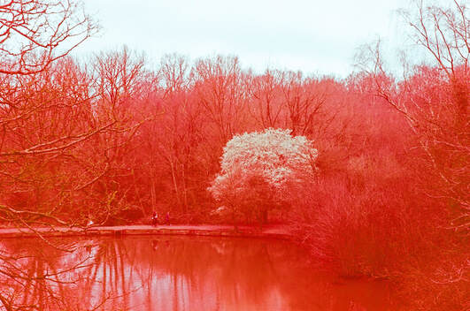
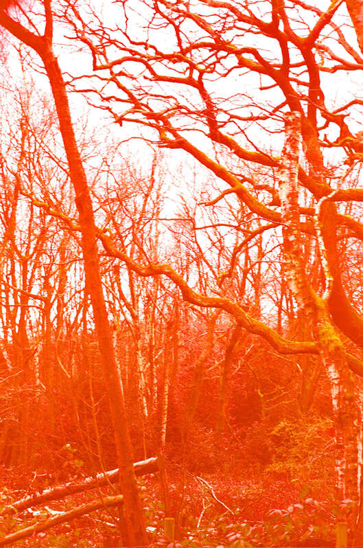
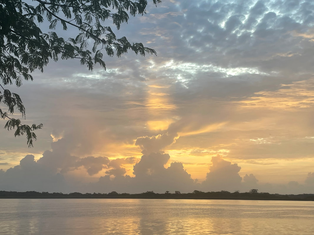
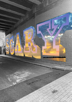
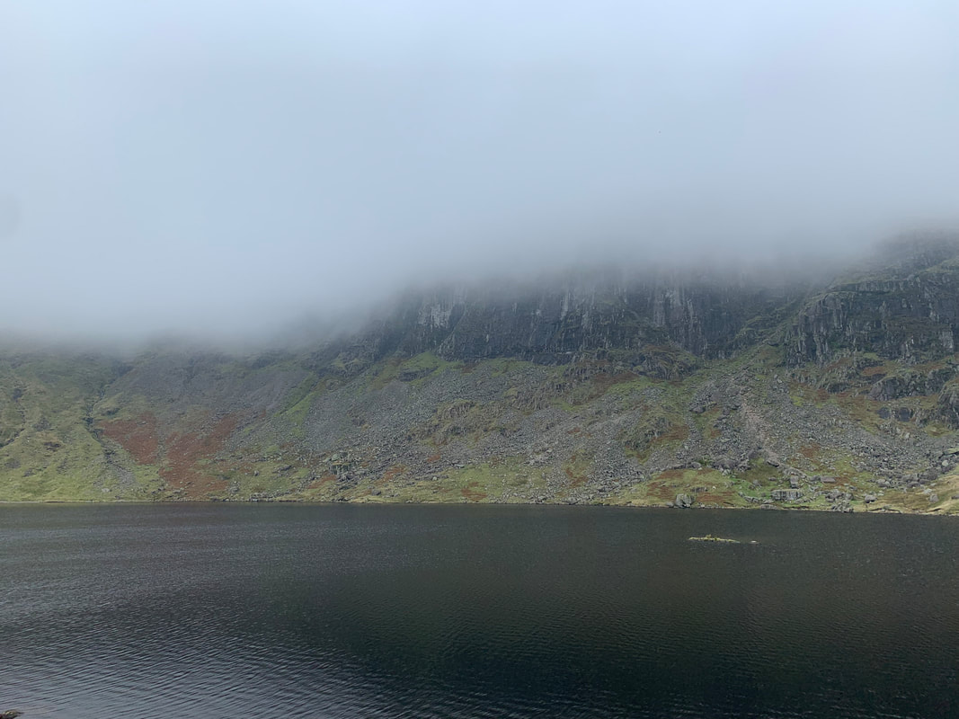
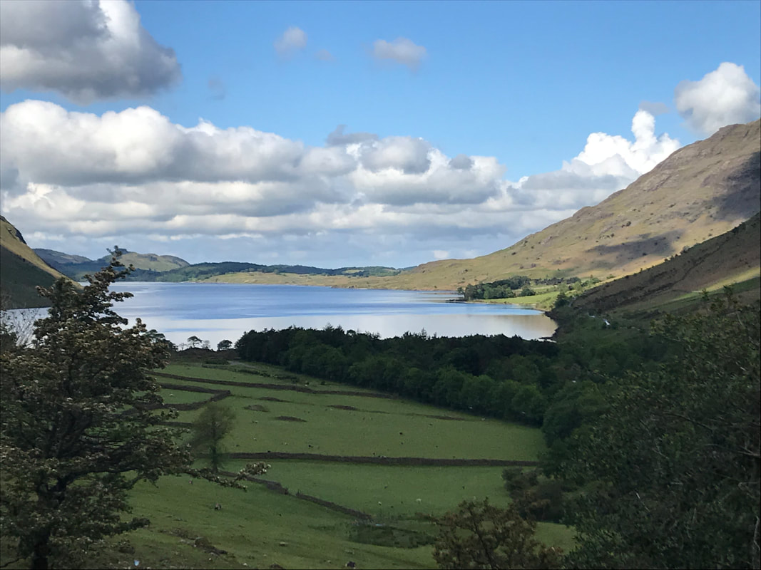
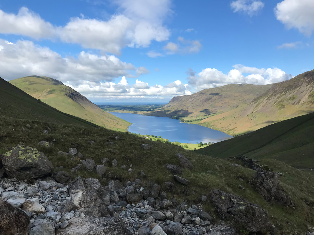
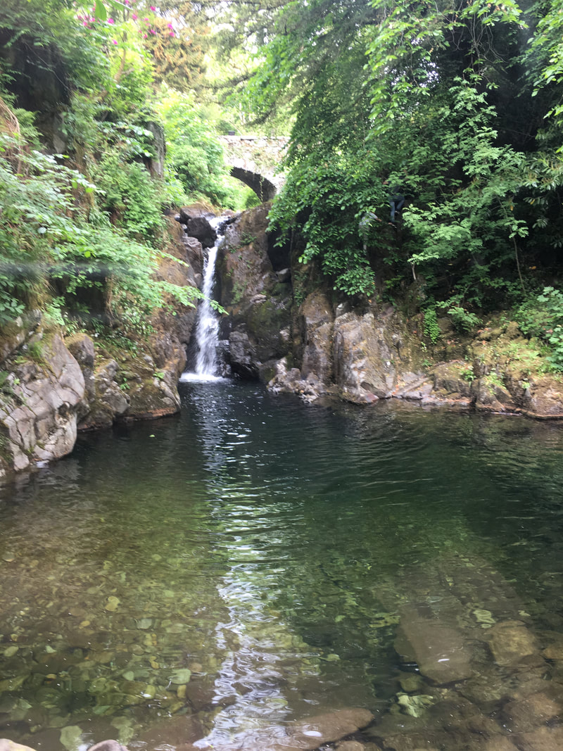
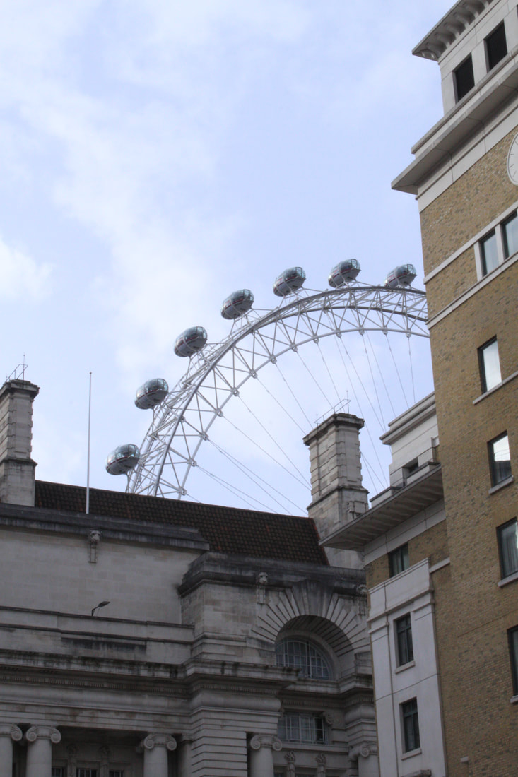
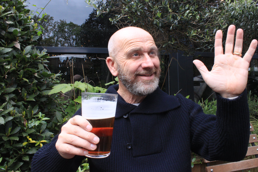
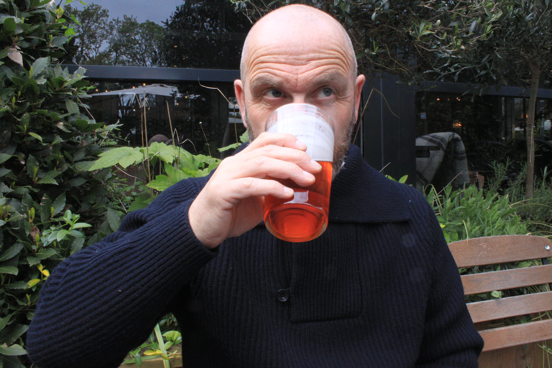
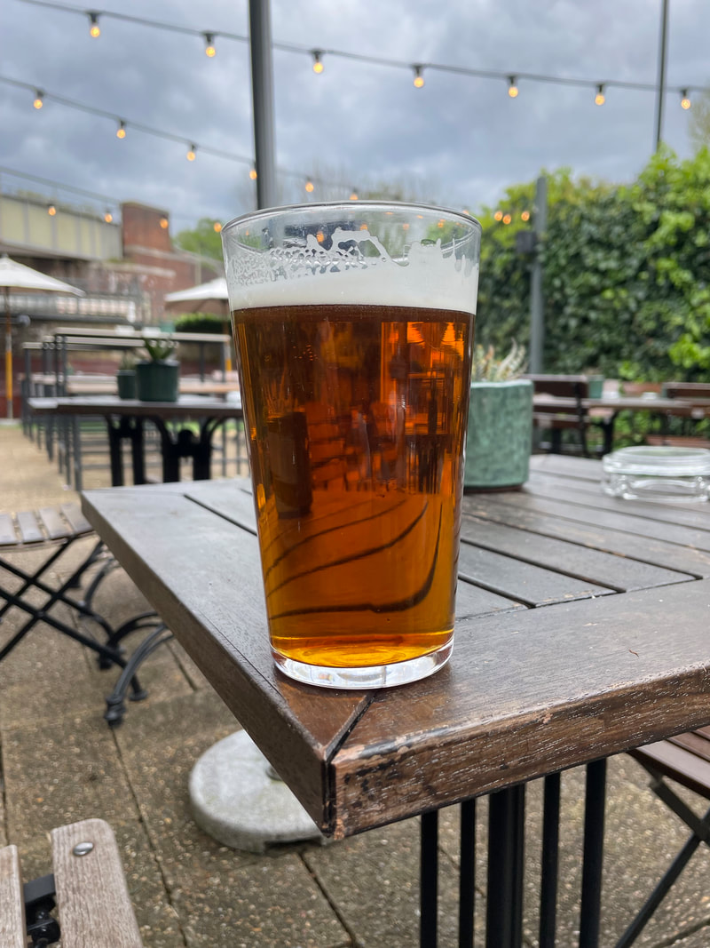
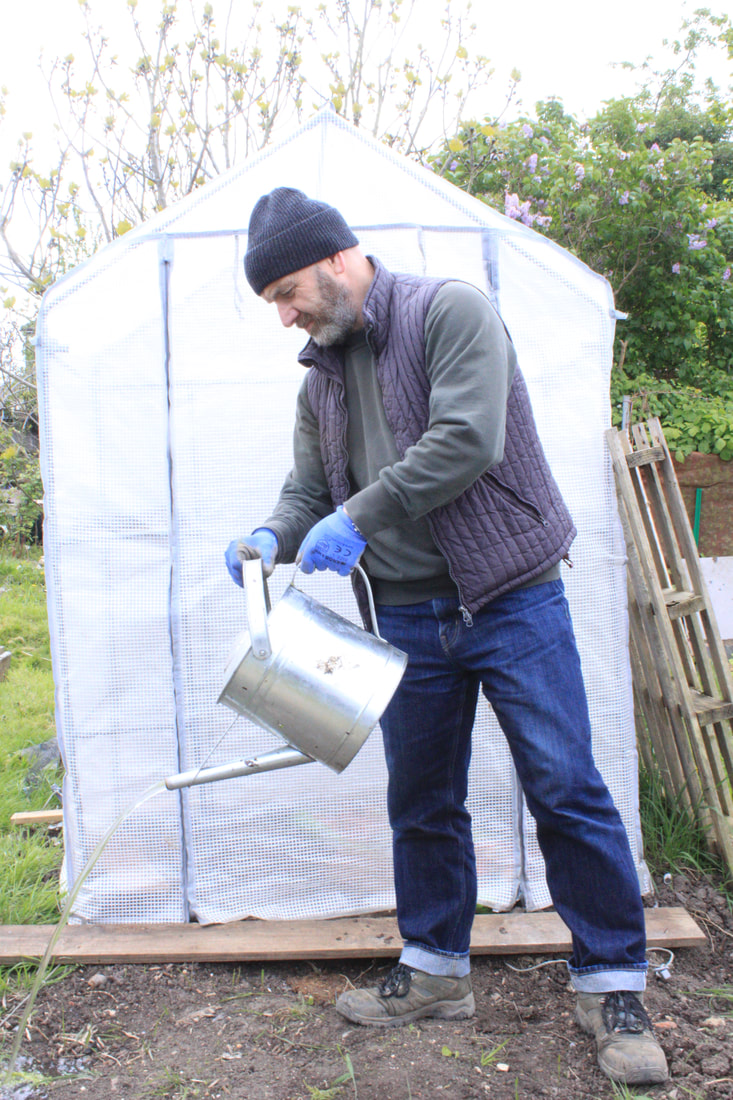
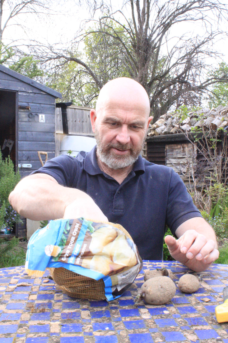
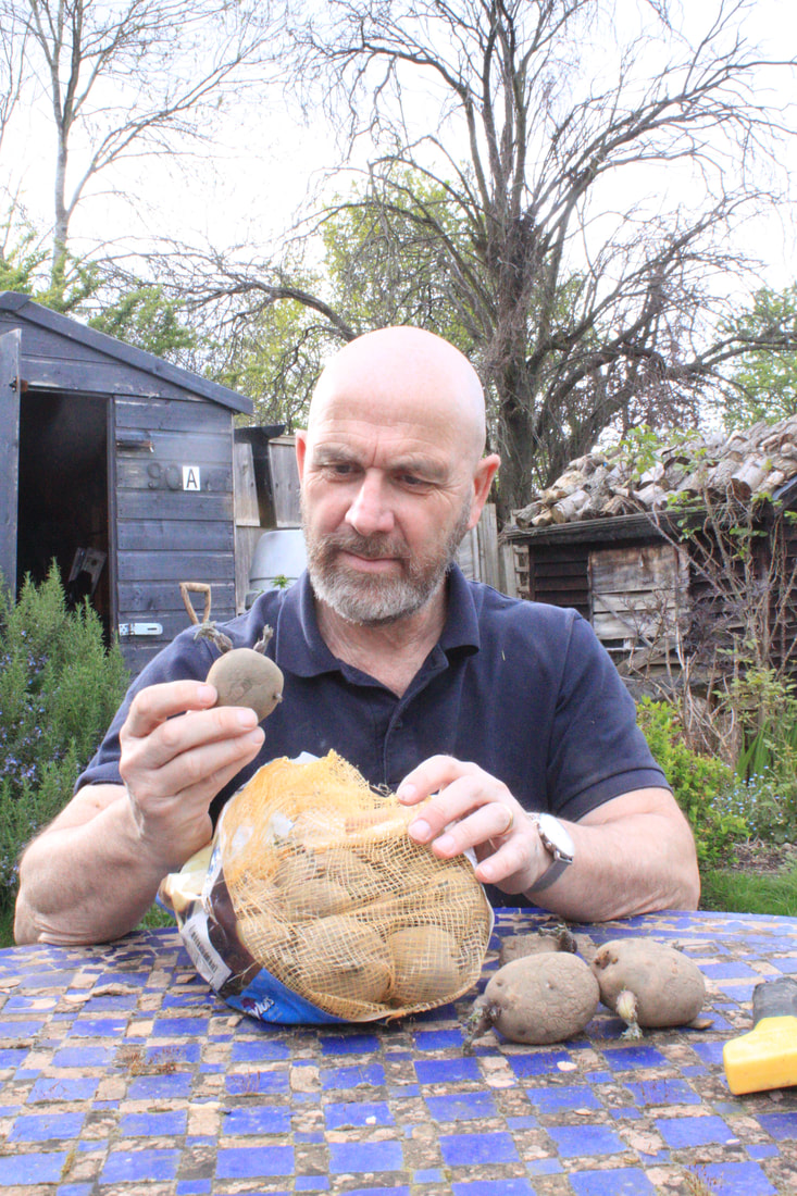
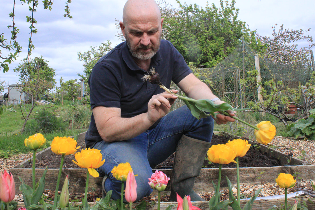
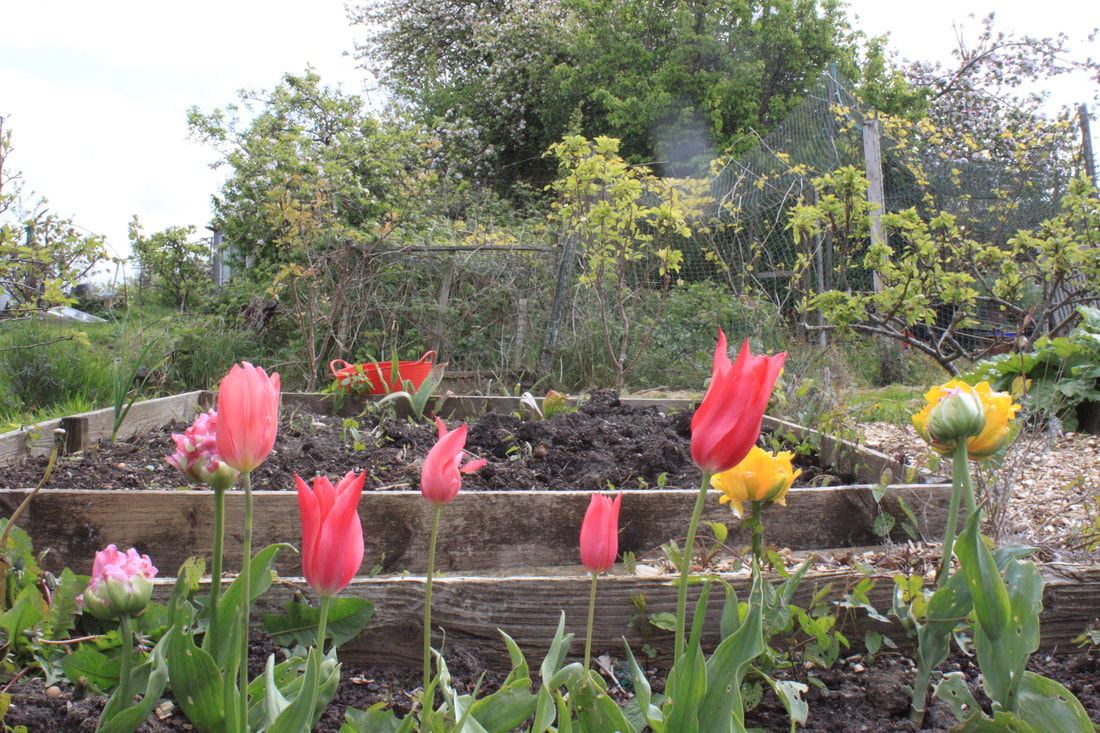
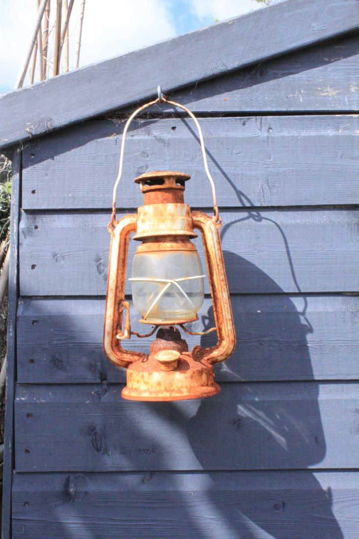
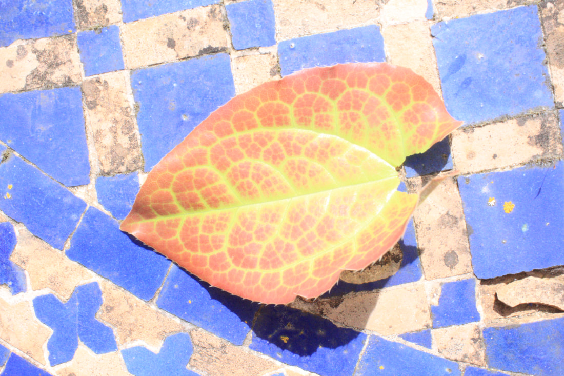
For my response I visited Hampstead Heath with a revelog 600nm film loaded in a Canon SLR. I hoped this film would transform the photos I had taken of Hampstead's natural green and brown landscapes into something more otherworldly with a burst of red, blue or orange. I chose to photograph Hampstead Heath because of the variety of environments for example the ponds, trees and woodland.
Edited:
With my edited images I just wanted to brighten the image up a bit as some came out a little dark. The two images of the dead tree are interesting as the colour shifts work nicely as a pair. The transformation being at once obvious because of the colour but with the grass on the red image still being green may make you begin to question the reality of the overall image.
|
|
|
|
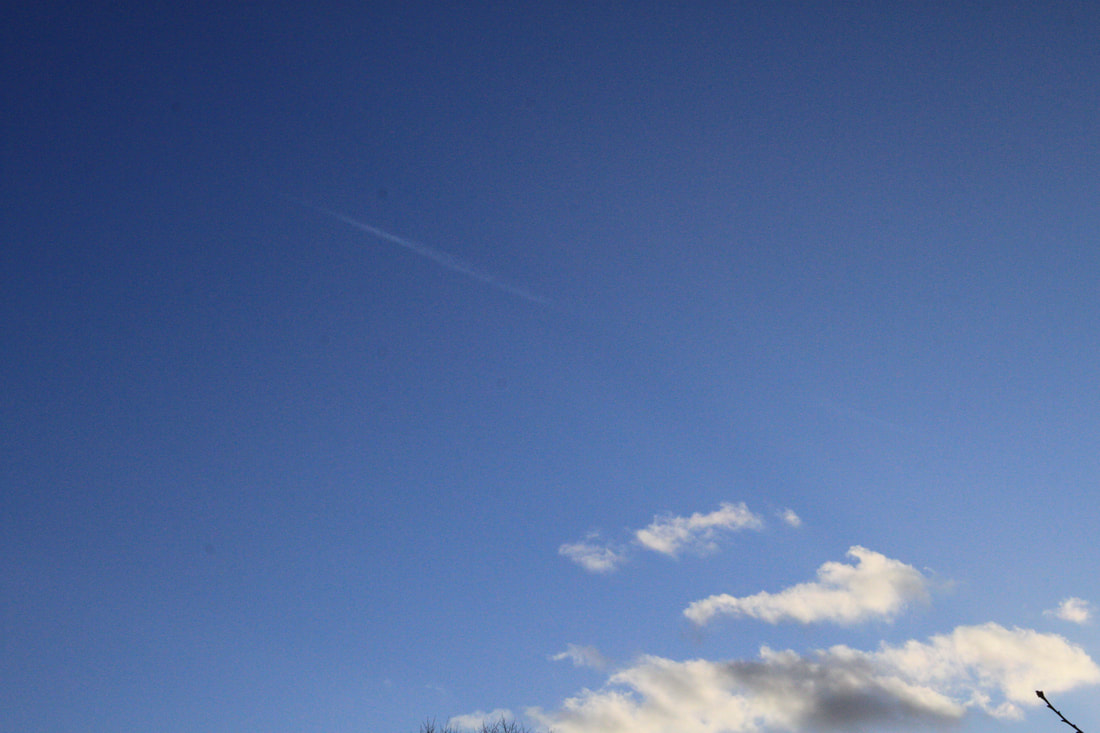
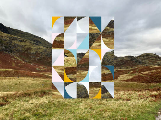
Overall I am very happy with some of my images. I felt the colour from the Revelog film came out nicely and with a good variety of colours although it clearly takes much more exploration to understand how to get the best from the film. When taking my photos I wanted to focus on nature and landscape incorporating both land and sky which I believe was successfully captured across my images. Next time I would expose the film for longer as some images did come out a bit dark particularly bottom left image. Furthermore I would try other types of Revelog film as the unexpected, even random nature of the film is exciting to see when developed. I'd also like to experiment with people in the environment to hopefully achieve better contrats between the subject matter in colour. The use of an analog film development process to transform nature into something that seems more likely to be done digitally gave me more inspiration into exploring how familiar 'analog' natural, everyday images of landscape, people or buildings could be transformed.
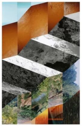
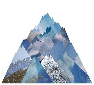
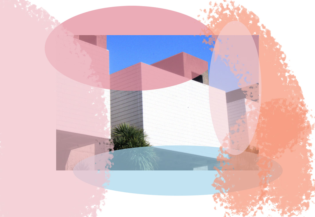
Artist 2 - Liesl Pfeffer
Liesl Pfeffer is an Australian artist based in Berlin, working with photography, collage and textiles in the environment. With an interest in pattern, form and colour and using an invented, personal language of symbols and shapes. Pfeffer's collages, or the photographs from which they are made, usually depict the natural world in some form or other. Plants, trees, skies, clouds, landscapes. but the concepts question what can a photograph be. The heavy manipulation, collage technique is a transformation of both subject matter and imagery creating a totally new image using only photographic media. I chose Pfeffer as my second artist because I love her presentation and representation of landscapes creating a medium between abstraction and reality. I wanted to use her style of work in my response using 2 different types of landscapes, an urban and natural landscape.
|
|
|
My response:
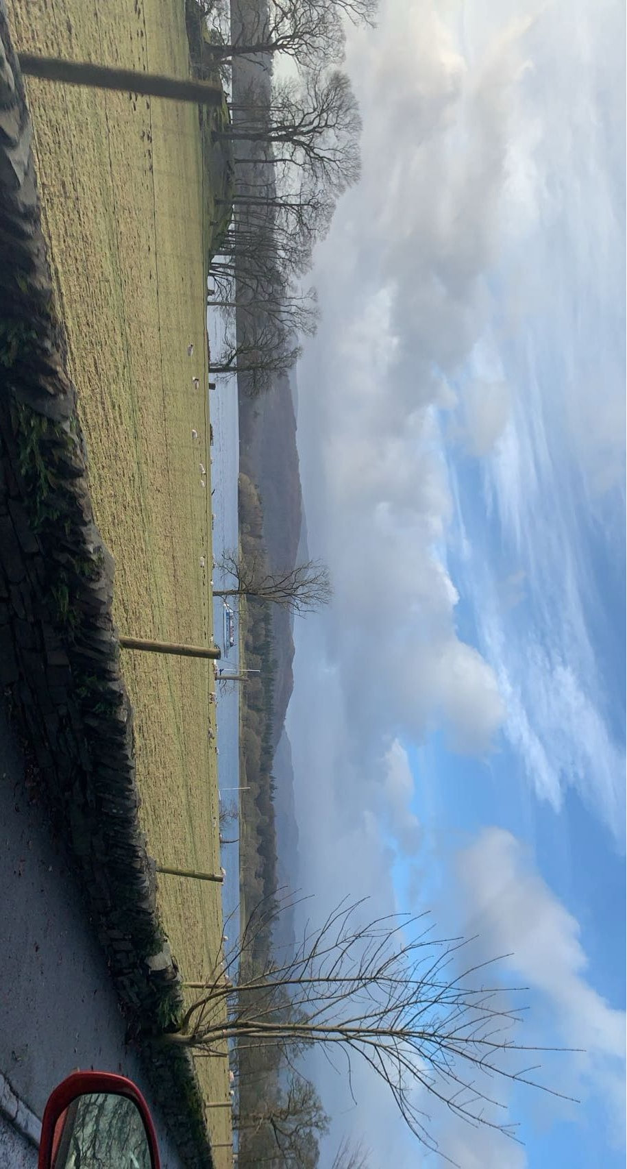
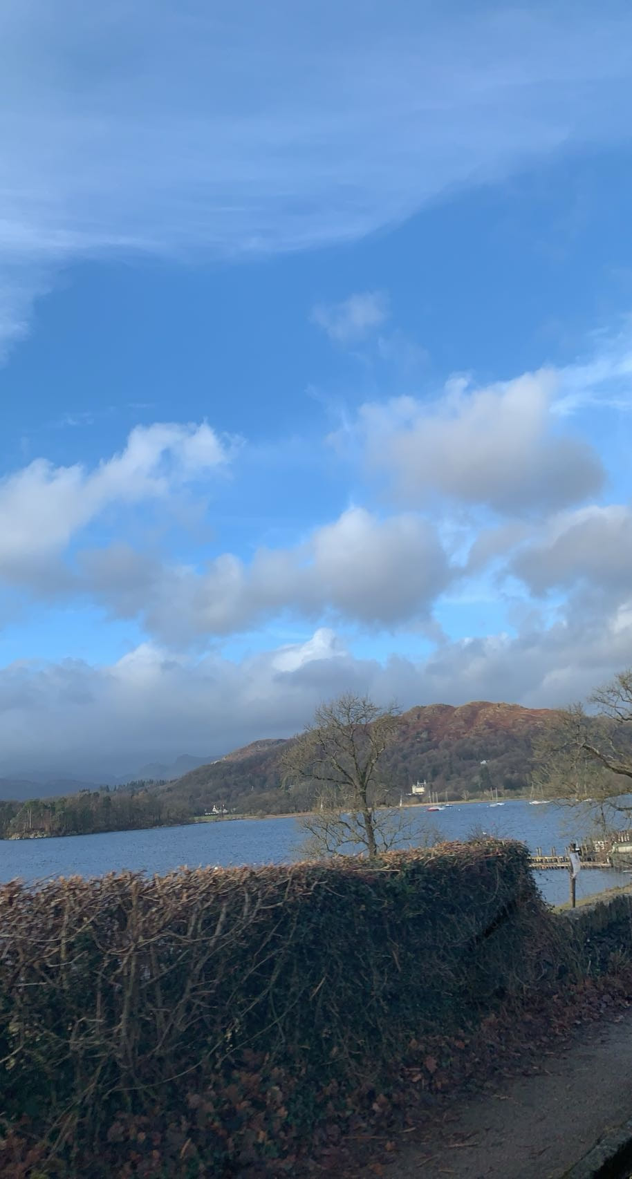
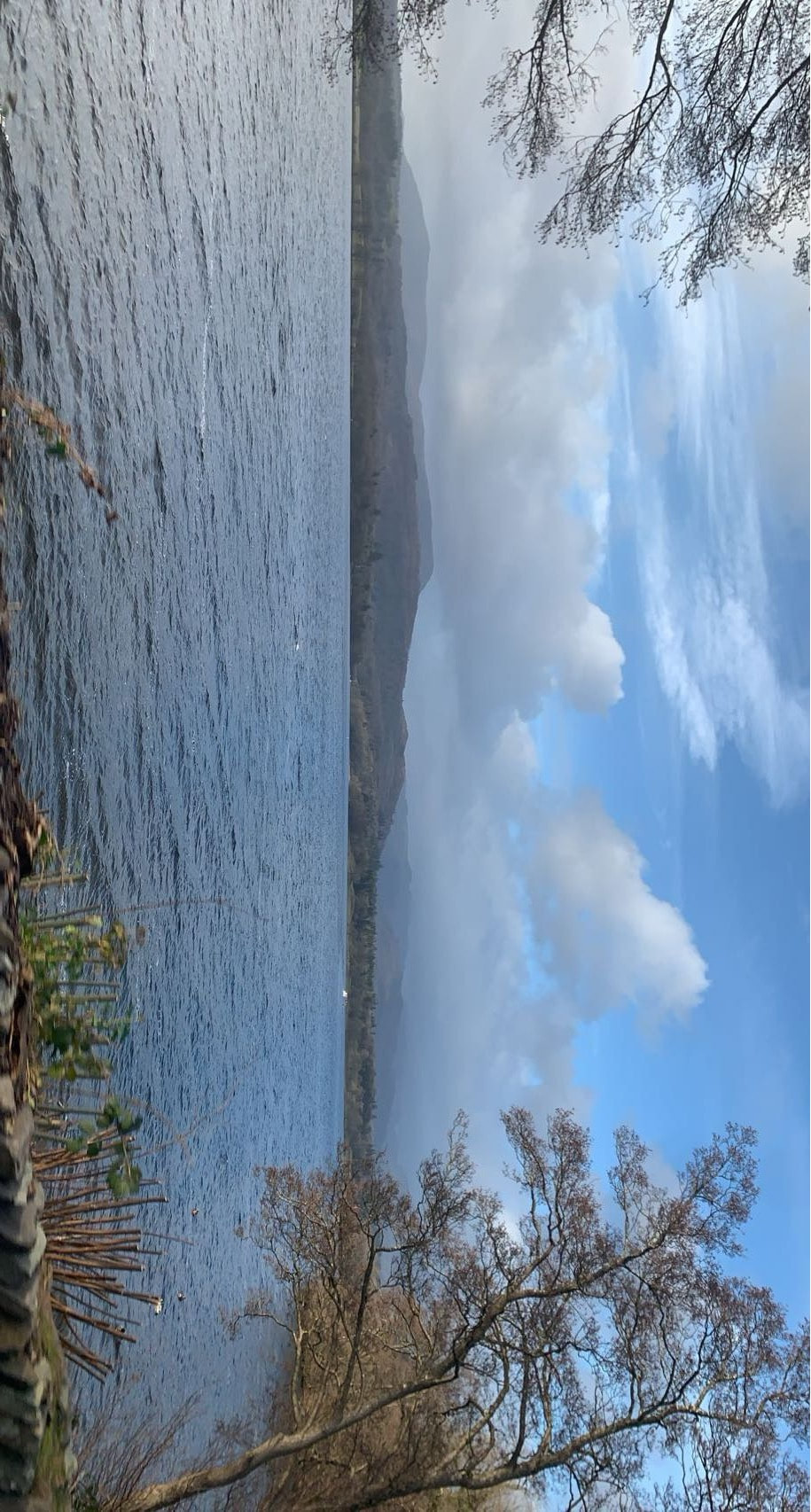
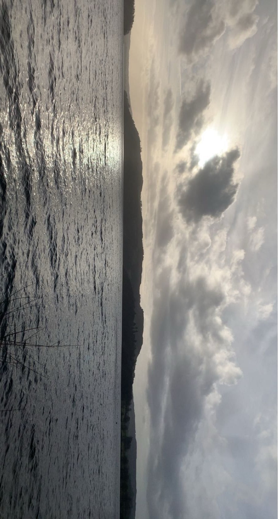
For my response I took three sets of images of sky, natural landscape and urban. I wanted to get variety of coloured skies in both daytime and evening. In my first set of photos I went out locally to Highgate Woods and Muswell Hill on a sunny afternoon and proceeded to take images of the pale and rich blue skies in mid and late afternoon. I then waited till the sun was setting so I could photograph colourful orange, pink and purple sky. I also used images I took in the Lake District so managed to get a few images of more dramatic skies reflected against Windermere Lake.

Edited:
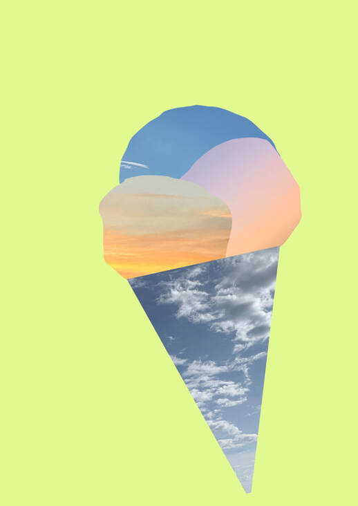
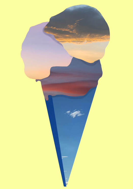
With my edited images I wanted to experiment with a mixture of Pfeffer's style of editing where she creates new environments and objects by combining multiple images from other environments. My own idea is of combining cut-outs of the sky with buildings/scenes of the urban environment. Ice cream cones made from the skies from which they are sold under, in Highgate Woods and by Windermere Lake. I was rather disappointed with the flatness of the ice cream cones so began to explore subverting the urban landscape images with those of the nature in order to transform both the image but also the way in which the viewer reads the image.
|
1st image: for my first response I wanted to almost copy Pfeffer's style so that I can reimagine it in some other way. So I created an ice-cream from the images of the sky. Using different coloured skies to represent the different flavours of an ice-cream. However I felt as if the image was to simple and lacked depth.
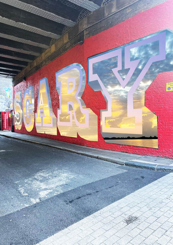
For my next Images I really liked the way that grafitti had already begun to transform the urban landscape in these shots I took on my iphone whilst walking in Shoreditch. So started to work in photoshop creating layers of selected elements which I then selected the inverse and deleted elements to allow the next layer to appear. These urban images are more influenced by Pfeffer but I like the way the use of colour blocking and mix of monochrome with colour creates a two world effect. Transporting the viewer between two places whilst creating a transformation of the original image.

|
2nd image: For my second image I wanted to just improve on my first ice-cream, I did this by adding depth with shading the underside where the two scoops meet and also using other images of the sky to see which ones worked best.
|
Overall I am very happy with my final images and edits, I liked the urban images, particularly as the original building have been transformed in their own way with graffiti. By masking and editing in the images of natural skies I like the way the grittiness of the original has been softened by introducing the sky. I particularly like my final image of the multi storey car park in the way that it is transformed in 3 ways, firstly the grafitti itself and then in editing with by inverting the sky images (of daytime and sunset) into the building itself and the shadow and sky recoloured to match the double red lines in the road. Furthermore I think it perfectly depicted my idea of transformation of nature into man-made structures whereby the the sky is entwined within the building/structure. Next time I would definitely take more buildings shots so that I could have had a greater variety of edits to choose from.
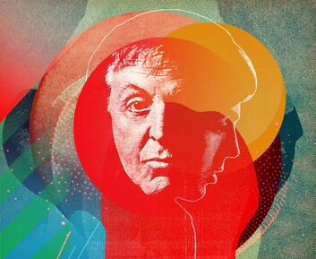
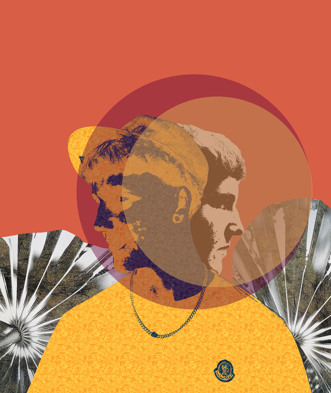
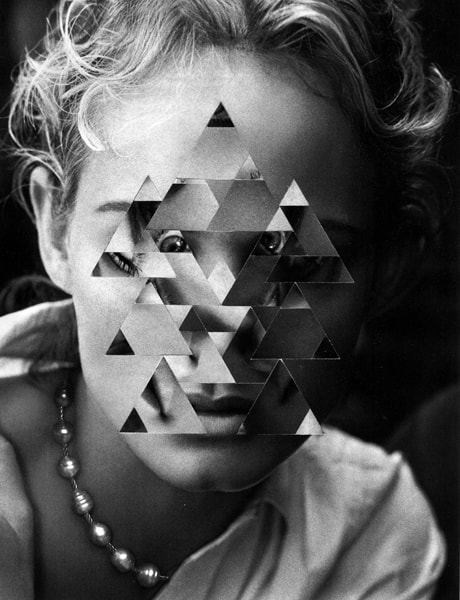
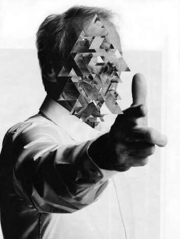
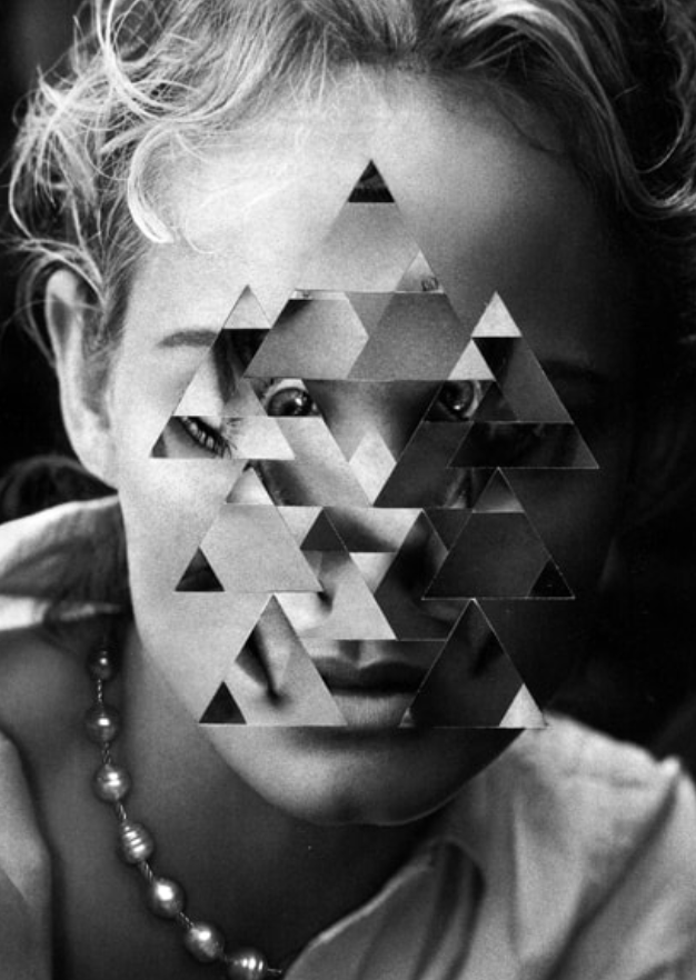
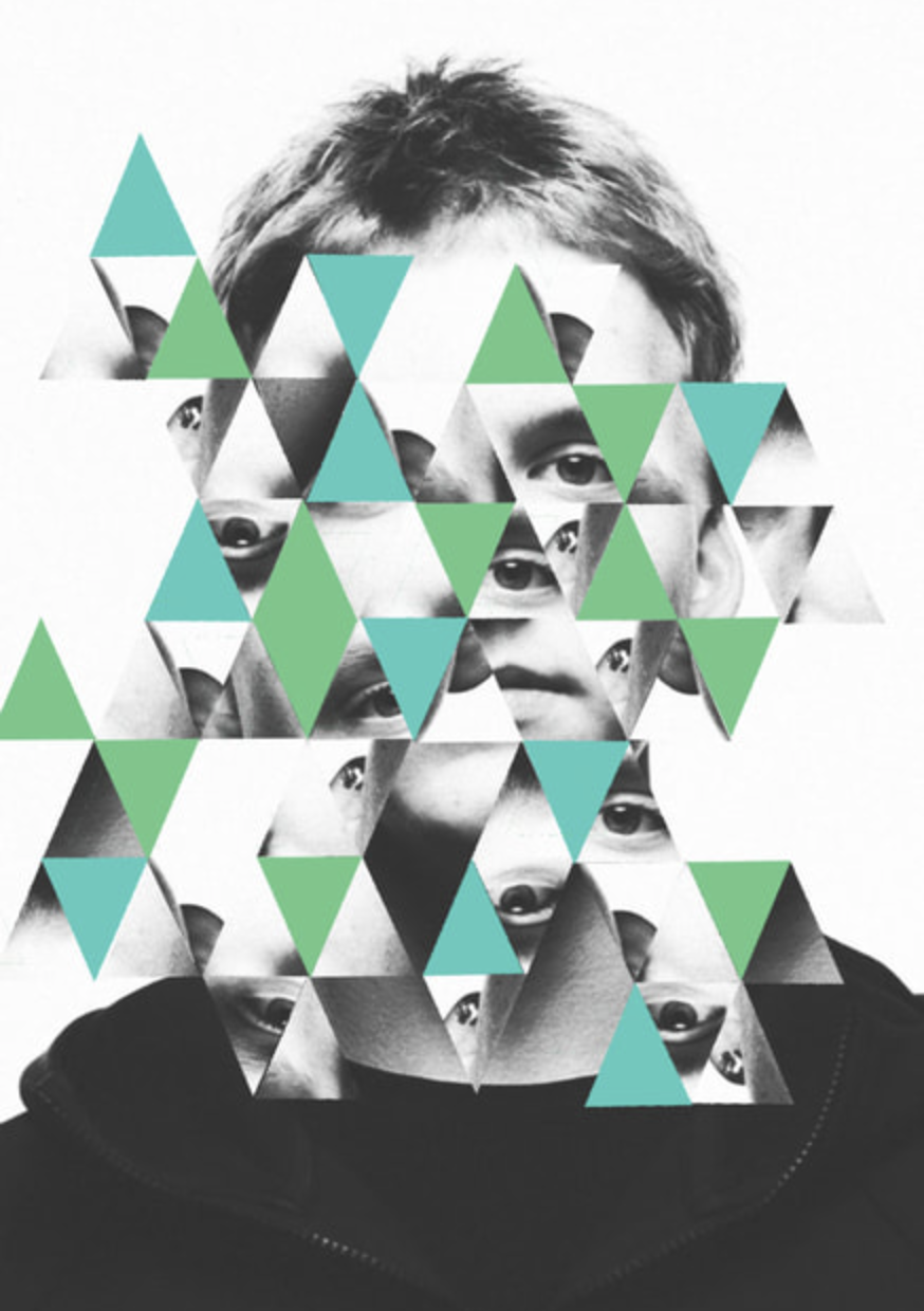
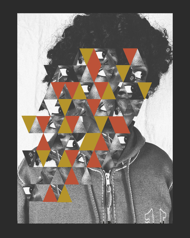
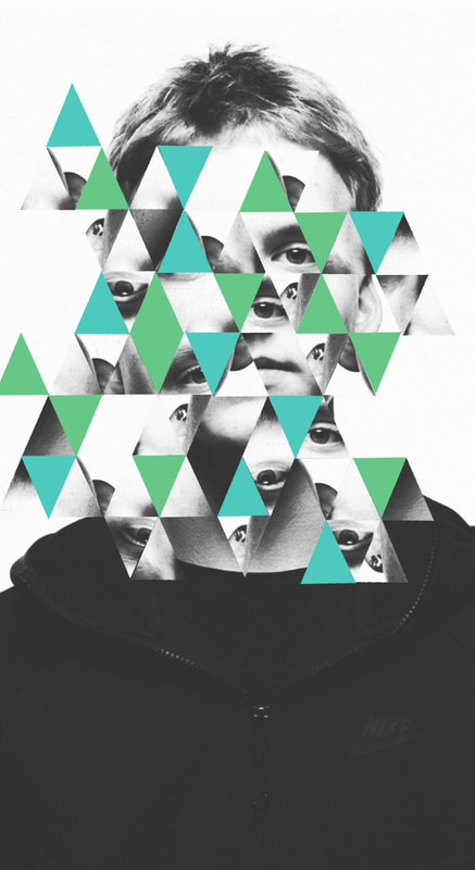
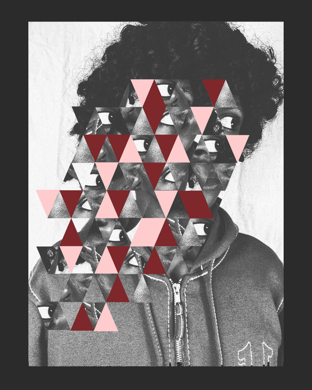
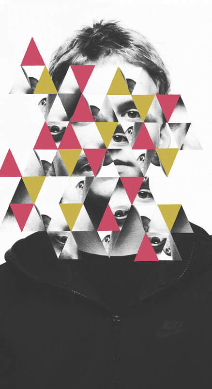
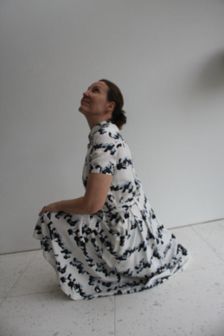
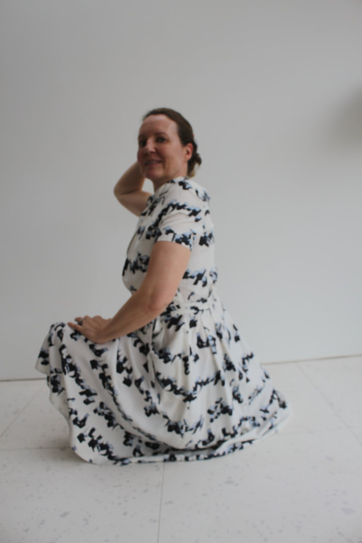
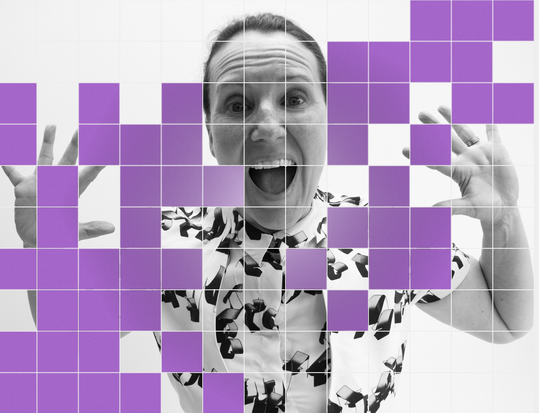
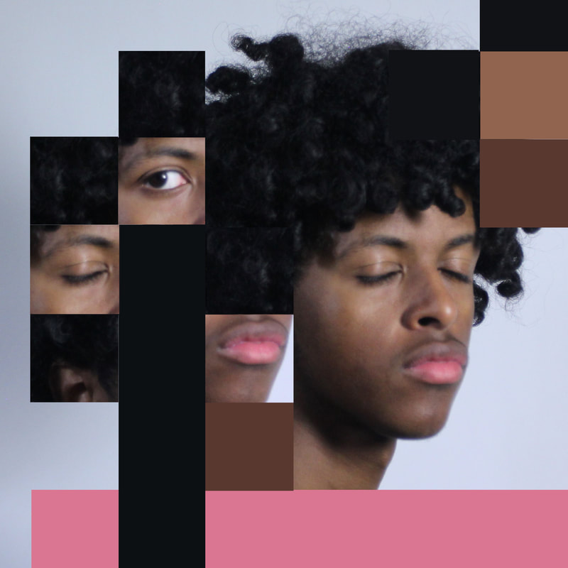
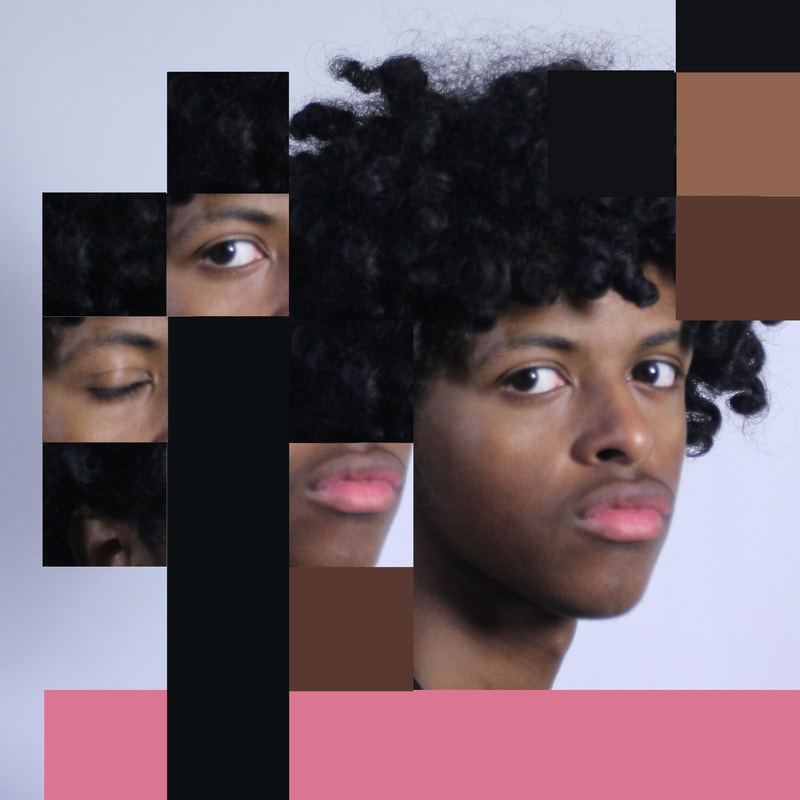
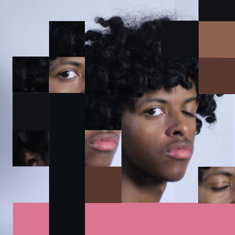
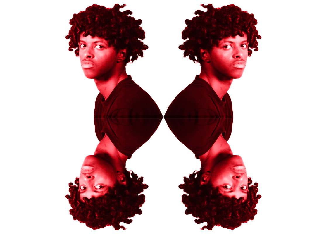
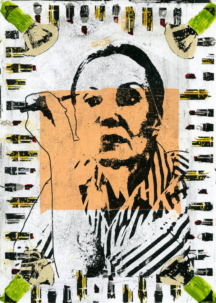
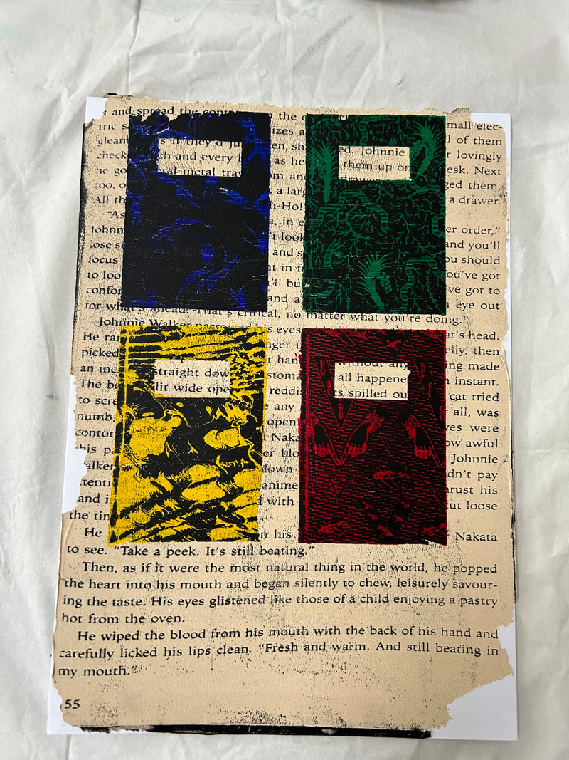
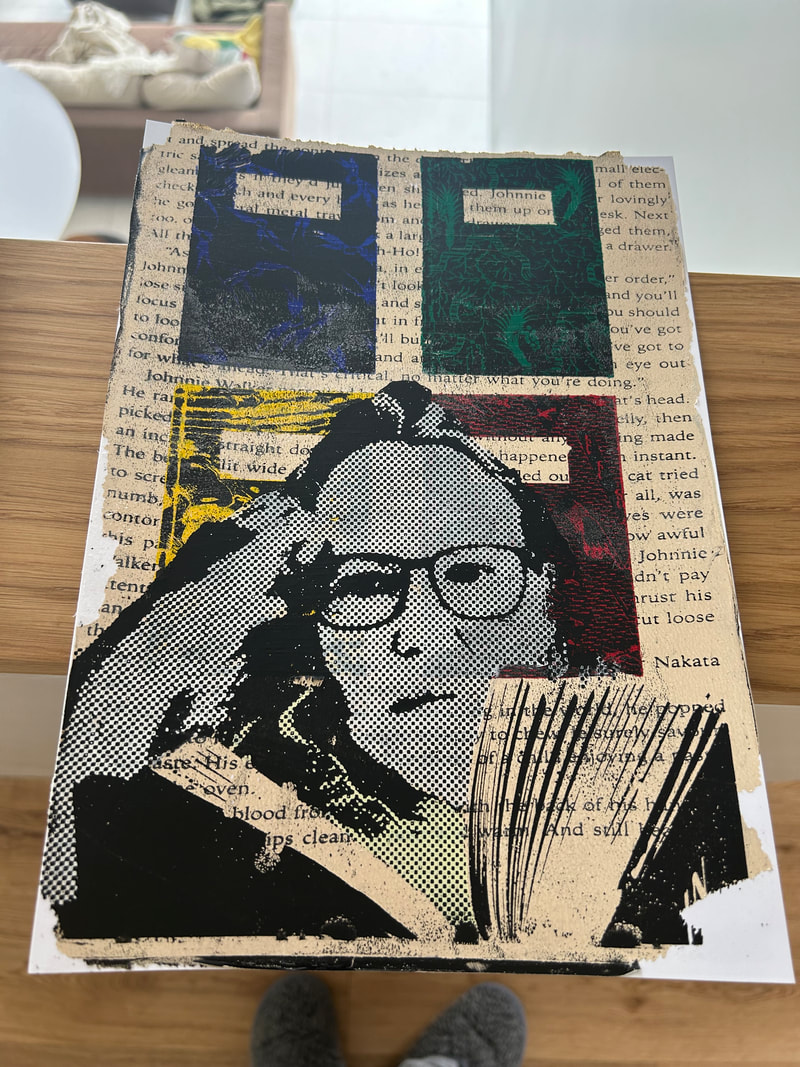
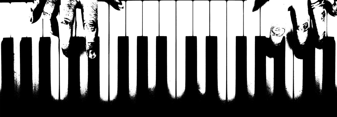
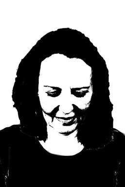
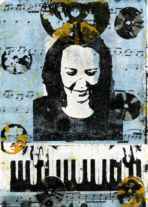
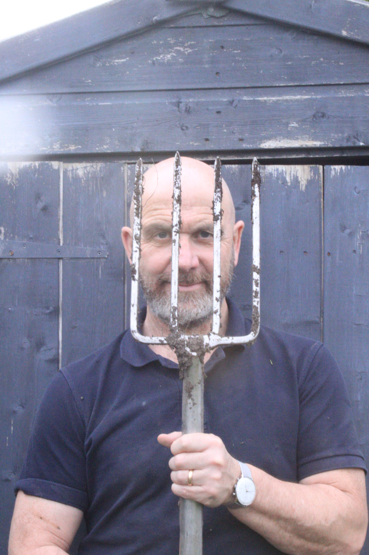
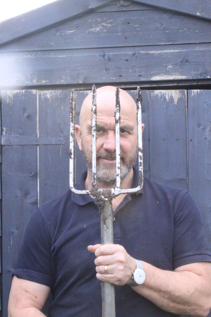
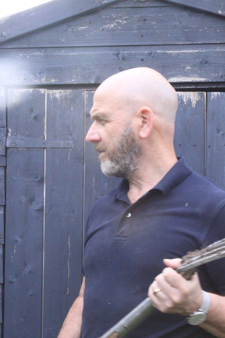
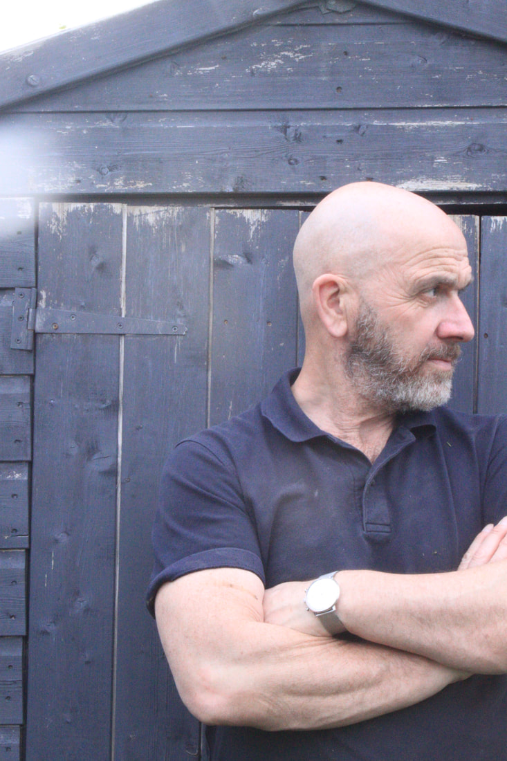
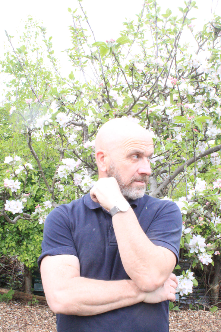
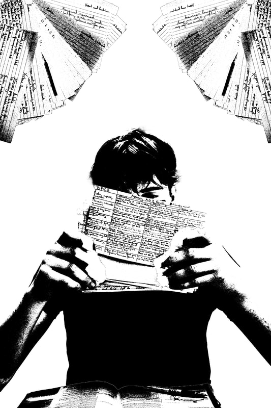
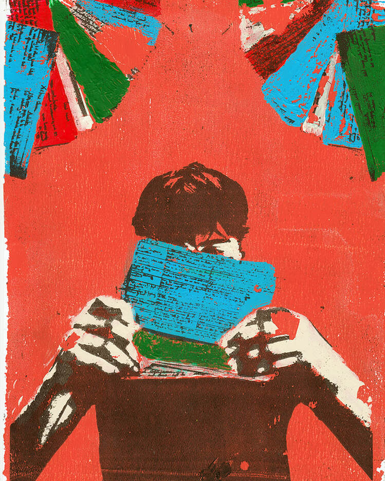
Artist 3 - Jimmy Turrell
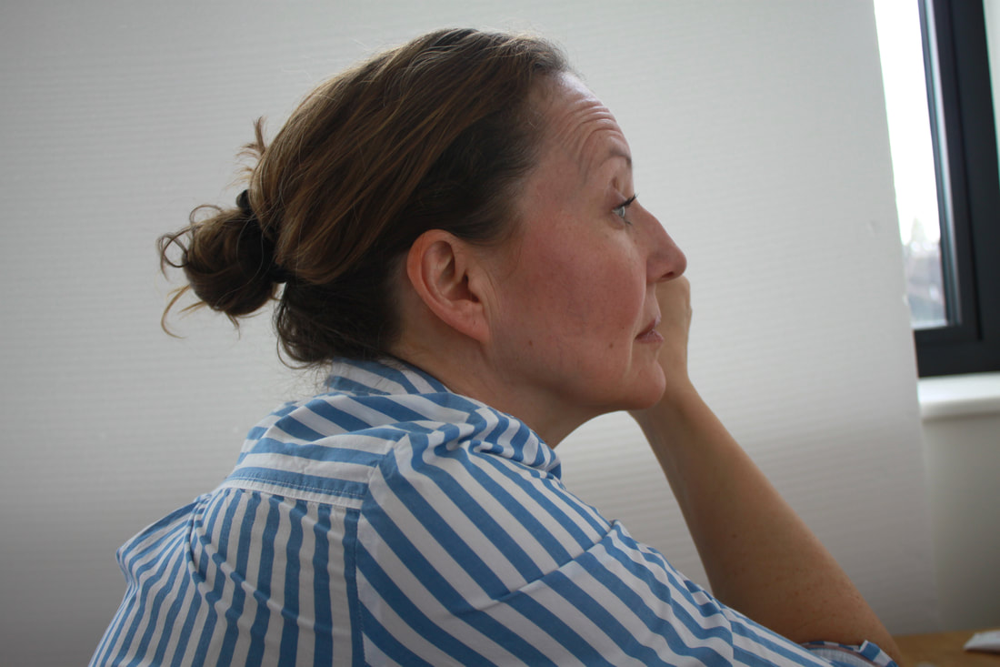
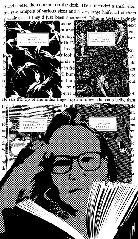
For my third photographer I wanted to explore portraits of individuals and how they can be transformed through the editing process. I came across James Turrells' work which uses a hybrid of techniques including collage, print making, photography and using a range of digital techniques as well. He creates his work through collages, buying second hand books to cut up and repurpose. On top of these he creates textures, adds colour and builds his picture, either physically or on the computer or a mixture of the two. Turrell takes his own photos, sometimes hiring models to create the exact images he needs or for commissions he is assigned.
|
|
|
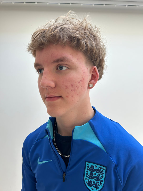
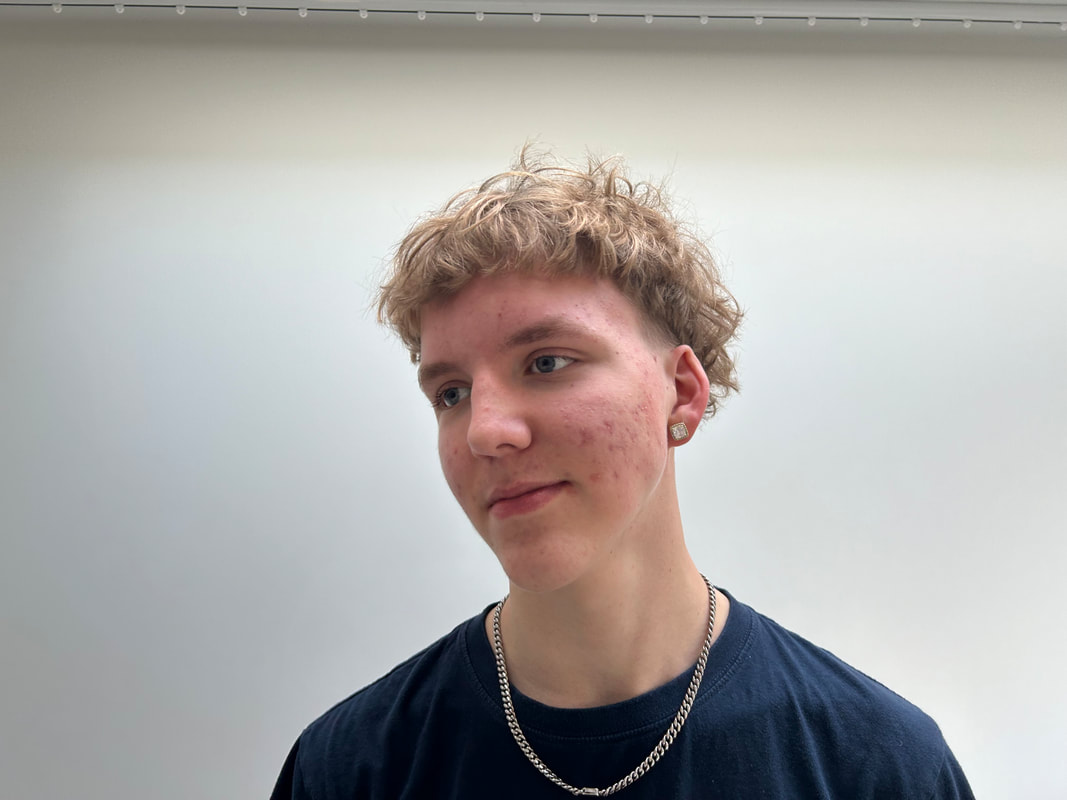
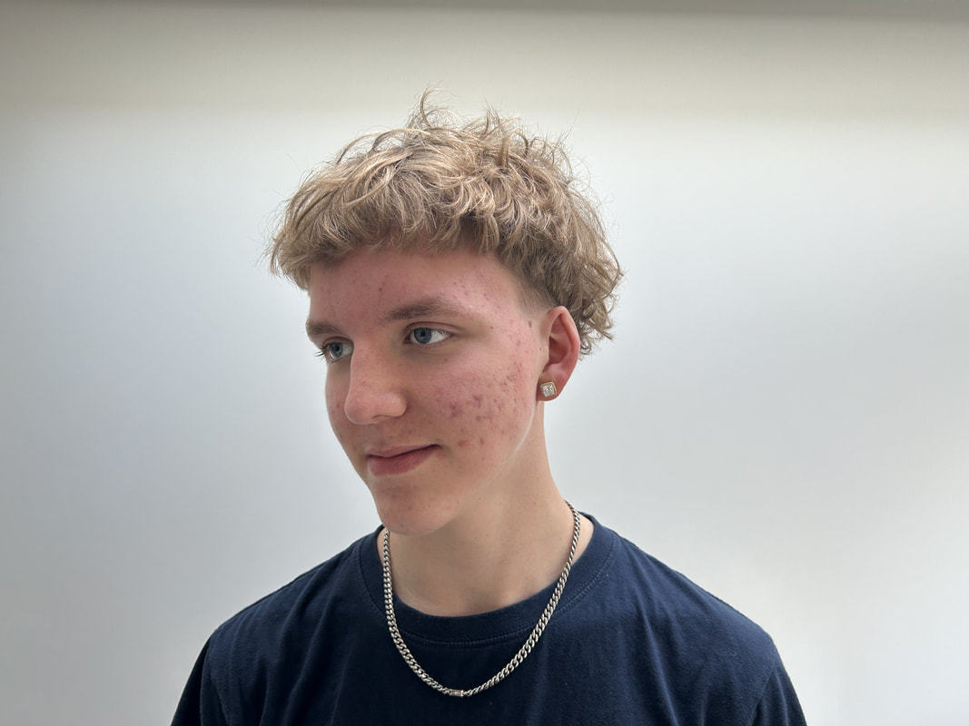
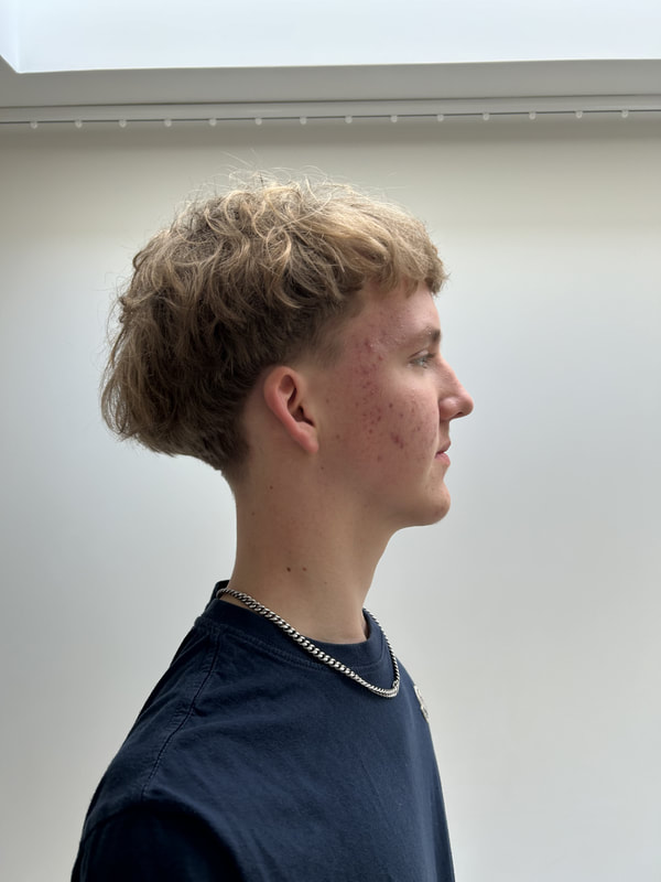
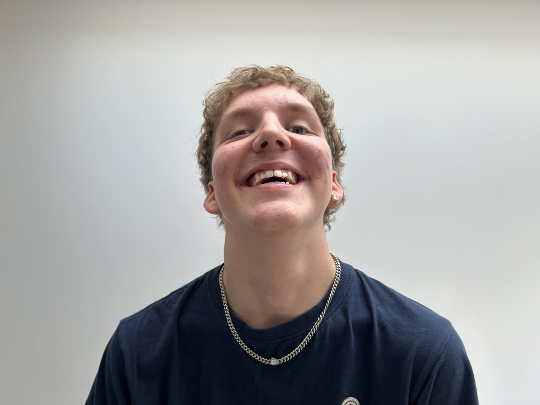
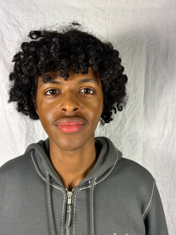
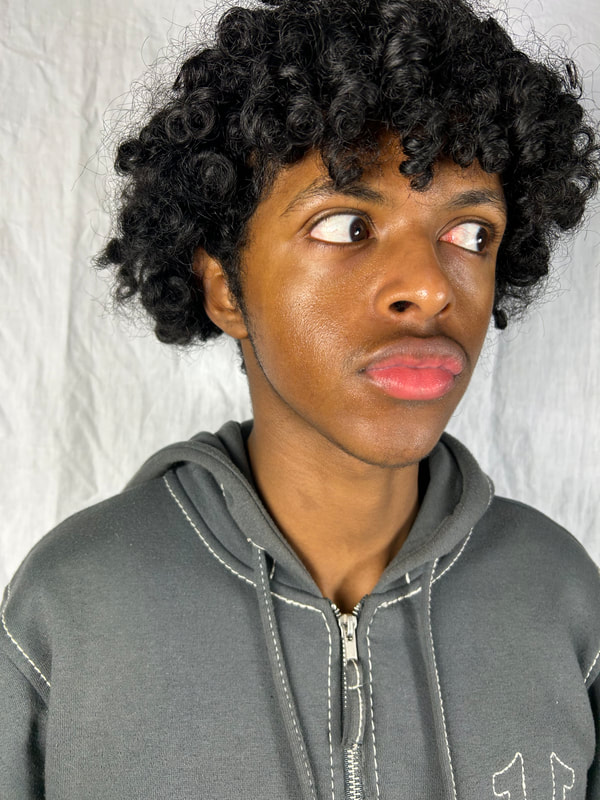
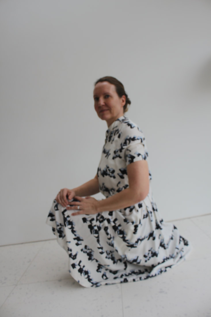
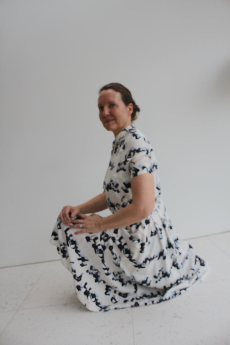
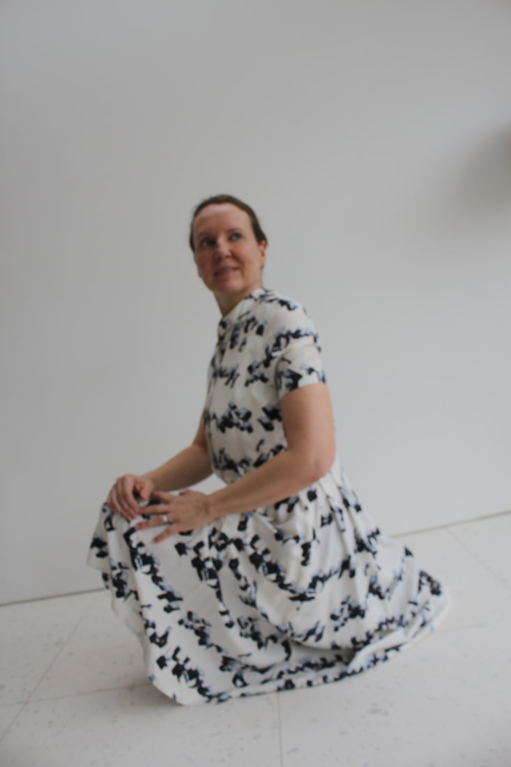
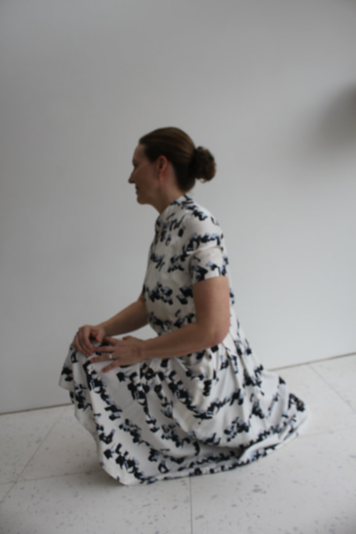
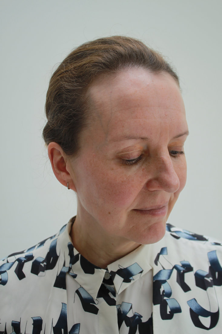
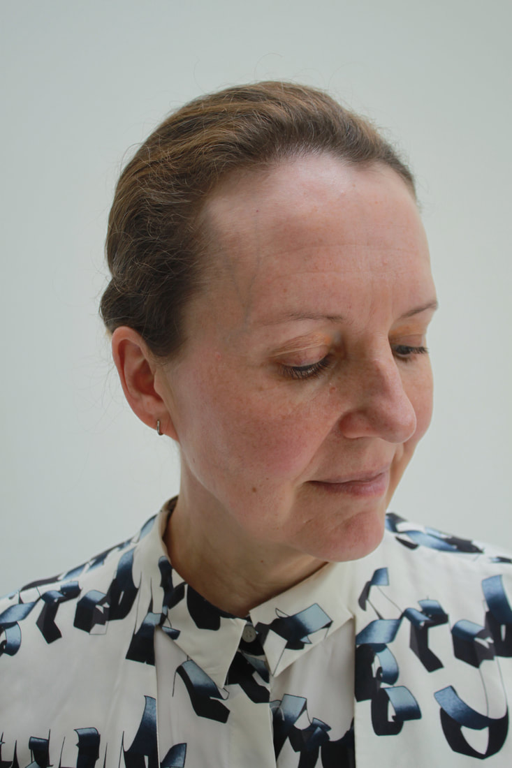
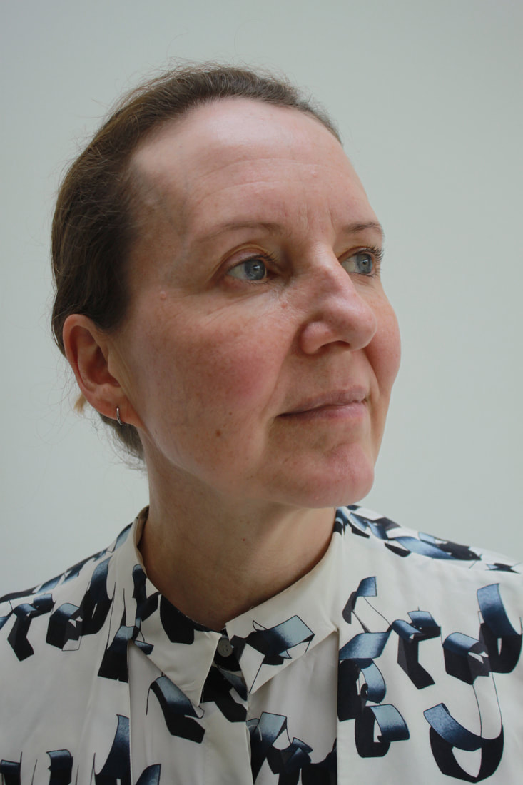
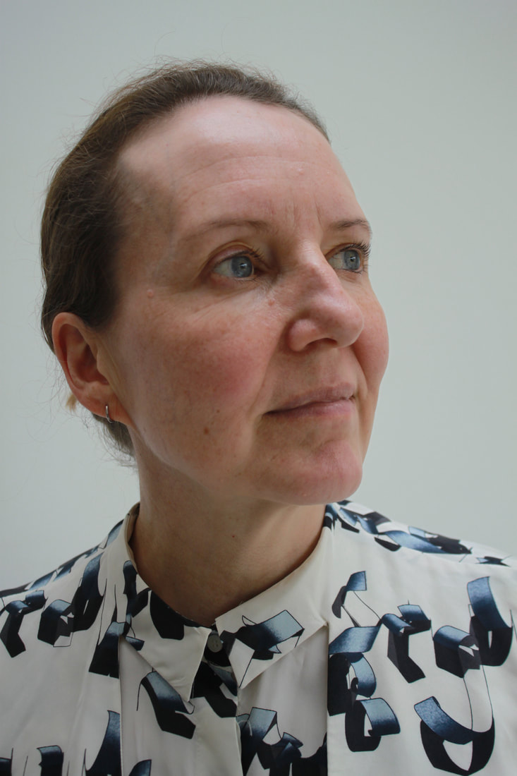
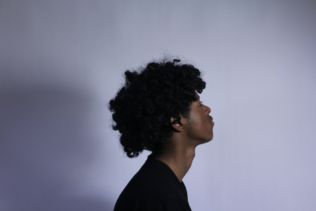
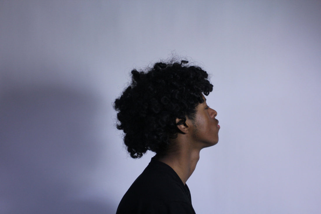
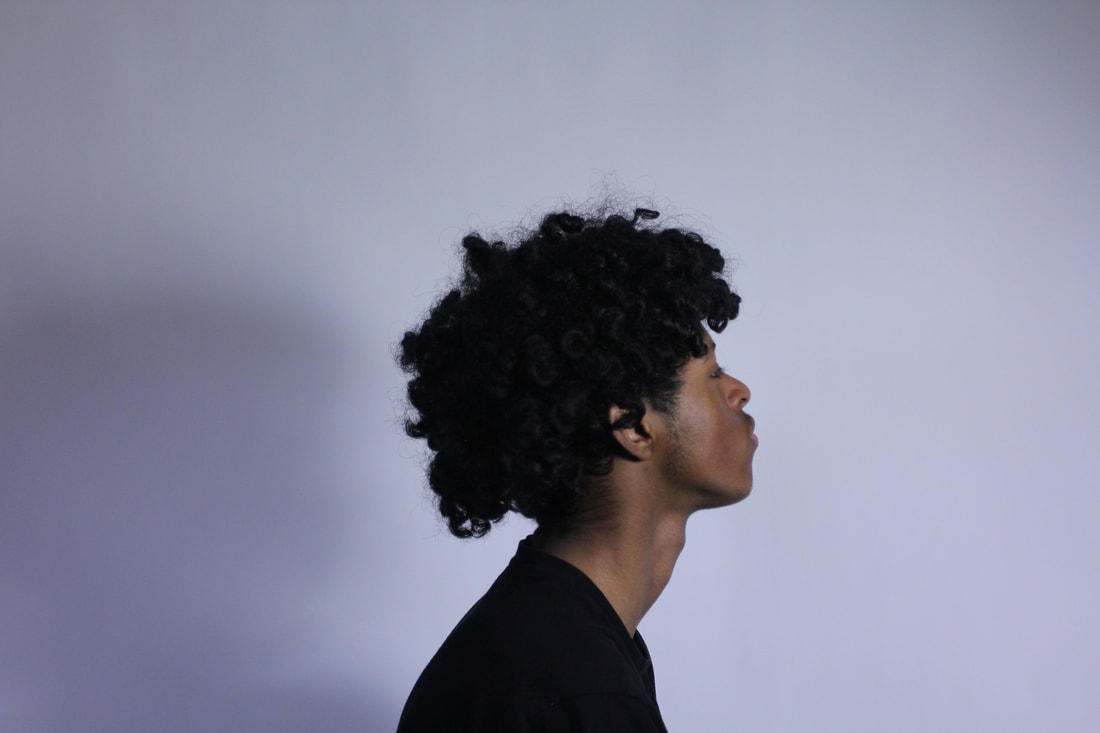
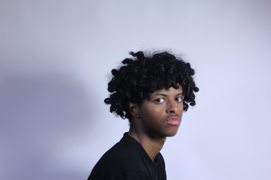
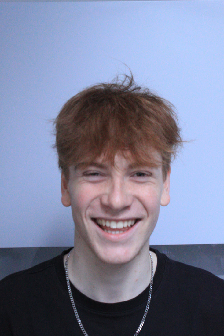
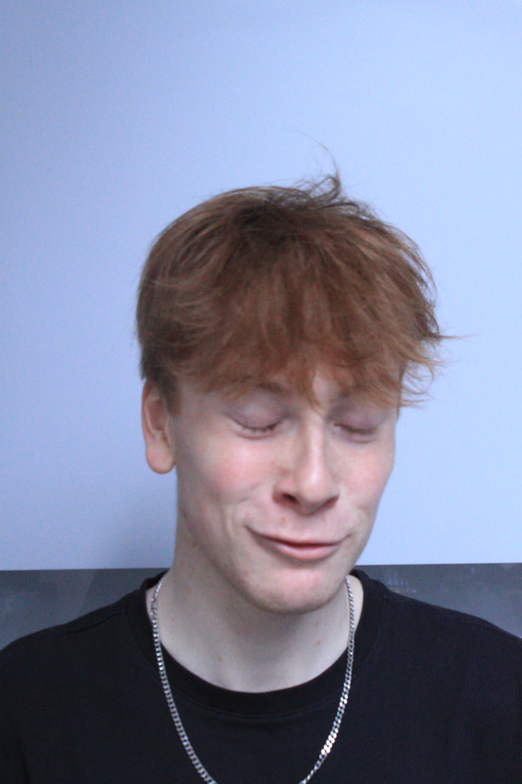
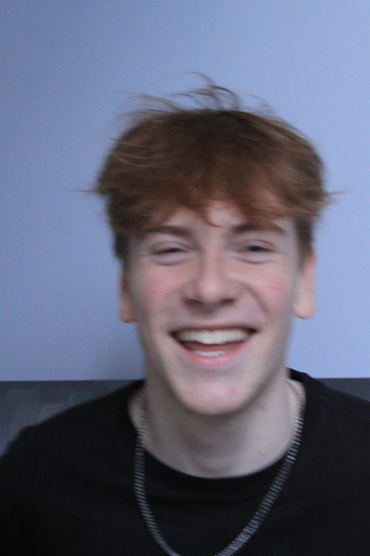
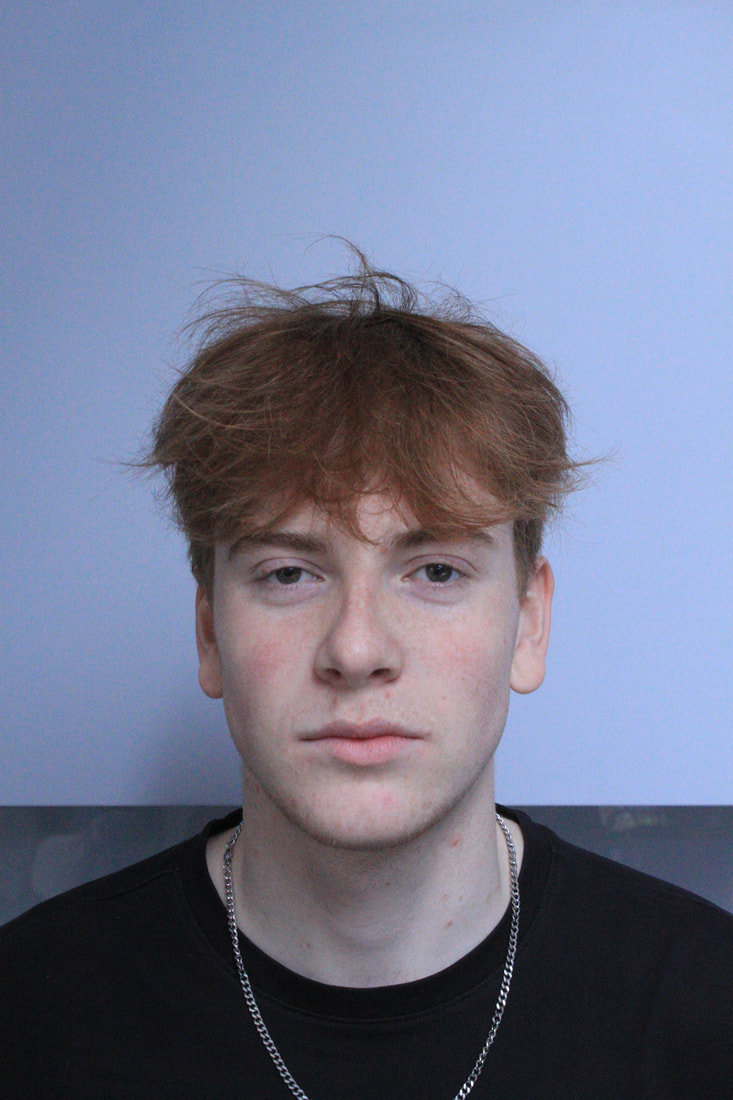
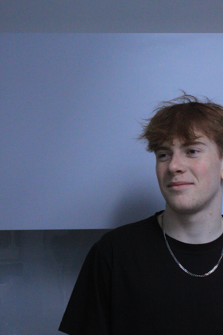
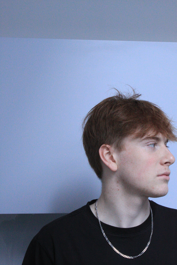
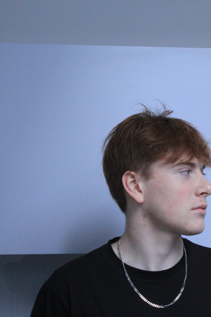
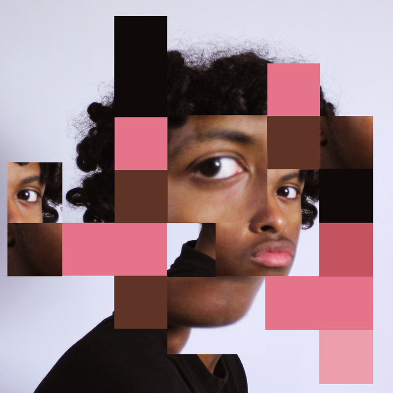
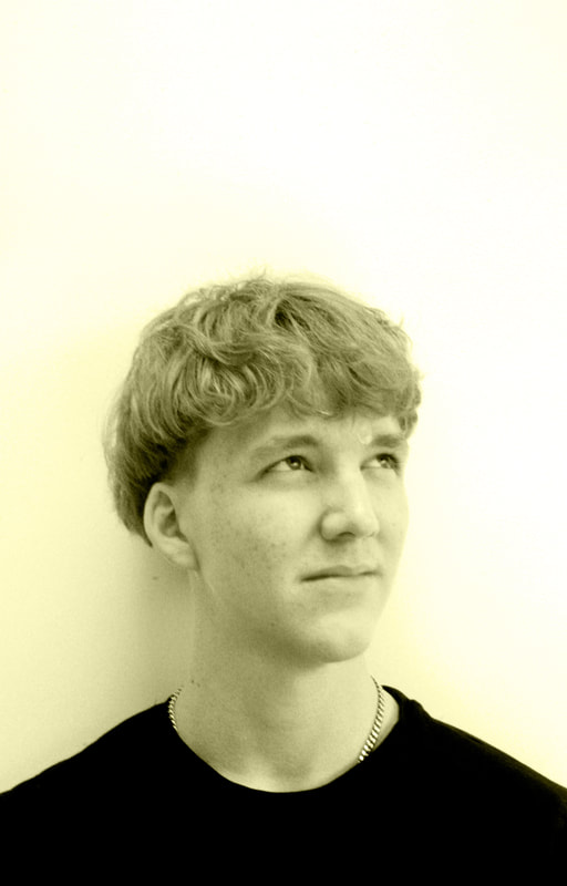
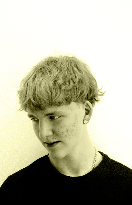
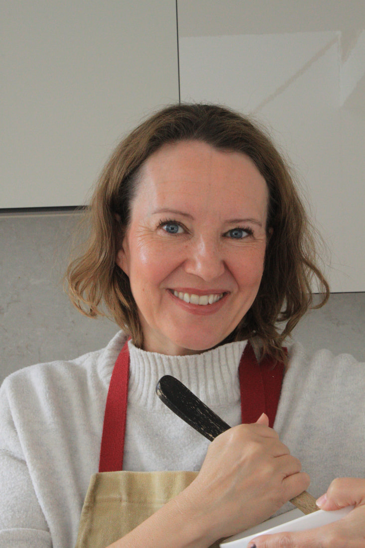
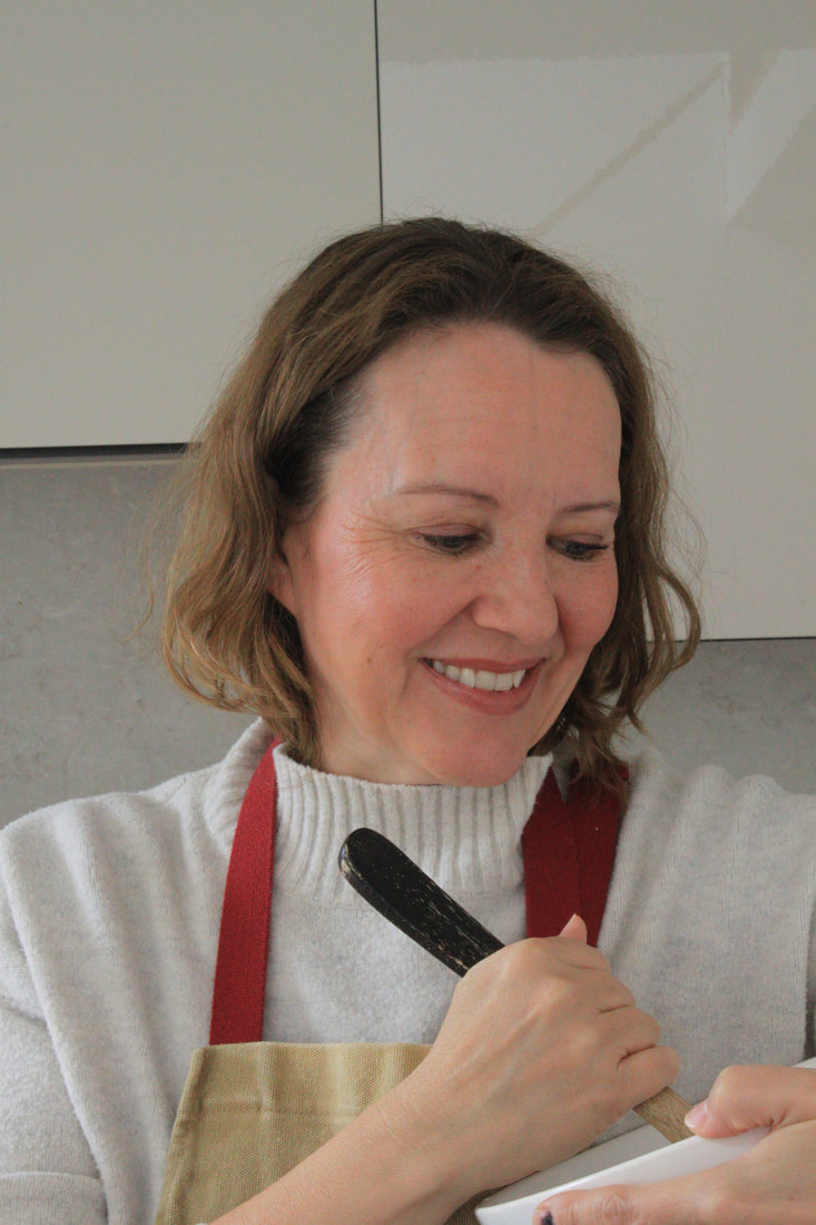
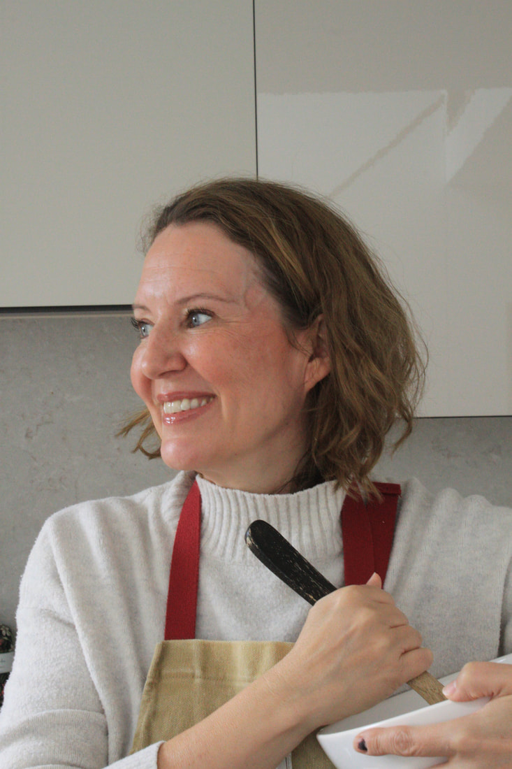
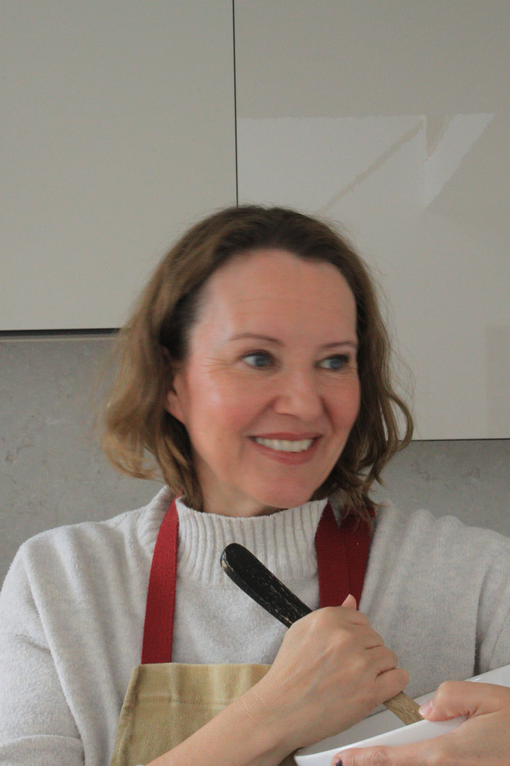
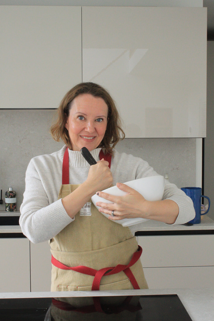
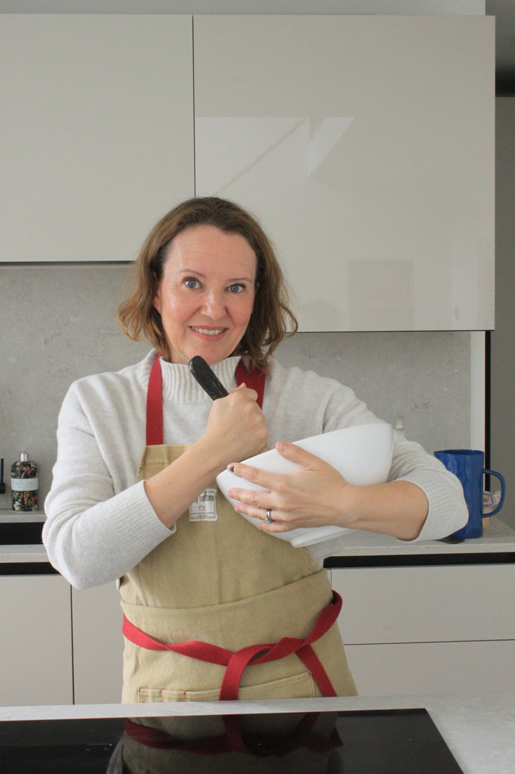
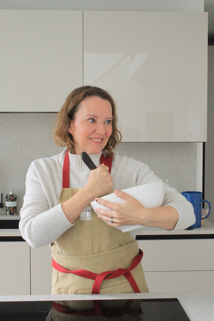
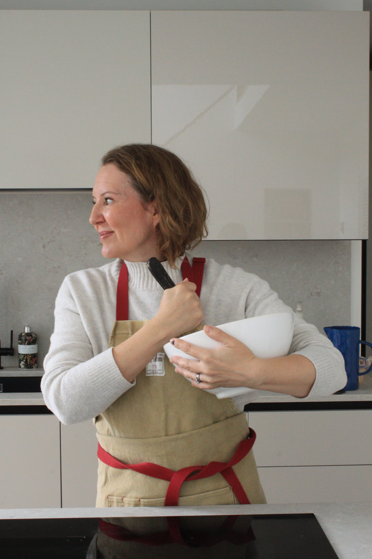
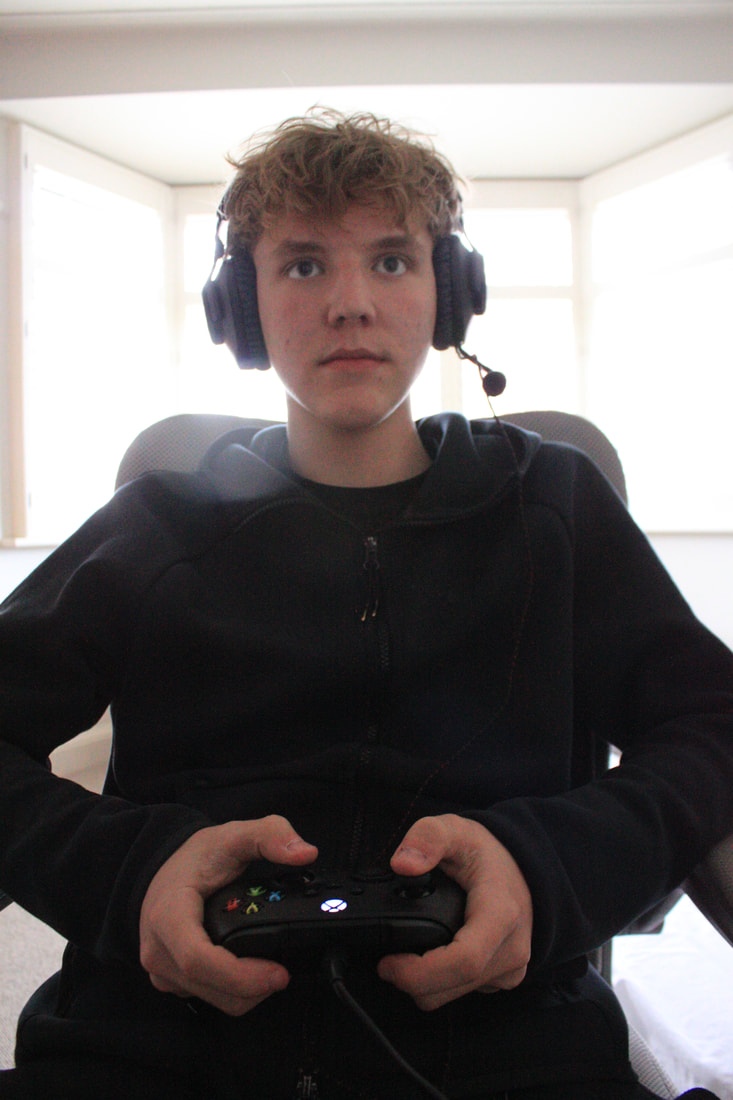
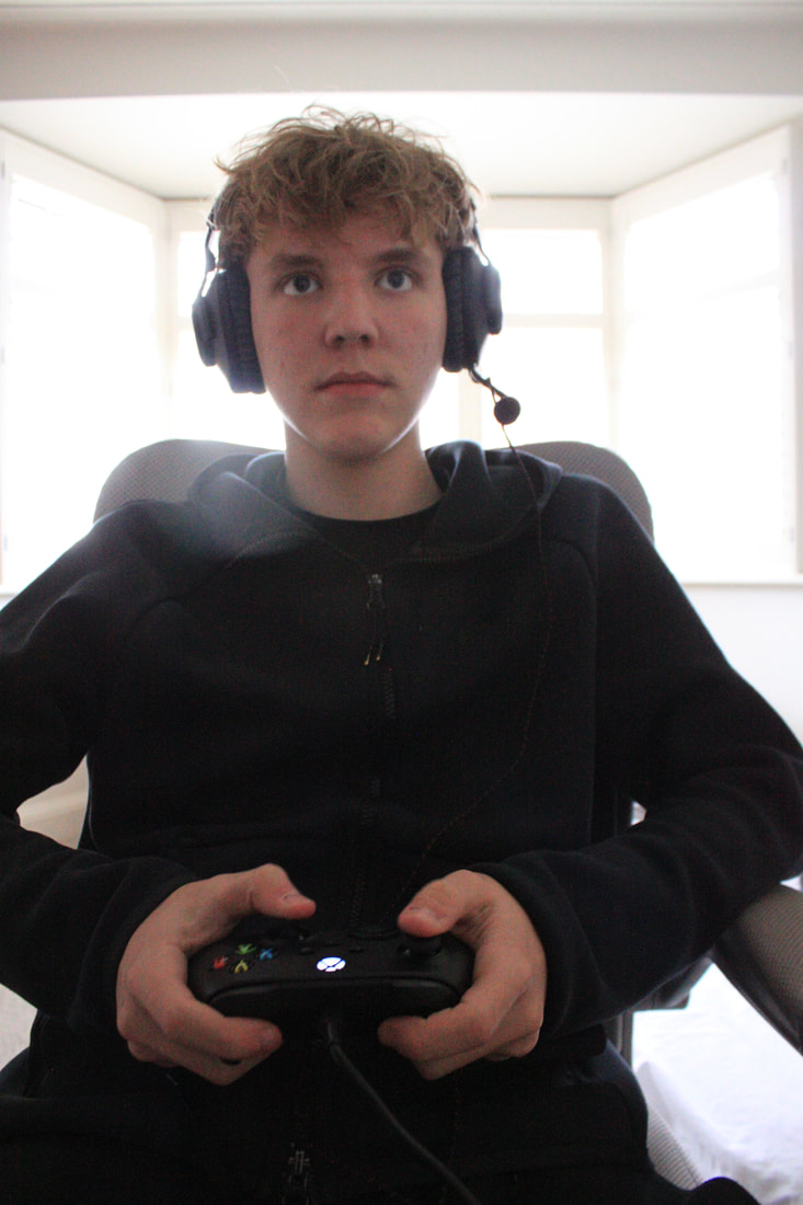
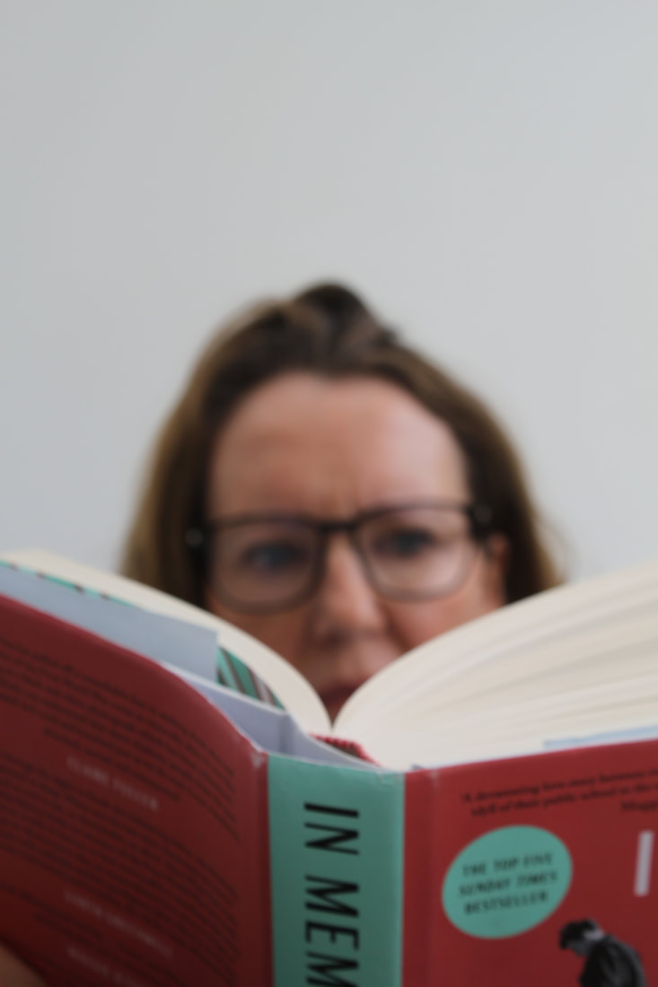
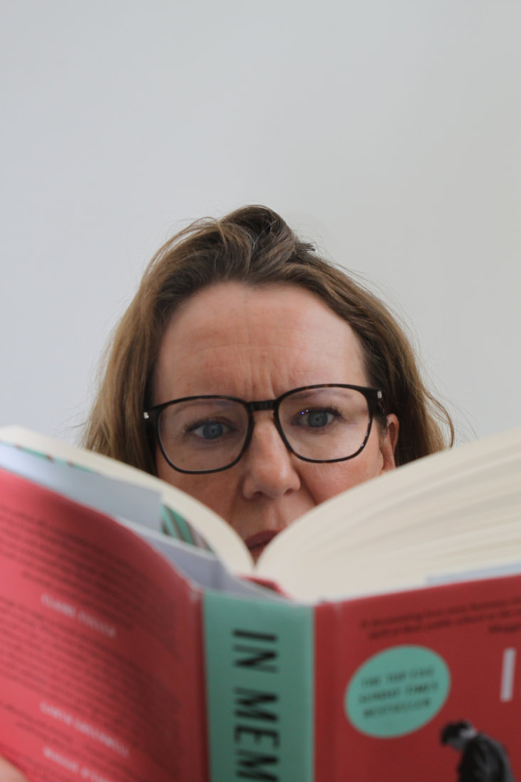
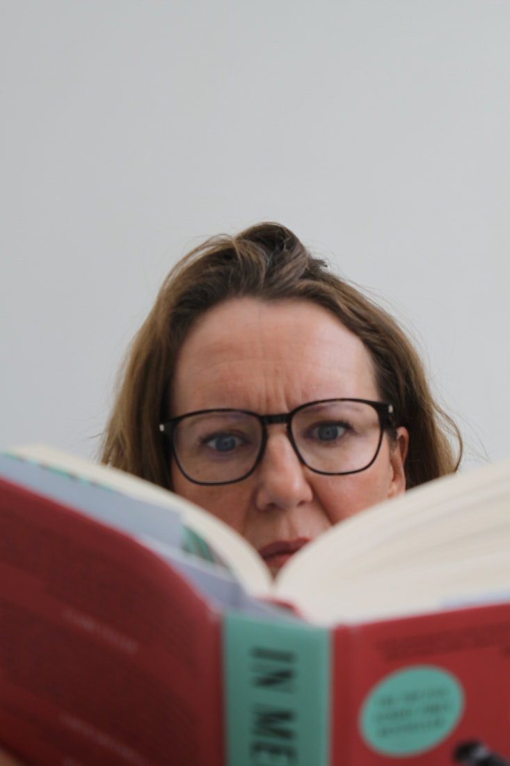
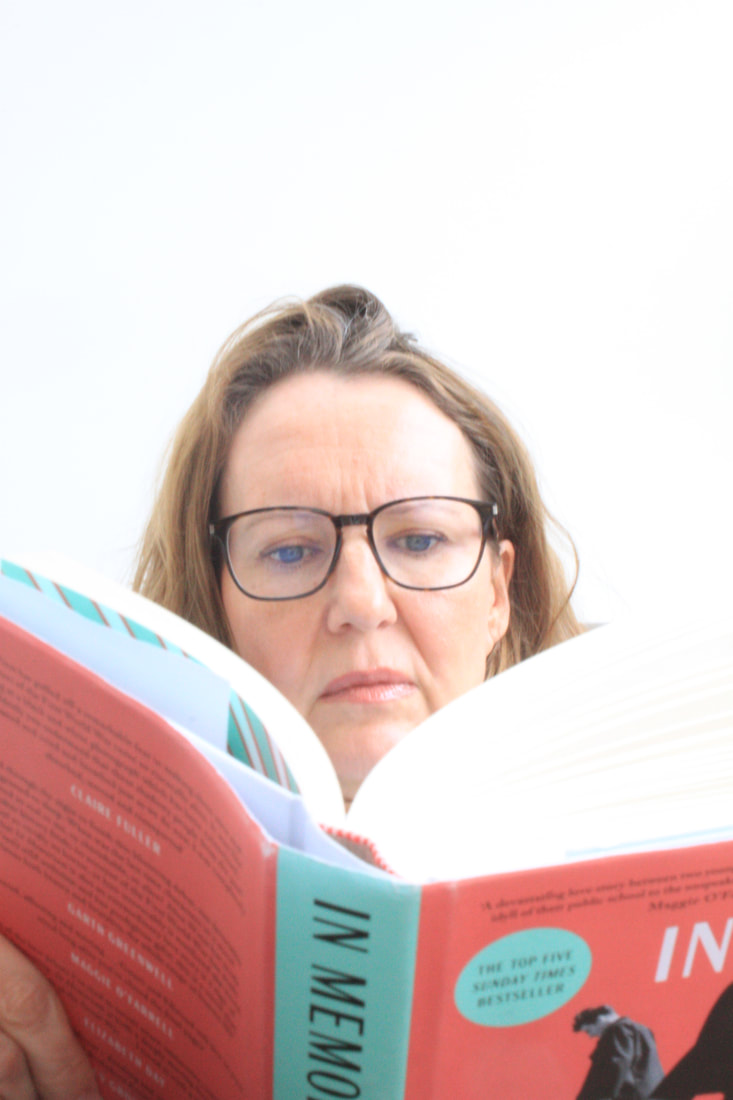
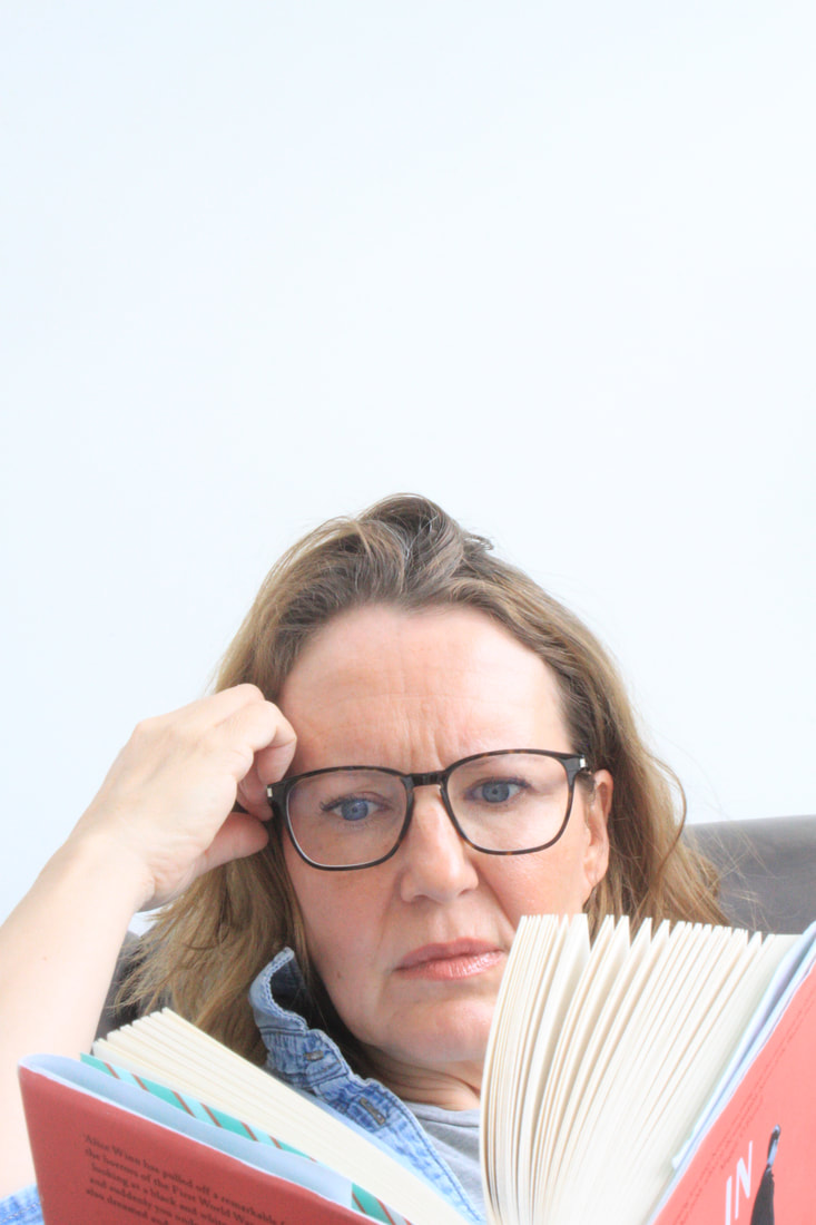
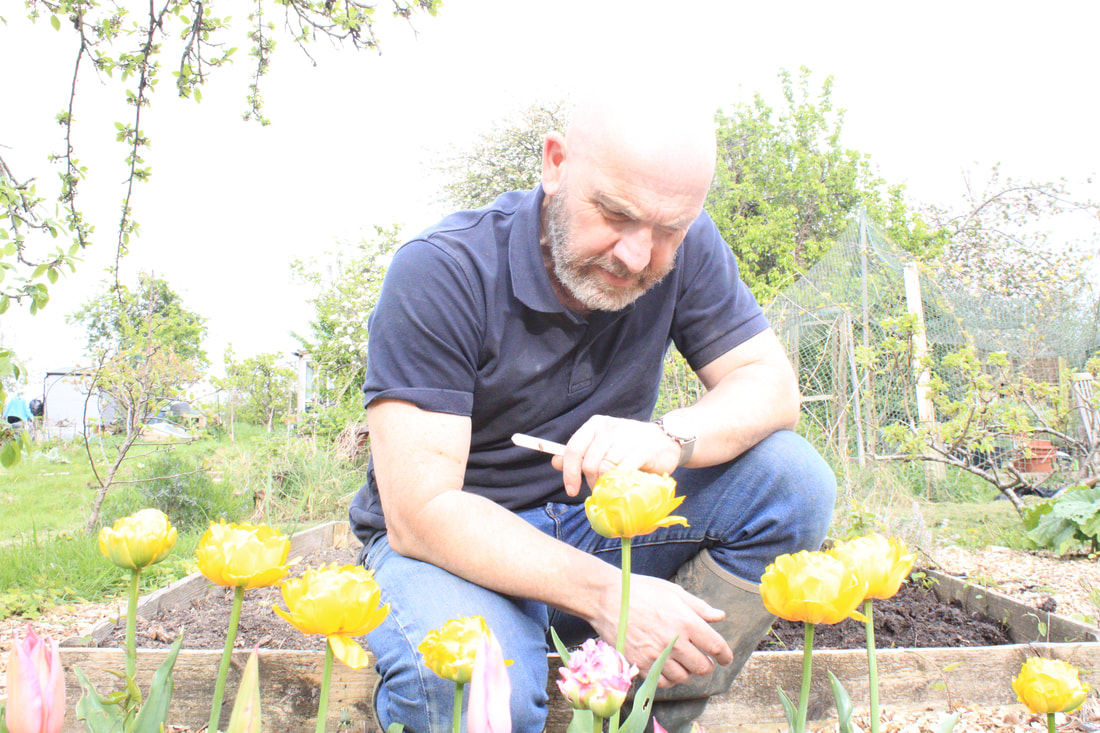
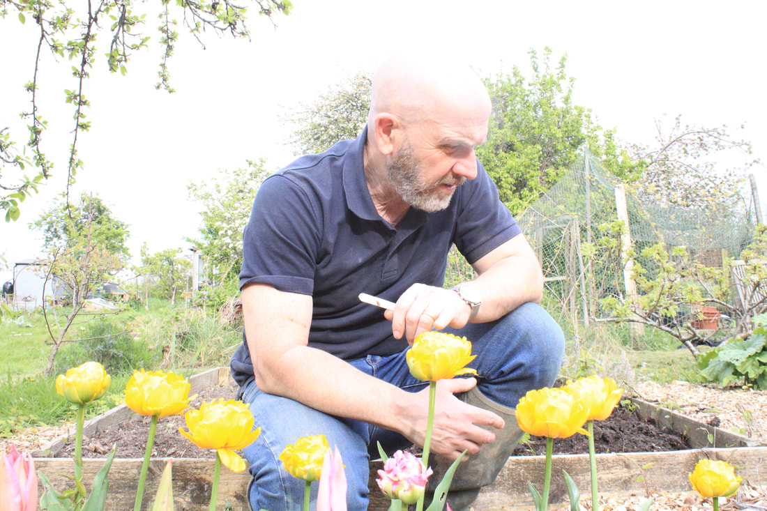
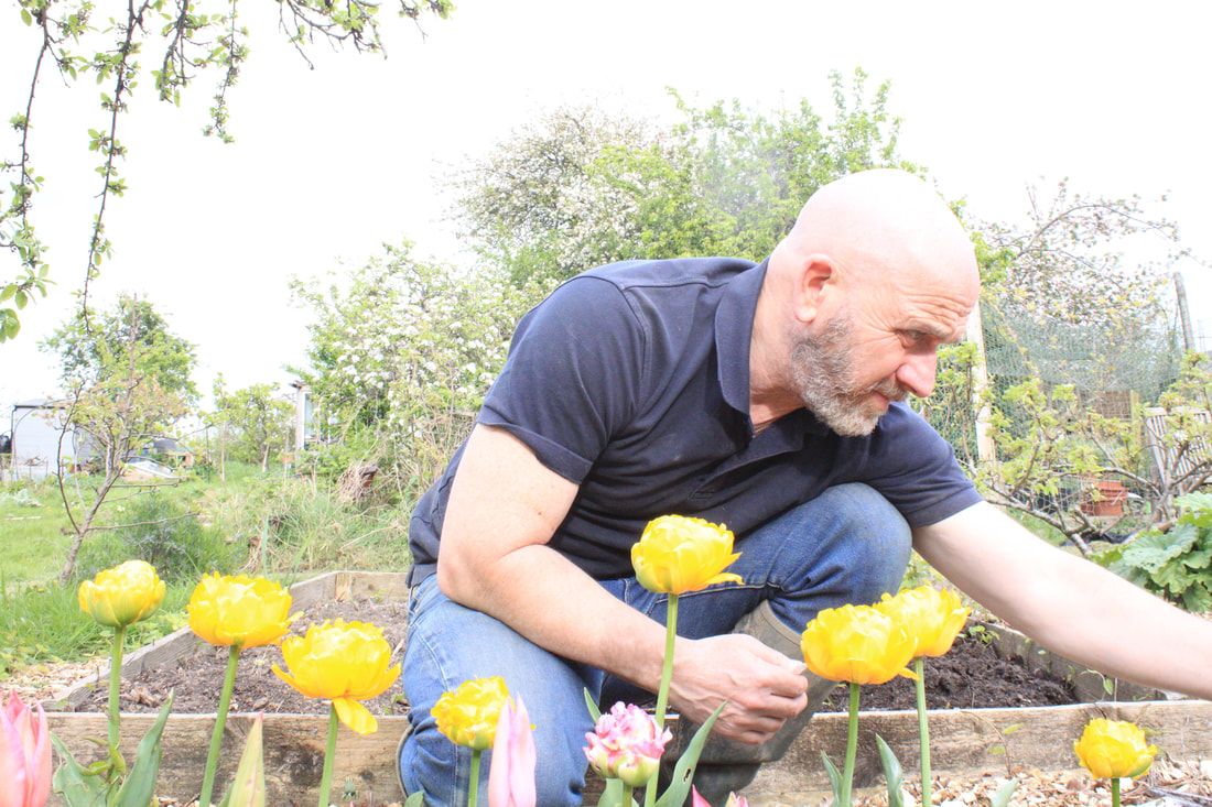
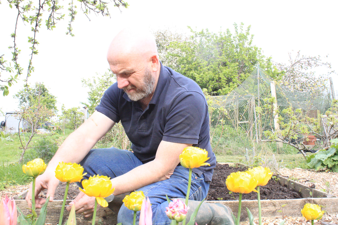
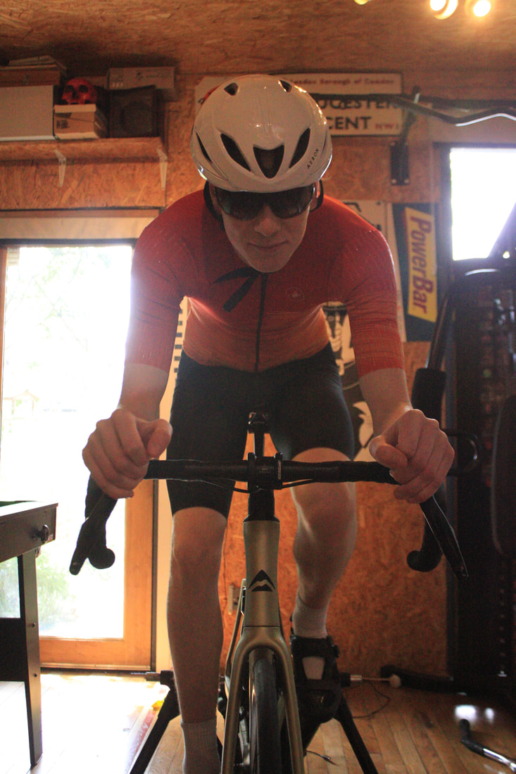
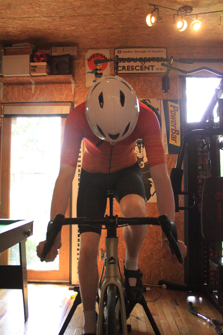
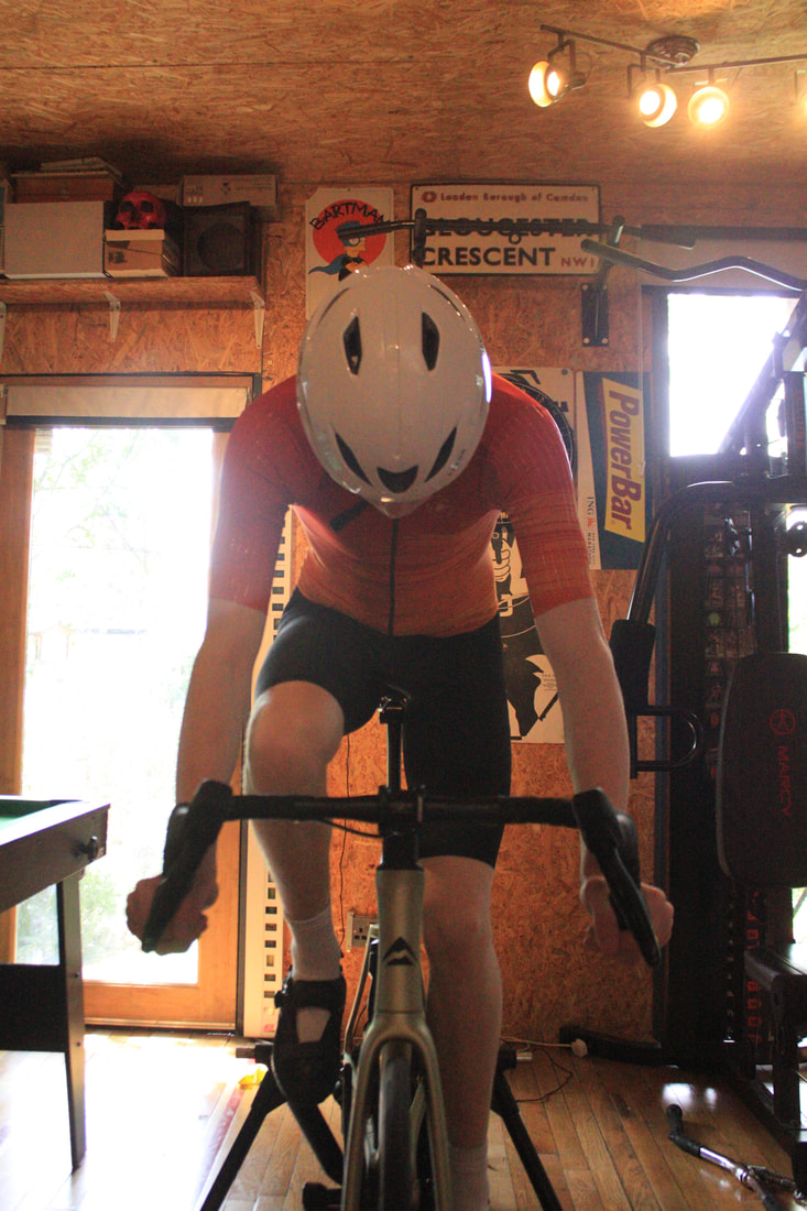
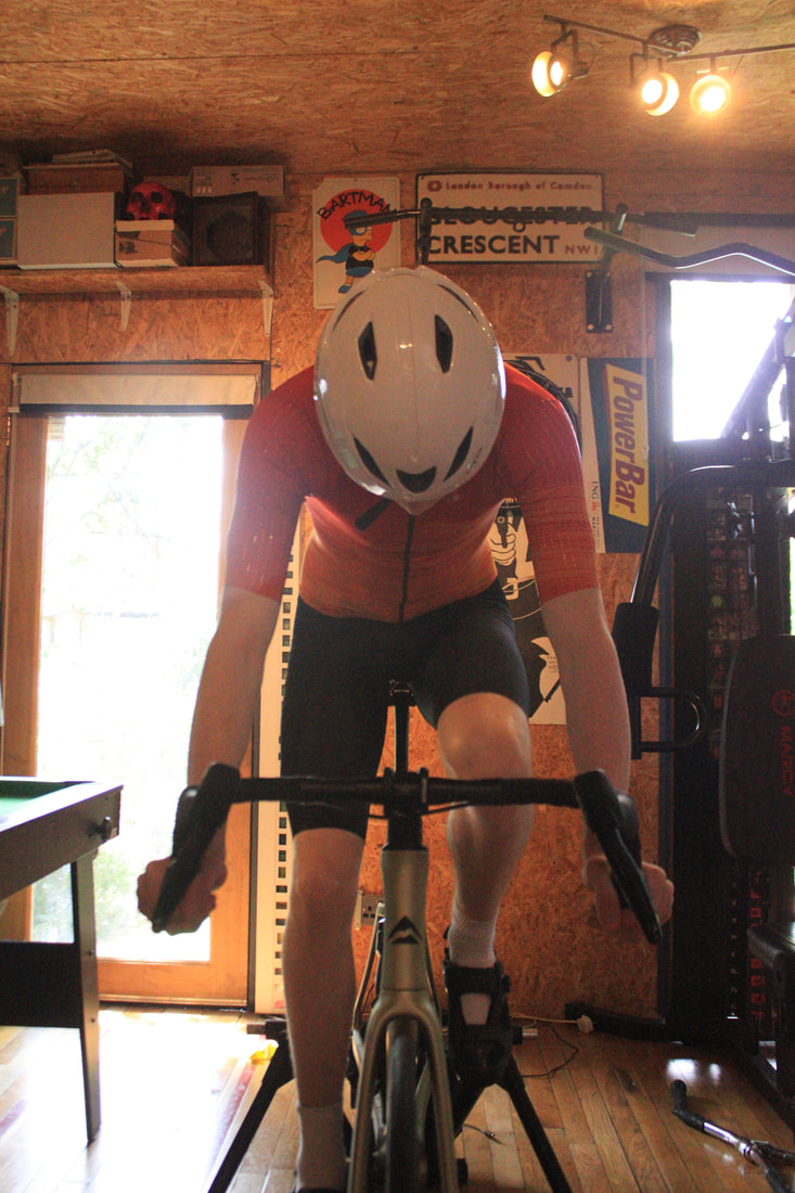
My response:
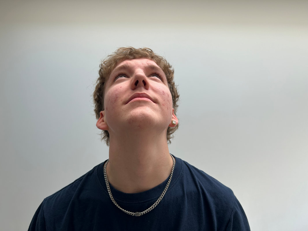
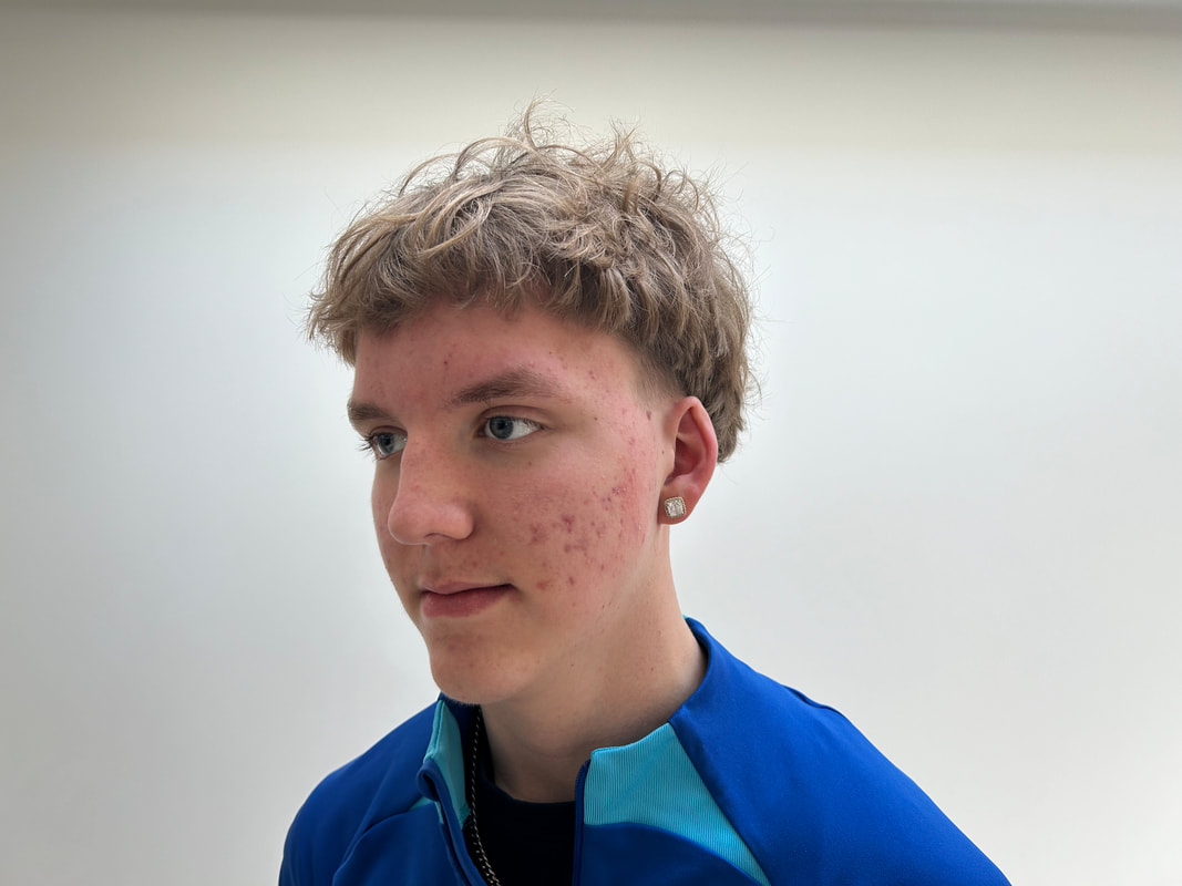
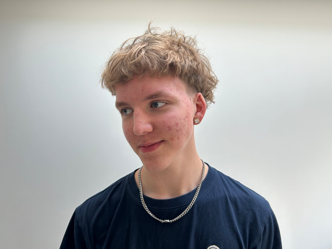
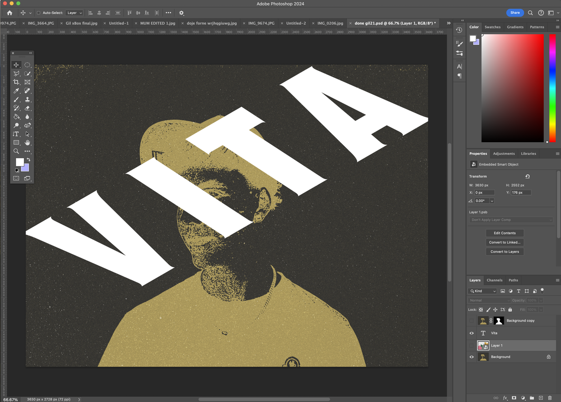
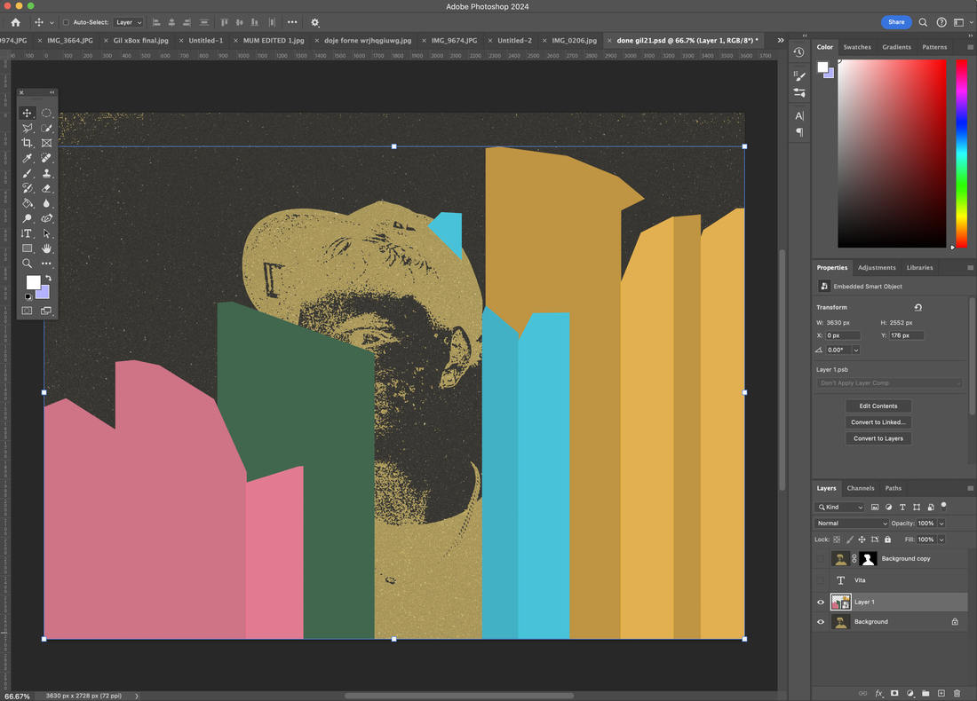
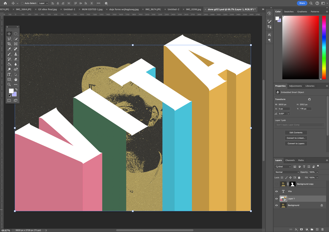
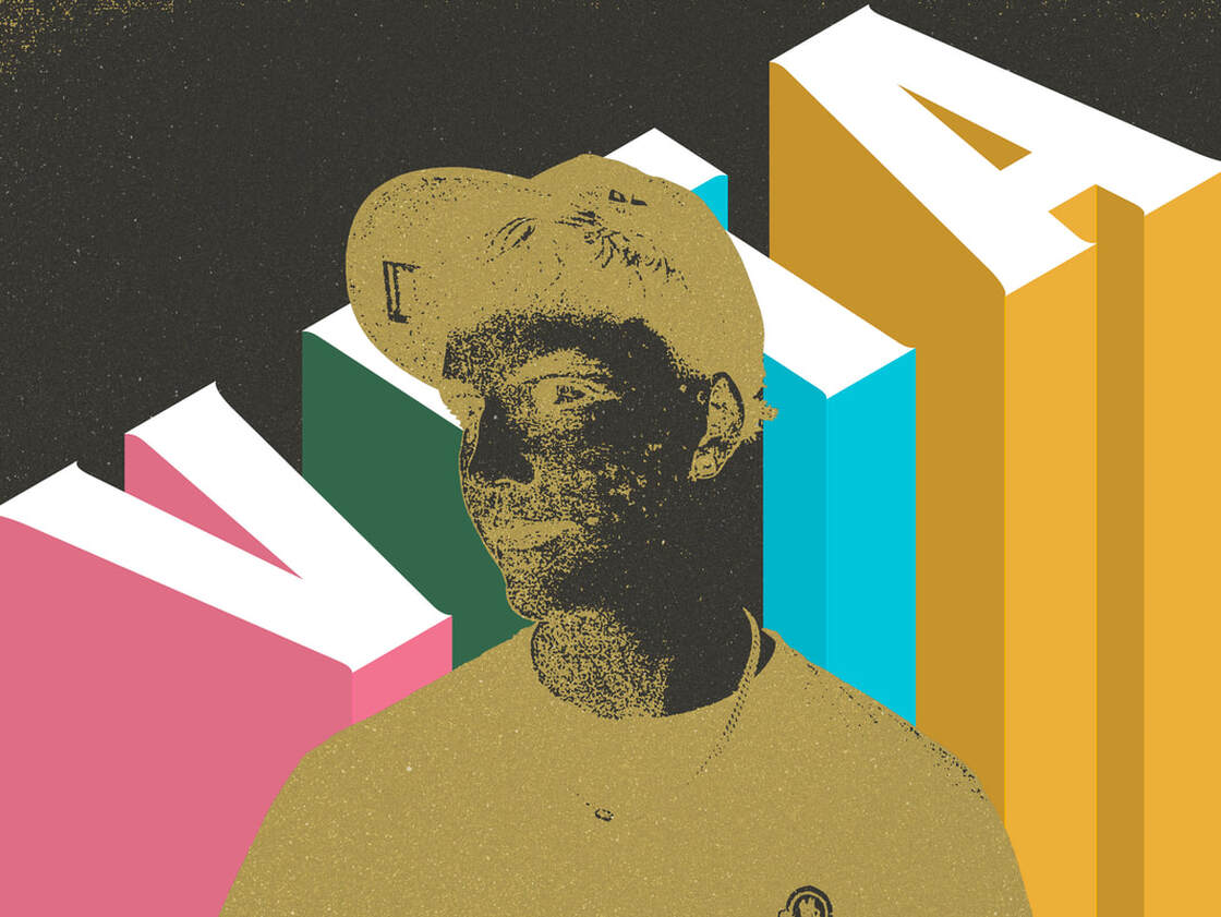
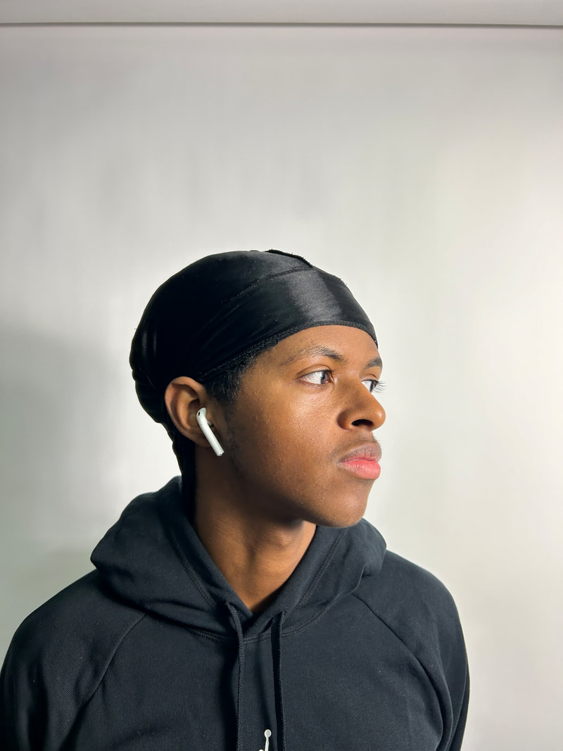
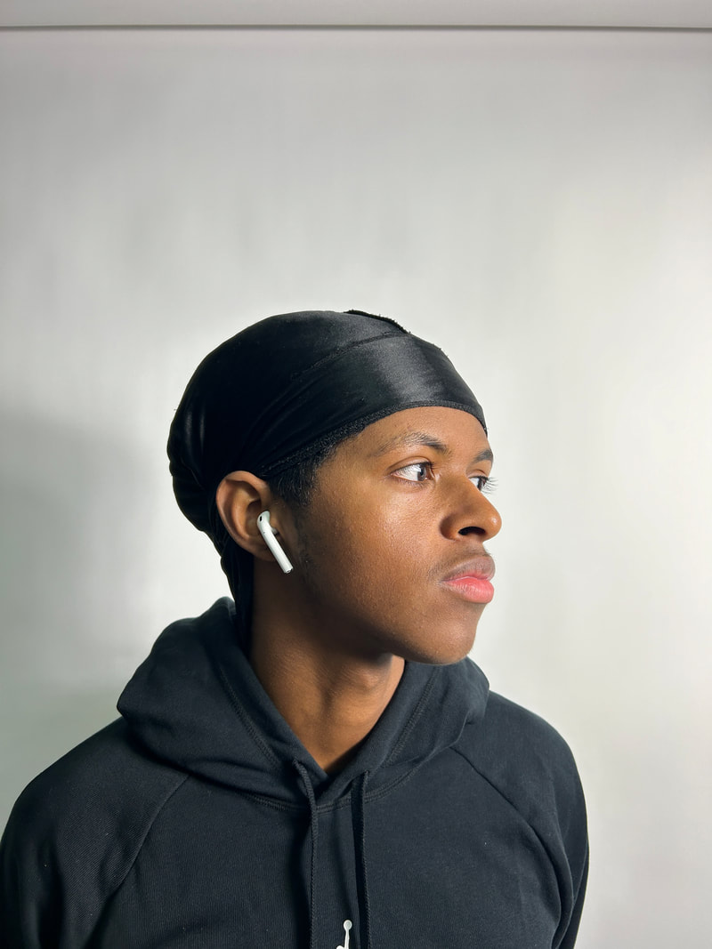
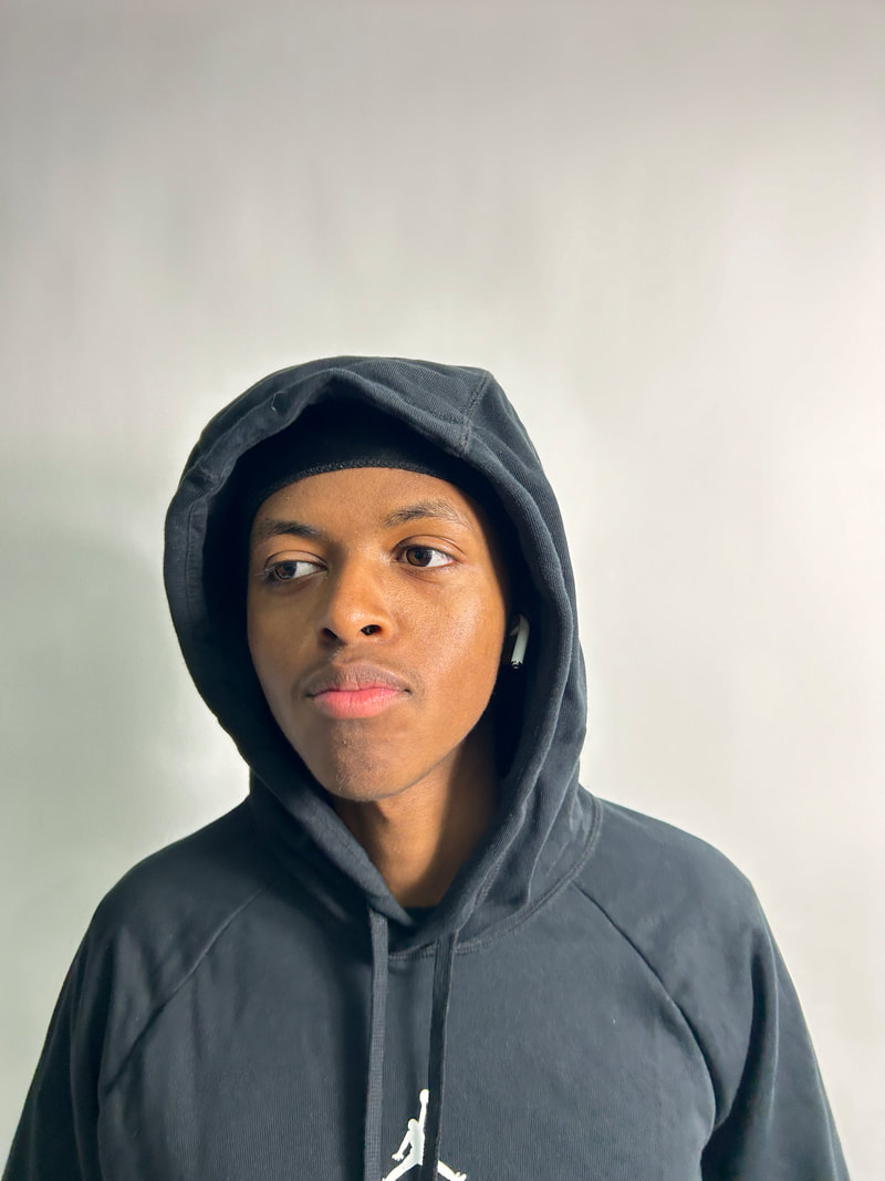
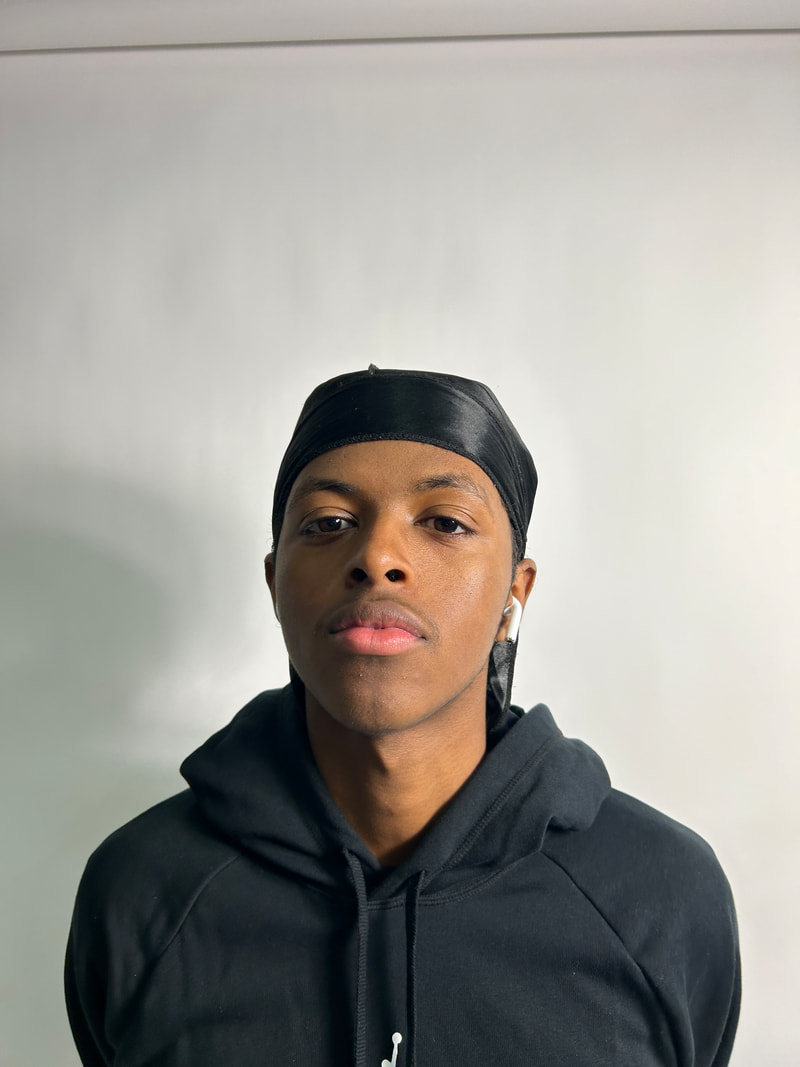
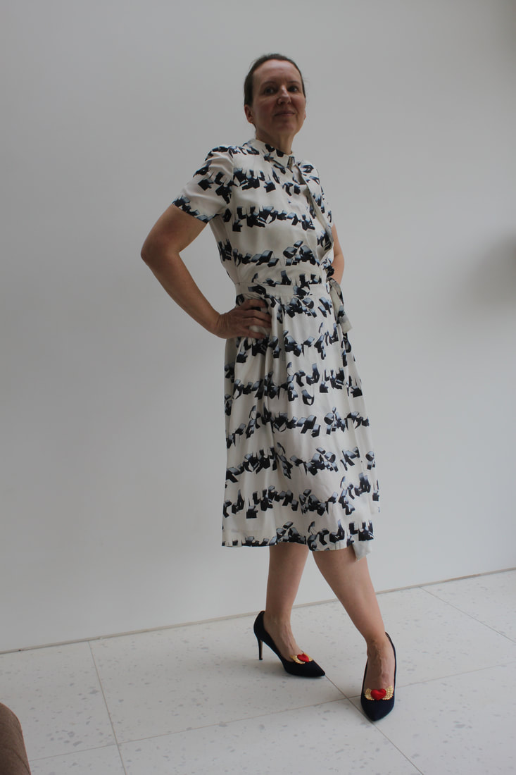
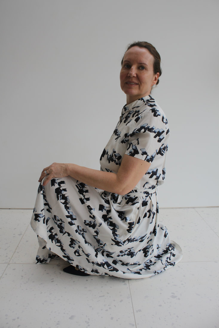
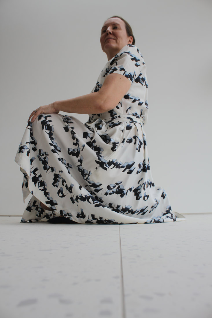
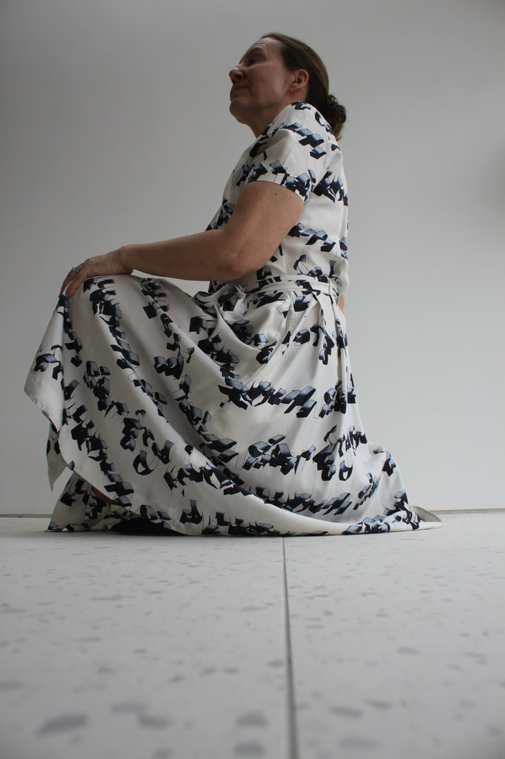
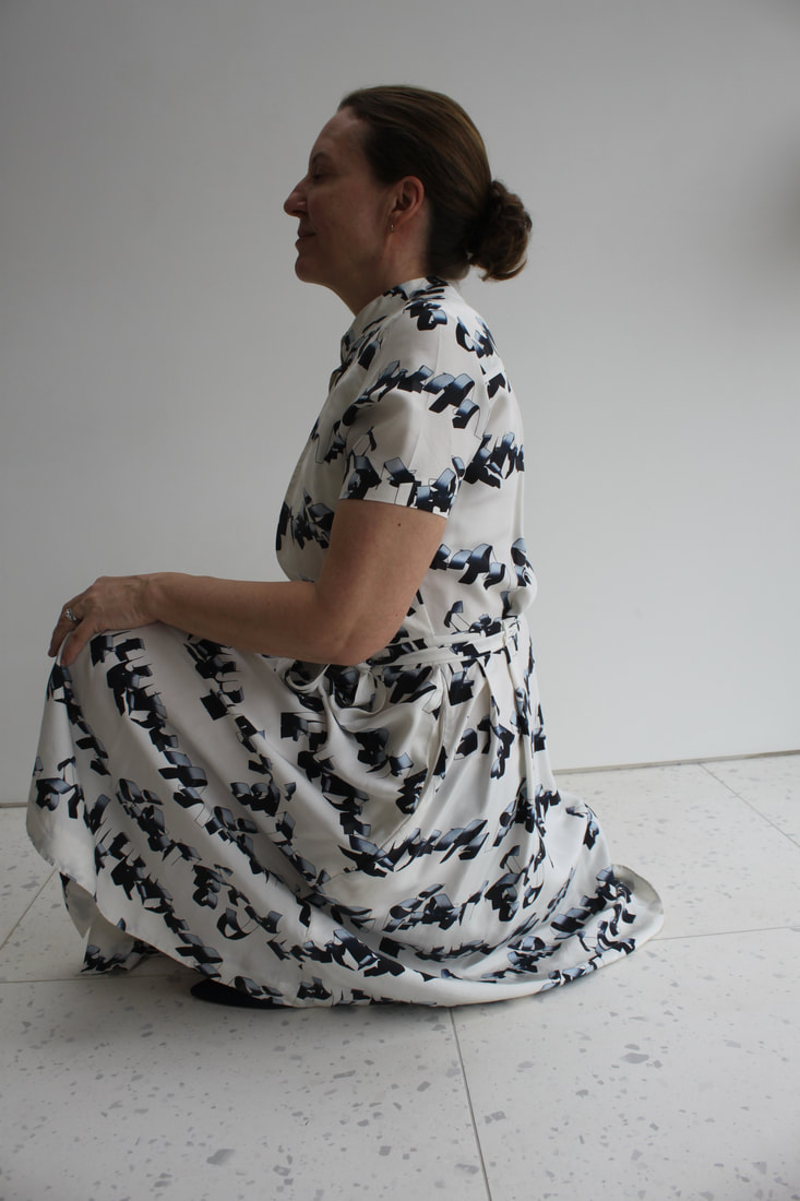
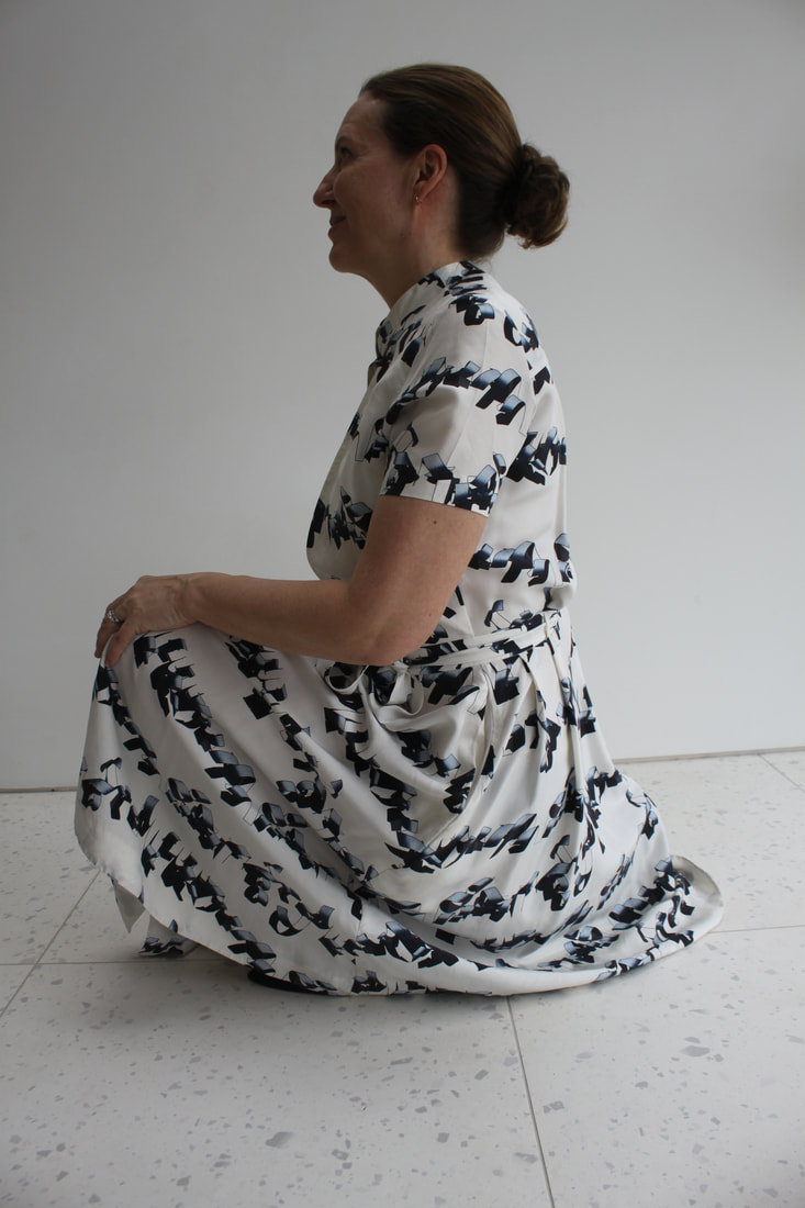
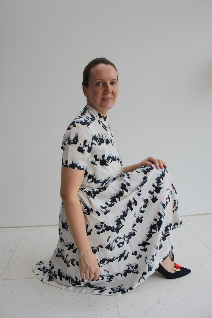
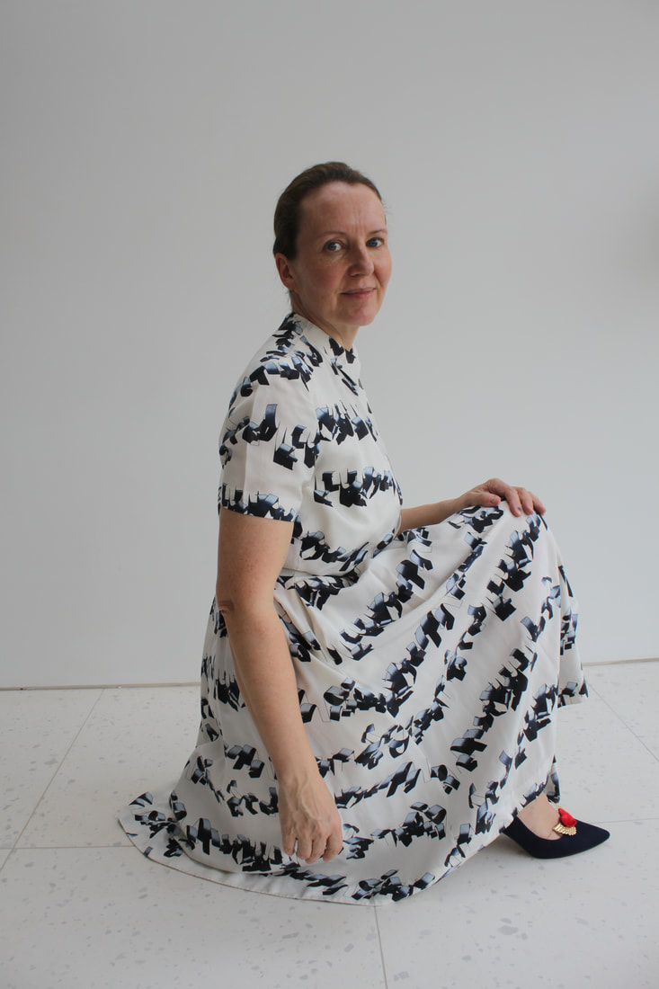
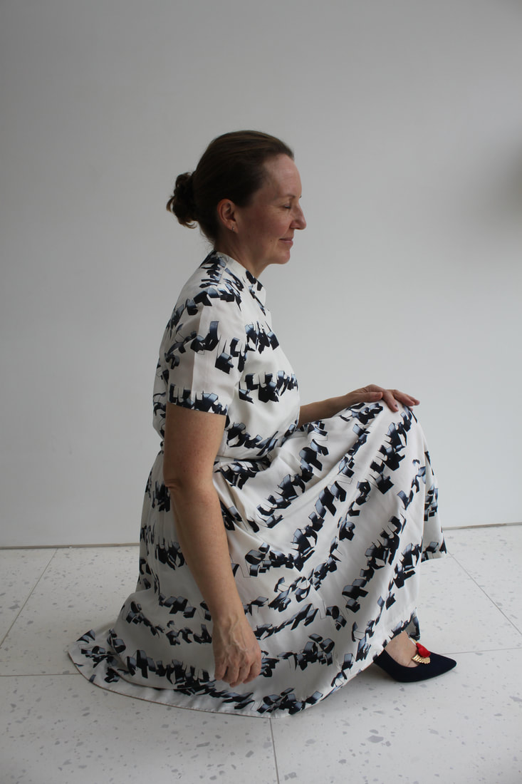
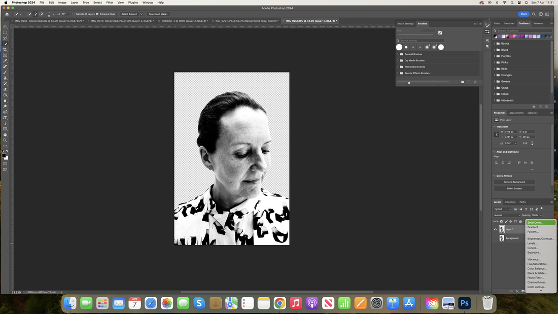
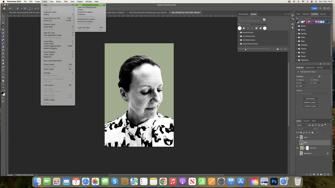
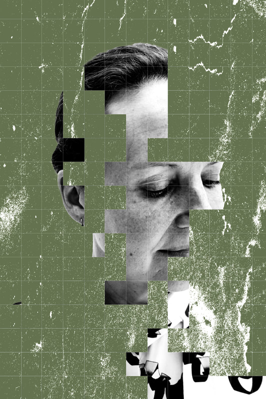
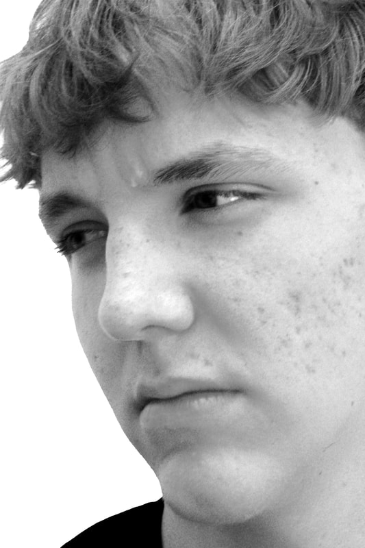
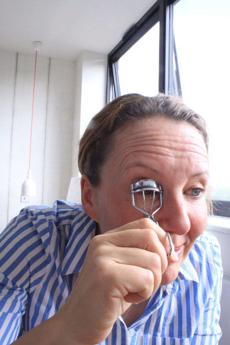
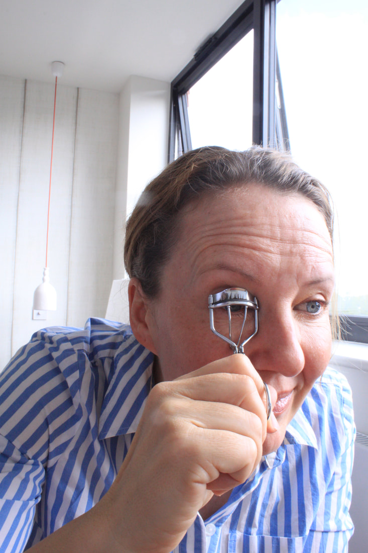
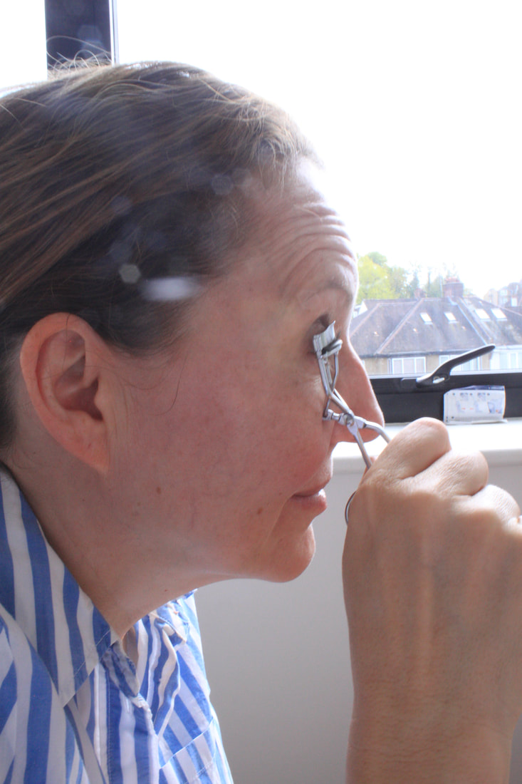
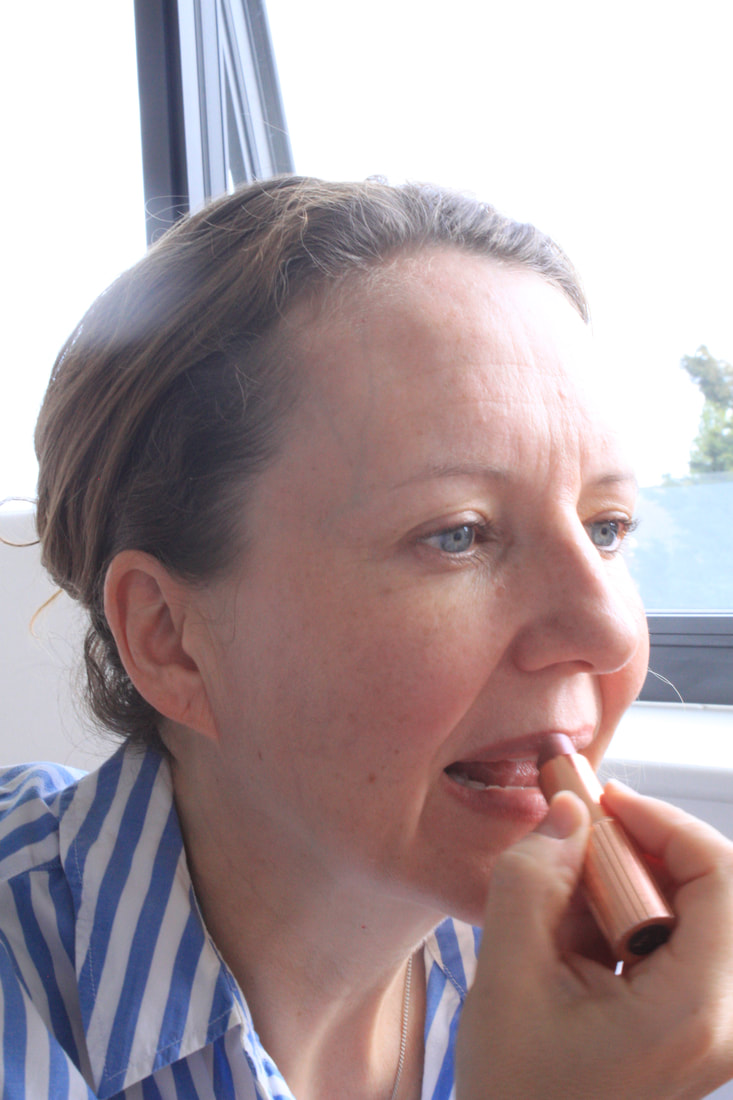
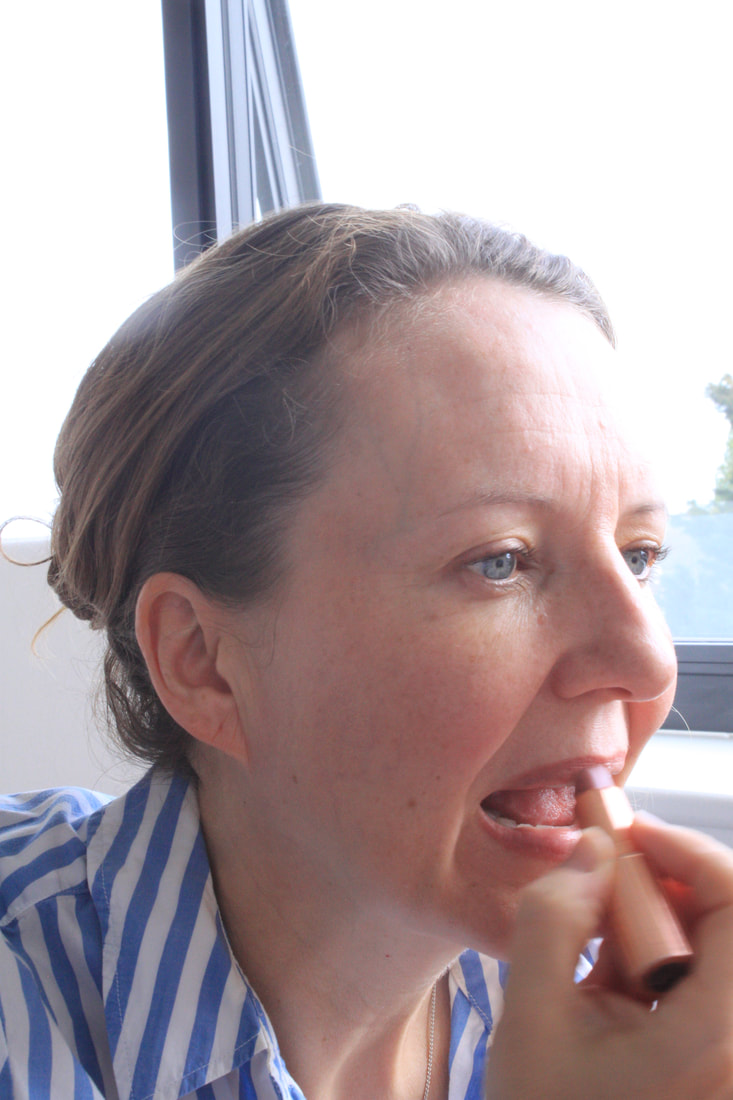
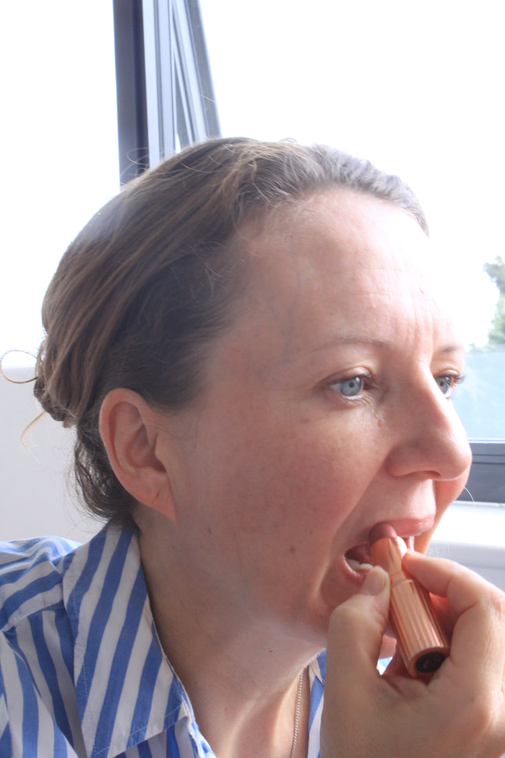
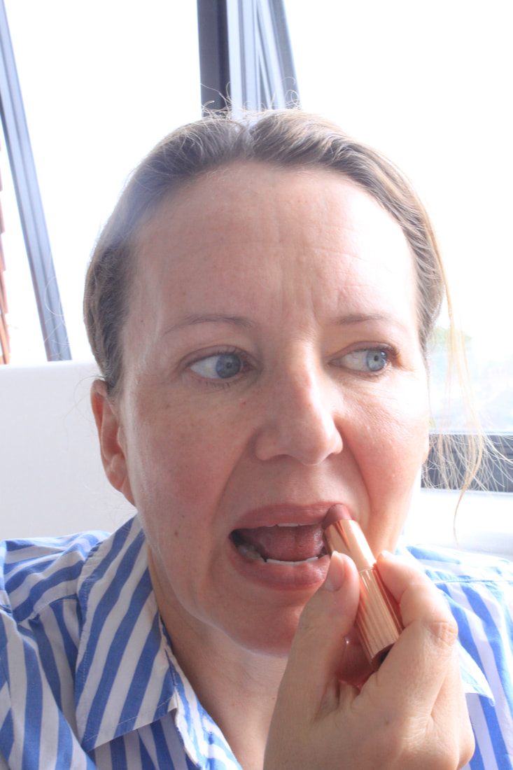
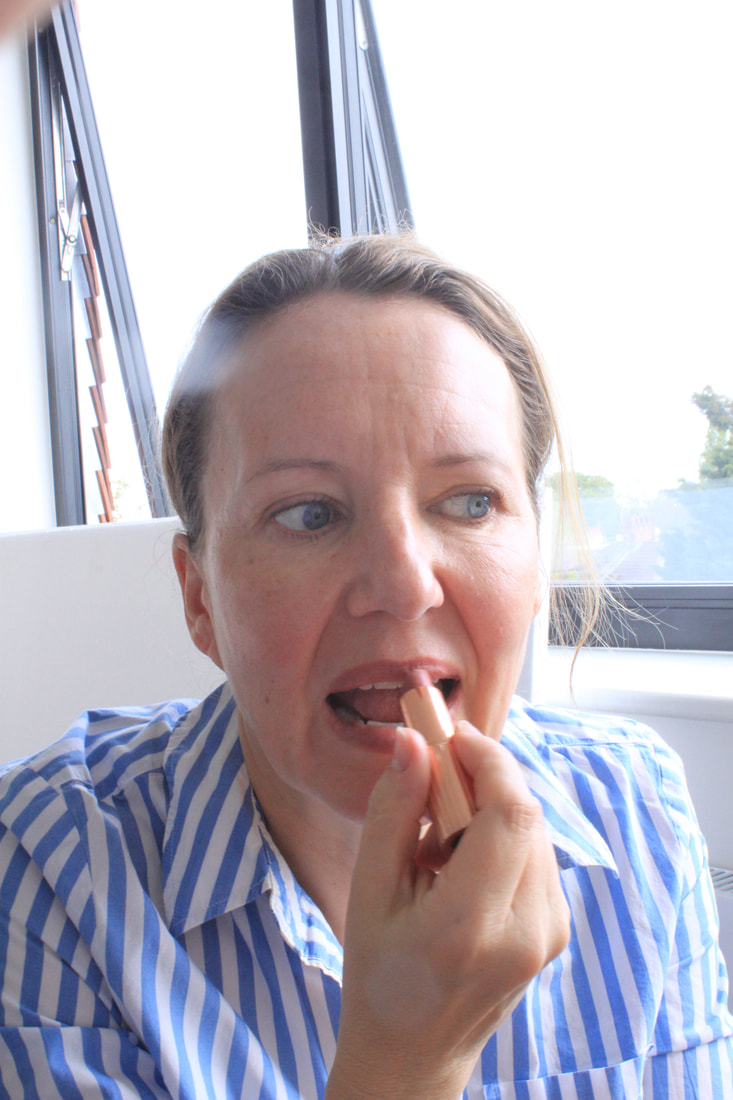
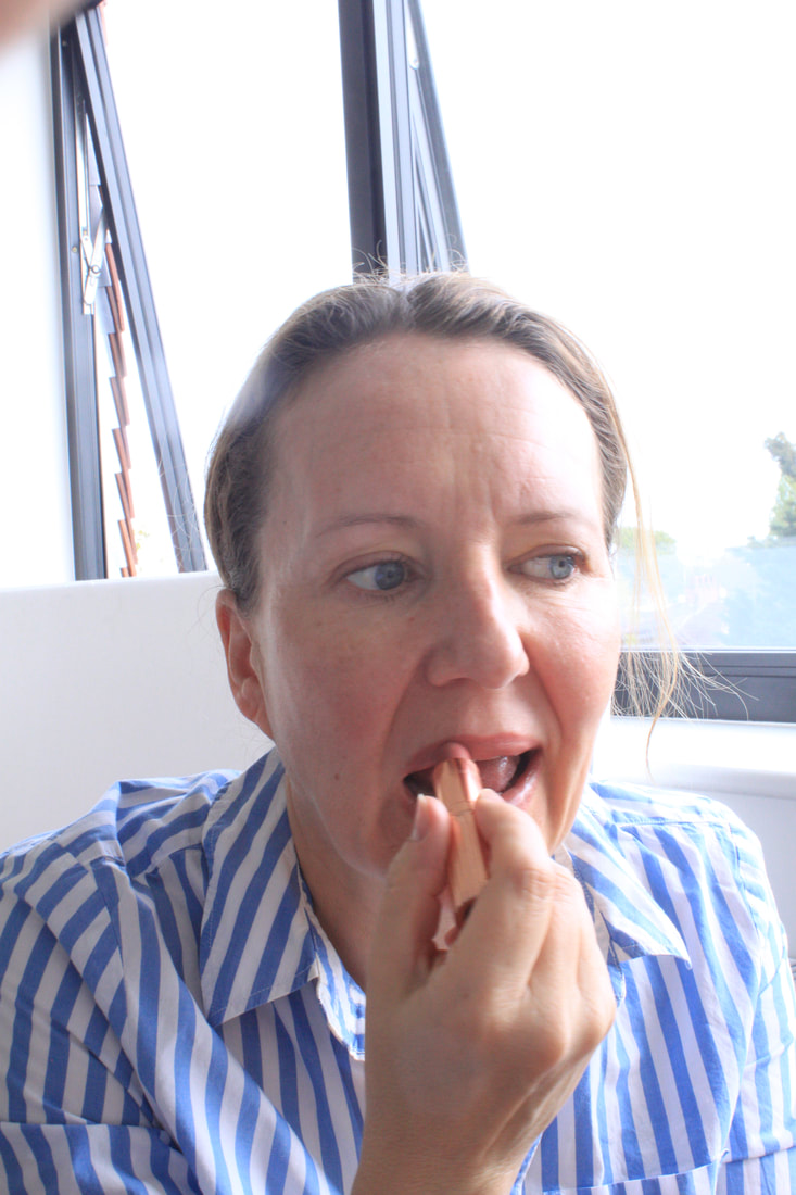
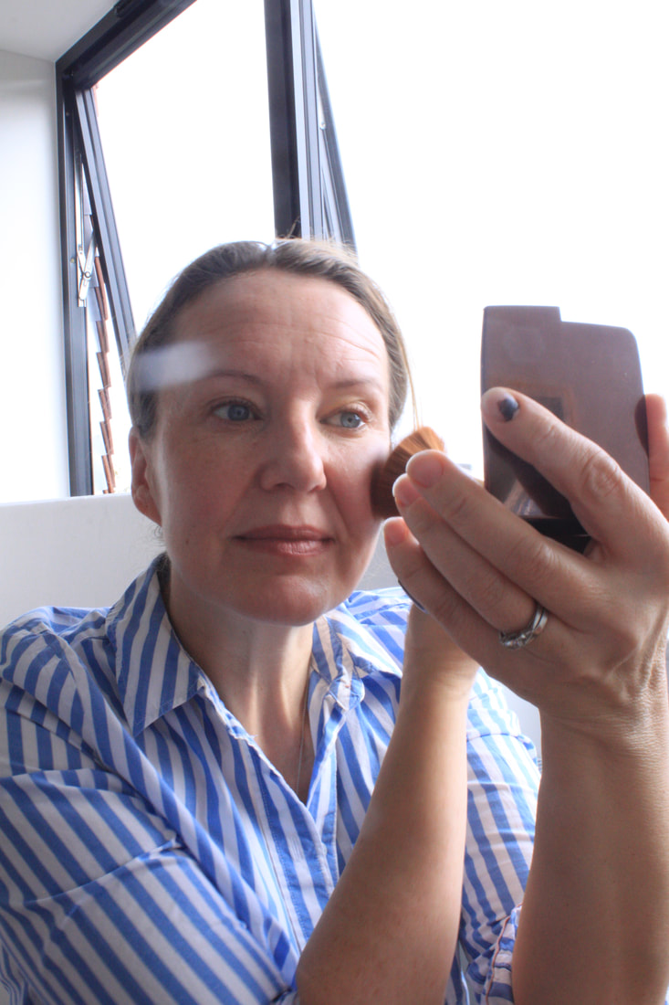
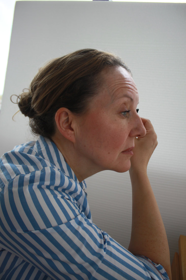
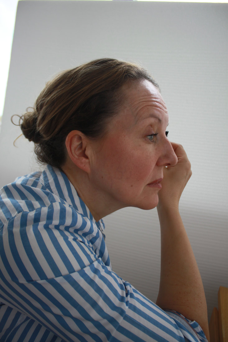
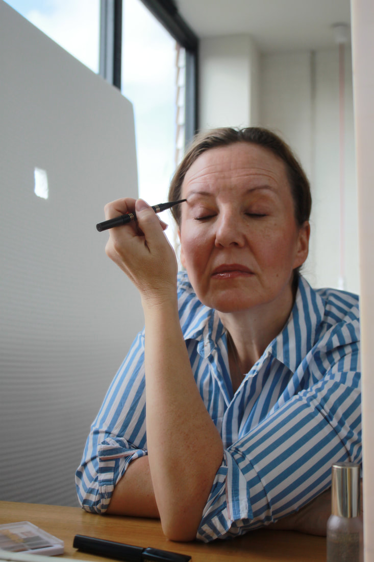
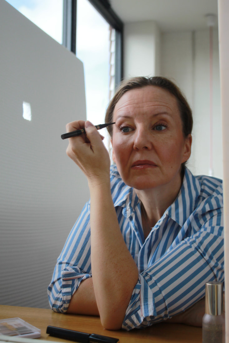
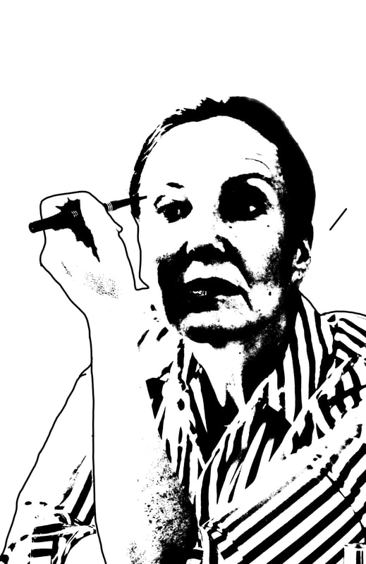
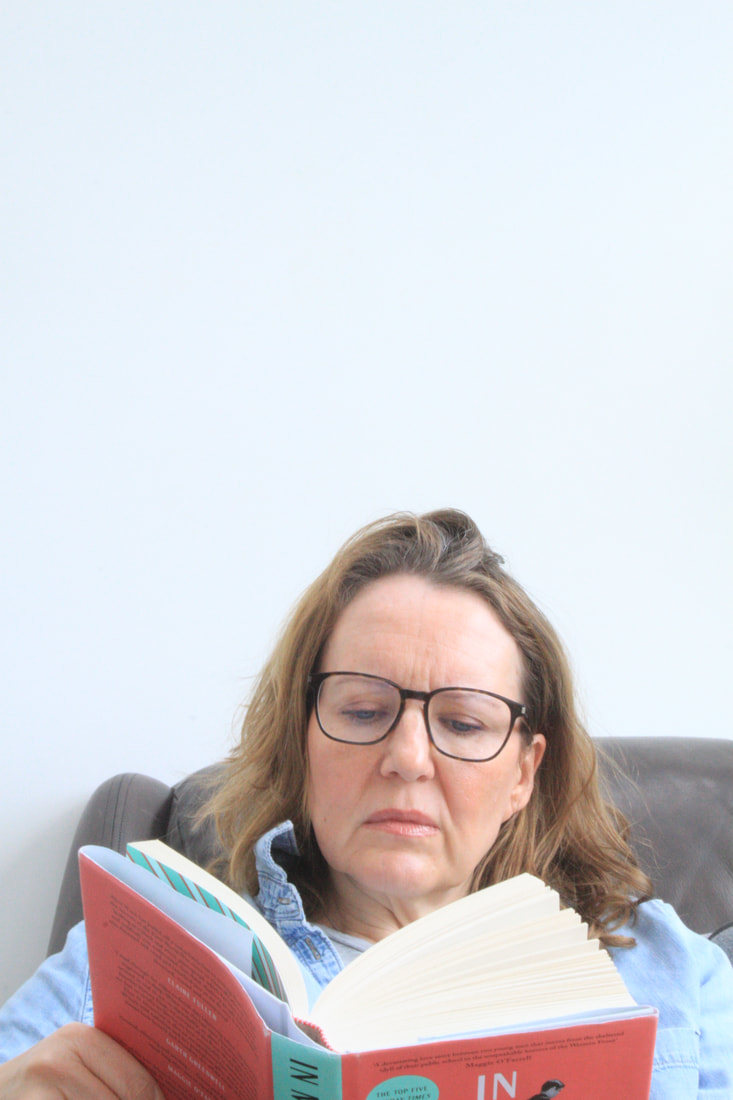
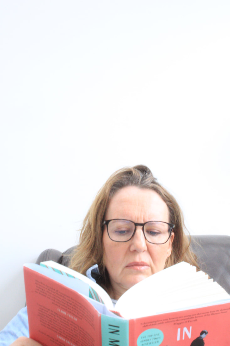
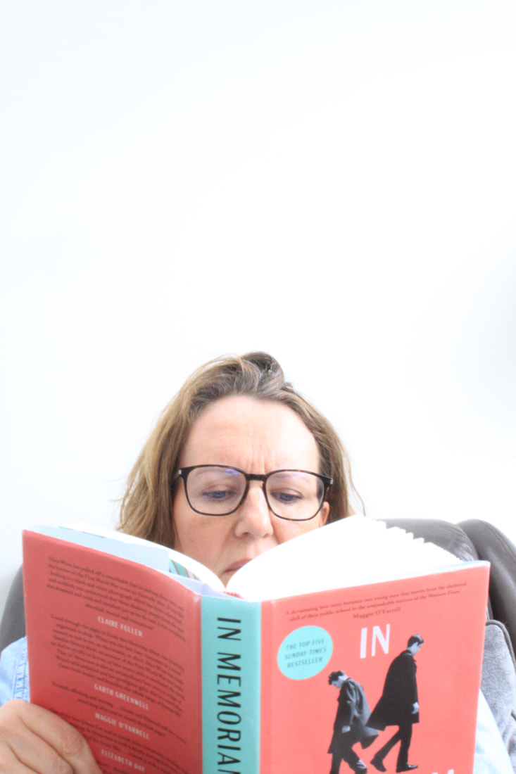
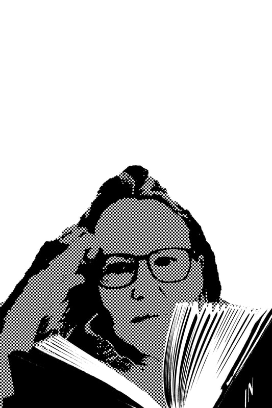
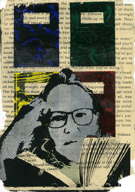
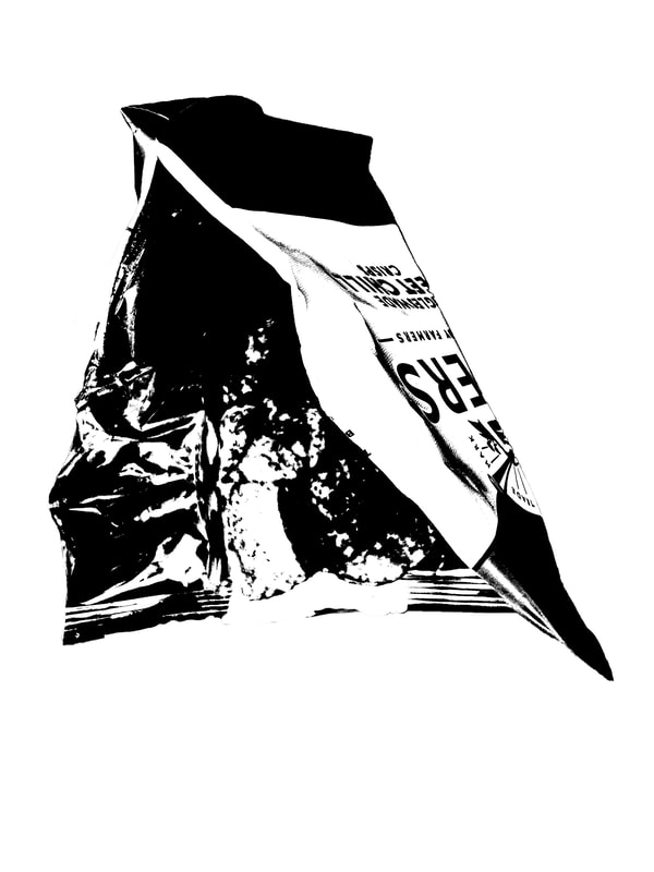
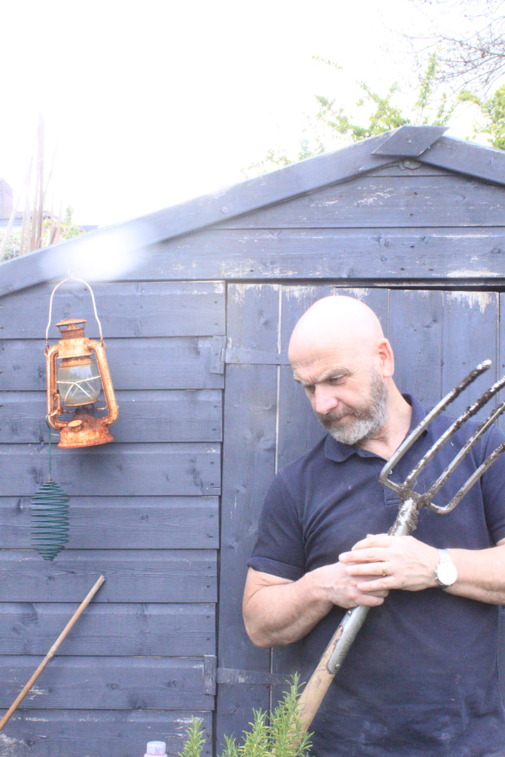
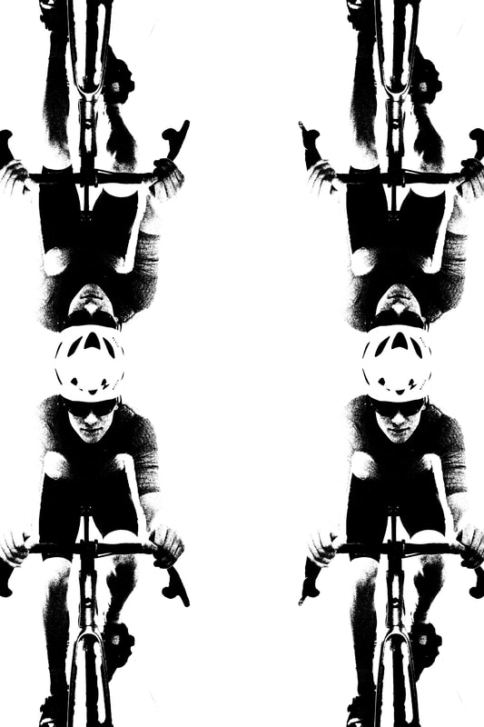
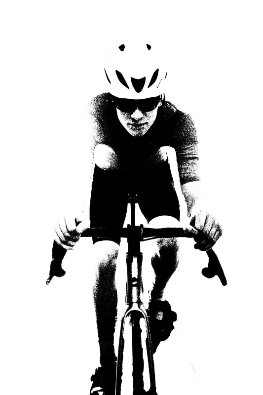
For my response I wanted to explore a much more graphic idea of transformation. Unashamedly manipulating images in photoshop to create heavily composed portraits. The thought of a more commercial aspect to imagery reflecting Turrell's overtly colourful photo-graphics. I took some simple portrait head shots against a white background using natural lighting from directly above and reflected from the side with a large sheet of foam board. I used a digital SLR on manual mode setting the exposure and manual focus.
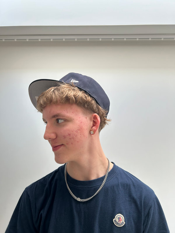
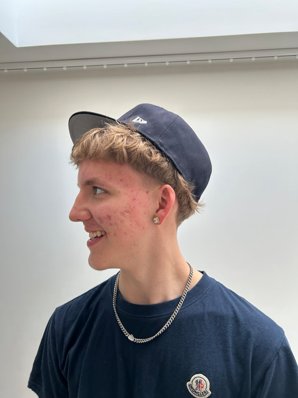
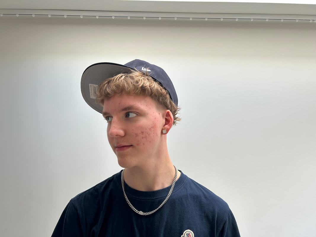
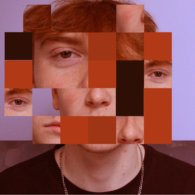
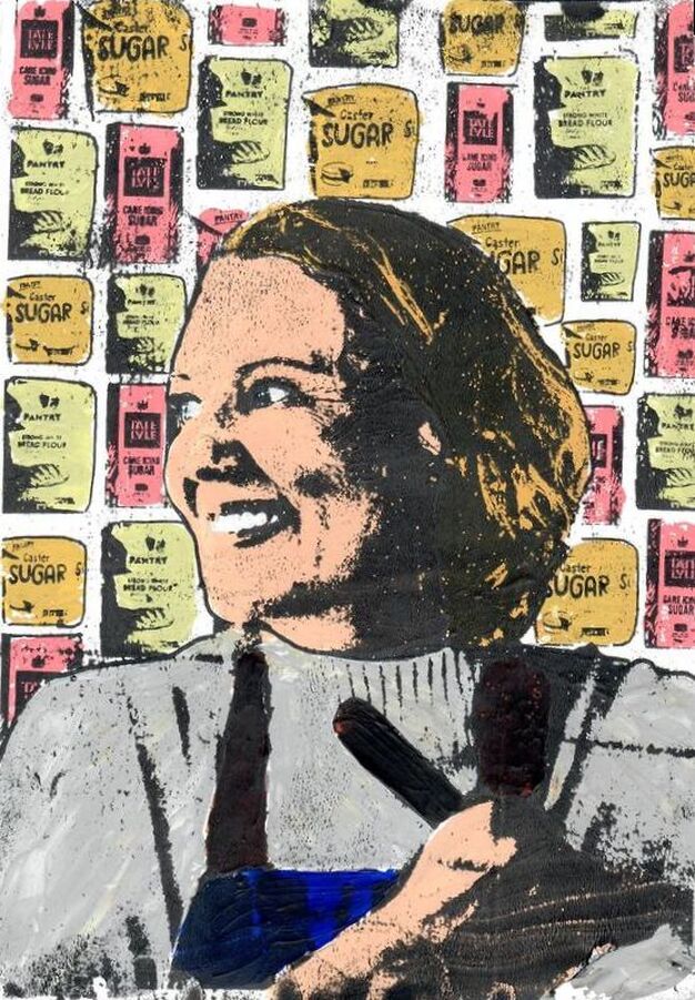
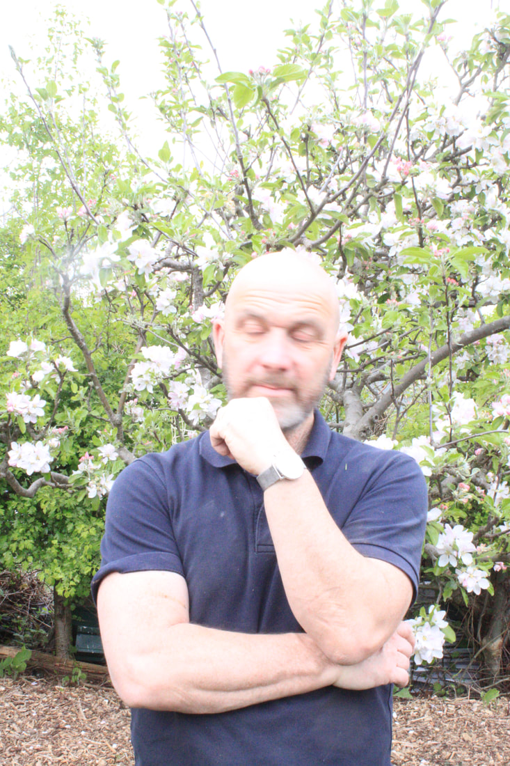
EDITED:
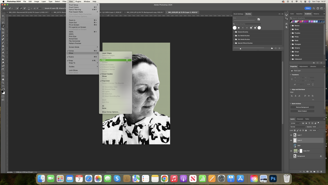
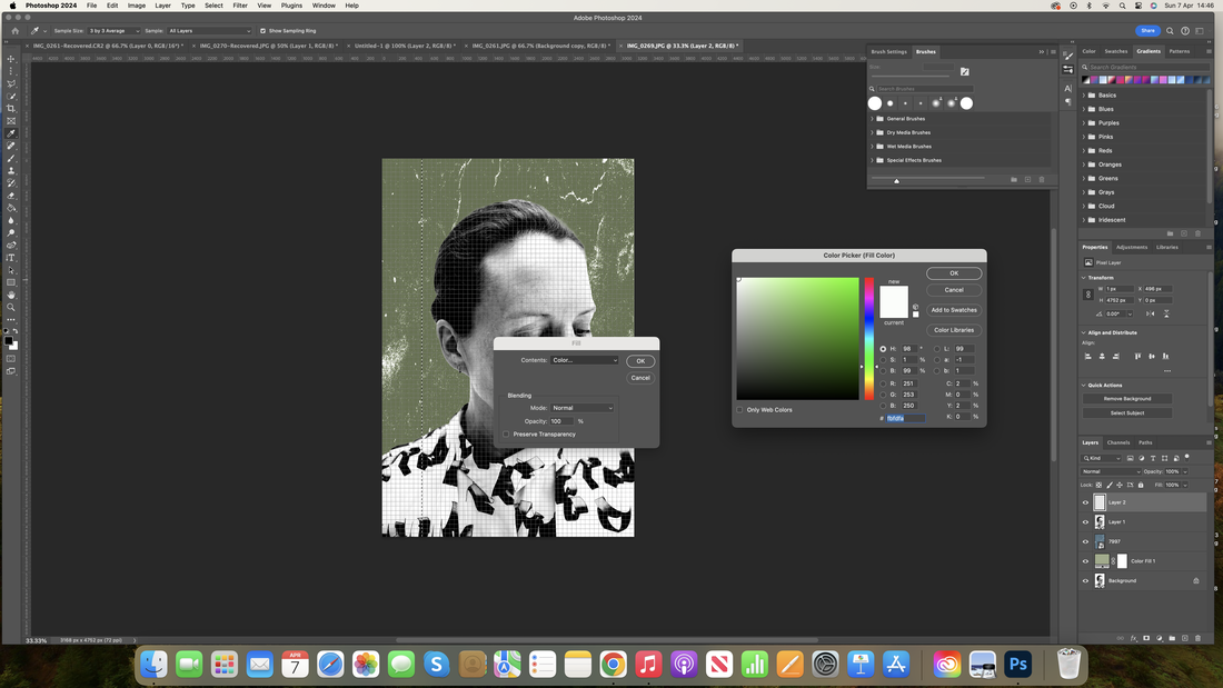
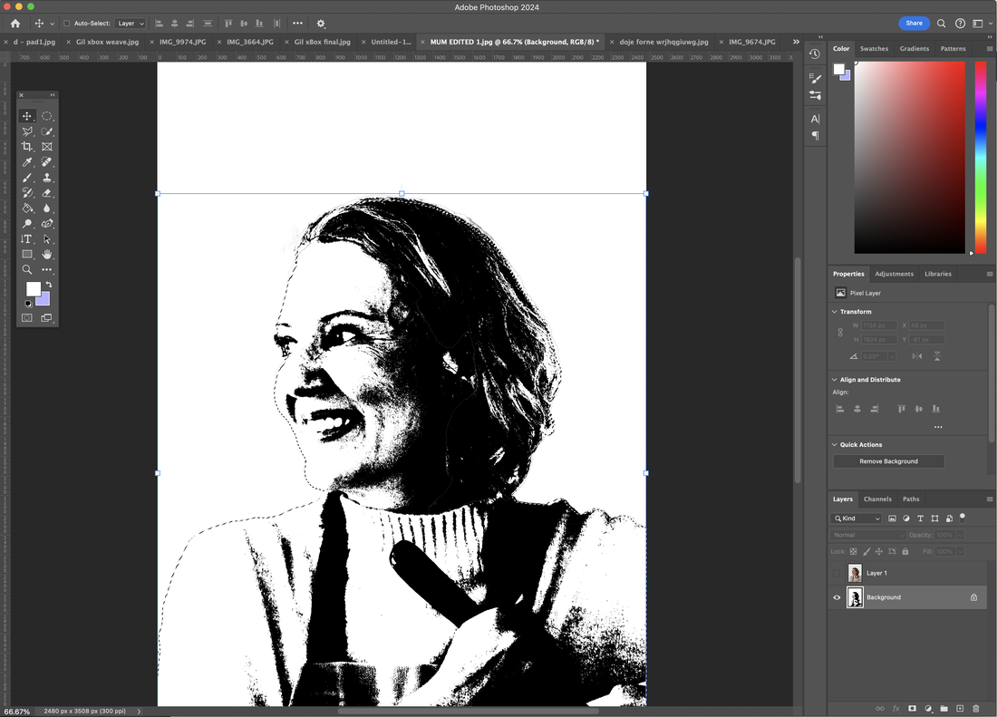
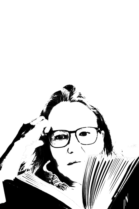
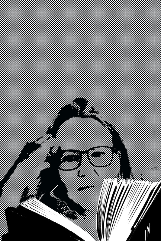
For my edited images I wanted to try and implement Jimmy Turrells editing style. I tried to do this by using different editing techniques such as the noise filter for the face and background and using positive and negative images of the subjects face as another way to transform the original portrait. A main part of the edits was combining textures by using flat colour and also distorted colour by using the noise filter on the background and then using layers to add the colour.
The use of the word VITA and flower patterns was an experiment in messaging, trying to add a level of energy to transform the original record of the subjects face into one with more LIFE.
The use of the word VITA and flower patterns was an experiment in messaging, trying to add a level of energy to transform the original record of the subjects face into one with more LIFE.
|
|
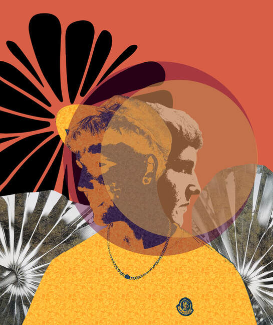
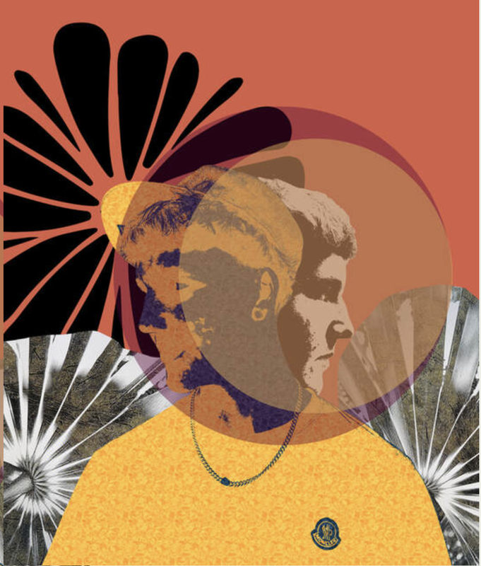
Overall I am very happy with how my images turned out, I enjoyed trying to piece together different images and how I could create a certain mood in the images. For example with my first edit I felt as if I had created a theme of an ad poster and the second two music album covers. I really enjoyed combining and choosing colour combinations, I feel that for the last two edited images the deep orange and bright yellow perfectly complemented each other.
Of the three source photographers I really was excited by Turrell and Pfeffer, although very different in their own right I found they resulted in more interesting images of my own.
Of the three source photographers I really was excited by Turrell and Pfeffer, although very different in their own right I found they resulted in more interesting images of my own.
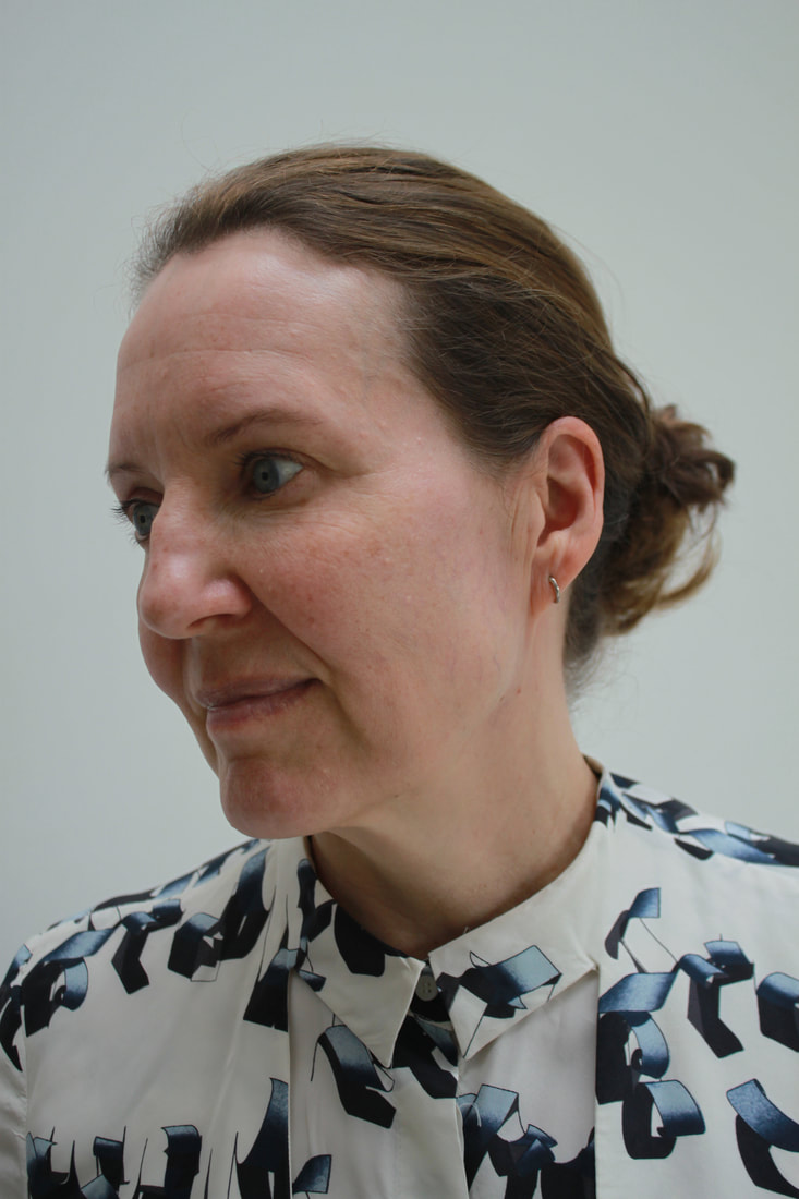
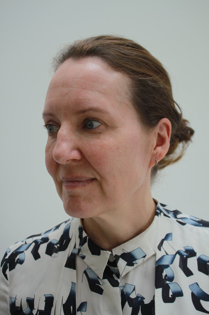
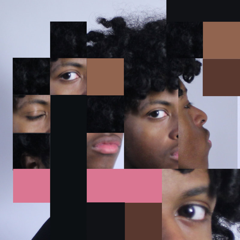
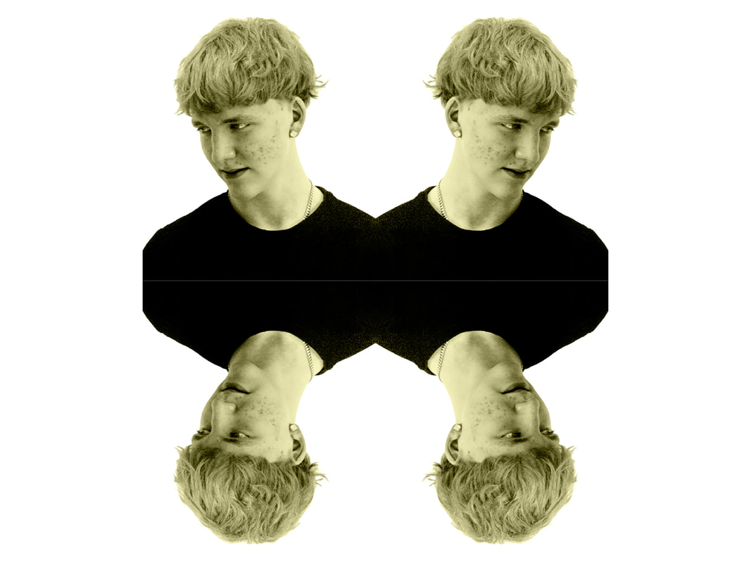
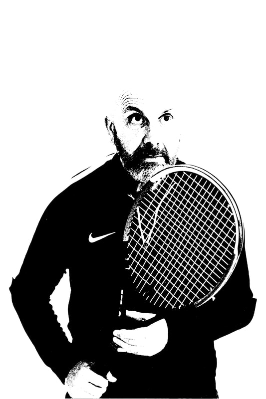
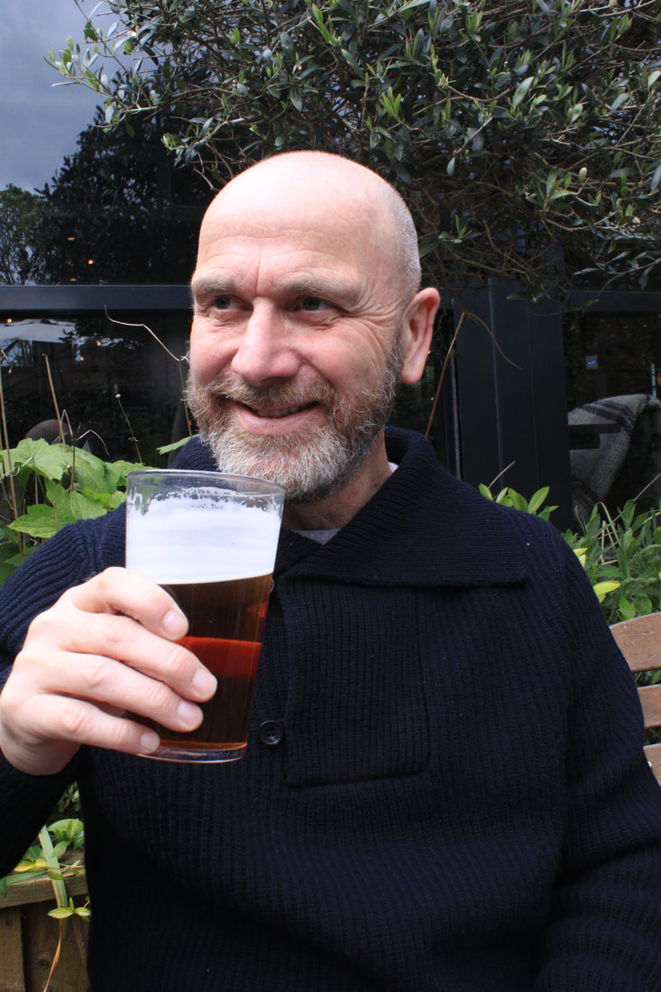
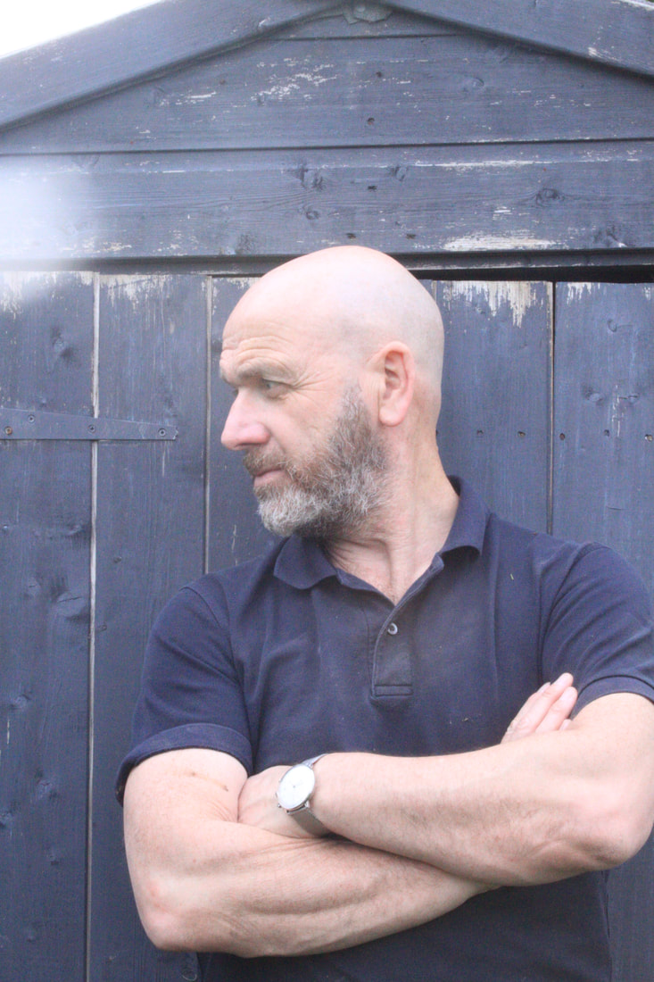
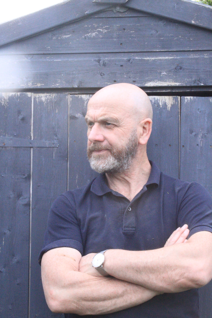
Artist and Me |
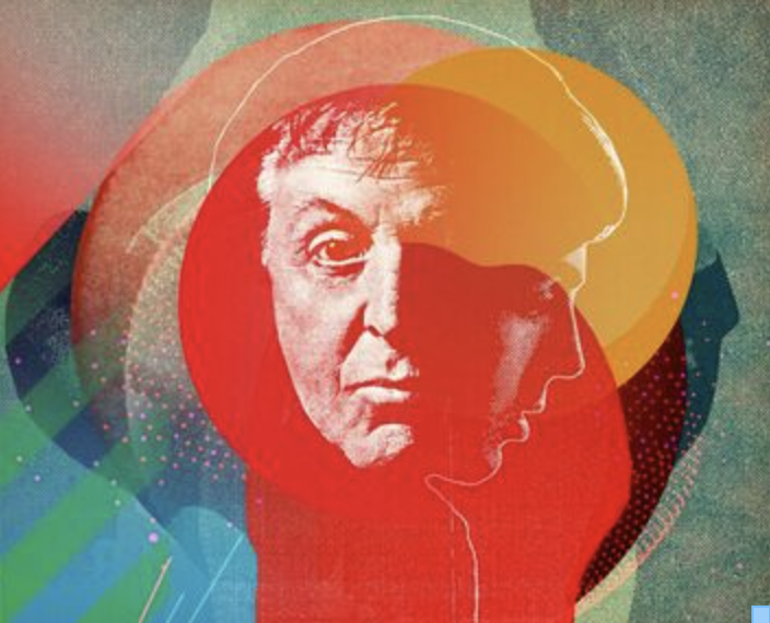
On the left is Turrell's image and on the right is my image. The key similarity is the 2 shots of the same person facing in different directions. My composition is slightly different, with the faces in different directions. The colour palettes are similar, mine is slightly more muted. I feel I have effectively captured and taken inspiration from the style and idea of Turrell.
Development one
For my developments I want to continue from my response to Jimmy Turrell, and use his montage techniques as inspiration in my transformation work. The reason I chose Turrell to develop from is because his work consists of colour, collage and textures which all help transform an original image of a face for example into a more artistic narrative piece. The layering and colour use both transforming the physical appearance of an image but also how you view and perceive the image differently. My overriding goal for my developments is to use different techniques both digital or physical or a combination, to transform a familiar image to something more expressive. Following the Liesl Pfeffer exploration I started to look at photographers who worked with urban landscapes as I wasn't satisfied with the number of my original urban images. Seeing Caitlan Parks work led me to imagine using this digital editing technique on an urban environment instead of a person. Imagining what colour combinations would work well within an urban scene.
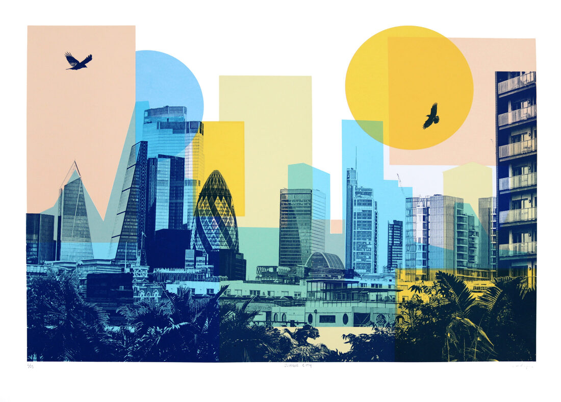
caitlin parks
Caitlin Parks is a London based silkscreen artist and illustrator. Her work is inspired by nature, travel, wildlife and narrative. She primarily uses screen printing as a process to create her final images. Caitlin often combines drawing and photography to explore her ideas. Then develops her images using collage techniques, she creates strong, bold coloured pieces that build a new narrative from her original photographs. Textures and colour play an important role in the look of her work, as she uses the physical and tactile aspects of screen printing to create her imagery and as she says 'the endless possibilities and mishaps that come with the process.'
|
|
|
Below is my attempt to mimic Caitlan's work. Although I have left in the sky and used different colours and skyline in my piece I think I've done a credible job in copying her style. The addition of a bird may have helped give it a focal point and therefore helped the composition but I do like the graphic nature of the result.
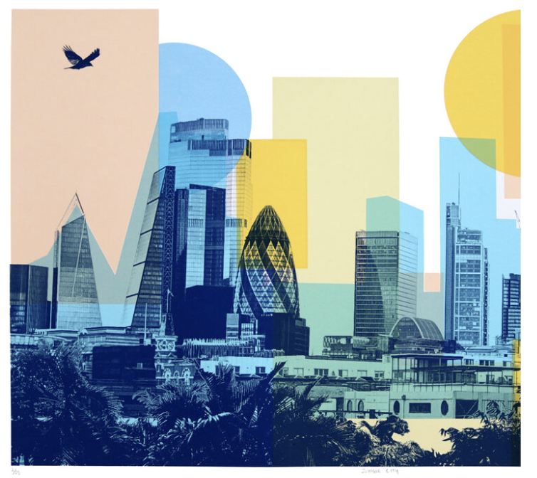
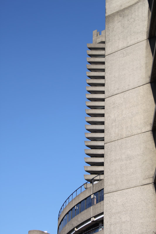
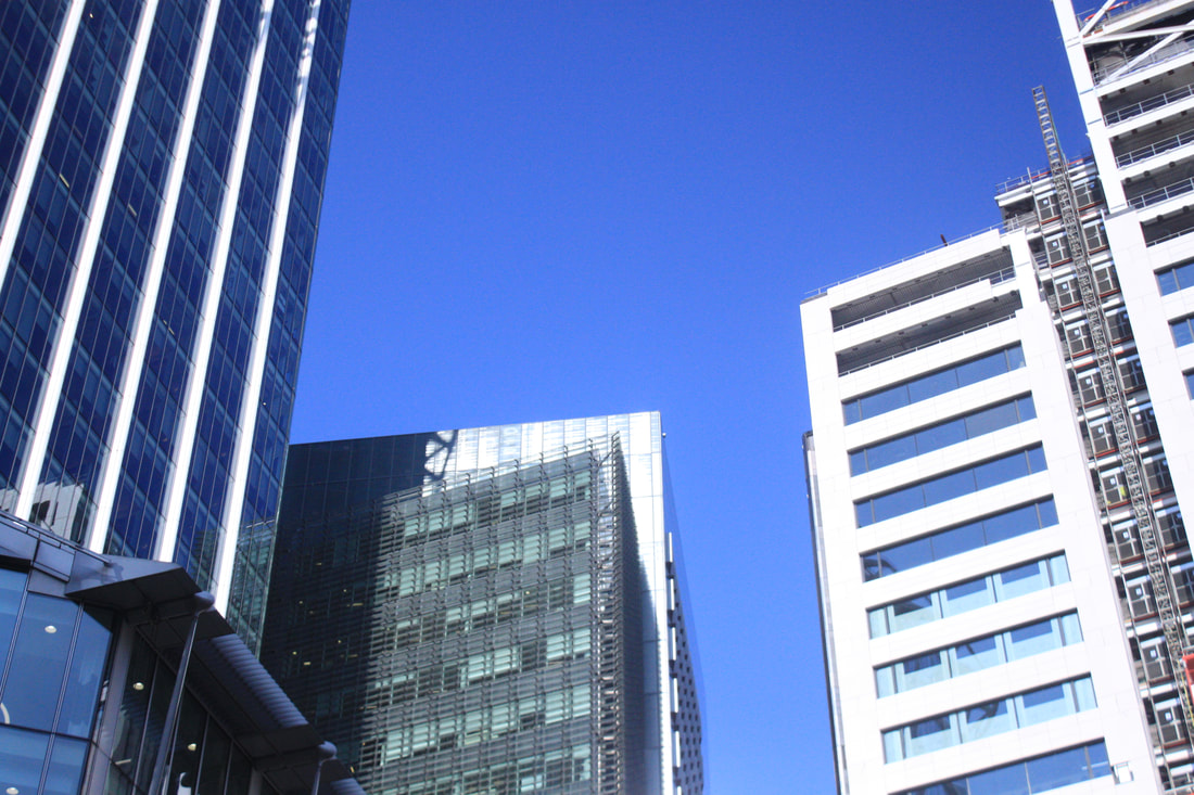
For my response I went to the Central and East London to take photos. By photographing different architectural styles both modern and historical, I wanted to capture large skies and more dramatic angles than in Caitlan's work. My goal was to create quite dramatic compositions to begin with that I can then build into with even bolder graphic shapes reflected in the original images. Thereby transforming the original image not simply by adding colour and shapes but transforming the way in which the viewer interprets the original scene.

Edited
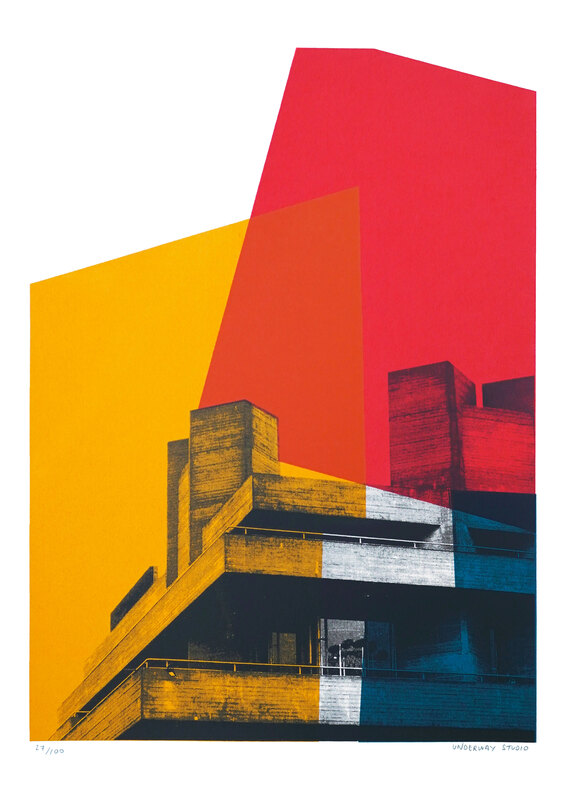
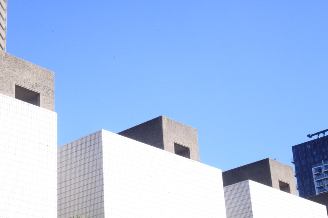
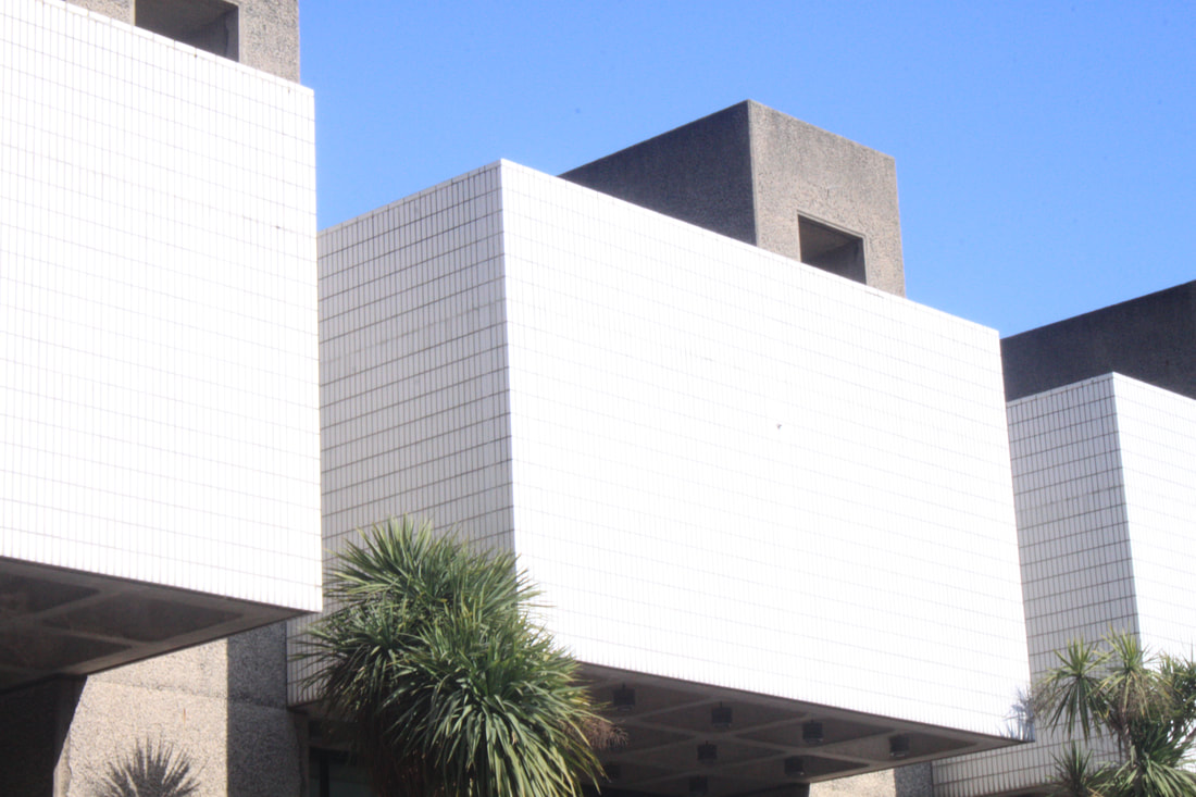
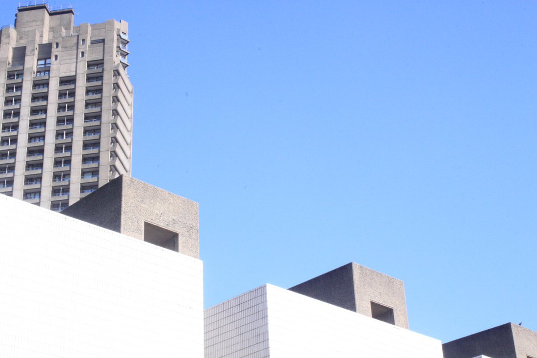
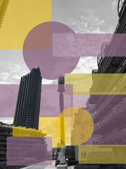
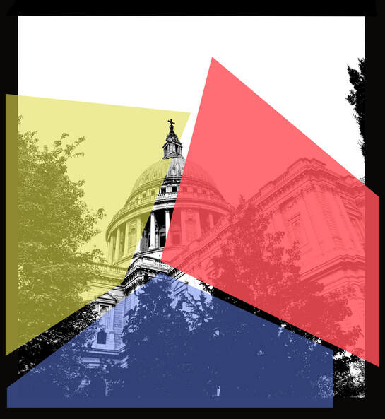
Parks uses screen printing to create her images, sadly I don't have a screen printer so I had to use photoshop to create the illusion of a screen print and then implement my own style influenced from Parks'. To do this I used the threshold technique on the top left image, this threshold technique recreates a screen print style. To do this I had to create 3 copies of my chosen image and then add threshold (image - adjustments - threshold). By layering the image and colour blocks as seen on the Barbican images you can transform the depth and perspective of the original in quite interesting ways.
|
|
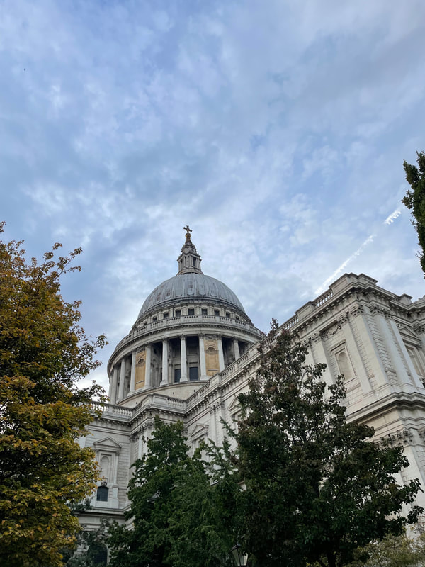
I really liked the juxtaposition of bold graphic shapes and fresh colours against the original period architecture of St. Paul's Cathedral. With that in mind I saw the opportunity to develop both hard and soft shapes with mellower colours to contrast with the more modern brutalist architecture of The Barbican in the above image. the texture inspired by the organic shape of the palm combined with the ovals that soften the hard angular nature of the original. I kept the original blue sky at the top of the image by selecting the inverse and cutting this out of the pink oval. I really like this development as it uses a colour image unlike Parks' work and by using contratsing shapes and colour turns a Brutalist building into an almost Deco style image. Also by reframing the original with the graphic shapes on a white ground the photograph transforms into a piece of 'art' rather than a simple record of the building.
Development two
I really liked the energy of the bold graphic shapes against an urban environment making you look at the original subject matter in a different way as a way of transforming it. What I started to think about was how this idea of transforming a regular, real life image can be so dramatically altered with the use of a bolder graphic pattern. I want to try and continue experimenting with the idea of using graphic shape and colour but in a more contained and structured way than in development 1. This led me to go back to researching photographers that play with pattern, shape and image in more intriguing ways.
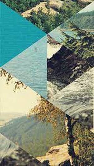
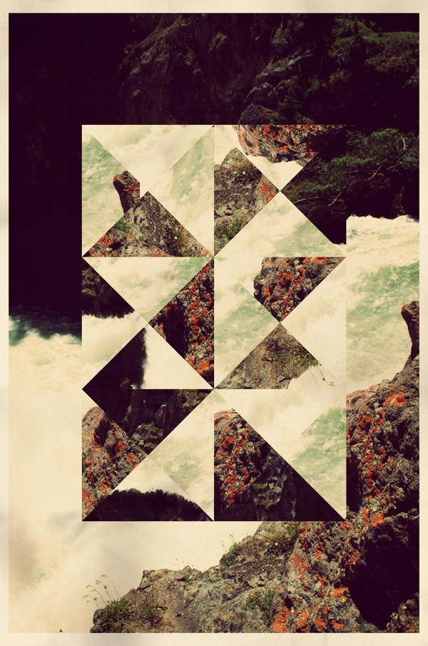
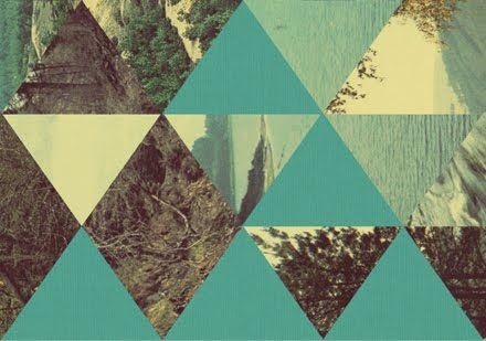
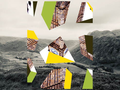
Jelle martens
Jelle Martens is an artist and graphic designer, from Belgium, he is well known for his mixture of photography within a collage. His work is very unusual but is very interesting at the same time. He uses geometric shapes, which are filled in with various image taken by him, and the ones that are left he fills in with block colour. The parts of his work that I like about, is his style of the way his work is presented at the end. Also the way he only uses small components of a picture leaving the viewer trying to fill the gaps of the image in order to make sense of the whole. I feel like each image is somehow in a constant flux of transformation.
|
|
|

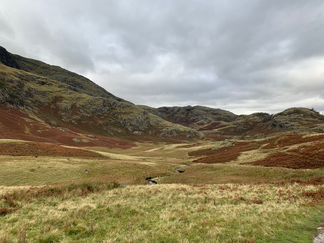
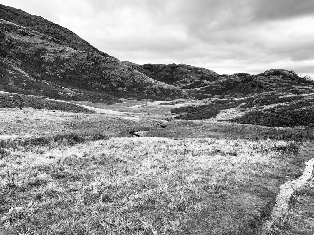
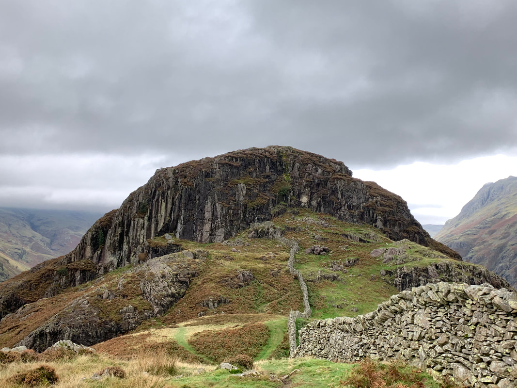
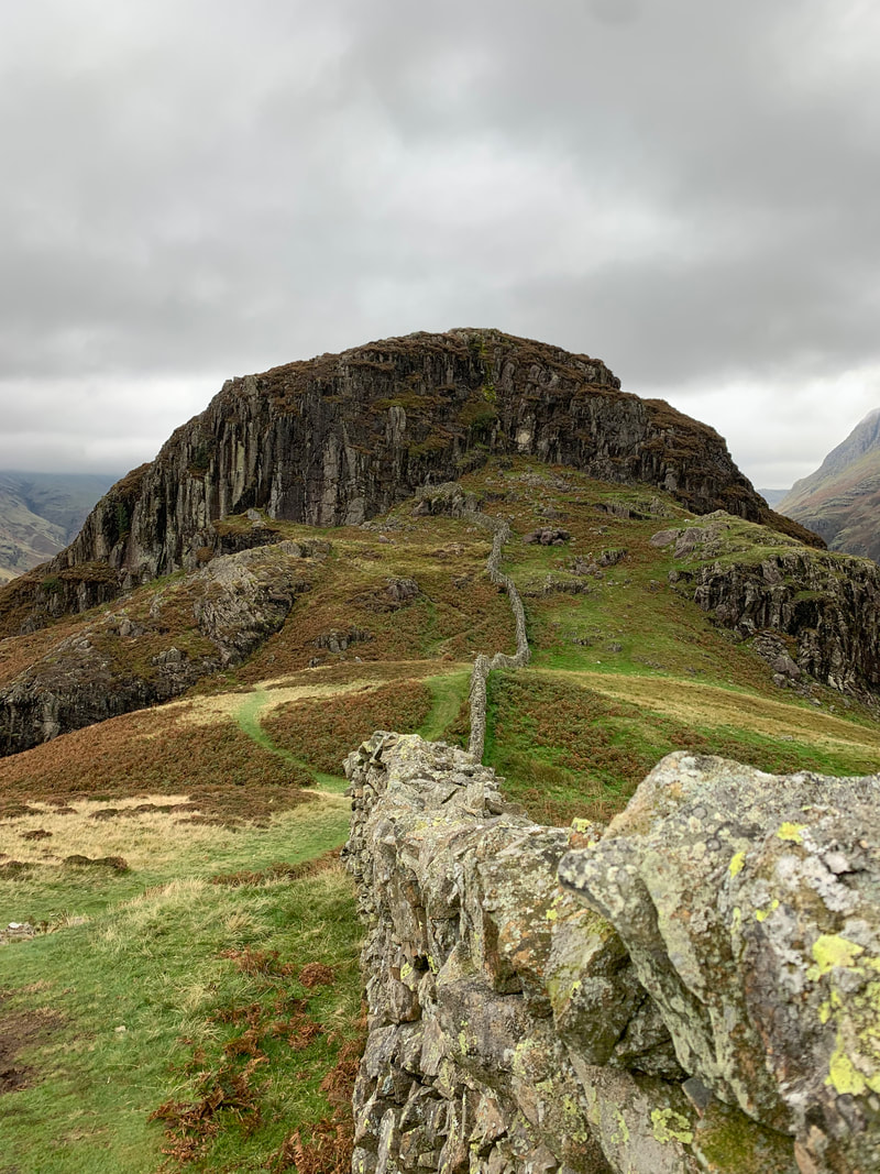
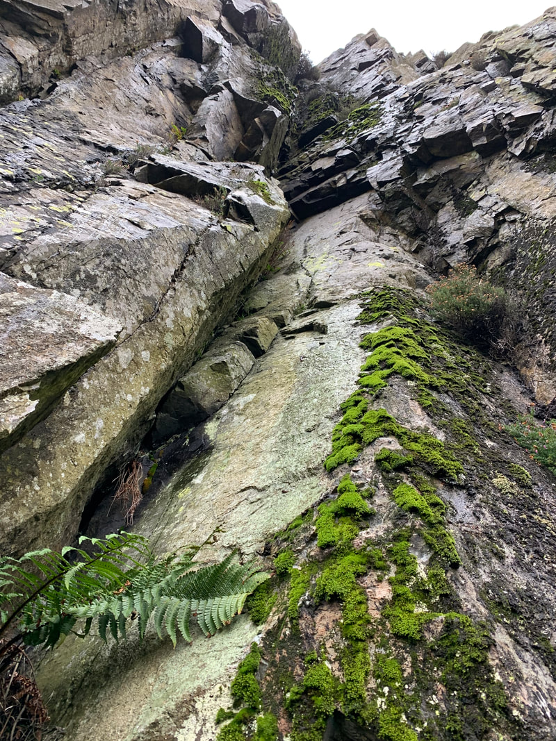
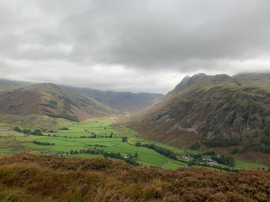
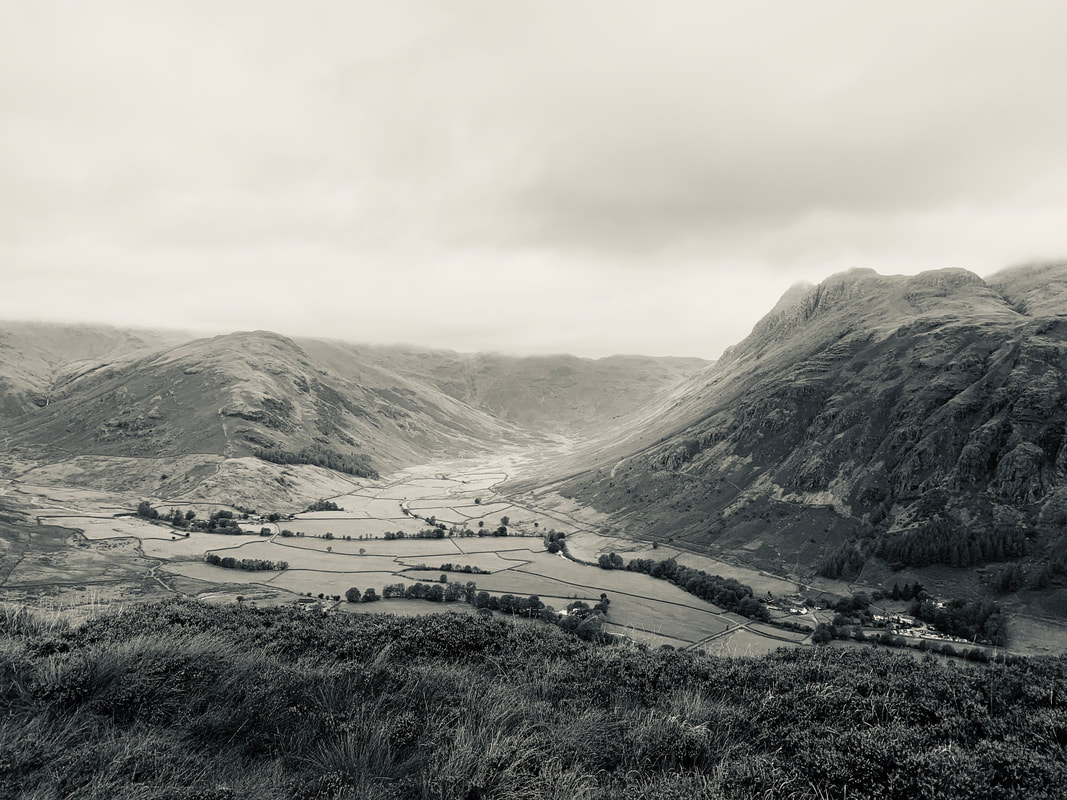
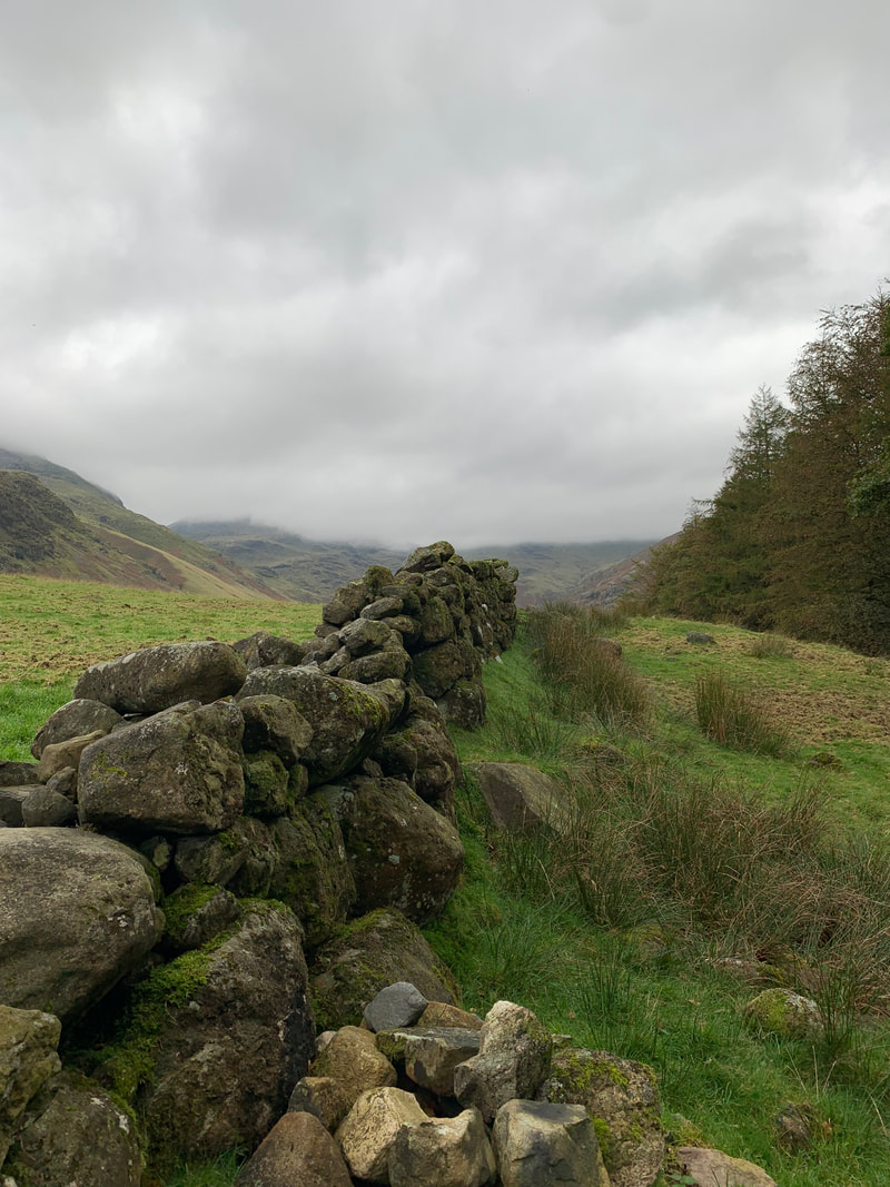
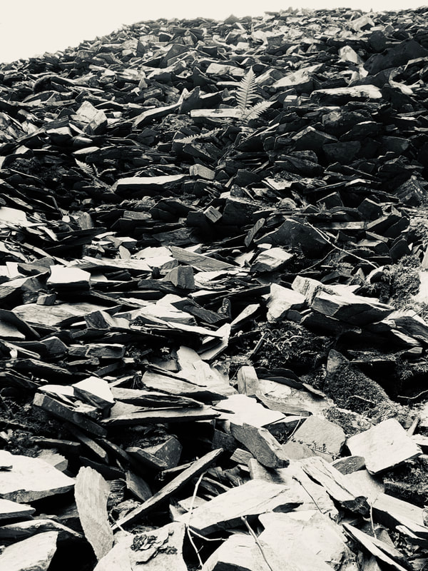
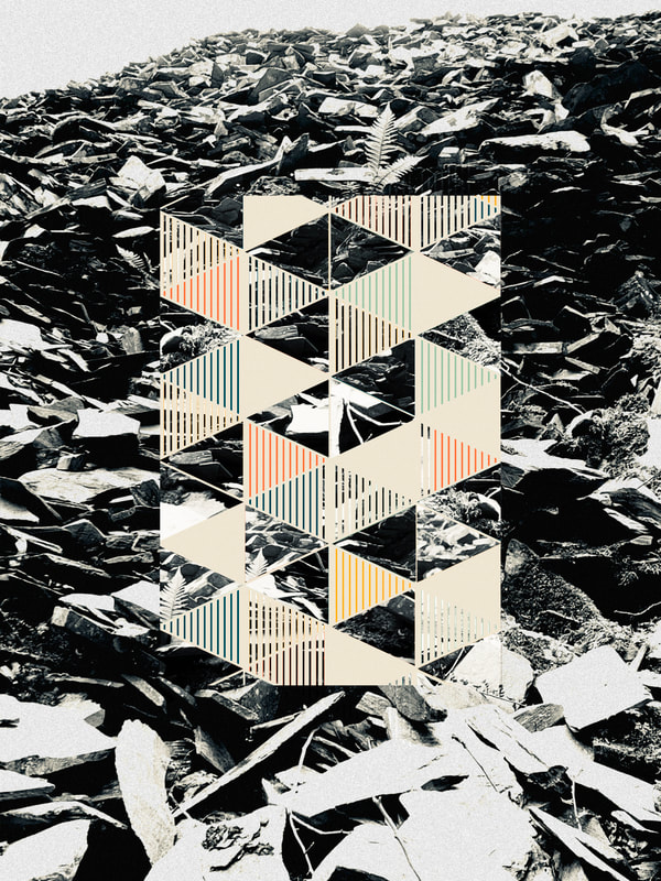
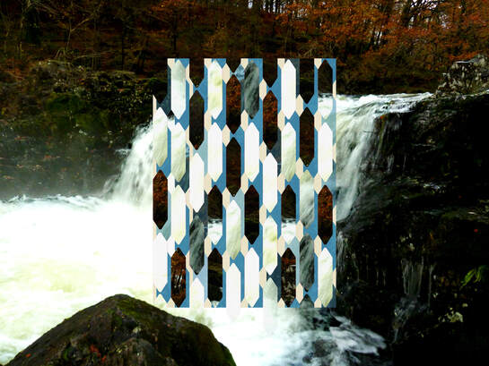
This idea of transformation in flux got me thinking how I might create edits to my nature and urban images that may gain more energy from a similar method. At first appearing relatively simple patterned images but on closer inspection being a more complex mix of both urban and natural landscape complemented again with colour and shape. For my response I took scenic pictures from a weekend in the Lake District near Ambleside. Taking pictures with a wide landscape and also close up shots of the natural environment so that when editing I could experiment with how a close up with more texture compared to a broader scape would look like. I also took some images on my phone so that I could turn them to black and white on the phone itself to gain a clear sense of contrast within the image. For the SLR I used a mid range f8 for general shots. For the images with the stone wall in the foreground that leads to the rocky crag I upped the aperture to f16 in order to ensure a greater depth of field and so keep everything sharp. The stone walls were a gift I used as 'leading lines' in these landscapes.
Edited:
When editing I used 2 geometric shape templates which I felt reflected the broken slate in the original first image so I could get a grasp of the process and what it would look like. I then created my own shapes and chose my own colours for the image on the bottom left in order to better reflect the subject matter. When deciding on colour for the shapes I wanted to use ones that would reflect or contrast the image behind, for example a light blue colour on the bottom left image to reflect the stream of water. Furthermore I used the opacity filter to reflect the clearness of the water on some images. I wanted my shapes to be as striking and sharp as possible to transform the natural, rugged landscape of the Lake District into new graphic forms. By using croping of the central area it brings tension to the overall images I think.
|
|
Overall I believe my edits came out successfully, the contrast between the fixed background and non-uniform landscape and sharp shapes look great. Not only are the images pleasing to the eye but by breaking the image up like this it makes you focus on the environment around the shapes and makes you try to piece the image together. I had fun deciding on which shapes to use and which way to rotate the cut-outs which took the longest time to organise. Although the editing process was long, I would try and maybe switch the roles, where the landscape is brought into the foreground of a colourful geometric shape background. My favourite image is the first one because its firstly the most pleasing to the eye but also the environment perfectly contrasts the colourful patterns. I also like the fact they work as a set with the focus on the central part of each image providing the transformation of the original into an intriguing graphic piece.
DEVelopment THREE
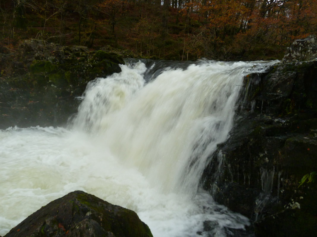
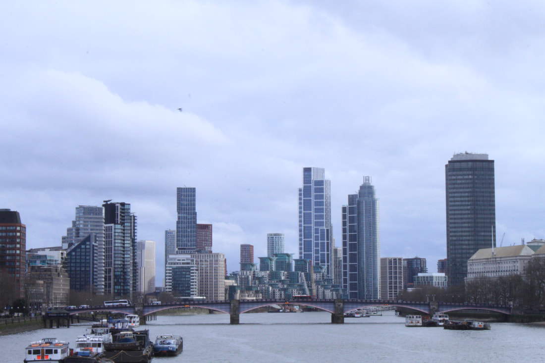
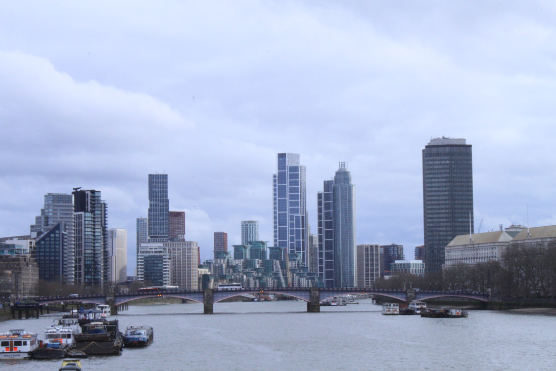
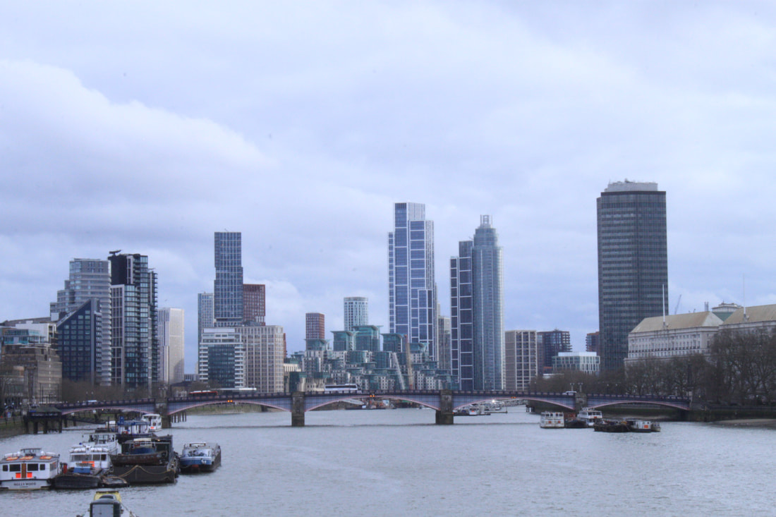
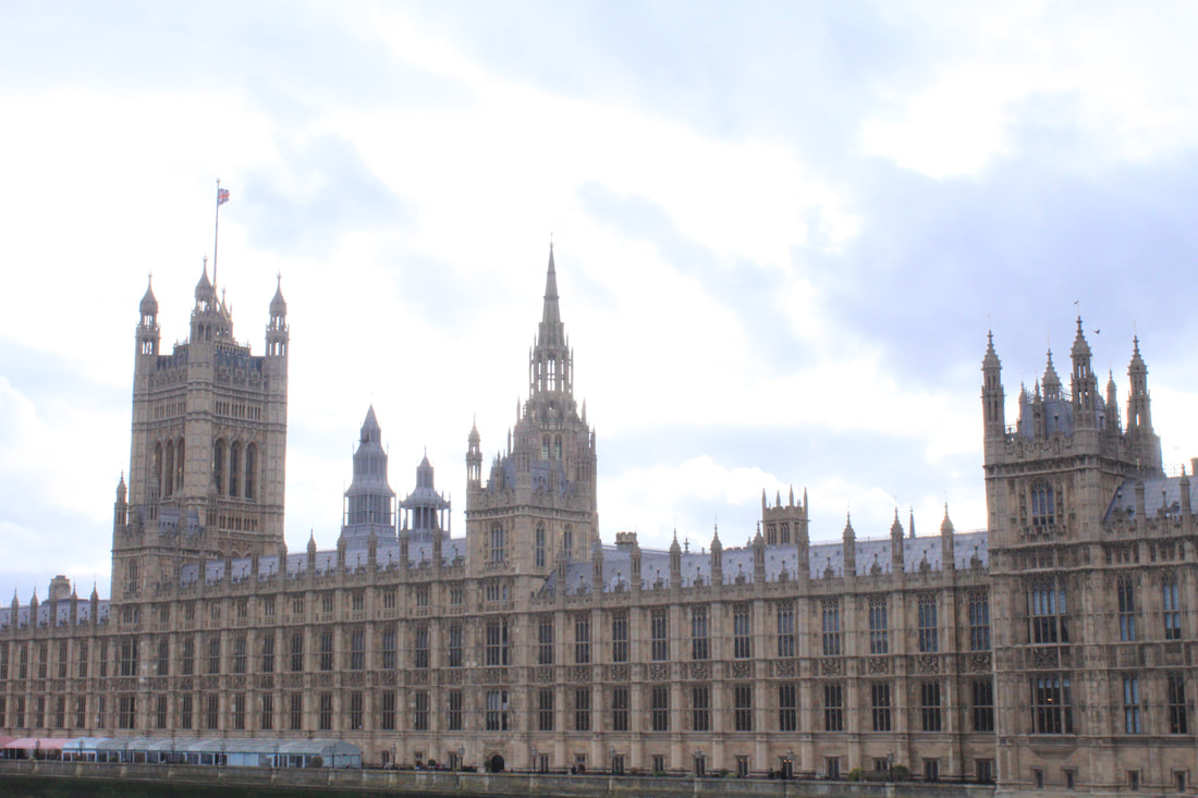
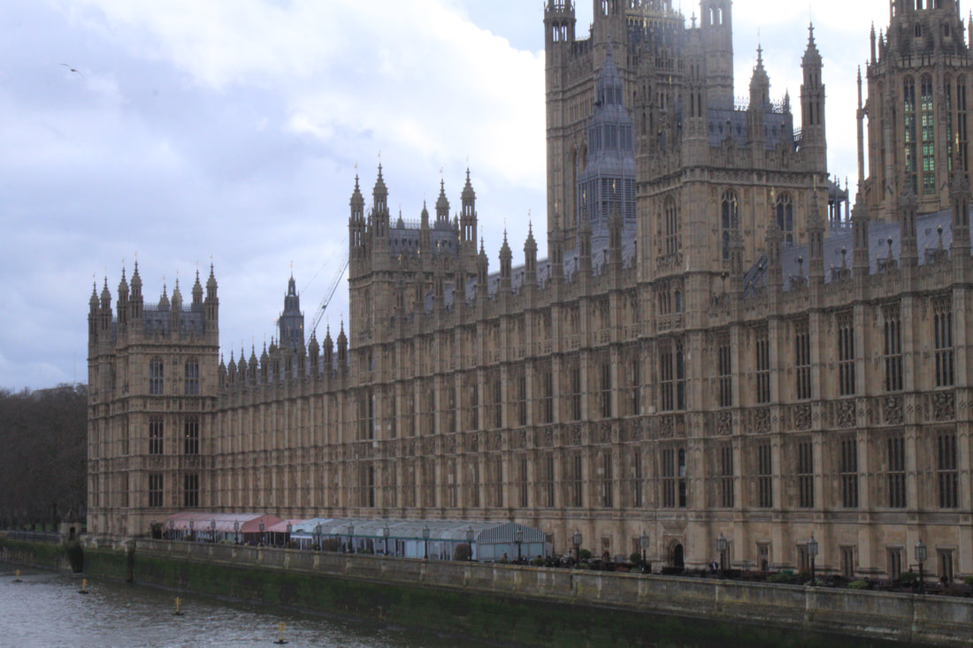
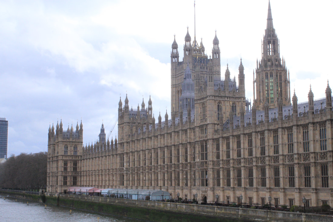
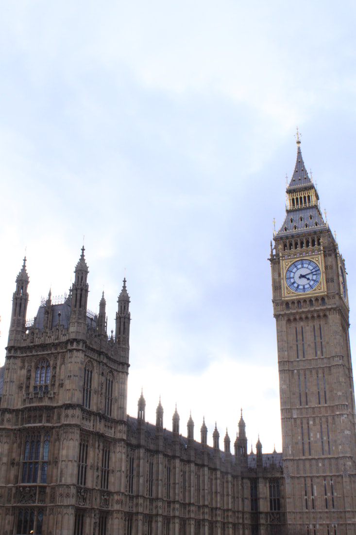
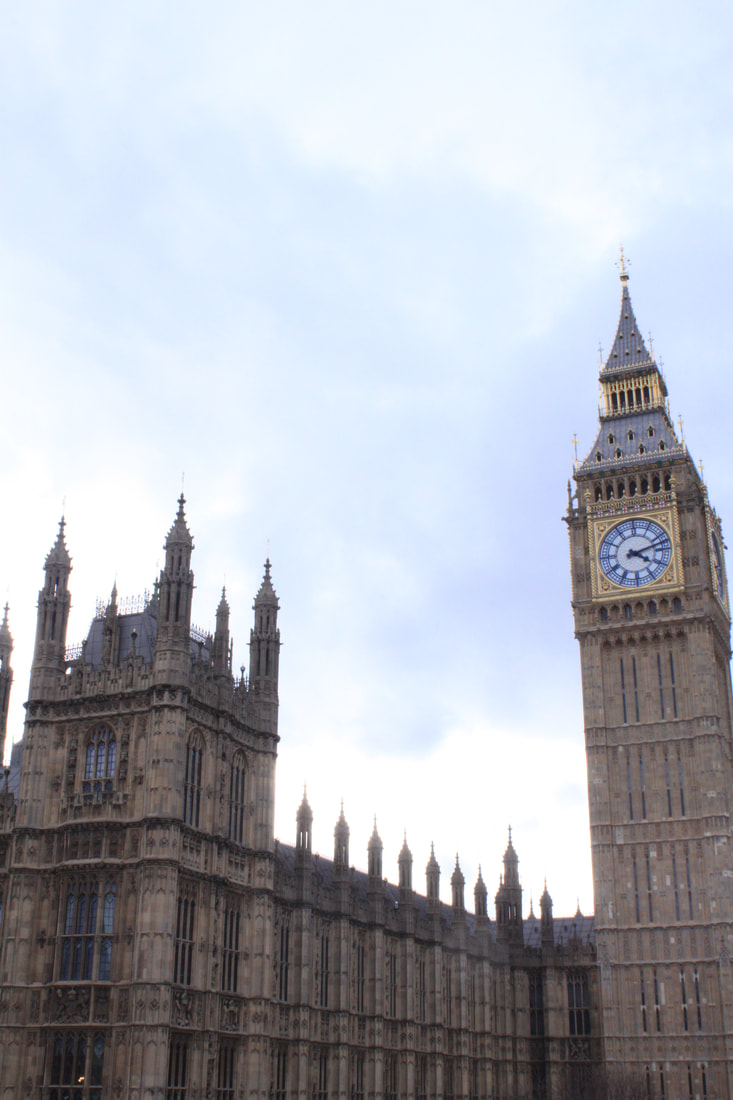
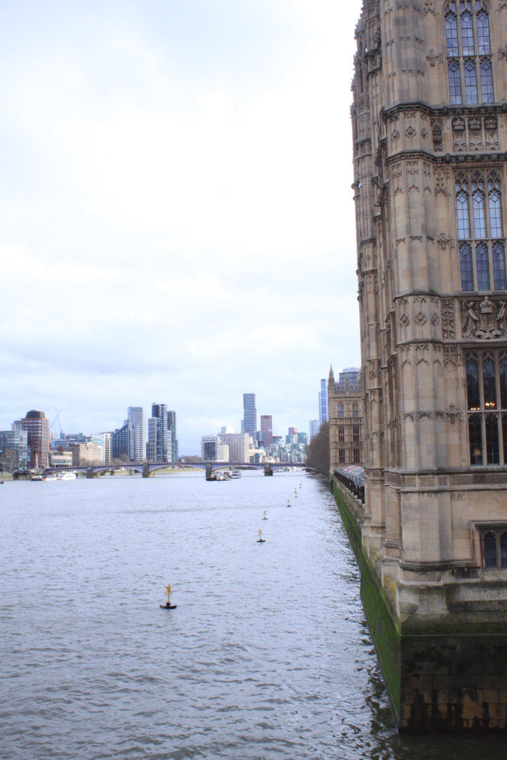
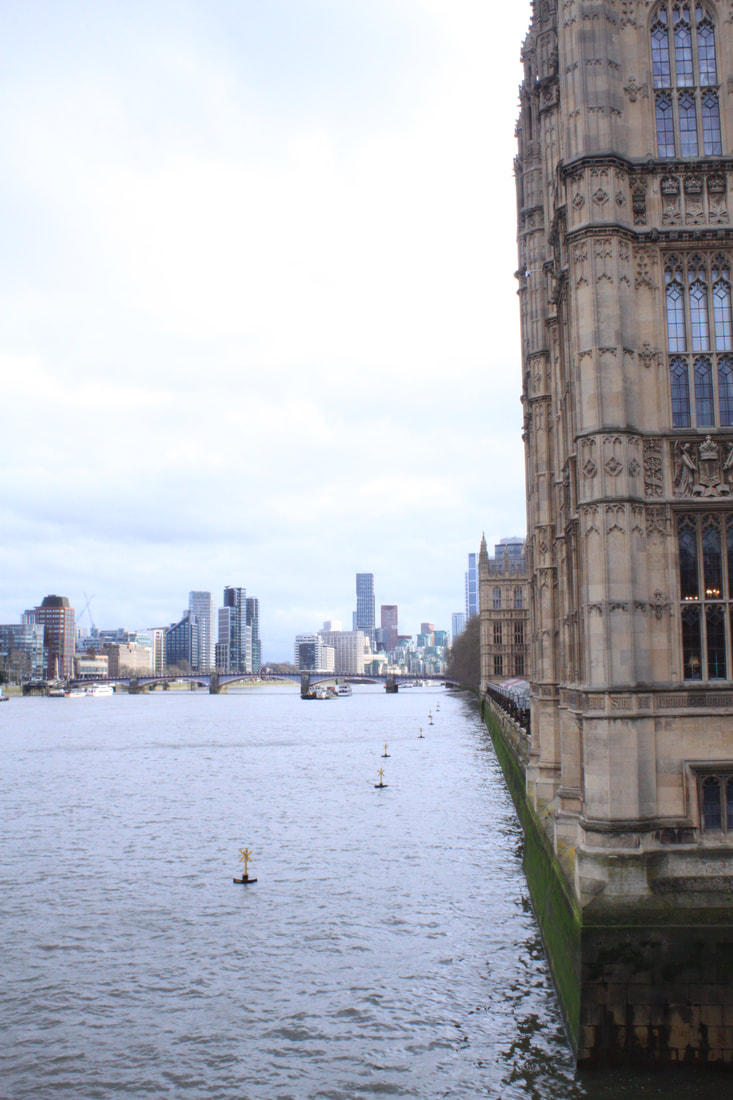
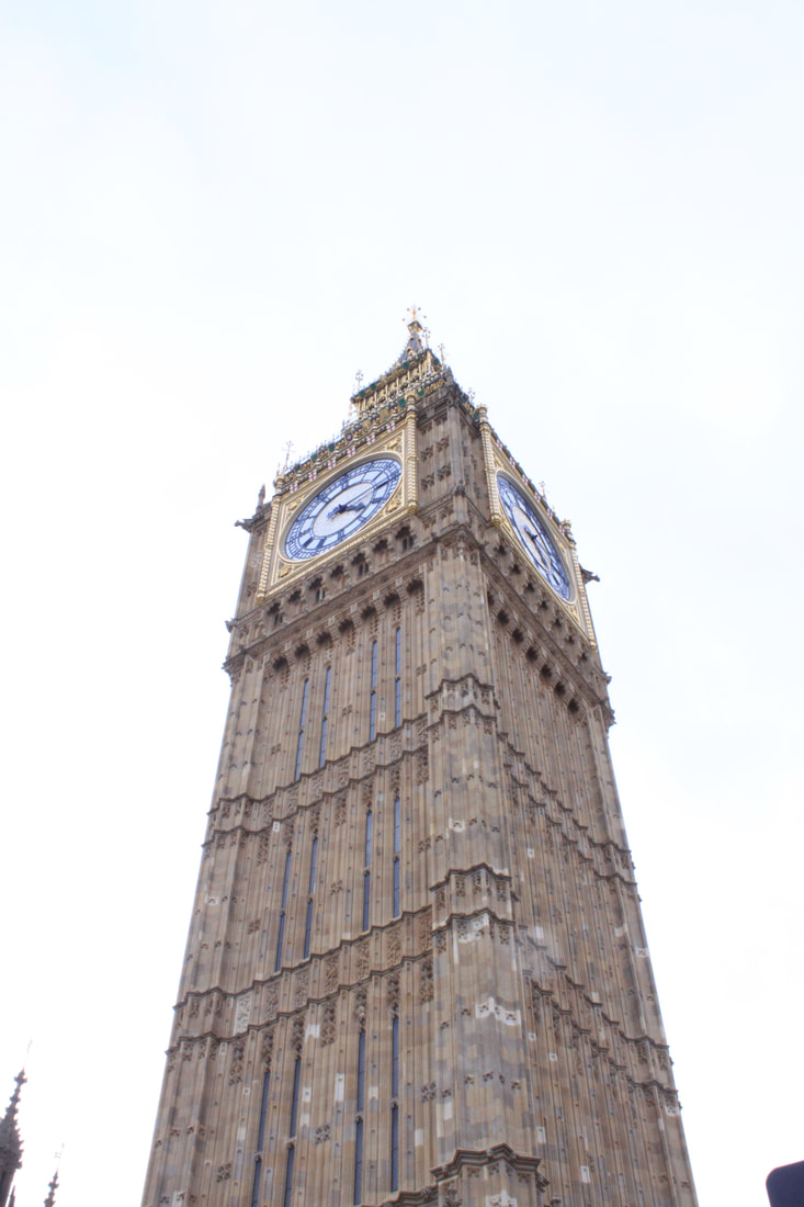
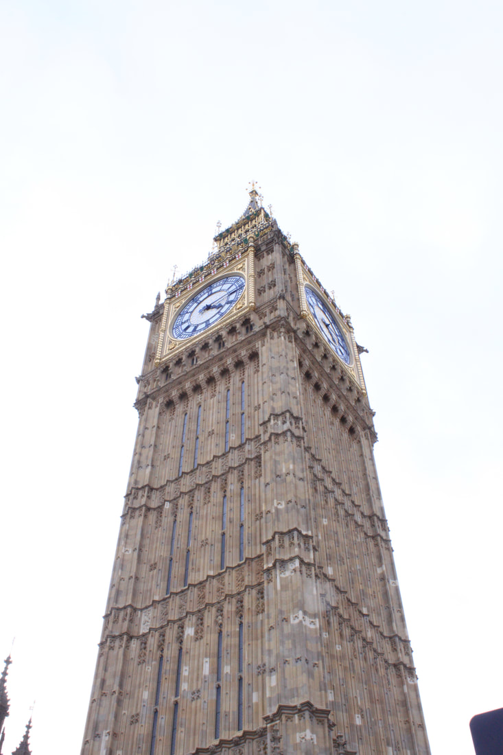
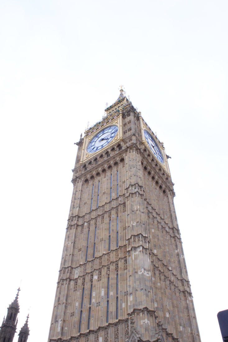
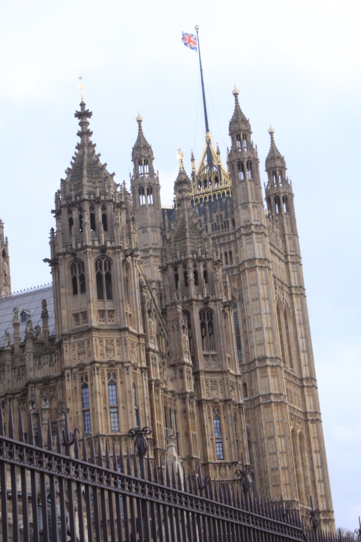
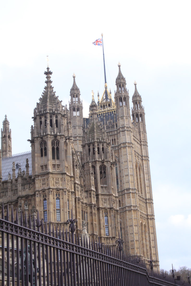
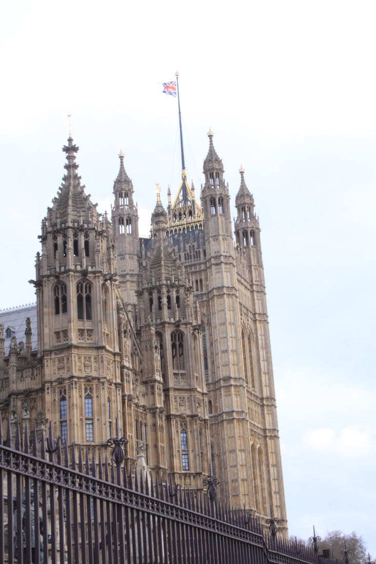
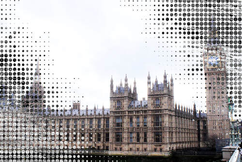
My next development I wanted to push the last development further and be more dramatic. I like the juxtaposition of urban and natural images to create a transformation by crashing an urban architecture into the 'idylic' images from the Lakes. Sadly a rather grey day however I travelled down to Westminster Bridge to take images of the Houses of Parliament and further along the river for landscape shots. With the Big Ben shots I wanted to get textures from the gothic building that can be used to contrast with the natural rocks in the Lakes images.
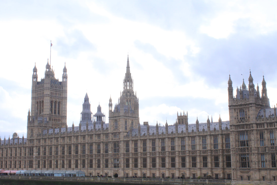
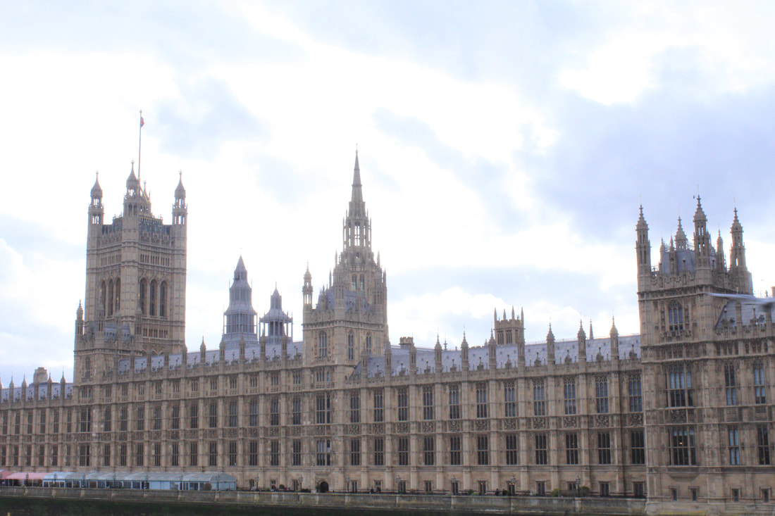
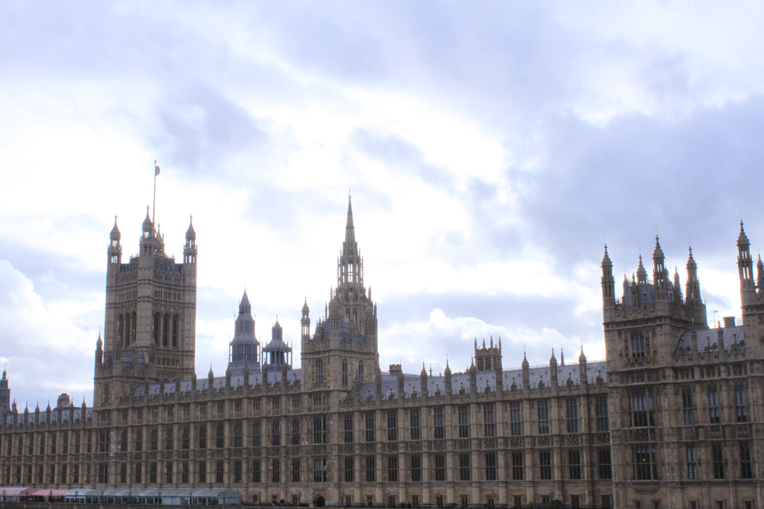

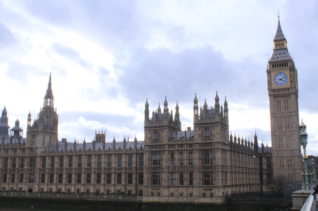
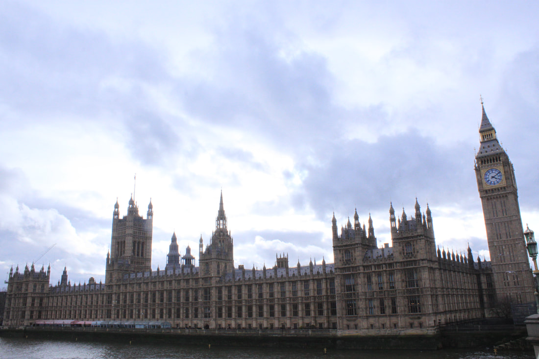
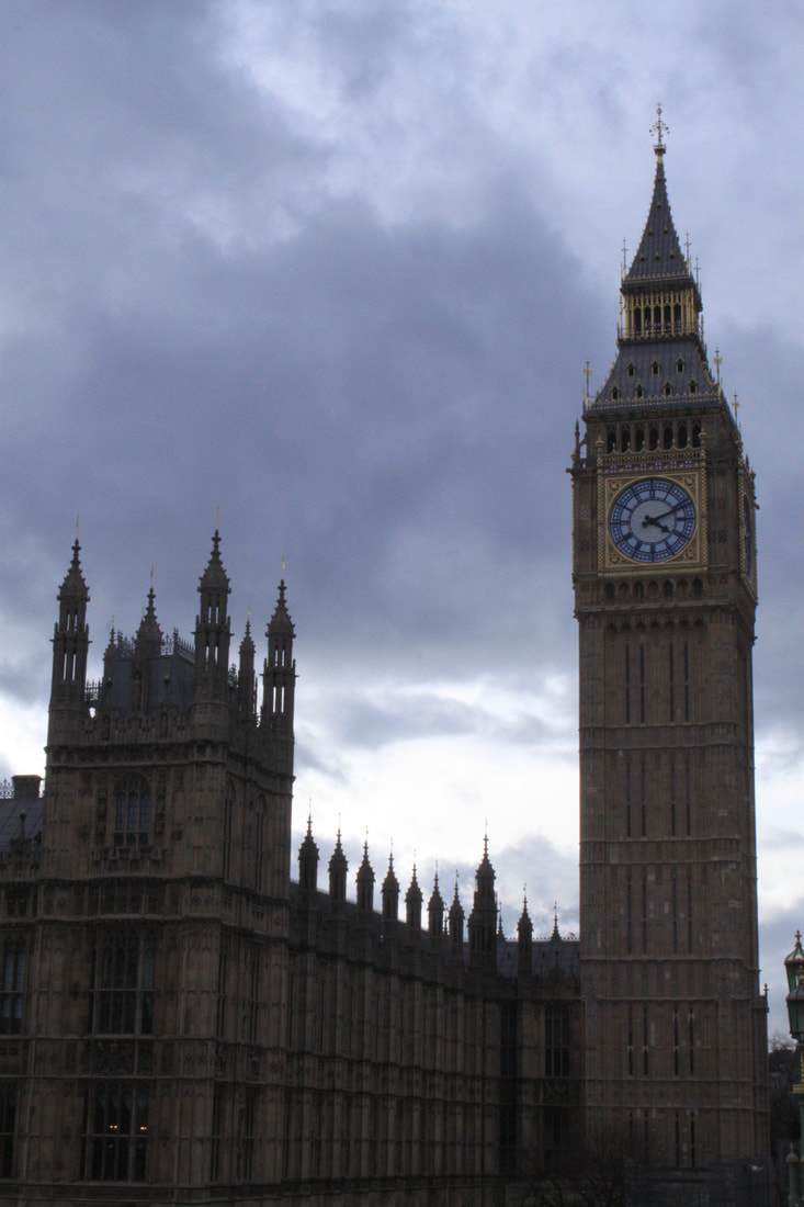
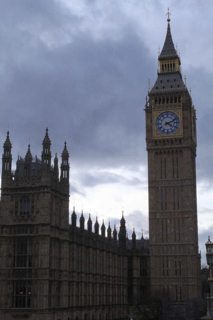
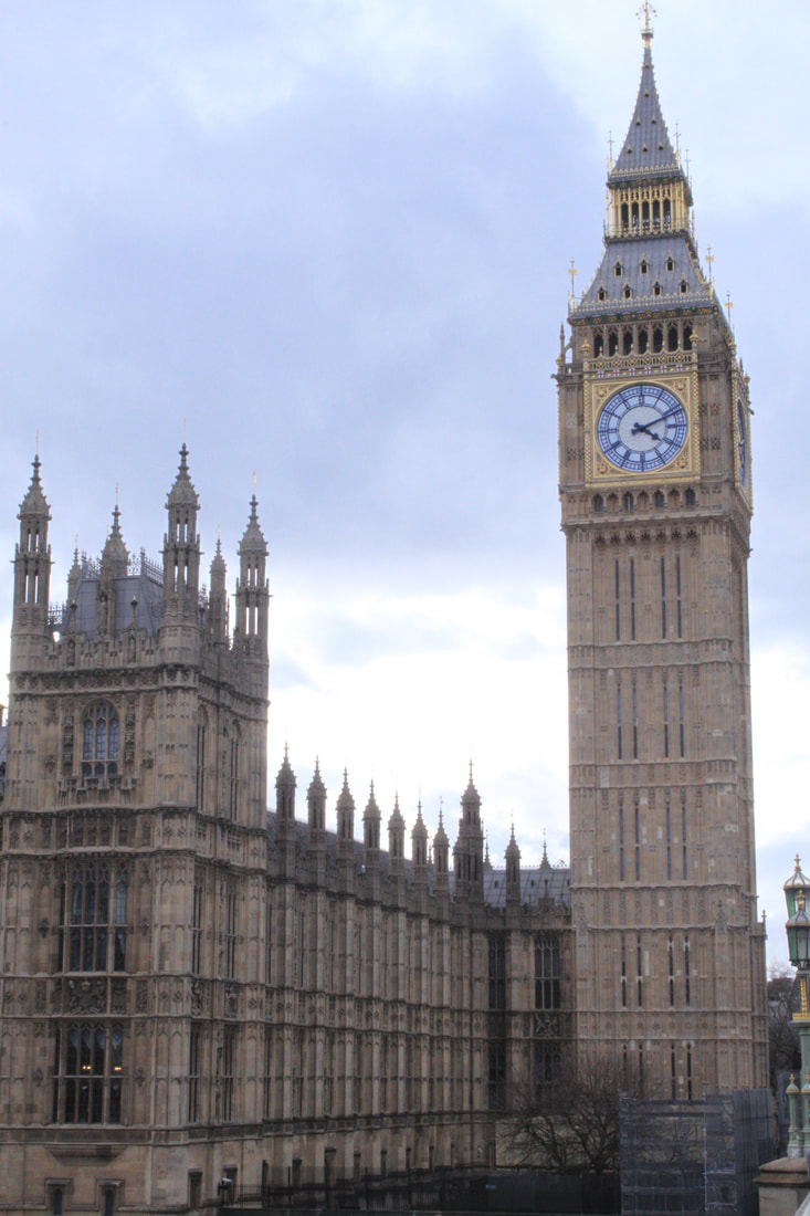
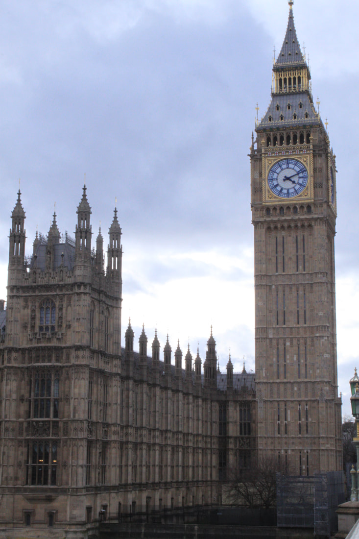
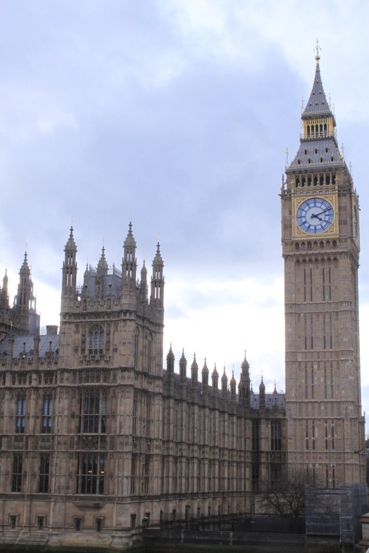
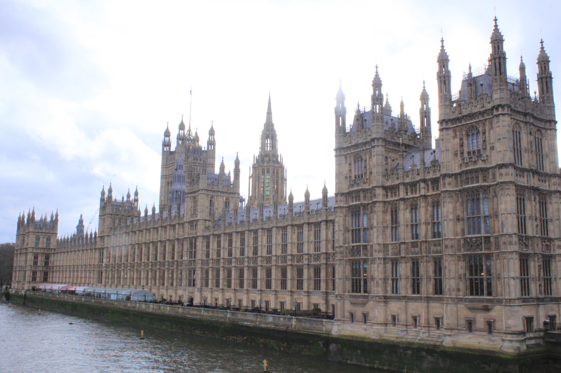
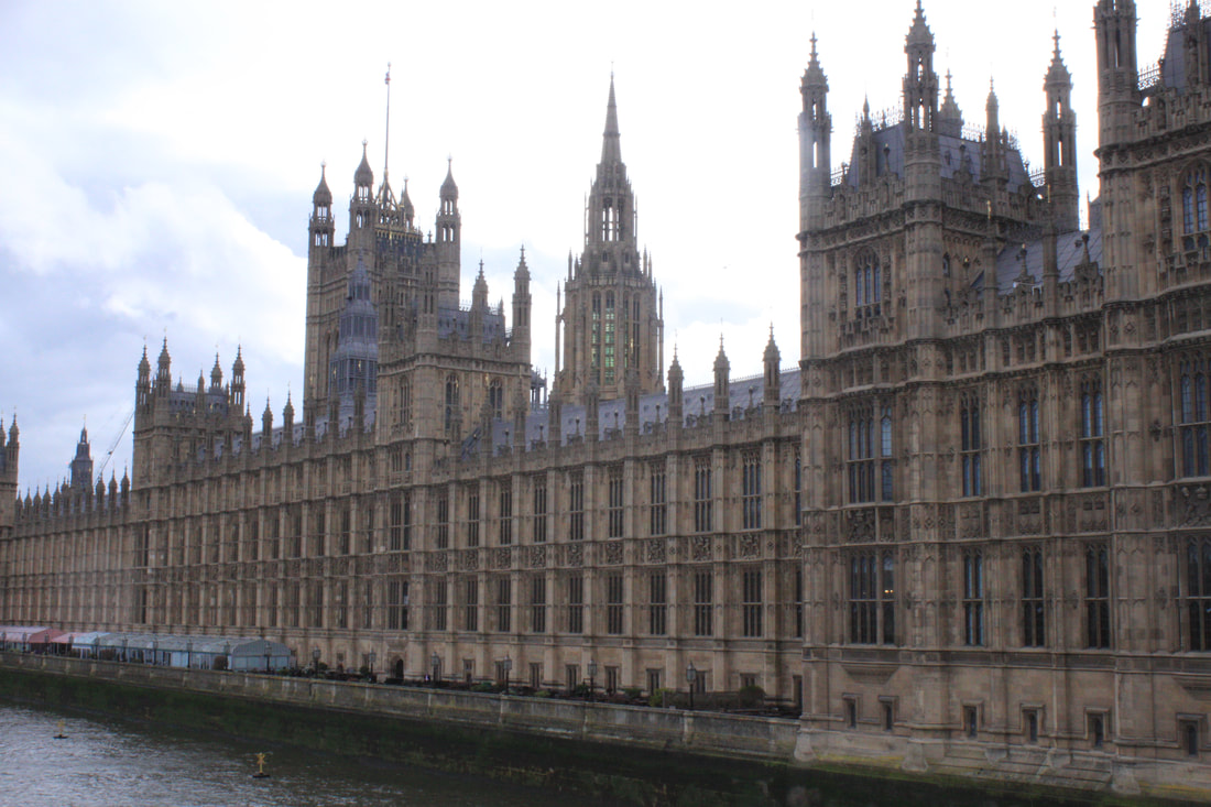
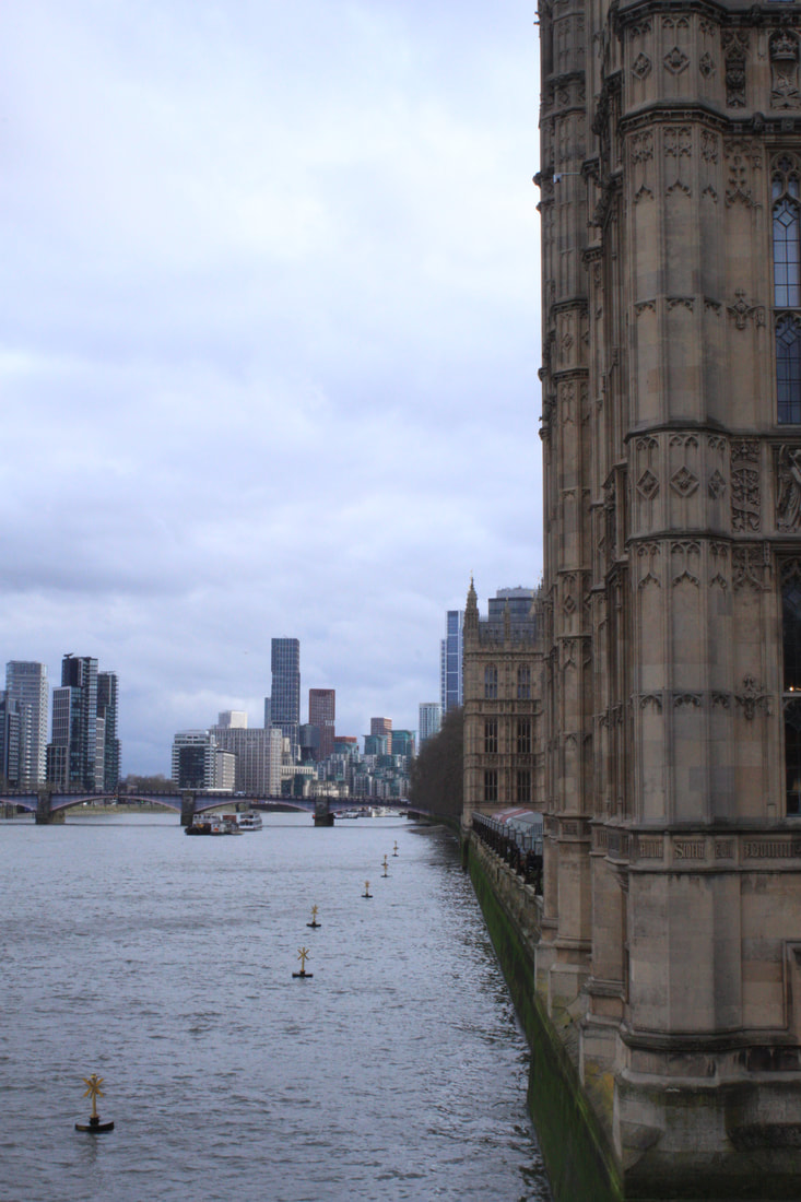
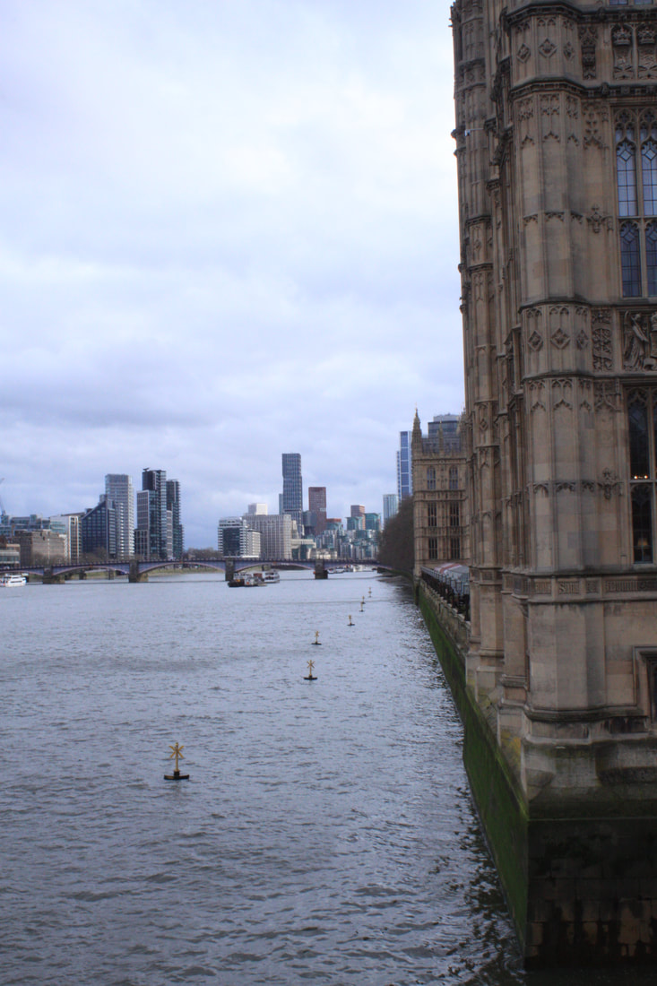
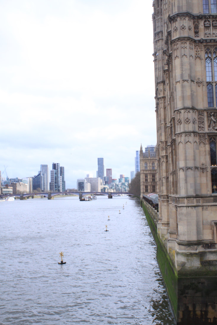
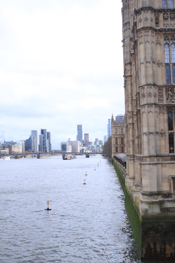
EDITED:
|
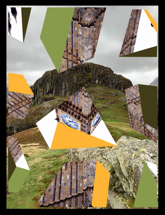
|
Although I'm not particularly pleased with these images overall as the two Lakes images are rather disjointed in their composition. I wanted to create a juxtapostion between real rocks and architectural stone which doesn't quite work out as well as I'd imagined it might. I then explored using a blended pattern in the Houses of Parliament image attempting to blend a rocky natural landscape with that of the buildings. Although I do think this is starting to illustrate a transformation more literally it didn't inspire me to continue transformation in landscape. At this point I took a step back and visited an exhibition in London of Edward Burtynsky at the Saatchi gallery.
exhibition Visit: Edward Burtynsky at the saatchi gallery
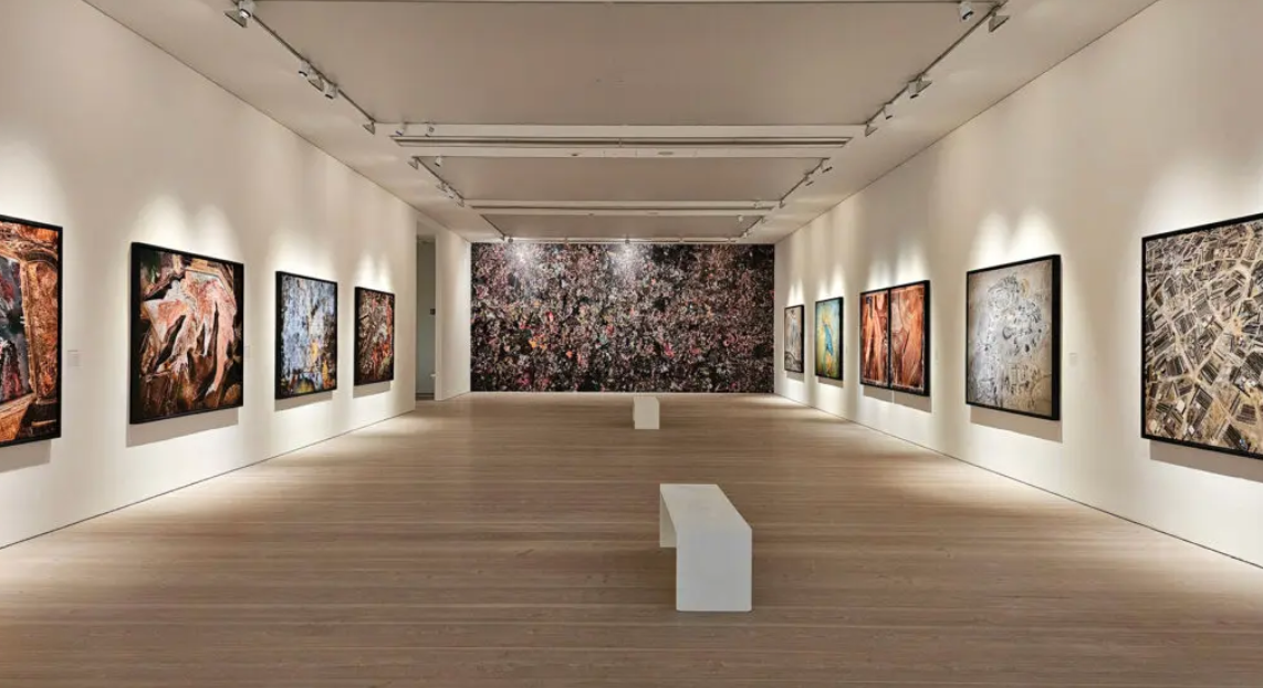
The Edward Burtynsky retrospective at The Saatchi Gallery celebrates his 40 year career which has been spent documenting the devastation that humans have inflicted on the planet. Titled Extraction/Abstraction the exhibition was vast, taking up much of the Saatchi Gallery, spread over 5 large rooms. I spent a long time making my way through all of the content. The output was primarily large and extra large scale photographic images but also included some film and documentary making. One whole room was dedicated to the techniques and technology that Burtynsky has used over his career. The technology used in creating his images has changed dramatically and has had an impact on his work. In particular the advent of drones has enabled him to take large scale images of landscapes and industry from an aerial perspective.
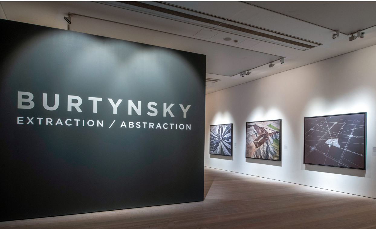
Burtynsky has consistently created visually arresting images of industry, landscape and agriculture. They often look like abstract paintings or graphic patterns rather than what they expressly depict . He does this by taking close in details or large aerial shots of natural places as well as industries such as mining, salt plains, factories, blowing them up or casting the camera out to create patterns, textures and distorted perspectives. The images often look like something they are not and encourage the viewer to do a double take, to go closer to the image and further away in order to 'work out' what they are looking at. He is asking us to consider the impact human beings are having on the planet. He does this in an engaging and incredibly beautiful way. The title Extraction/Abstraction talks to the nature of the images and how they present almost as abstract paintings or graphic patterns and also nods to the way humans are extracting resources from the world.
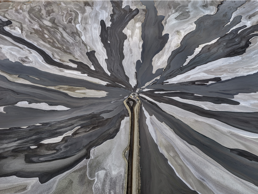
Pengah Wall 1, Komodo National Park, Indonesia 2017
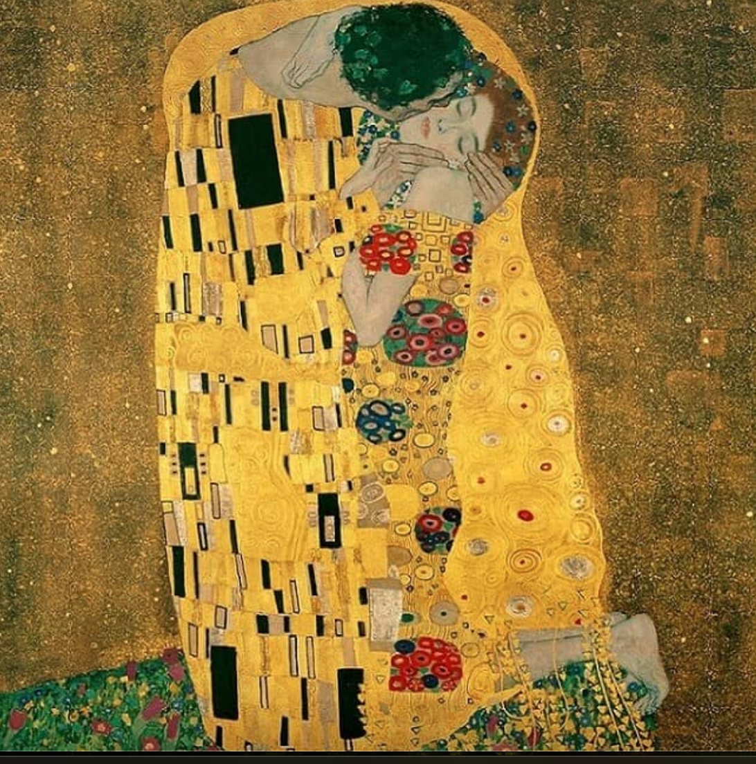
Many of the images are reminiscent of abstract art or of parts of other paintings from the past. For example, the work entitled Brine Wells 1, Salt Flats, Atacama Desert, Chile, 2017 shows Lithium being extracted from evaporation ponds and salt lakes. Lithium is one of the most sought after resources on the planet being used in rechargeable batteries. I found the image reminded me of part of Gustav Klimt's The Kiss. In the photograph Morenci Mine 1, Clifton, Arizona, USA, 2012 the image shows an underground copper mine, it made me think of some of the old masters paintings, it looks very painterly, if you look closely parts of the image look like brushstrokes. I found it reminiscent of some of Rembrandts self portrait details. The photograph Uralkiali Potash Mine 2, Berezniki, Russia, 2017 was taken deep below the city of Berezniki, a mining town in the Ural Mountains, they can cause giant sinkholes across the city. At a glance they look like an urban skyscraper environment like New York.
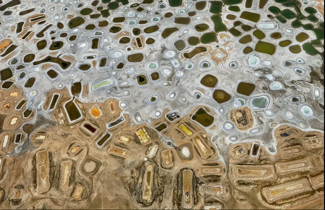
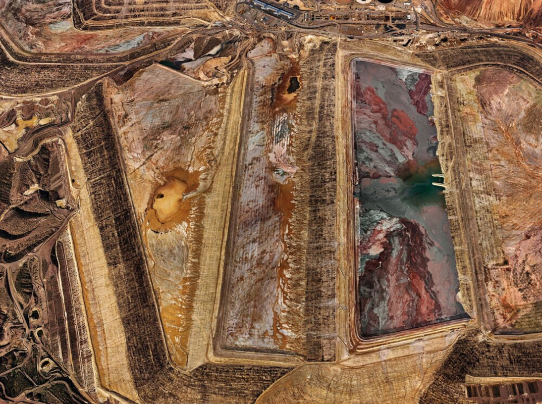
I think the exhibition spoke to my title of Transformation in a number of ways. Burtynsky's images show how humankinds extraction of the earths resources and continued industrial development have transformed the planets landscapes. Many of these extractions and industrial developments are damaging to the earth and ugly in their nature and yet Burtynsky turns them into something that is undeniably beautiful and very compelling. I would like to take the idea of altered landscape and the idea of a double take further in my future developments. I also like the idea of using photography in a way that tricks the eye to present itself as other mediums.
Development FOUR
For my fourth development I wanted to continue expanding using shapes and colour as a way of creating Transformation, picking back up on my earlier development work inspired by Jimmy Turrell and Jelli Martens. I liked how my images came out with the nature and urban landscapes but i want to try and incorporate faces more into my images. The main idea I want to push with the fourth development is the how the use of shapes and colour can transform an image of of a portrait into a mind-boggling digital image that sparks the viewer into de-transforming the image into its original, almost like a puzzle. To do this I started researching artist/photographers that use this type of technique in there work.
Gordon Magnin
Gordon Magnin was born in 1978, in Reno, Nevada. He is well known for using Photoshop to create collages from found images. However the majority of Magnin's work is creating editorial portraits with his distinctive twist. He distorts a face by creating a pattern, rotating an identical part of the image and then repeating that shape or cut out repeatedly. Magnin usually uses different portraits and cuts geometrical shapes from them. Then he rotates them in a variety of ways to create a new image, with a new personality. He creates a puzzle for the audience to interpret in their own mind. The shapes in the image, and the distortion of facial features could be interpreted as a mixture of emotions in these images. I particularly like the image of the young girl or boy on the left and how you want to reconstruct the face in your mind's eye when looking at it.
|
|
|
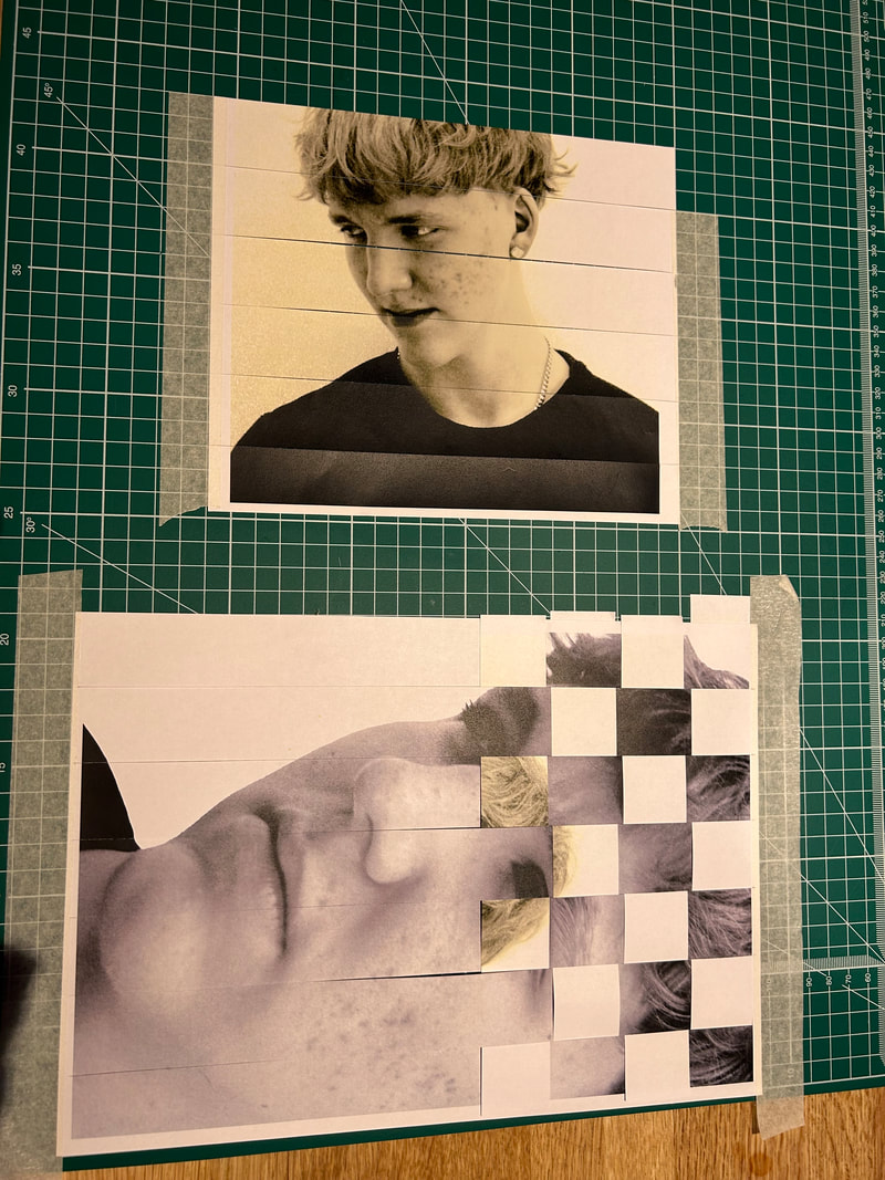
I was intrigued by the work of Marten's colourful graphic puzzles and how his technique might be used with Magnin's transformed faces. This got me to play with portraits of my brother and a friend in photoshop once more. I want to combine Magnin's technique into my own work by bringing in colour as well.
I took some portraits of a friend at school using a cloth backdrop as quite close in shots to emphasise his facial features as much as possible. I also took images of my brother at home against a white wall and wearing a black to with the intention of creating black and white high contrast images to develop in photoshop.
I took some portraits of a friend at school using a cloth backdrop as quite close in shots to emphasise his facial features as much as possible. I also took images of my brother at home against a white wall and wearing a black to with the intention of creating black and white high contrast images to develop in photoshop.

edited:
When editing I wanted to try and transform the face as much as possible to so thats its almost unrecognisable, unlike Magnin I didn't use any other found images but rather used editing to copy and paste sections of the original portraits. Focussing mainly on the eyes as a repeat with the idea of holding the viewers gaze as they look at the portraits. I like the way colour can also play quite a dramatic transformation in how you view each image.
|
|
Overall I am very happy with my edited images. The last two images retain enough of the original portrait (which I took of my brother earlier this year) as to allow the viewer a sense of who the original sitter is however by using elements from other shots of his eyes at different angles it starts to become difficult to make sense of the whole. Almost like a puzzle again in which you want to move pieces. The other two images take the transformation further and I think are almost disturbing in their distortion from the original. I liked creating these images and want to explore this sense of transformative technique further, to go deeper into using shape, pattern creating a visual puzzle.
Development FIVE
In my next development I want to explore transformation of a portrait using pattern to create a puzzling Transformation. The thought of how to capture someones mood, continuing to use colour, shape and texture to enhance the original image whilst transforming it by disguising key elements.
All images were taken at home in natural daylight with a digital SLR. I asked the subject to pose in different ways in order to capture different poses and facial expressions. Using eye level as well as low level shots and placing the subject against a white background to ensure I can easily crop them out in Photoshop.
All images were taken at home in natural daylight with a digital SLR. I asked the subject to pose in different ways in order to capture different poses and facial expressions. Using eye level as well as low level shots and placing the subject against a white background to ensure I can easily crop them out in Photoshop.
model images


Edited:
|
|
I found the use of texture into a simple grid pattern helps the depth of the image. Changing the original image to black and white in photoshop in image 1 I think enhances the mood of the original and the choice of an olive green to complement the mood. I actually like these images however feel the level or sense of transformation is not as dramatic as I want. The contrast between person and graphic shape being too obviously layered. If I were to do this again I think I'd use more expressions and try to comp two of the portraits together to add to the sense of Transformation.
I realised what I want to create is a more dramatic sense of Transformation of a person which got me looking into the role of portraiture in photography and art.
I realised what I want to create is a more dramatic sense of Transformation of a person which got me looking into the role of portraiture in photography and art.
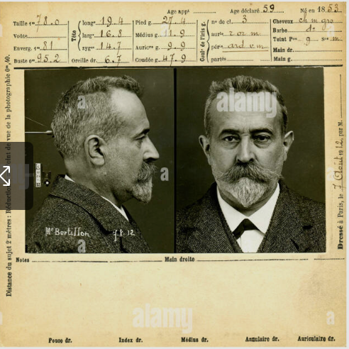
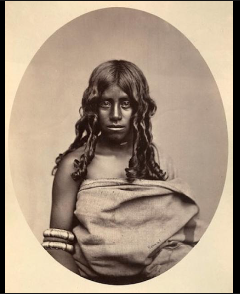
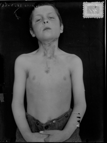
Development 6
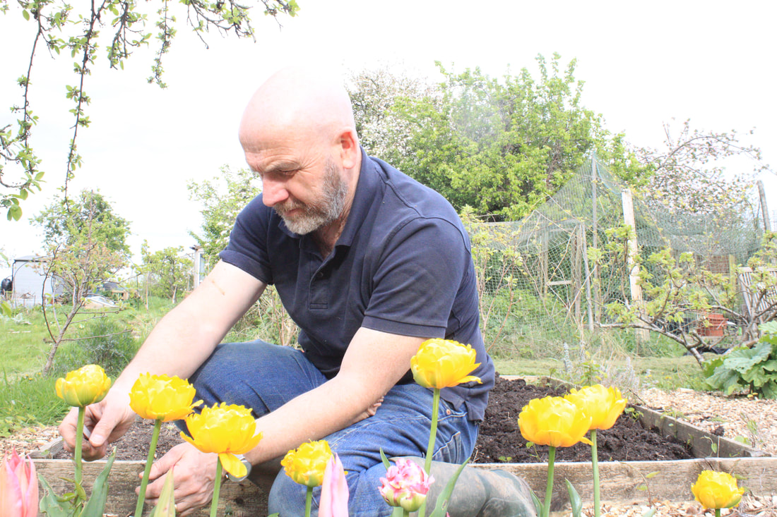
The use of graphic shape, colour and pattern has a puzzle like quality that I want to explore further. Also using people feels more engaging than landscape as the viewer can hopefully relate more to the face and expressions of individuals. Historically portrait photography was used to show an accurate representation of the individual. It was taken for granted that an image would be a genuine reproduction of a person, with them in a particular time and place. For example portraits were taken of criminals, recording accurate details of the face along with written descriptions. Portrait photography was also used in the documentation of people from other countries during the expansion of the empire. These portraits would be used to document physical attributes, clothing and tools etc. The Victorians used portrait photography to document disease and mental disorders in patients to be used as accurate records and representation. I wanted to look at how I could play with this idea and disrupt the portraits to encourage the viewer to question what it is they are looking at. With this in mind I took some quick portrait shots of friends at school and at a friends house. For this next development I want to use colour and pattern to totally transform the original portrait into a completely new imagined version of the original sitter.
My response:
The portraits aren't the sharpest nor are they the best lit however for the purposes of this experiment I had enough to work on with a variety of facial expressions and individual characteristics of my friends to draw from. All images where taken in peoples houses so it was difficult to control lighting however I wanted to capture something expressive in the character of each individual for the purposes of this development.
Edited:
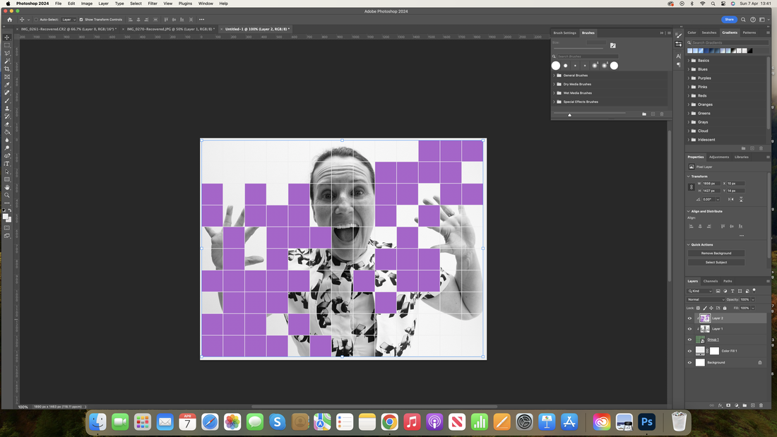
Working in photoshop I quickly recalibrated the colour and tone of the chosen images. I then started to draw out a limited colour palette selected directly from the original images. Then applying a grid pattern I began to select squares of key features such as mouth, nose, eye, hair and skin etc. Once I had taken these from one or more original images I began experimenting with the Transformation by enlarging certain parts of the face for example an eye.
|
|
|
|
I'm particularly pleased with the way the first and last images (enlarged) came out. I particularly like how enlarging one eye for example creates a very different attitude in the sitters face, it feels like it starts to tell me more about the sitter than the original portrait. It also brings a real dynamism to the image, making it feel slightly in motion or like a film still. I am fascinated by how some simple additions of graphic shape and colour and change the feel of the mood of the image. The distorted proportions add both emphasis but also begin to create a totally new kind of portrait of the individual. I'd definitely make sure that I get crisper original shots next time although I really want to take the portraiture further in my next development. I'm also keen to use different media to see how I can physically play around with the imagery.
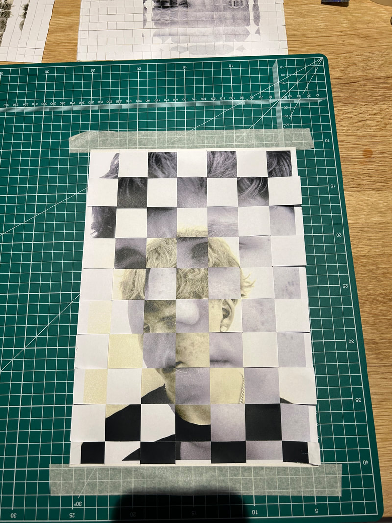
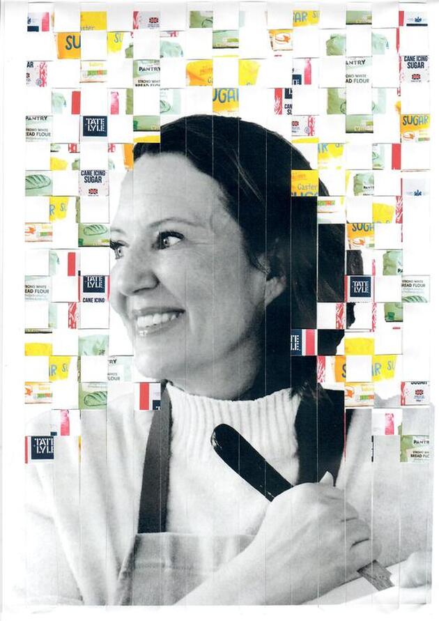
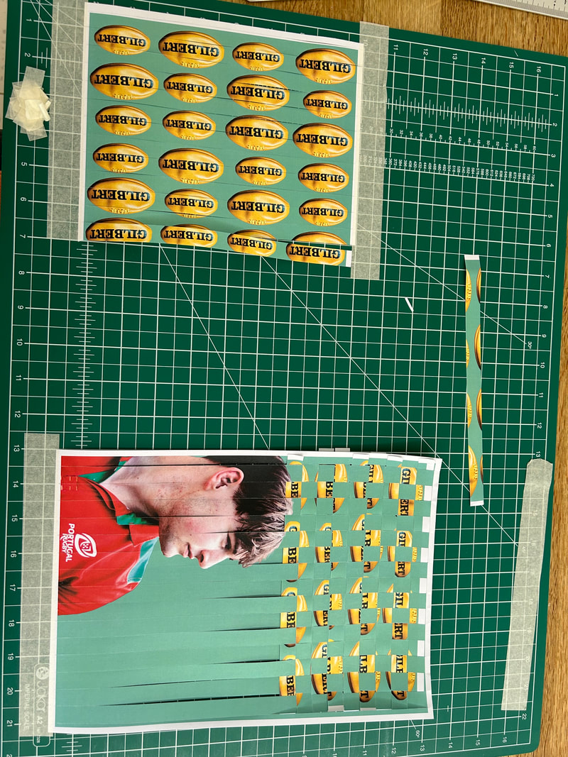
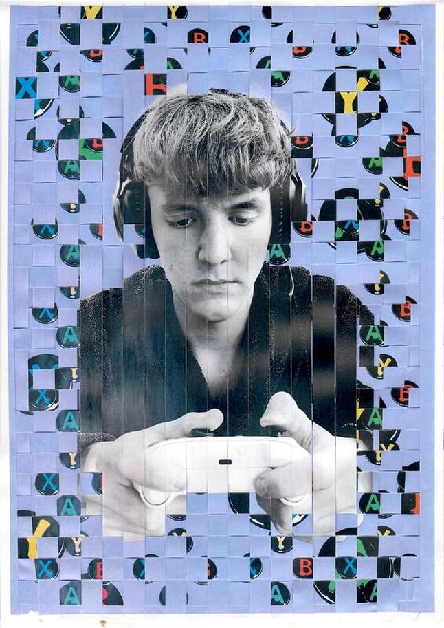
Development 7: Weaving
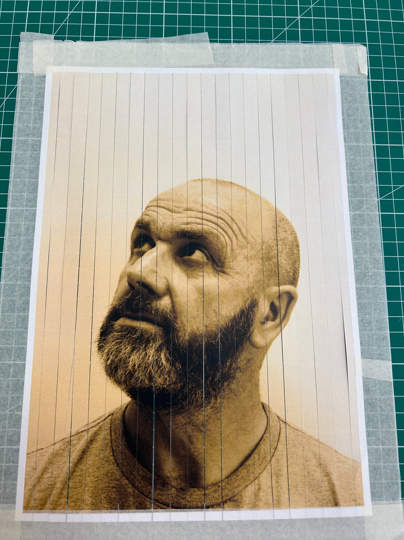
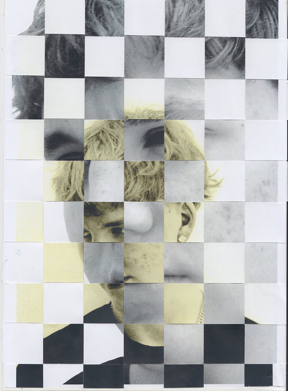
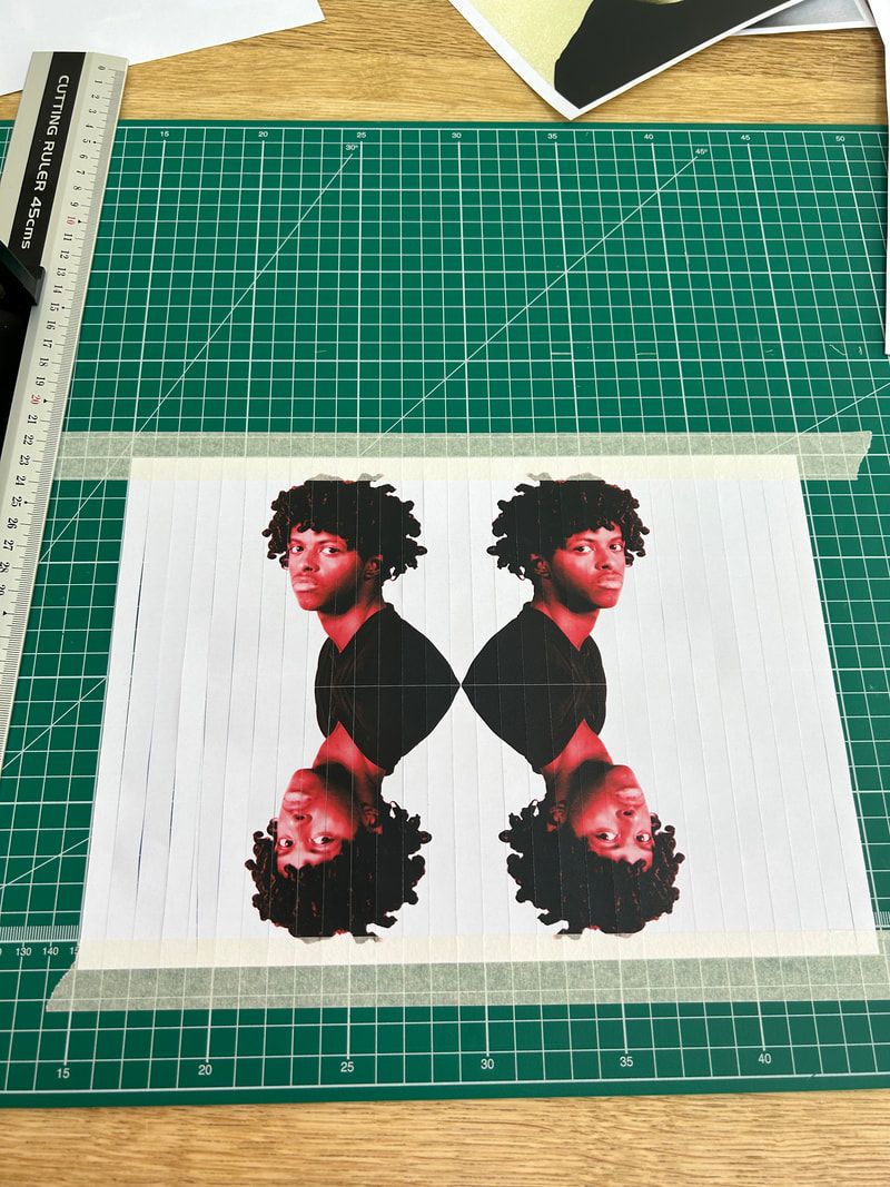
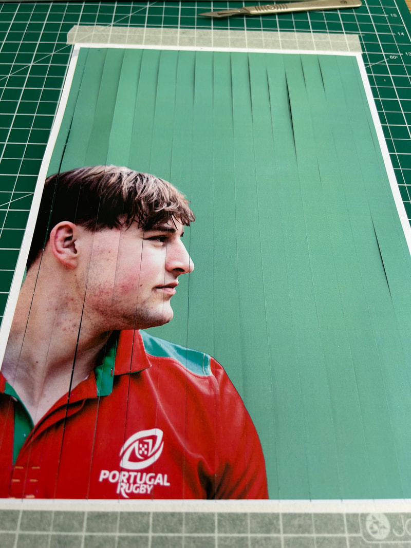
From doing work in Photoshop and digitally altering images I wanted to take a look at using print and then manually manipulating the images to see how that would work. I decided to experiment with printing images and then weaving them in a pattern. I took two portraits of the same person, in slightly different poses and did them in two different monochrome colours then printed them on separate pieces of paper. I then cut one vertically in a portrait position and used this as the 'loom'. The other piece of paper was cut in a landscape position and the strips of paper were woven through and then held together with tape on the back.
Response:
Weaving:
|
|
|
|
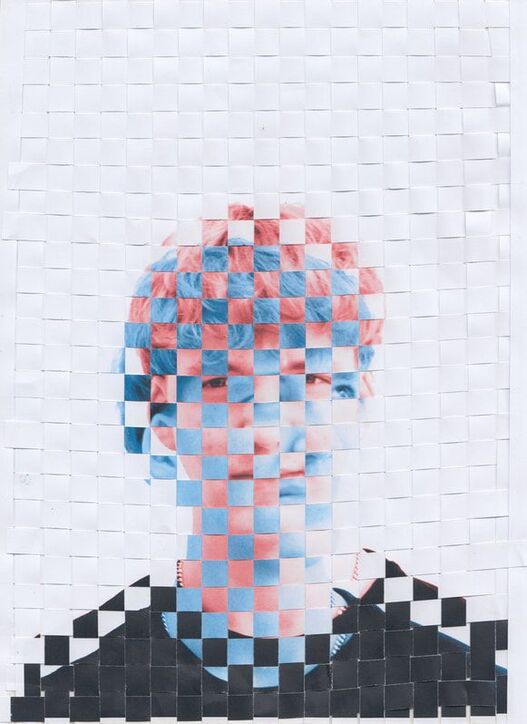
I then experimented with scale to see if that brought a different dynamic to the image. I also experimented with colour, keeping one large image in black and white and the other small image in a monochrome colour.
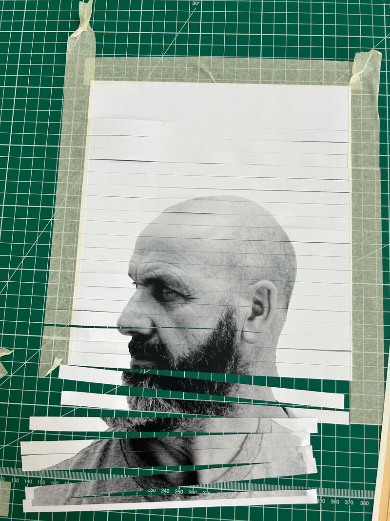
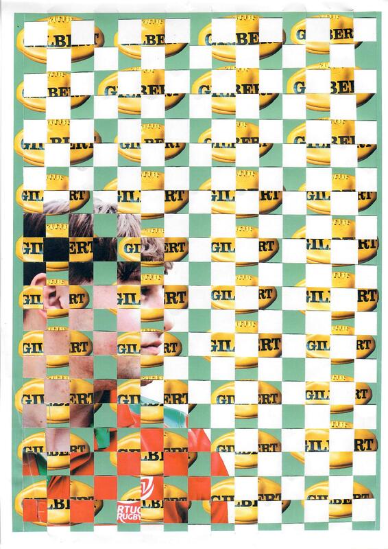
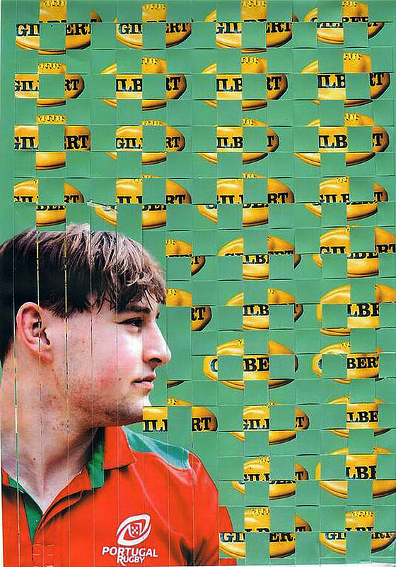
The resulting images are interesting but I don't feel they are interesting enough. Back to the idea of the double take from the Burtynsky exhibition, I wanted there to be greater distortion and therefore intrigue to make the viewer work harder to decode the image. In order to create greater distortion of the image I worked with the idea of mirroring and experimented further with the physical weaving idea. The first step was to take a portrait shot and then manipulate the image in Photoshop to create a mirrored image of 4 faces. I printed this out and then cut the image into strips. These were then mounted on to tape in an alternating pattern. I took one strip from the left, stuck it to the tape and then took one strip from the far right and then alternated in that pattern until the whole image was on on the tape, creating a new distorted picture. I rotated the whole picture and cut it in 1cm strips again, this mimicked the square pattern that was created by weaving in the previous work. I then repeated the process of taking one strip from the left and one strip from the right and sticking them together to make a new image.
Mirored faces done in photoshop to create effect:
Mirored faces done in photoshop to create effect:
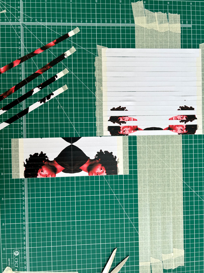
Alternate strips from left then right mounted onto masking tape
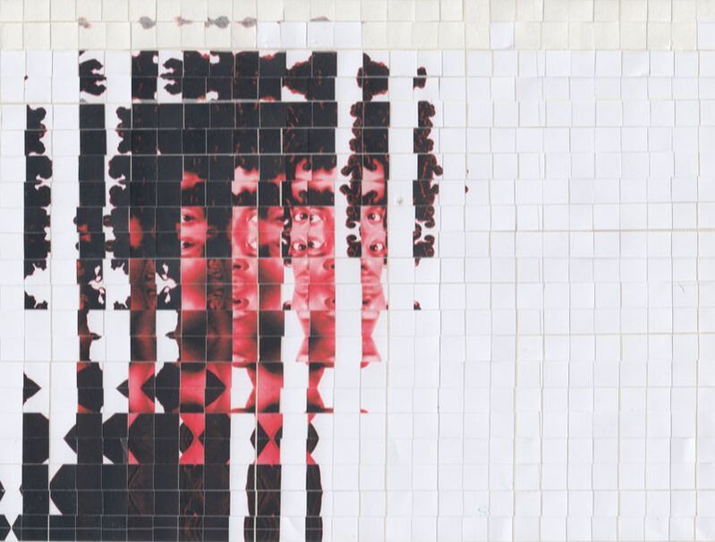
Final image put together after rotating and repeating the pattern
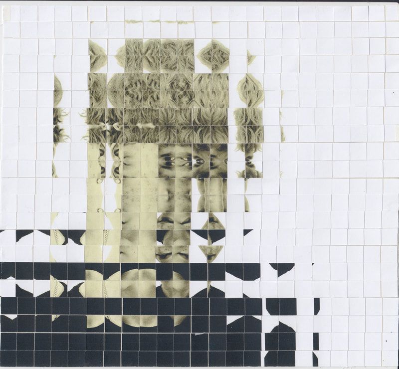
I think this image is successful in creating greater intrigue and encouraging the viewer to be drawn into the complexity. I like how the mind tries to reconstruct the original image, it engages the viewer in a type of game playing. I really like the physicality of it and the way the very slight imperfections of alignment in the strips of paper give it an additional dimension rather than the perfection that can be achieved in Photoshop. This was a surprise that I wasn't expecting but was very pleased with. It creates almost a distorted wave effect, not unlike what you would see when looking at someone through distorted glass. I experimented further with other images and with black and white as well as colour.
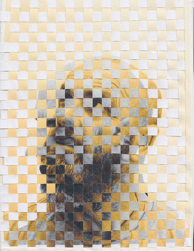
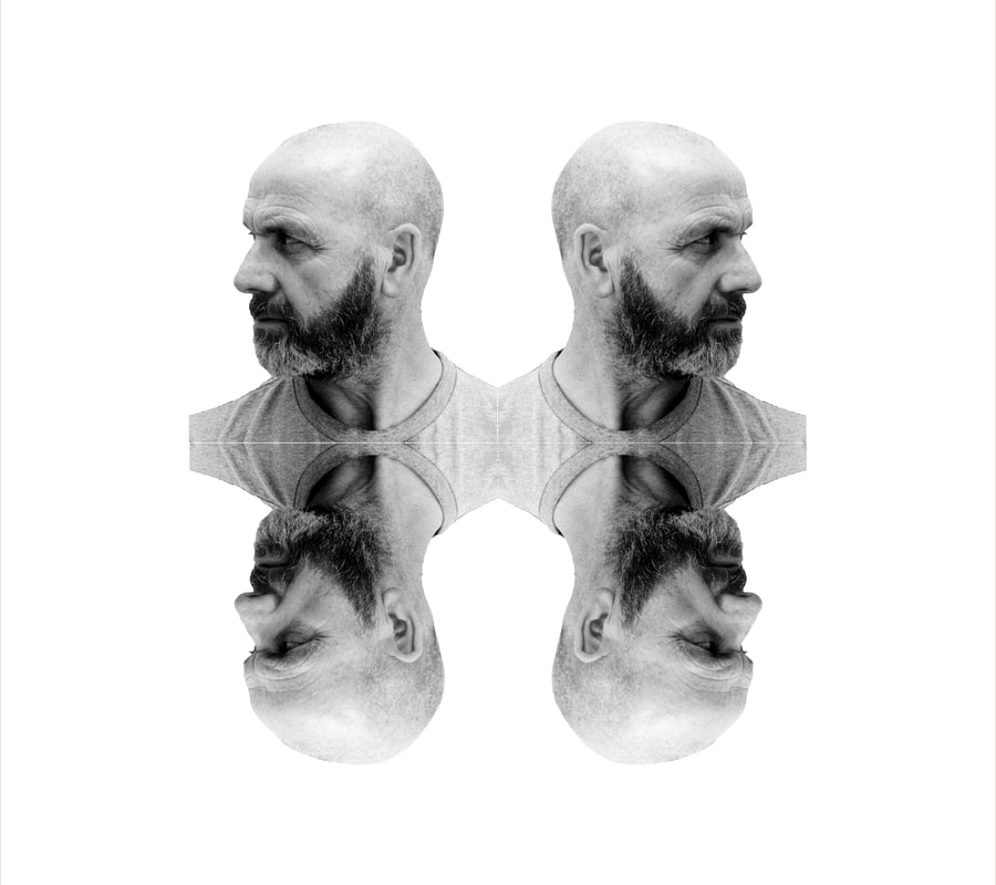
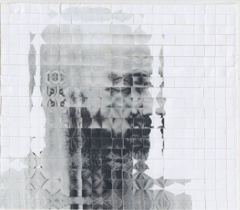
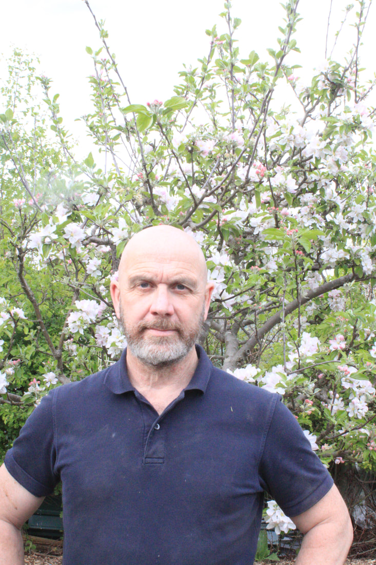
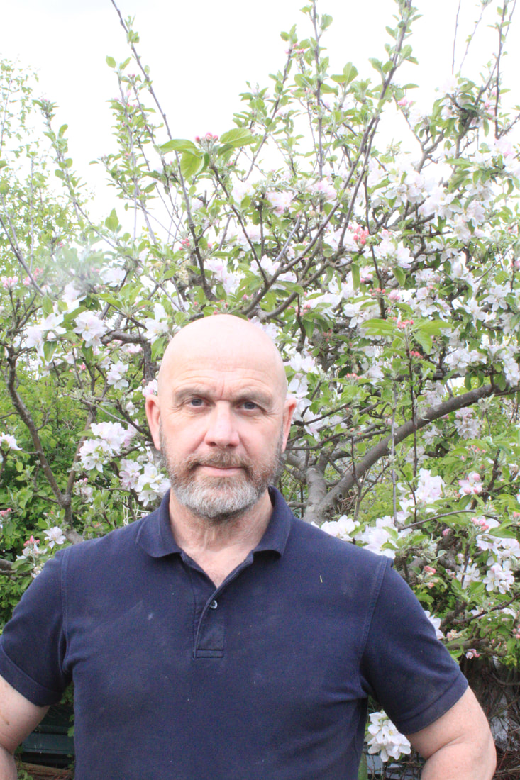
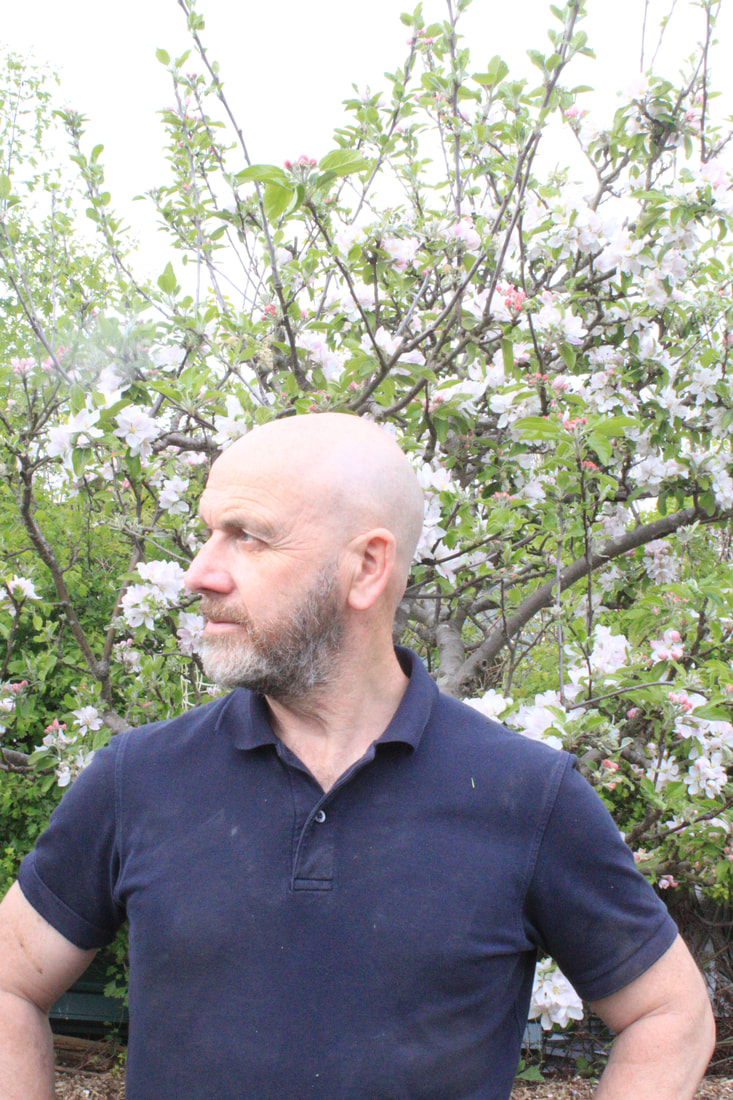
The image below of my dad was really successful. I really liked how although the technique really transforms the original image it is still recognisable as a portrait.
The image below of my dad was really successful. I really liked how although the technique really transforms the original image it is still recognisable as a portrait.
development 8
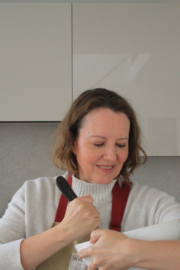
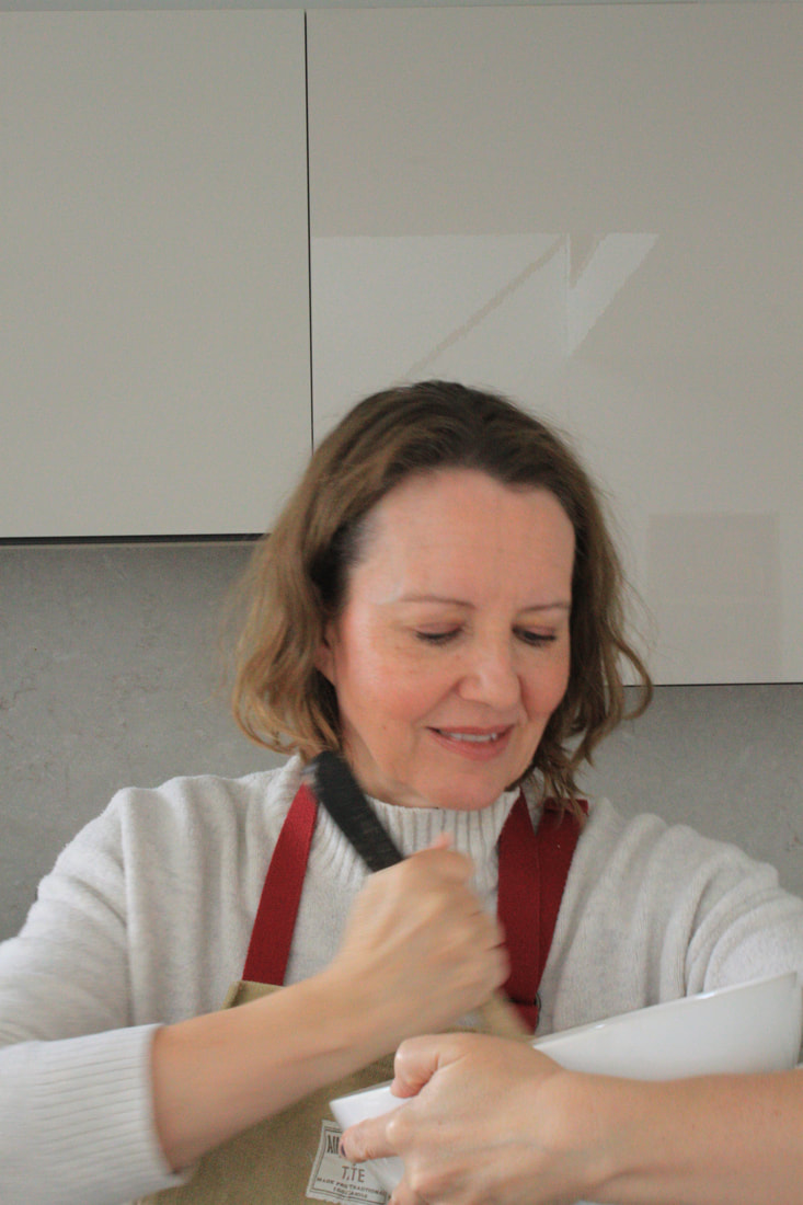
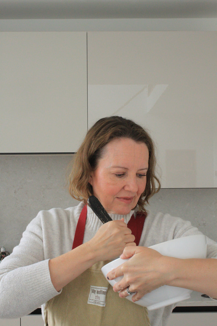
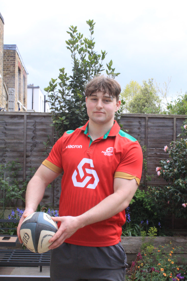
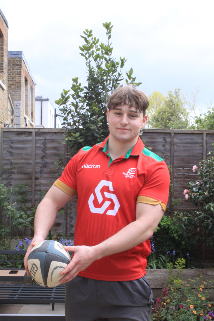
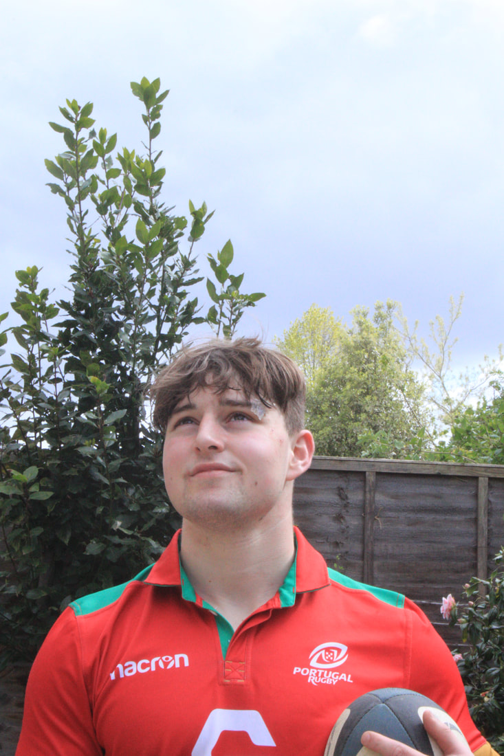
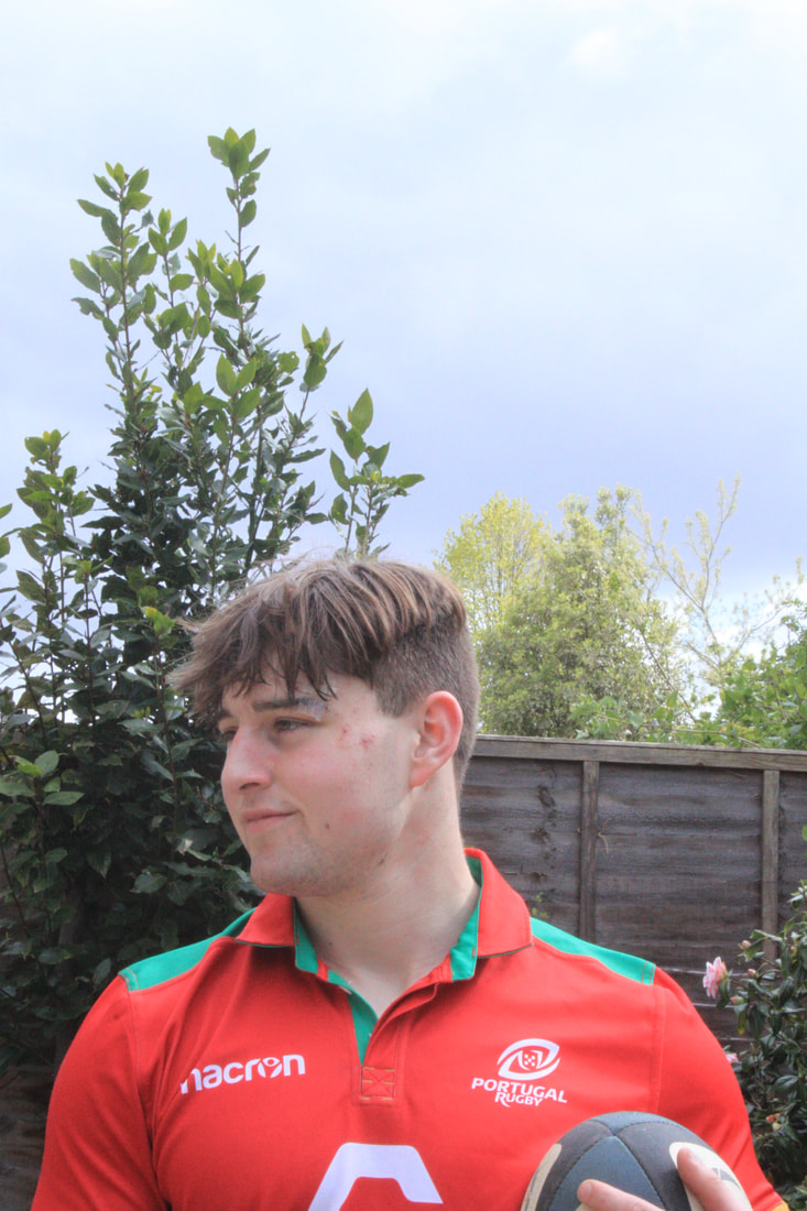
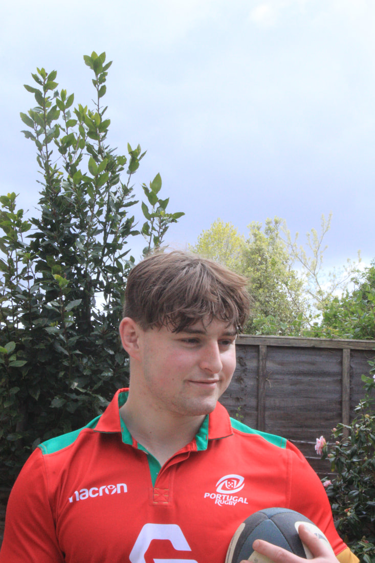
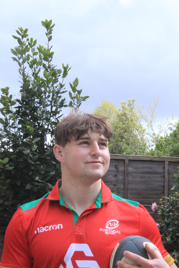
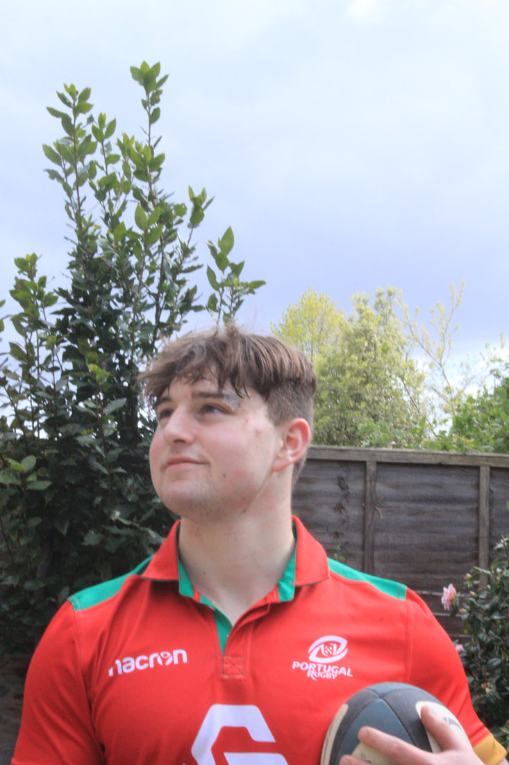
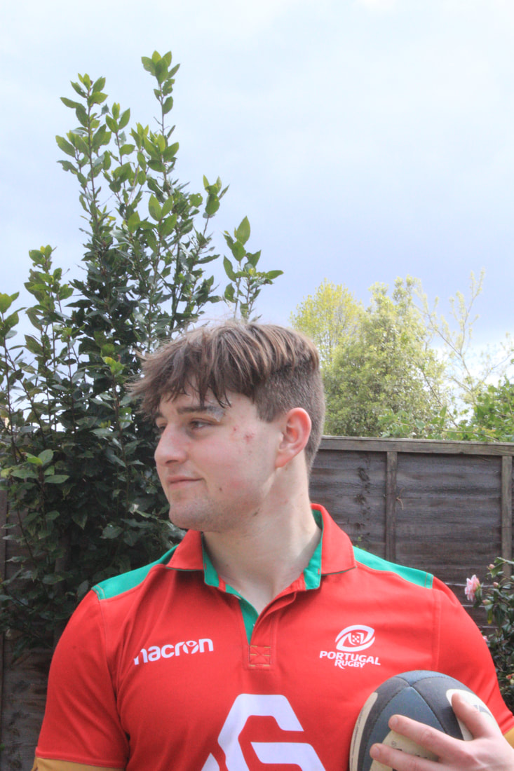
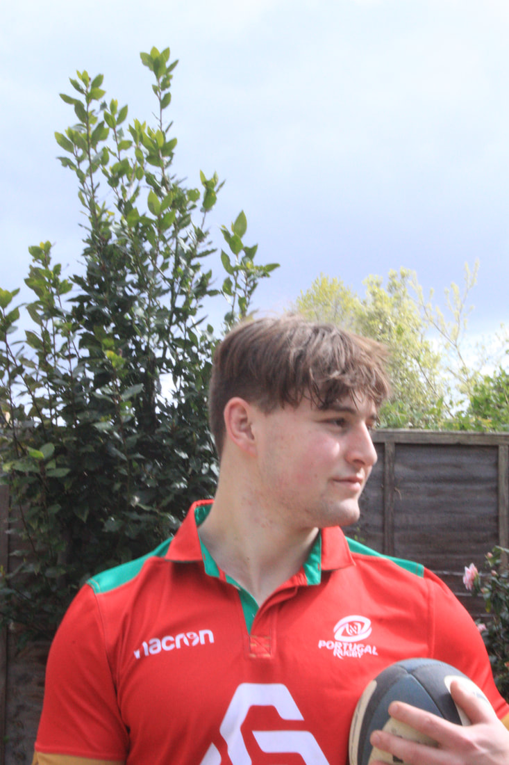
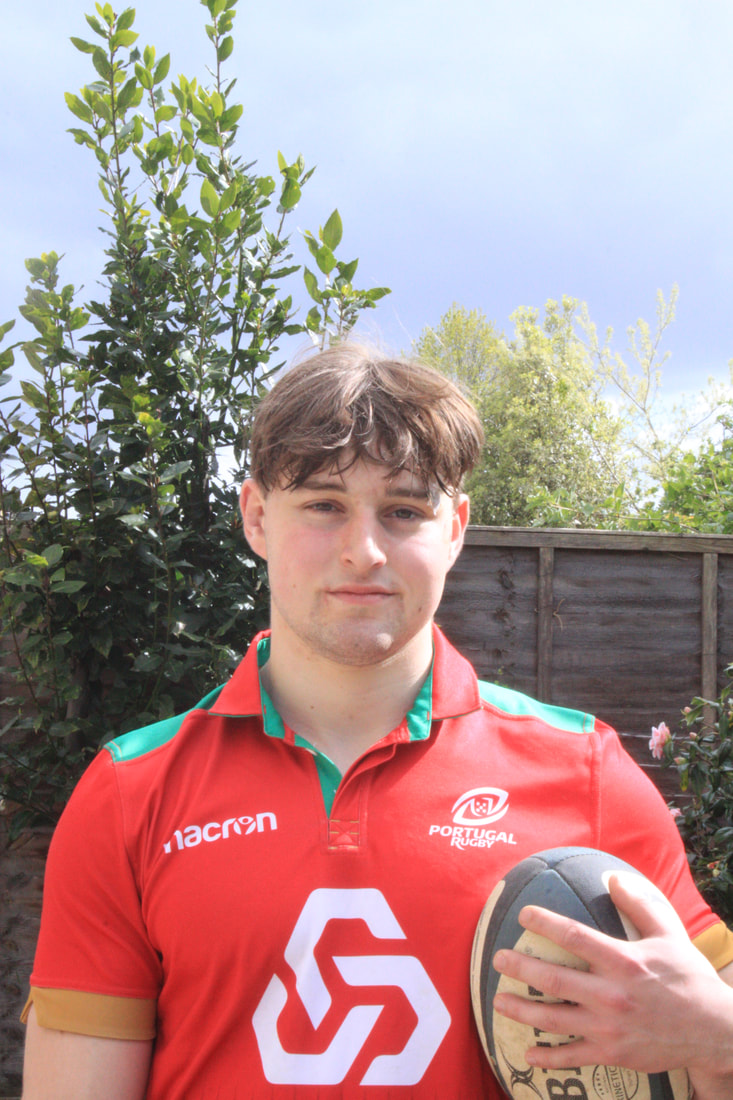
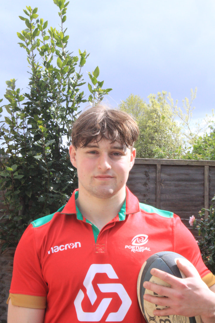
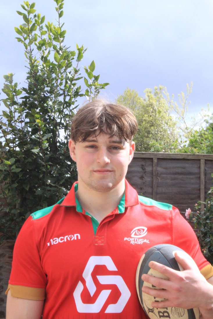
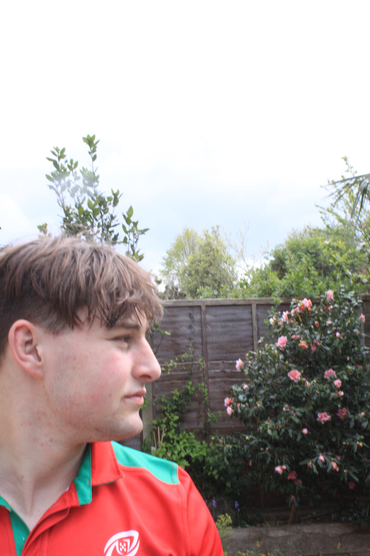
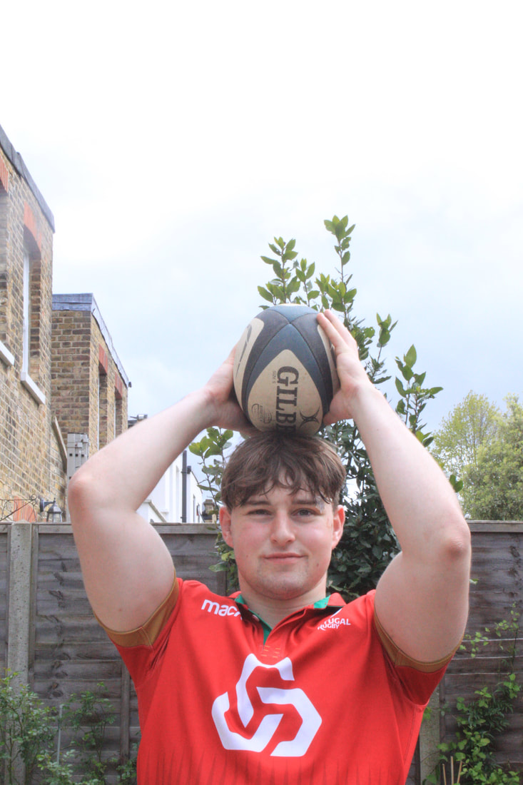
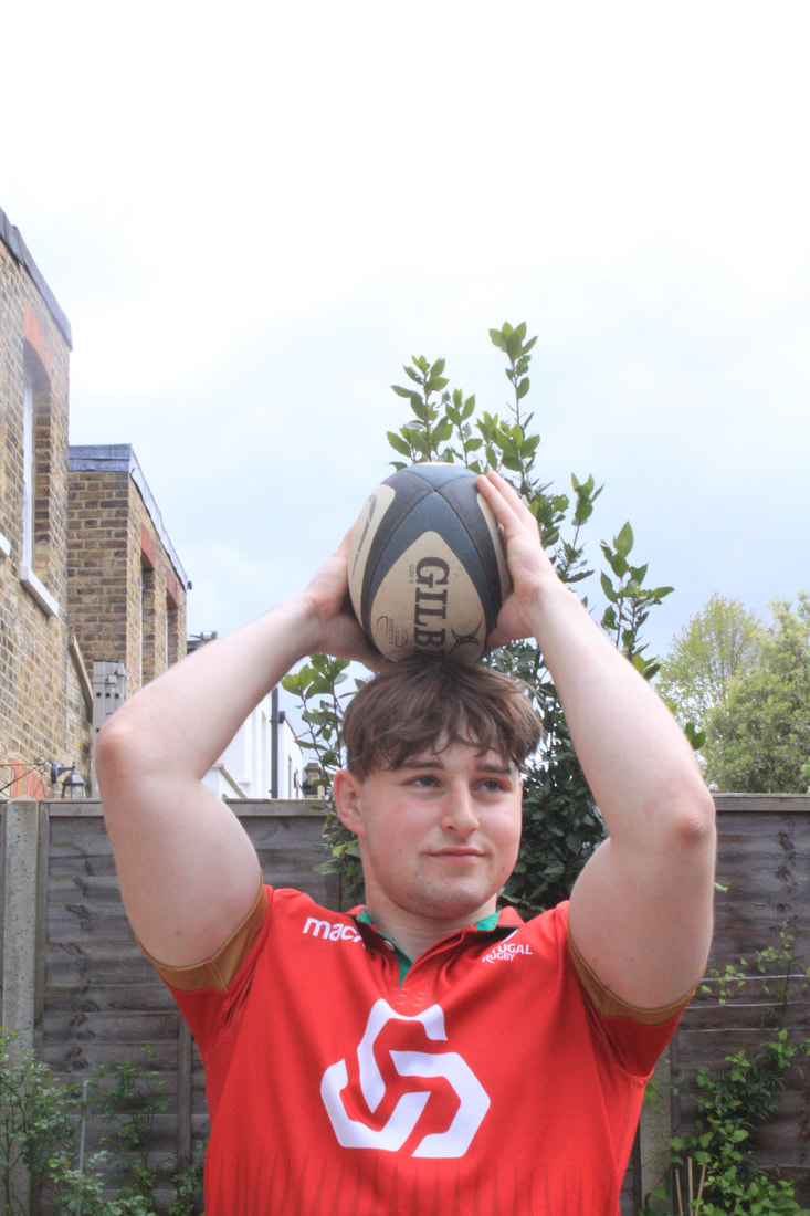
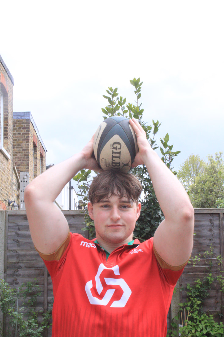
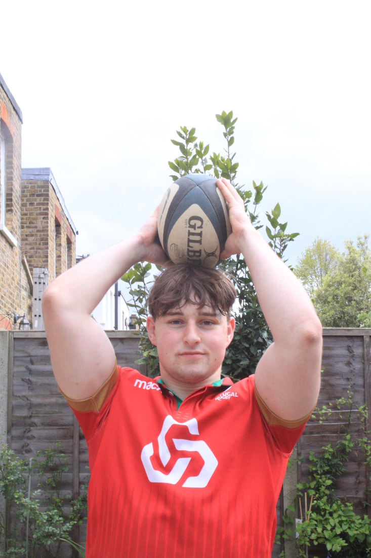
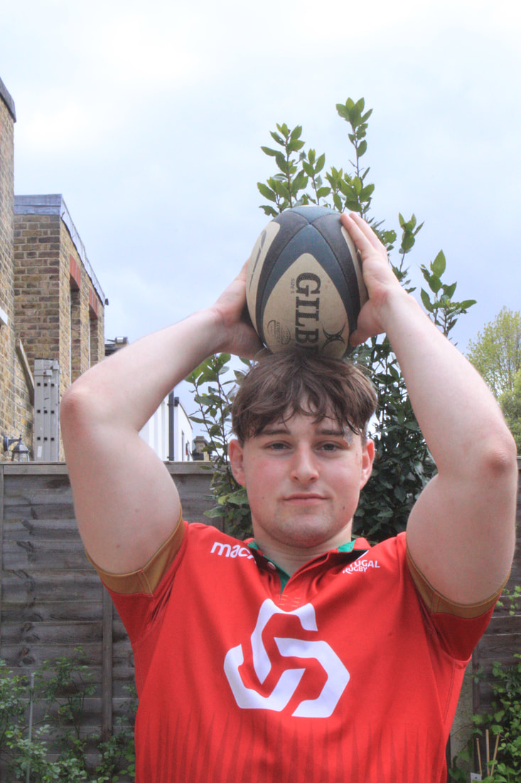
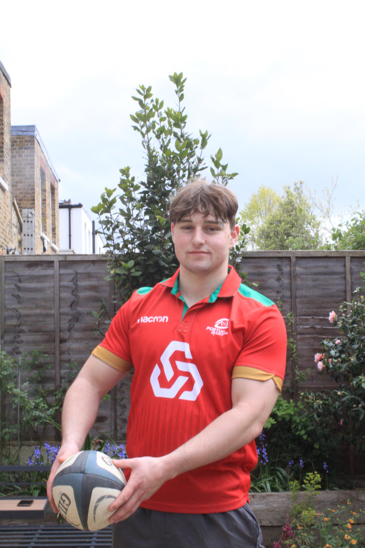
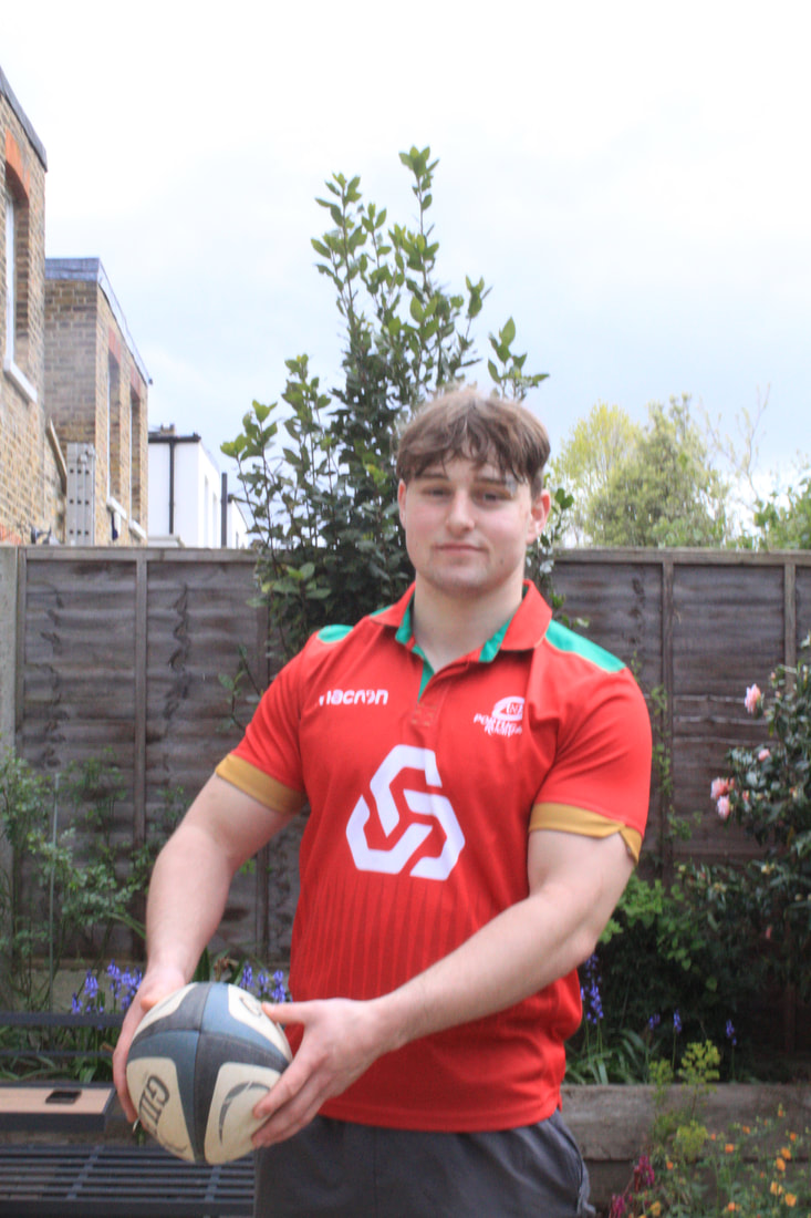
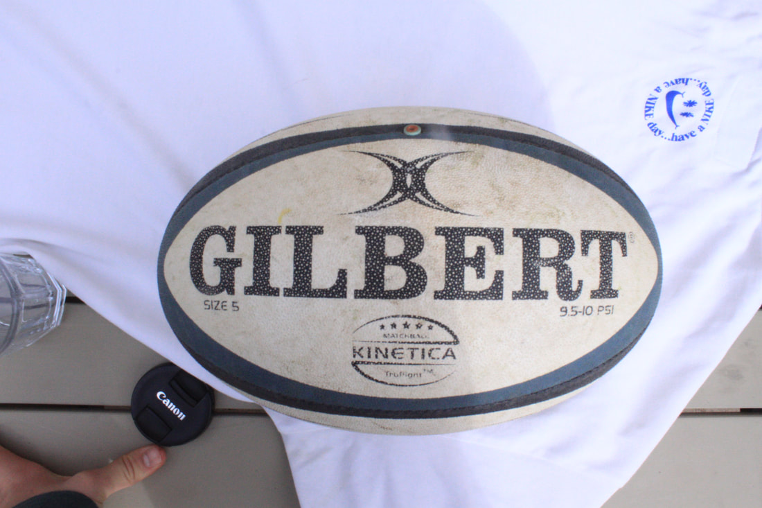
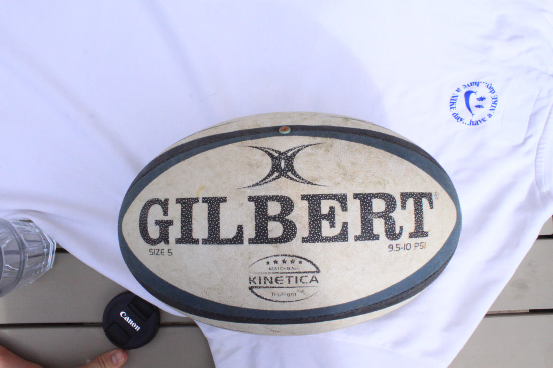
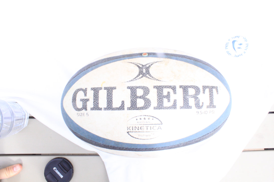
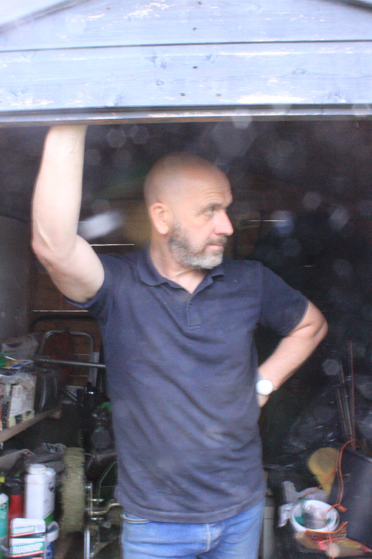
Having looked at transforming portrait images through visual tricks like distortion I wanted to move the content of the portraits on to consider the idea of transformation of the individual. I continued my exploration of the history of portait photography and how it developed over time. I was intrigued by how in the 19th Century the subject would be in a highly staged setting, often a painted backdrop and be holding or surrounded by objects that would reveal something of their status, profession, hobbies or interests.
|
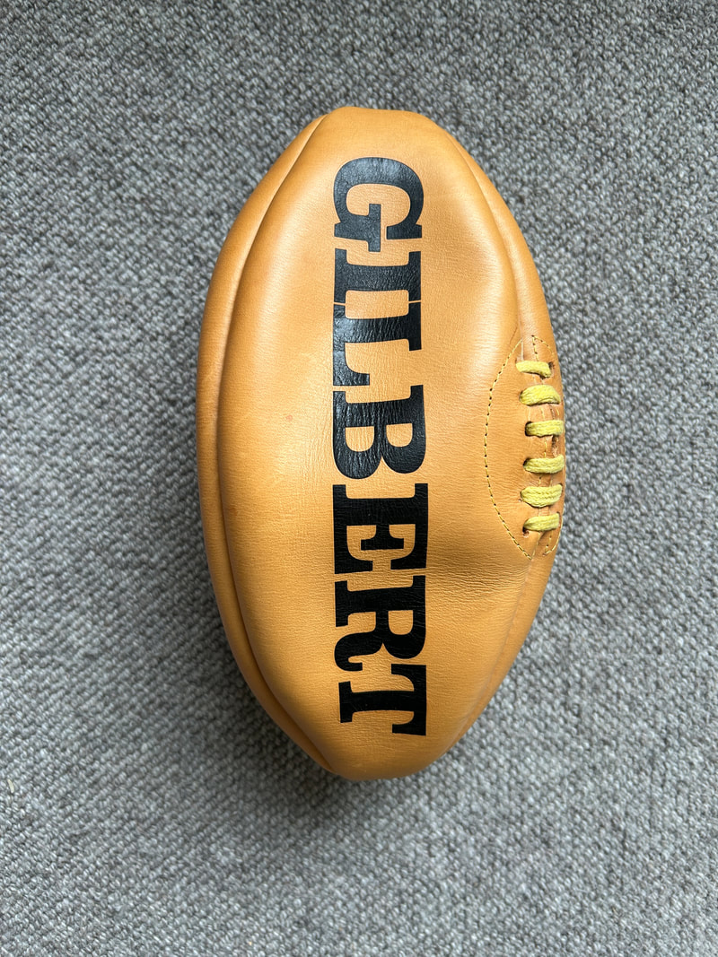
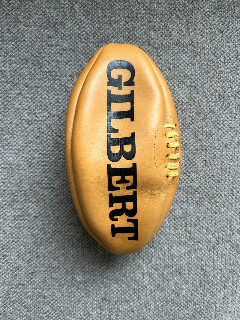
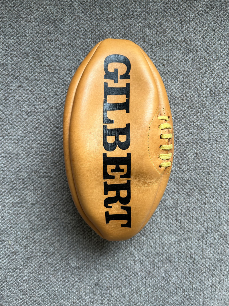
|
|
With this in mind I thought about how I could develop a modern take on this idea. I asked my mum and a close friend to pose for me. My mum baking and Matt, who is rugby mad in his rugby gear. I then took stills of related objects like the rugby ball and baking ingredients in order to create compositions for the development images. I wanted to continue to use a physical process to create these images and to keep the idea of the more complex visual dimension and visual trickery so I decided to do more experiments with paper weaving.
Working in Photoshop i could then bring in each element and cut them out, altering contrast and brightness. Editing the originals and then using coloured backgrounds to tie the pictures together. I really enjoyed using the weaving technique as a means to transform the portrait in this round of work. The weaving didn't always come out as I expected but this made the process of transformation even more relevant to me in the resulting images.
Working in Photoshop i could then bring in each element and cut them out, altering contrast and brightness. Editing the originals and then using coloured backgrounds to tie the pictures together. I really enjoyed using the weaving technique as a means to transform the portrait in this round of work. The weaving didn't always come out as I expected but this made the process of transformation even more relevant to me in the resulting images.
1st images model bakinG: |
1st images baking equipment |


Weaved:
2nd images model rugby: |
2nd images rugby equipment: |
weaved:
I quite like the graphic nature of this image but overall I find it too simplistic. When I attempted to weave the face as well as the background it became too abstract and I wanted to make these more identifiable as the individual.
3rd images model Gaming: |
3rd images gaming equipment: |
Weaved:
Being a very difficult development to complete because of the amount of hands on weaving, I'm very happy with how all the images turned out. Especially the rugby one as originally I had used a white background which just didn't work so I switched to the original background colour of a light green which turned out amazing. Also the transformation aspect of this development was awesome as I was not only weaving but experimenting with the relationship between digital and physical processes and how I could combine them, to transform a person to be surrounded by there hobby, status etc. Next time i would probably experiment with even more weaving techniques to see their transfromation.
development 9
Throughout the developments I have enjoyed experimenting with different film, editing, printing and physical creation of the final image. Using the word transformed as a licence to be a lot freer in the creation of images themselves. Whilst researching different processes that directly alter, transform the original image I came across a print process that I'd never heard of called Gelli prints. I was really taken by the idea of mono prints. The fact that no two mono prints, by definition can be the same seemed so appropriate to the idea of transformed, altering the original every time.
I am also set on the idea of portraiture now as well. Using photoshop to edit and create a portrait that reveals something about the individual, what they enjoy or how they are seen by others.
I am also set on the idea of portraiture now as well. Using photoshop to edit and create a portrait that reveals something about the individual, what they enjoy or how they are seen by others.
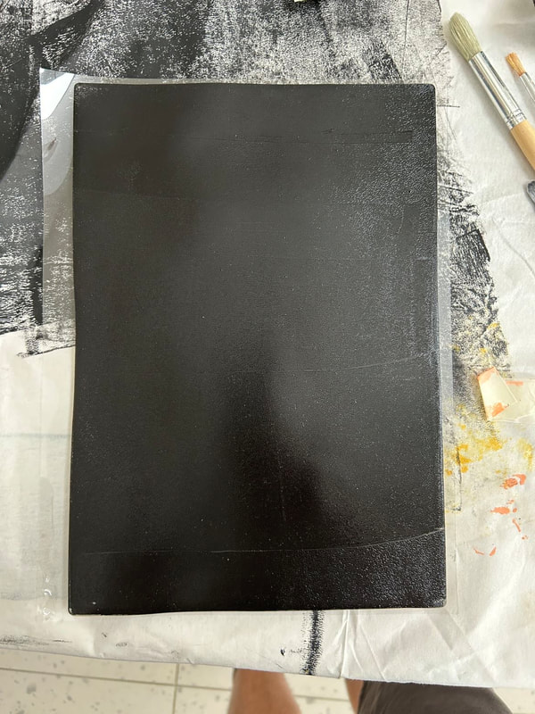
The Gelli Print process:
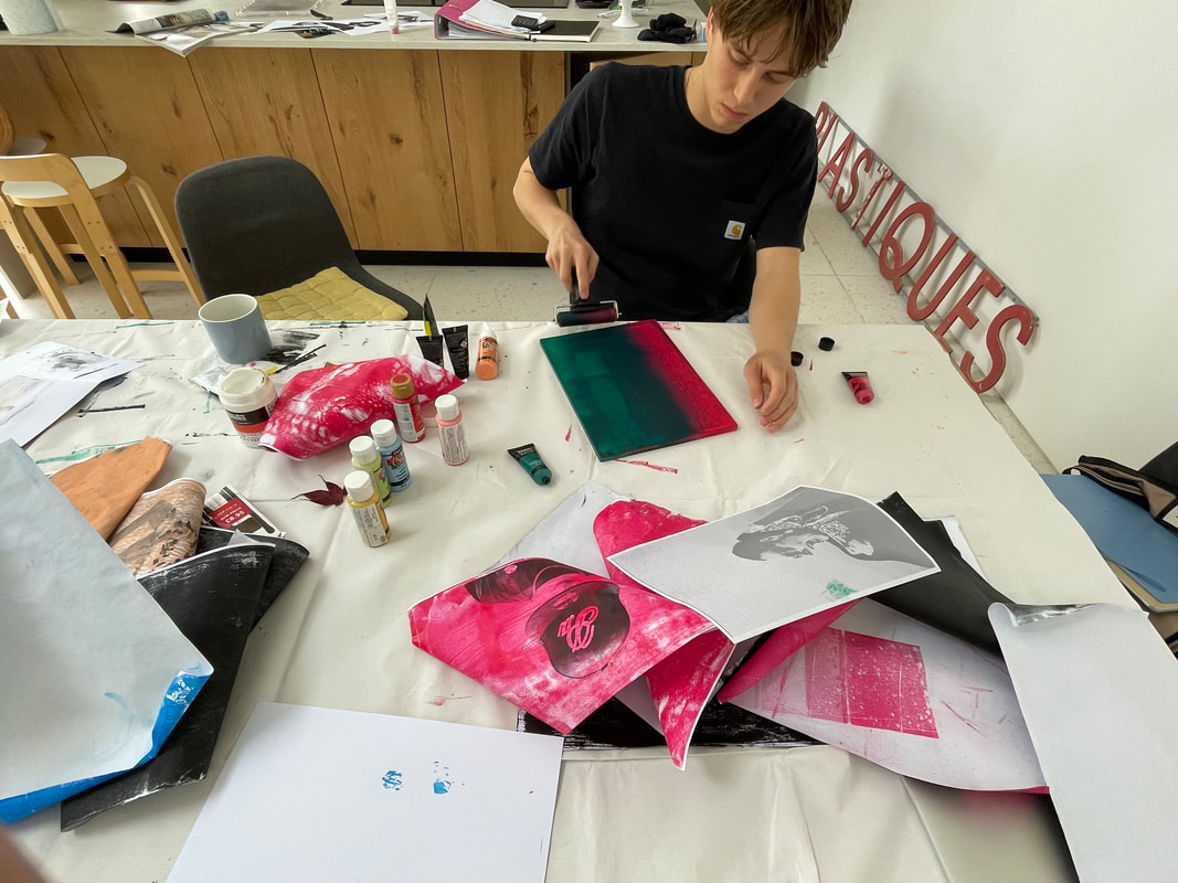
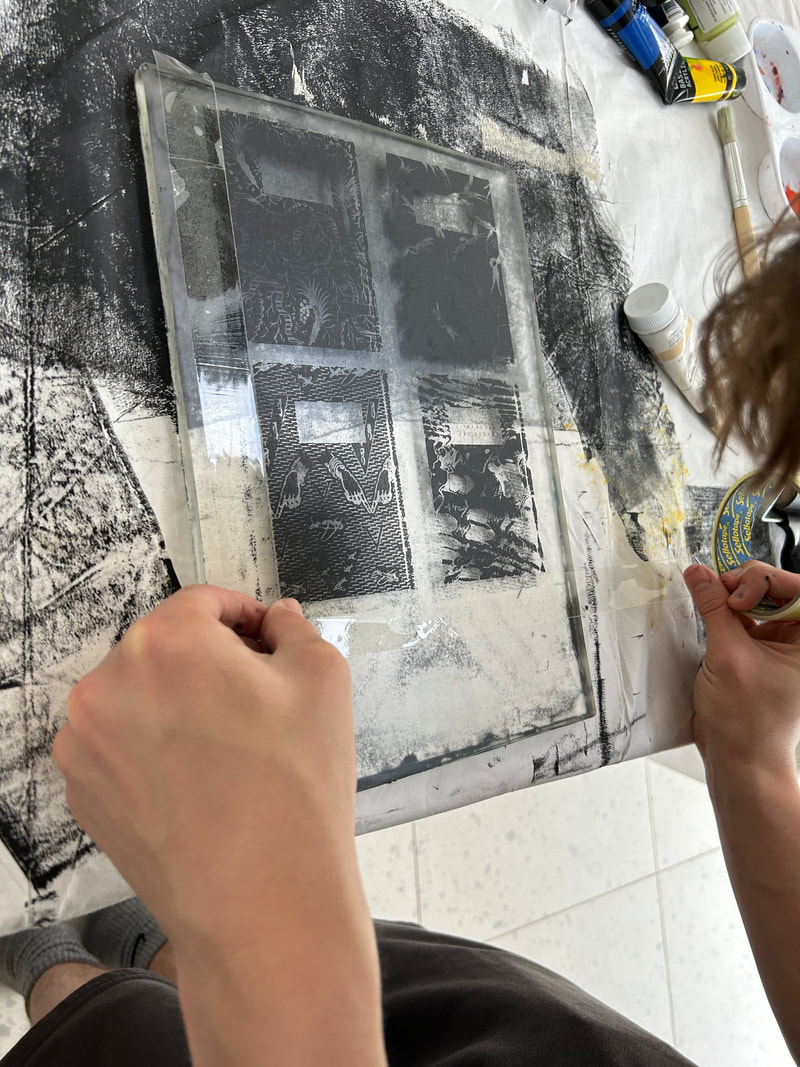
A Gelli Print is created using plates made of a gelatin like rubbery material, they come in a variety of sizes. You can use it over and over again, by washing it each time you use it. You can use all sorts of different mediums to create prints, including stencils, 3D objects and photographs. It works best with acrylic paints rather than inks or dyes that can damage the surface of the plate. Having researched the method and examined work by other artists I was excited about using this method. I tried a variety of different methods to arrive at my final process which I have detailed here. The process has multiple stages and is error heavy.
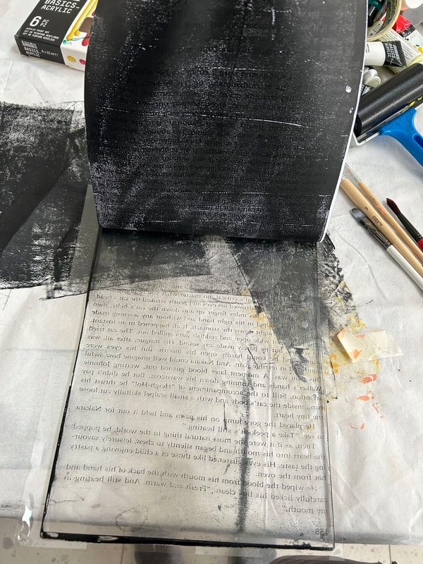
Step 1: Take photographs
Step 2: In Photoshop I then turn the image in to grey scale and then go to adjustments and increase brightness and contrast and use threshold to increase the depths of the black areas, producing a hard contrast in the image. I then separate out individual elements to create a layers that will be printed separately and then layered in stages on the Gelli Plate
Step 3: Print the layered images on separate pieces of paper on a Laser Printer (I tried ink jet but it didn't work). The images need to be printed in RGB in order to get the correct depth of ink on the page - printing black and white doesn't result in enough ink on the page and therefore not enough for the paint to adhere to when you get to the Gelli Plate. Once printed the images are then fed through the printer again to get a second layer of ink on the paper.
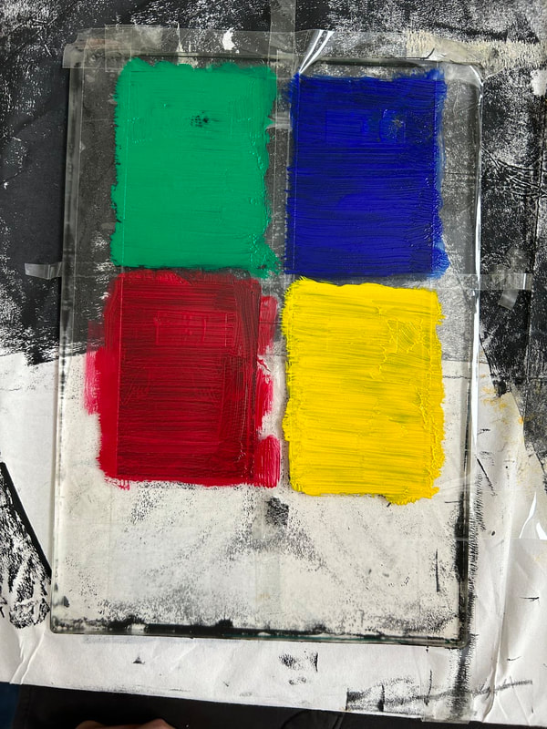
Step 4: Squeeze black acrylic paint onto the Gelli Plate and move around to create a think layer over the whole A4 plate using a roller.
Step 5: Apply the first layer of the imagery, print side down on to the painted Gelli Plate and rub with hands for 12 seconds in order for the paint to adhere to the black printed areas of the paper.
Step 6: Peel off the paper, leaving the image from the page on the Gelli Plate in black paint
Step 7: Clean any areas of excess paint by dabbing with sellotape
Step 8: Select colours and paint in areas of imagery with acrylic paint. Leave to dry or use a hairdryer for speed.
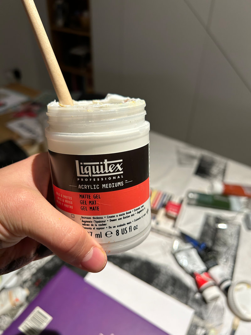
Step 9: Apply a thin coat of Liquitex Matte Gel using a roller. This helps the paint adhere to the Bristol Paper in the next step
Step 10: Before the Liquitex dries place the Gelli Plate down onto Bristol Paper. Place several heavy books on top of the plate and leave for 30-40 mintues.
Step 11: Carefully peel the paper off the Gelli Plate to reveal the painted image on the paper.
I then repeat Steps 4 through 11 for each of the different layers that make up the image.
It took me many attempts and failures to get to this process, each time I tried something I learned something new about the technique. Even once I had worked out how the process would work, failures would regularly happen part way through the process. For example, sometimes at Step 4 the image wouldn't adhere properly and I was left with just black smudges on the Gelli Plate and so had to wash the plate and print again. On several occasions I used too much Liquitex and the paper stuck to the plate and pulled off the imagery. If this happened on the final layer of imagery it was very frustrating as it meant repeating several steps.
Step 1: Take photographs
Step 2: In Photoshop I then turn the image in to grey scale and then go to adjustments and increase brightness and contrast and use threshold to increase the depths of the black areas, producing a hard contrast in the image. I then separate out individual elements to create a layers that will be printed separately and then layered in stages on the Gelli Plate
Step 3: Print the layered images on separate pieces of paper on a Laser Printer (I tried ink jet but it didn't work). The images need to be printed in RGB in order to get the correct depth of ink on the page - printing black and white doesn't result in enough ink on the page and therefore not enough for the paint to adhere to when you get to the Gelli Plate. Once printed the images are then fed through the printer again to get a second layer of ink on the paper.
Step 4: Squeeze black acrylic paint onto the Gelli Plate and move around to create a think layer over the whole A4 plate using a roller.
Step 5: Apply the first layer of the imagery, print side down on to the painted Gelli Plate and rub with hands for 12 seconds in order for the paint to adhere to the black printed areas of the paper.
Step 6: Peel off the paper, leaving the image from the page on the Gelli Plate in black paint
Step 7: Clean any areas of excess paint by dabbing with sellotape
Step 8: Select colours and paint in areas of imagery with acrylic paint. Leave to dry or use a hairdryer for speed.
Step 9: Apply a thin coat of Liquitex Matte Gel using a roller. This helps the paint adhere to the Bristol Paper in the next step
Step 10: Before the Liquitex dries place the Gelli Plate down onto Bristol Paper. Place several heavy books on top of the plate and leave for 30-40 mintues.
Step 11: Carefully peel the paper off the Gelli Plate to reveal the painted image on the paper.
I then repeat Steps 4 through 11 for each of the different layers that make up the image.
It took me many attempts and failures to get to this process, each time I tried something I learned something new about the technique. Even once I had worked out how the process would work, failures would regularly happen part way through the process. For example, sometimes at Step 4 the image wouldn't adhere properly and I was left with just black smudges on the Gelli Plate and so had to wash the plate and print again. On several occasions I used too much Liquitex and the paper stuck to the plate and pulled off the imagery. If this happened on the final layer of imagery it was very frustrating as it meant repeating several steps.

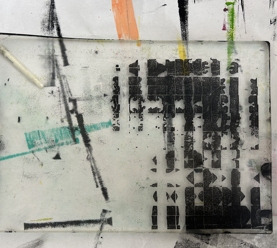
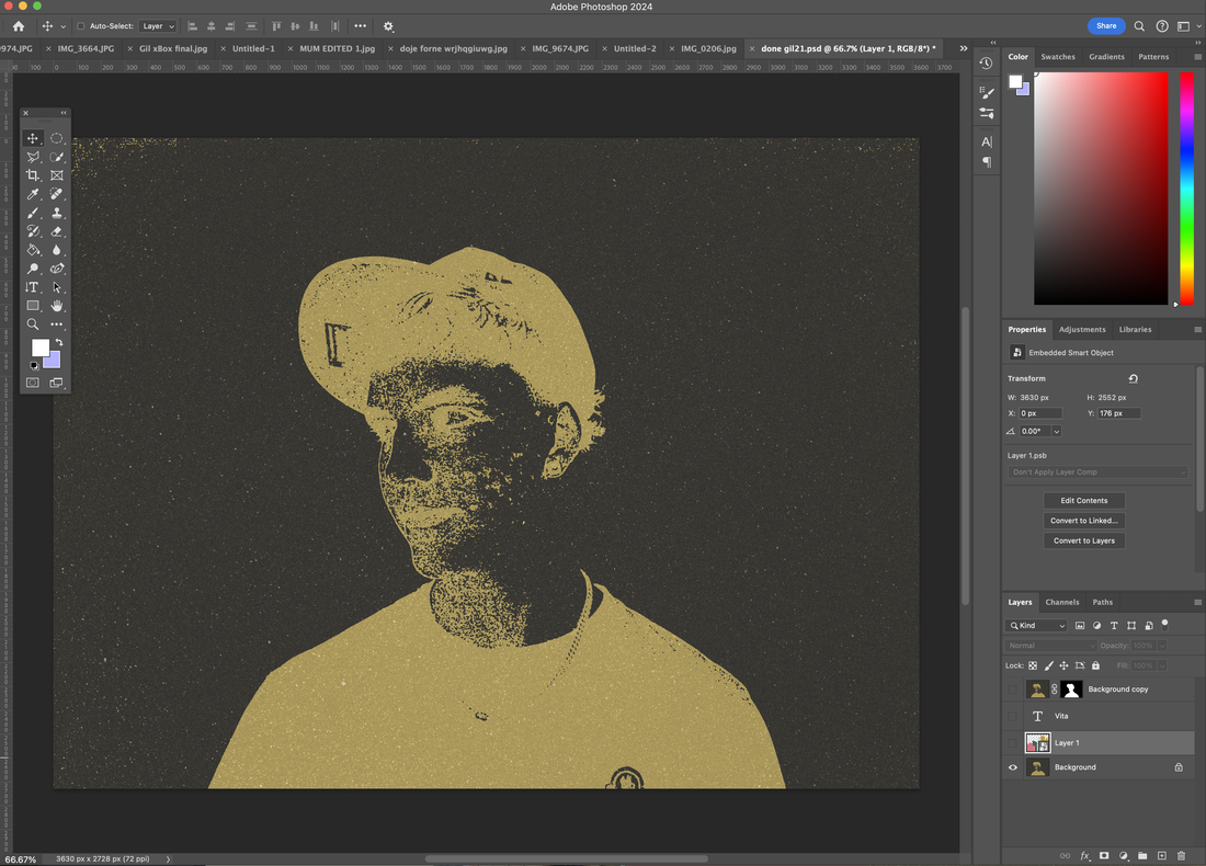
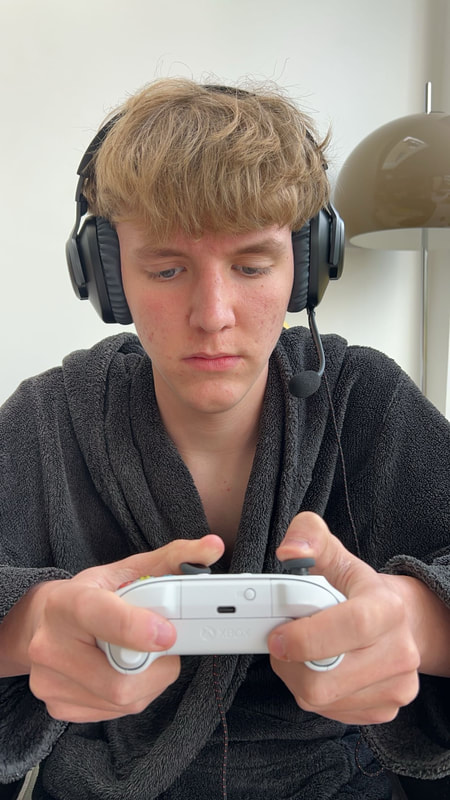
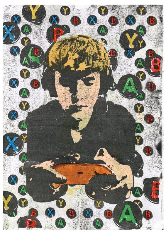
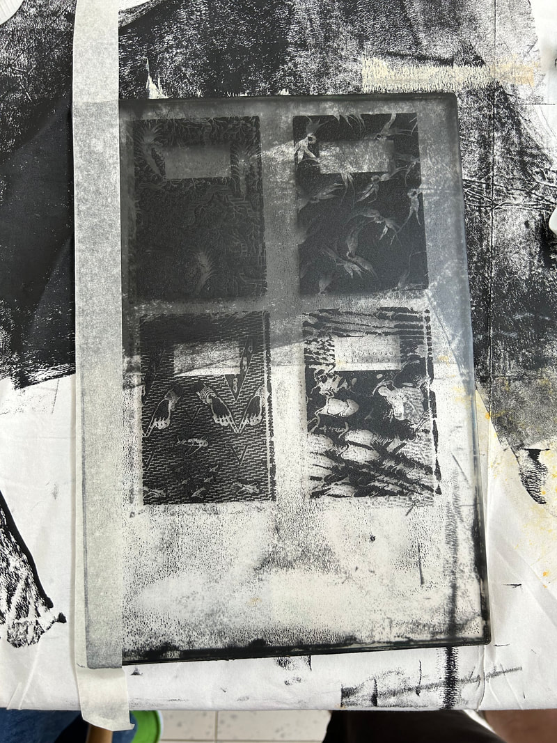
1st images gelli print:
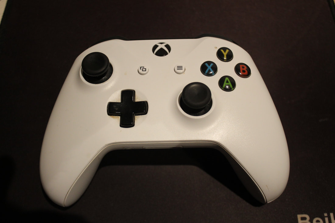
For the first Gelli print I used the same image that I had created for the weaving under gaming but edited so that it could be used in Gelli Print. To have an image ready for gelli print it needs to be a high contrast image, I used threshold to acheive this but you can also just turn the contrast up on an image to get the same sort of effect and result. However the threshold worked perfectly for this print because all I needed was black and white for example the white part of the X-Box controller button to be coloured in.
Image made in photoshop ready to print and to be transferred onto Gelli Plate:
Image made in photoshop ready to print and to be transferred onto Gelli Plate:
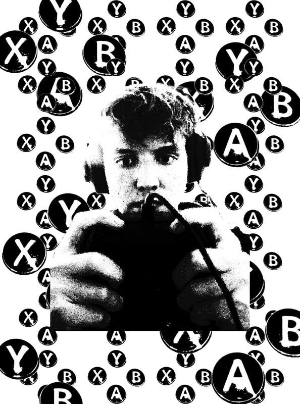
Now to create the complete Gelli Print I needed to select the colours to use. For this specific Gelli Print the whole concept is gaming so i looked up the main colours on an X-Box contoller d-pad and used those colours on the letters on the buttons. I decided to leave the background white so that the buttons would stand out more behind the face. Then i painted the face in a beige colour and the hair in a blonde colour to give a more realisitic view.
2nd images gelli print:
The second Gelli Print I wanted to use the exact same style of image that I had previously used for the rugby response. To do this I kept the original and just applied threshold to both the rugby balls and the models face.
Image made in photoshop ready to print of to be transferred onto Gelli Print:
Image made in photoshop ready to print of to be transferred onto Gelli Print:
|
I've attached a short film to show how the image is revealed after being pressed for at least 45 minutes under heavy weight, in this case a couple of cook books:
|
| ||
Overall I loved how these gelli prints tuned out compared to the development before when I was weaving the exact same images. Using the exact same images that I had created in the gelli print really shows you the difference the physical processes can make. Furthermore being a very long process I feel very awarded when each one gets finished. Having now experimented with gelli printing I want to keep using them for my final piece as they open so many doors for transforming an individual into an environment of their hobbies, status etc to express how a person can be multi -faceted in their everyday life which you may not seem on the surface.
final piece
Although I am no expert at the Gelli Print technique I really like the technique and what it offers as another dimension to the transformation of my images and so have used this in my final piece. The role of portraits got me thinking about how people like to be perceived, how they want to be seen or indeed are seen by others. This got me thinking about how one dimensional one portrait can be. A bit like the queen on a stamp or old portraits of noblemen and women forever fixed in one pose and one role. People are multifaceted in real life, in fact we are constantly transforming ourselves from one role to another, pupil, son, mate, footballer, party goer etc etc. Richard Avedon who is recognised as one of the greatest portrait photographers of our age said "A portrait is not a likeness. The moment an emotion or fact is transformed into a photograph it is no longer a fact but an opinion. There is no such thing as inaccuracy in a photograph. All photographs are accurate. None of them is the truth" I like the ambiguity in this thought and how we can be one thing and many things at the same time. I want to use these Gelli Prints to transform the person into environments of their chosen activity one by one.
For my final piece I chose to create three separate portraits of three different people photographing them doing three things they enjoy. Three triptychs that show how we transform ourselves throughout our daily lives and yet take those transformations for granted.
I had a short interview with each person asking them about what they themselves enjoy doing in their spare time to try and understand what is important to them as individuals. What makes them feel good and what gives them energy. I then chose three of the answers for each person and did separate photo shoots of each past time with them. I took a lot of images of them together with stills of associated objects in order to have enough material for each print.
The next stage was exploring compositions which I did within photoshop, along with experimenting with the Gelli Print process.
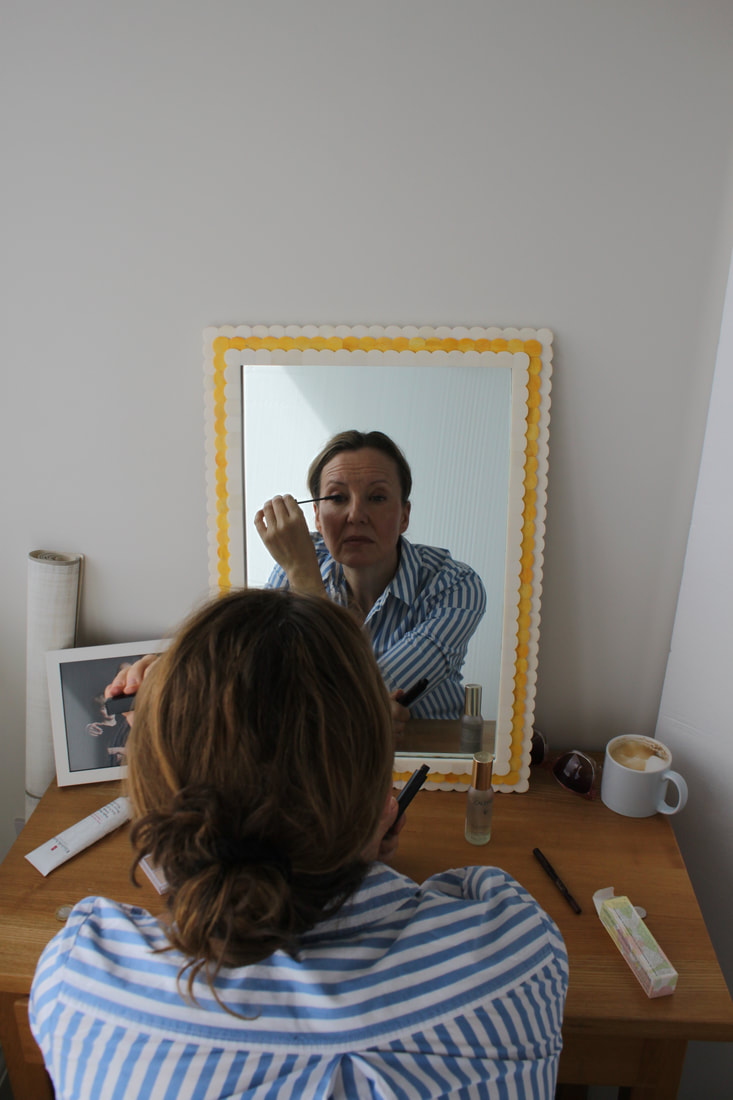
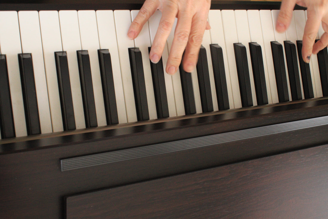
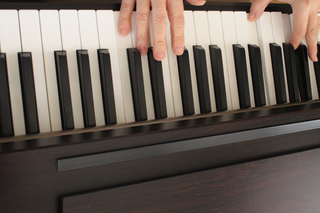
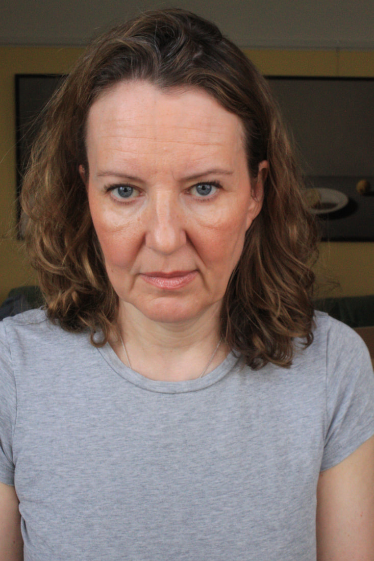
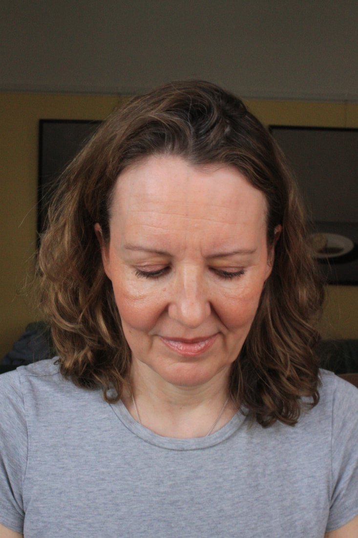
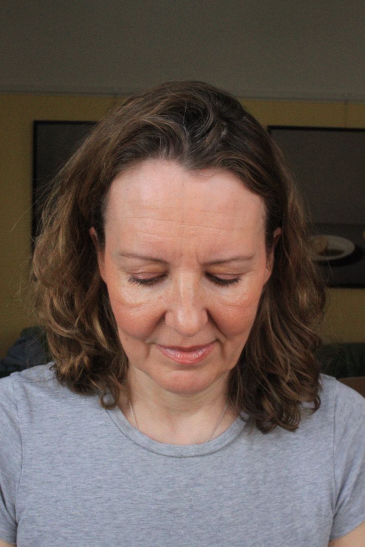
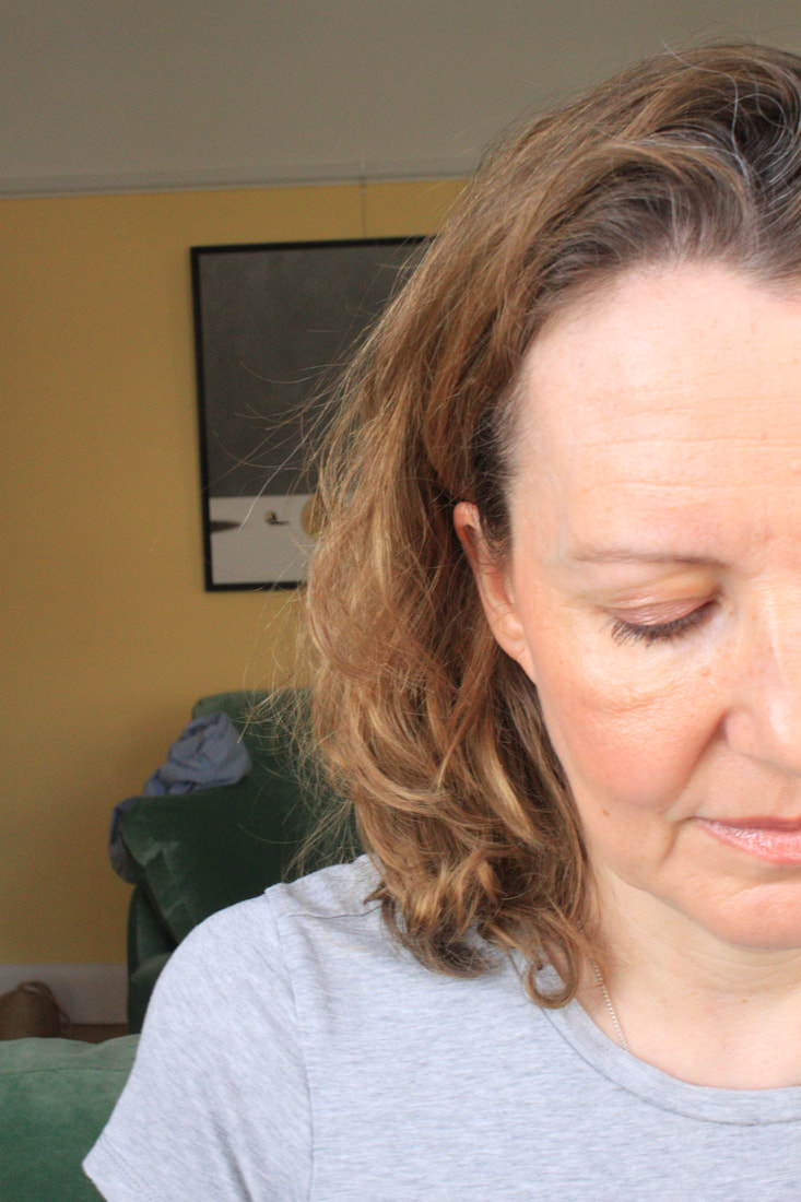
1st multifaceted model images makeup, reading, music:
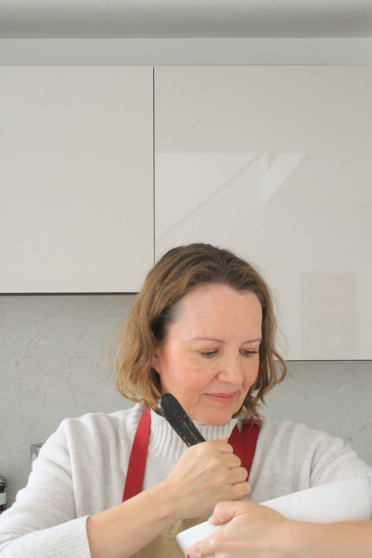
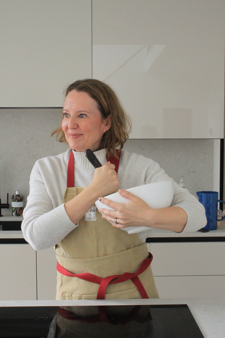
My first model to photograph was my Mum, I asked her want 3 things she does on a day to day basis and if any of the activities define her as a person. She responded with reading, playing music and applying makeup. Reading was a large part of her life and she has indulged in hundreds of books in that time, therefore fitting perfectly for the idea of this piece. Playing music is also something my mum does alot, mainly the piano so I also set about photographing her playing the piano. Lastly makeup was her last chosen activity, applying makeup is something my mum said she has done all her life getting ready for events or going out for dinner. With these 3 activities chosen I set about photographing each activity and designing each Gelli print.
|
Model doing Makeup:
|
Makeup objects/environment:
|
|
|
|
|
Edited images of model doing makeup for gelli print:
For the gelli print transfer to work I needed to up the contrast of the chosen image as much as possible. To do this I used the threshold technique ( edit - adjustments - threshold ), and contrast ( edit - adjustment - contrast ) for the best result. Having the image black and white is also another important factor as the acrylic paint only sticks to the black areas and doesn't stick to the white part, so whatever part of your image is black will stay. Therefore I needed to choose the right amount of black compared to white so that an image is noticeable.
|
Edited images of makeup objects/environment for gelli print:
The same goes for my chosen images, I needed to up the contrast as much as possible. Then use threshold to create a dense contrast with very little tone.
|
Chosen face and objects combined ( layered ) to create environment:
This was the background I created for the makeup gelli print. My idea was to create a frame around the face of the model, so I edited 4 different lipsticks to put around the edge of the image and the 1 other makeup utensil in the corner. Making sure that I chose the right amount of black and white so that i could colour in the lipstick in my chosen colours.
final gelli print of makeup:
My chosen colours before I made the Gelli Print where red for the lipstick ends and gold + silver for the case and then a beige colour for the blush tool with a green handle. I also decided not to colour the background as I wanted the colour of the object to stand out as much as possible as a frame. After transferring the lipstick frame on the Bristol paper ( special gloss paper ), I then transferred the models face on the Bristol paper, however I felt that is was a bit empty in the middle so I decided to place a large light pastel orange in the middle to fill the space.
Overall, being my first gelli print under my final piece, I am very pleased with how it turned out. The colours perfectly complemented each other and present the idea of 'makeup' perfectly. I think that just by presenting one Gelli Print you can't grasp the idea that I'm trying to present.
Next gelli print images:
For the next section the activity is reading, so I photographed my Mum in the action of reading and also objects such as books and pages out of a book.
|
Model Reading:
|
Reading objects/environment
|
|
Edited images of model reading for gelli print:
For the images on the right and middle I used the halftone pattern ( filter - filter gallery - halftone pattern, select dot ) to add more texture to the face.
|
Edited images of reading objects/environment for gelli print:
|
Chosen face and objects combined (layered) to create environment:
After combining all of the layers ( books, pages, model ) I created this environment to present the action of reading as best as possible. I enlarged the books and also the writing behind it so that you are even more aware of whats going on in the image.
final gelli print of reading:
For the Gelli Print i want to really push the idea of reading into the Gelli Print. To do this I used both book covers and pages out of a book. I decided to have the page of a book as the backgroung covering the whole A4 sheet and giving it a neutral book cover so that it feels more realistic and allows for the rest of the added objects and of the model to be in a more drastic colours.
Overall I am very pleased with the final outcome of this Gelli print, I think it perfectly depicts the activity of reading, for example my mum reading and the pages out of the a book a the background perfectly work together. Also the words finding there way out of places such as on the outside of the book my Mum is holding My mum always has books waiting to be read hence the multiple book jackets. More detail in the face may have helped, particularly as she has such a serious face when reading. I really like how the edges of the print have a torn look about them too, imagining old battered pages of manuscripts.
Gelli Print process for final piece:
Next Gelli Print images:
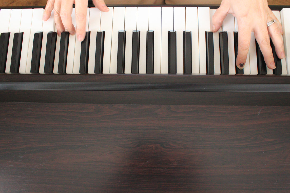
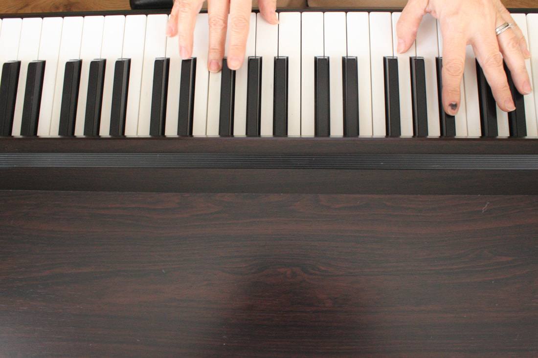
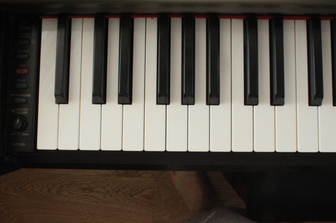
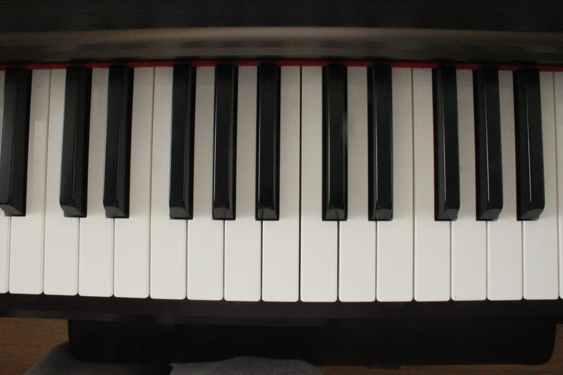
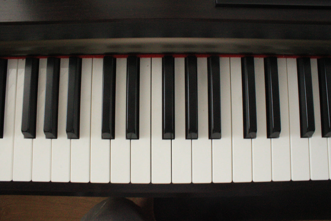
For the next section the activity is playing music (piano) , so I photographed my Mum in the action of playing the piano and also objects that are surrounded with the idea of playing music such as piano keys, CDs and musical pages.
|
Model playing Music:
|
Music objects/environment:
|
|
Edited images of model playing piano:
|
Edited images of music objects/environment for Gelli Print:
|
Chosen face and objects combined (layered) to create environment:
For this gelli print template I wanted to really express the idea of music. To do this i combined all of the objects of music that i had and arranged them on the A4 sheet in photoshop. I really like how the cds turned out and also the piano keys which are as clear as day.
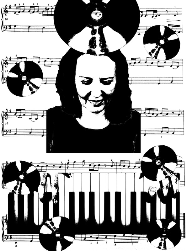
Final gelli print of music:
For making the Gelli print I wanted to use a mixture of pastel and shiny acrylic paints. I decided to paint the background a teal blue, making sure to leave a gap where the face is with sellotape, and then paint the CDs a mixture of some silver and some gold. I also wanted to leave the piano keys white to give a more familiar feel, so i also sellotaped the area around the piano keys. Overall this print used 3 layers ( face + piano keys, music book, CDs)

I am really happy with this gelli print and it might be my favourite so far. The colours perfectly match each other and i think it portrays the idea of music really well. I hope combining this with the other prints of this model work well in conveying the idea of the multi-faceted nature of a person.
the 3 gelli prints combined to present the multifaceted nature of a person:

|
|
|
I loved how these 3 Gelli Prints turned out, I think that you need to see the rest of the models prints as well to see the whole idea of how people are multifaceted in real life, and the way we are constantly transforming ourselves from one role to another. I think I transformed the person into that environment through the use of Gelli Prints technique, colour and moving parts around perfectly to show that idea of people being multi-faceted.
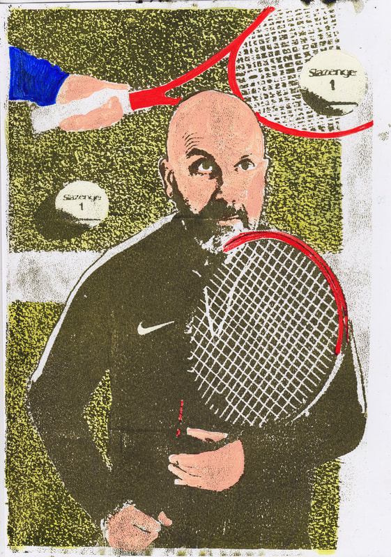
2nd multifaceted model images ( tennis, pub, allotment ):
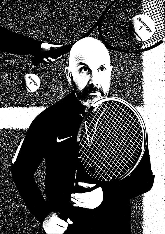
My second model was my dad, a man of many different hobbies, to which he chose tennis, being down at the allotment and I suggested the pub which he was only too happy to agree to.
|
Tennis model images:
Tennis model images ready for Gelli Print:
|
Tennis object images/environment:
Tennis objects/environment ready for Gelli print
|


Chosen face and objects/environment combined (layered) for Gelli Print:
Designing the composition for this Gelli Print I wanted to make it seem as if my Dad is playing tennis, to do this I made sure that the image i took of my Dad playing tennis was looking up to the side. Then I placed another image of a hand holding a tennis racket and a ball in the middle.
Final gelli print of tennis:
Making this Gelli print was difficult because of the amount of layers it invovled and there was also some failures with the final layer sticking to the gelli print when I tried transferring it onto the Bristol paper. I used green as the main colour both for the tennis ball and the astro turf for the ground.

Being the most difficult Gelli Print to make so far I'm very happy with how it turned out and it was well worth me redoing the image. When you compare the first attempt to the second the second attempt is much sharper with better depth of colour. I think the transformation of this print was great, the environment is great as it seems as if my dad is actually playing a tennis game.
Next Gelli Print images:
For the next Gelli Print the activity is hanging out at the pub, so I photographed my dad in the pub having a beer and also all of the objects that are present in the pub for example crisp packets, menus etc.
|
Pub model images:
Pub model images ready for Gelli Print
|
Pub objects/environments:
Pub objects/environment ready for gelli print:
|
Chosen face and objects/environment combined (layered) for Gelli Print:
For this gelli print I wanted to fill up the whole A4 sheet. To do this i edited each individual beer sign and adjsted the right amount of black to white ( threshold )so that the colour is presented niceley ( black sticks white doesn't ) and then placed them all over the background. I also used a mixture of ' pubby ' colours such as red, gold and silver.
fINAL GELLI PRINT OF PUB:
This images is so far my least favouirte, hwowever i think its a perfect envoirnment to present the action of hanging out at the pub. Next time i would probably be more carfeull in my colour selection for example using a dark green or navy i think would be better to represent the experience of a pub
Next gelli print images:
|
Model in allotment images:
Allotment model images ready for gelli:
|
Objects/environment in allotment:
Allotment objects/environment ready for gelli print:
|


Chosen face and objects/environment combined ( layered ) for gelli print:
Final gelli print of allotment:
For the gelli print i wanted to keep the colours similair to the object for example the dnadilion around the body i wanted to keep yellow, same goes with the flowers i wanted to keep red and so on. I felt that this would give the print a very natural feel as it is all to do with nature. Also being a very transformed image the right colour selection helps the viewer grasp whats going on in the image.

the 3 GELLI PRINTS COMBINED TO PRESENT THE MULTIFACETED NATURE OF A PERSON:
|

|

|
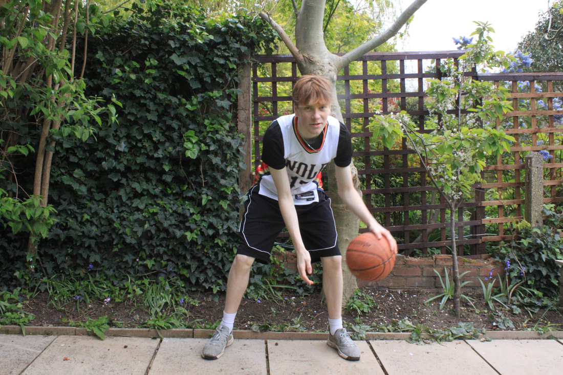
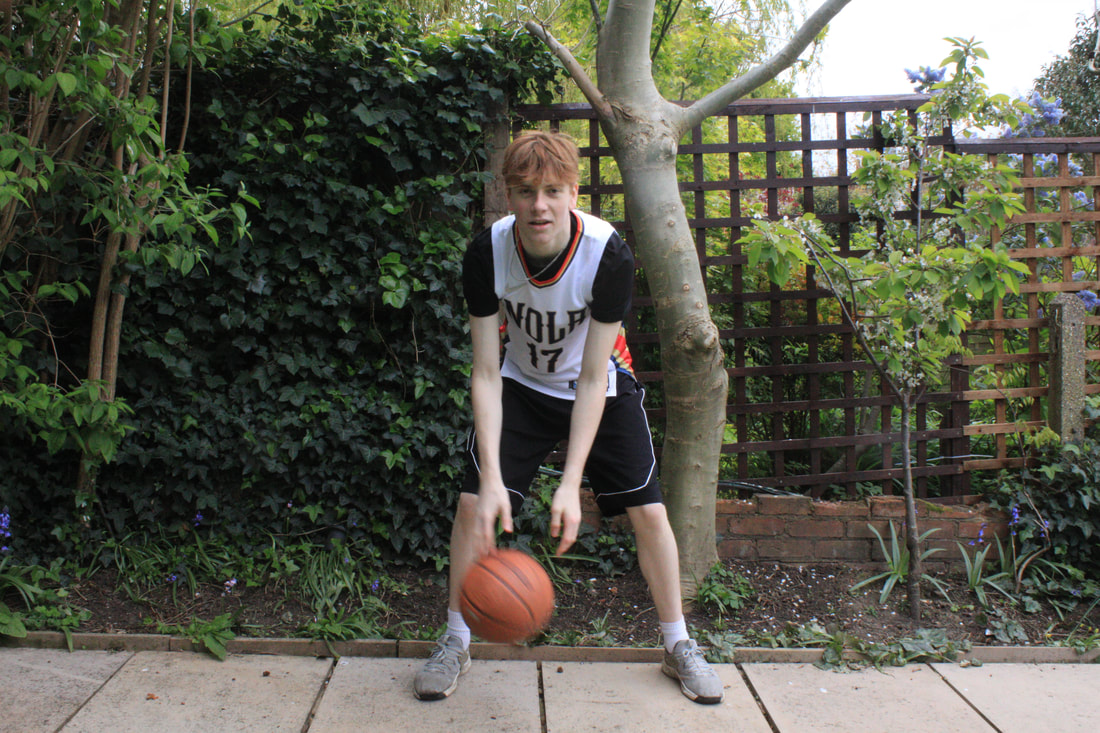
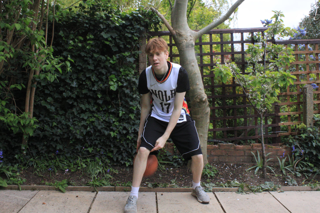
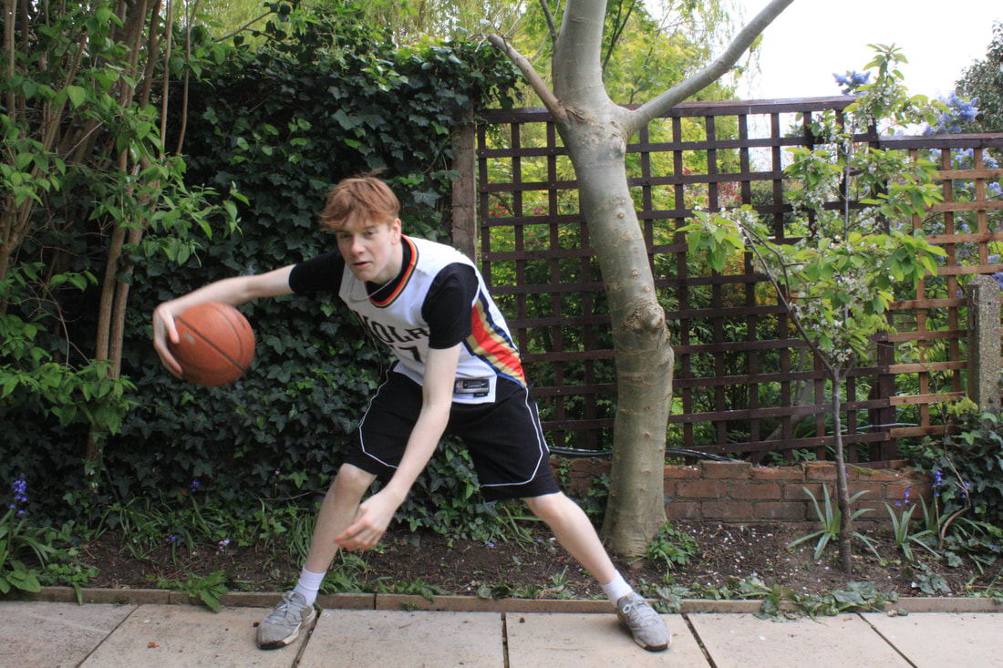
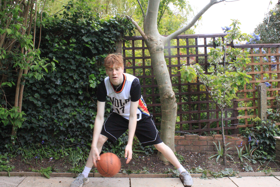
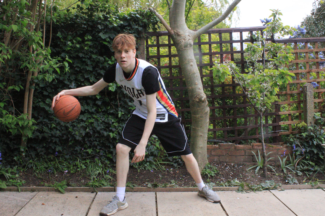
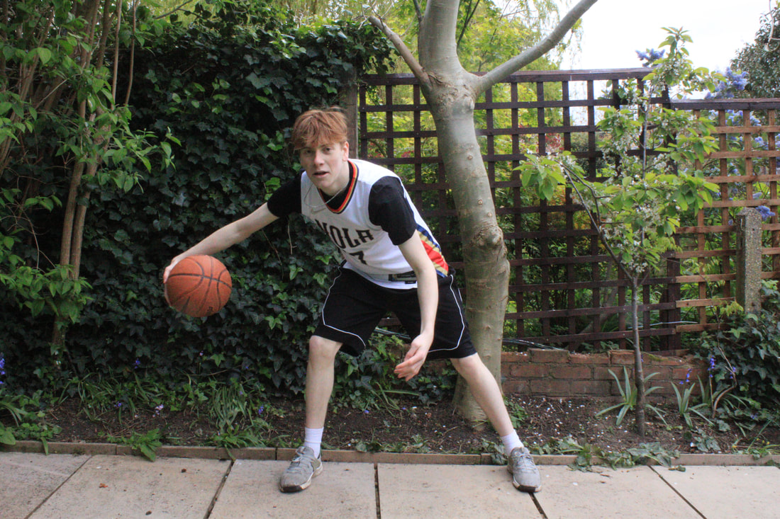
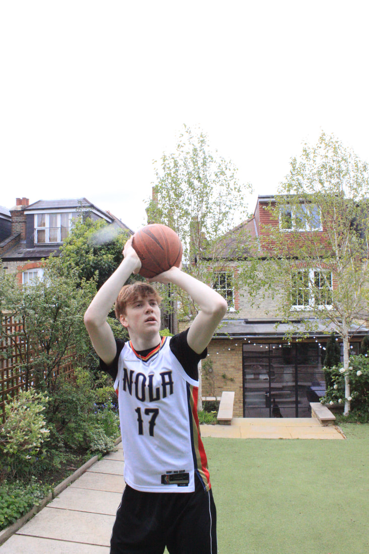
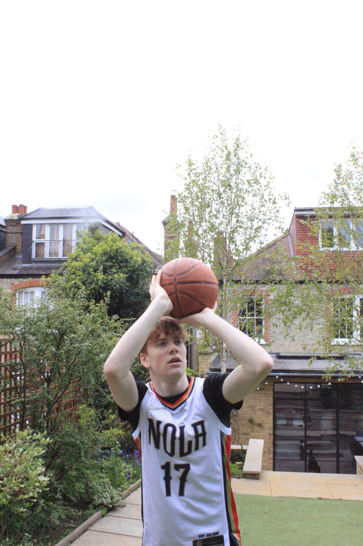
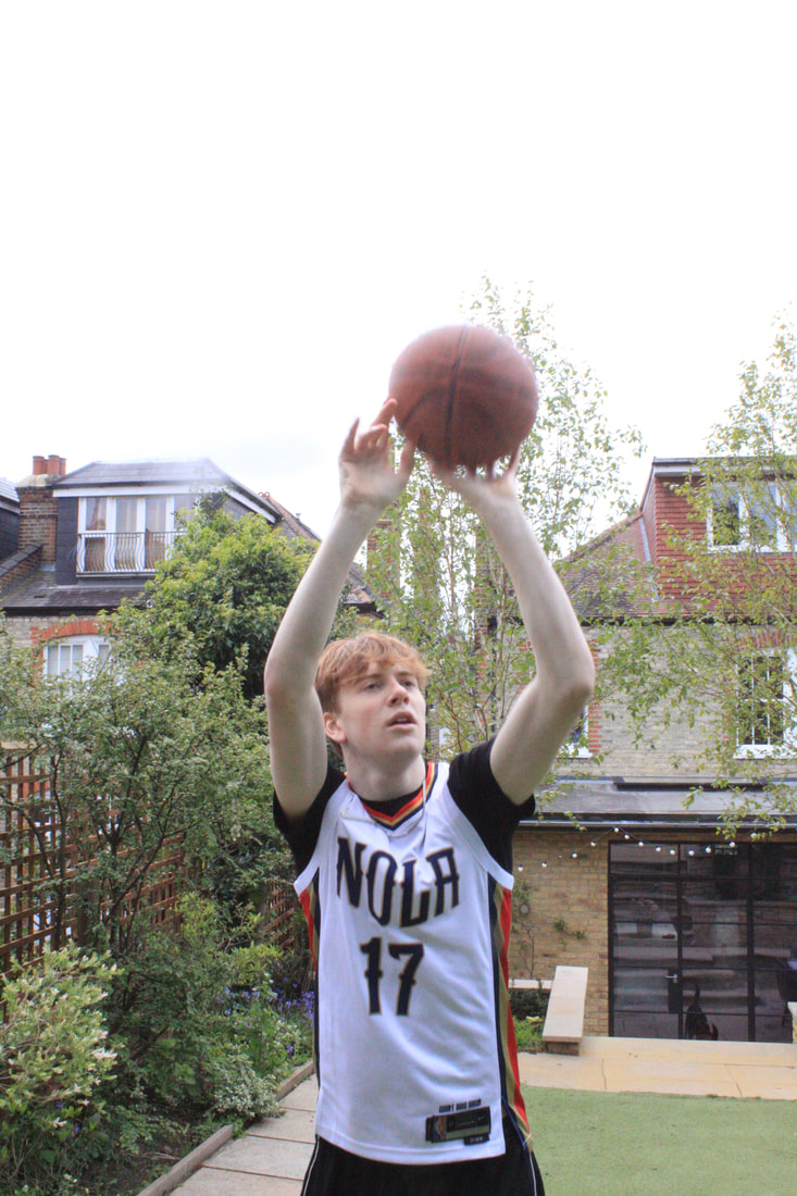
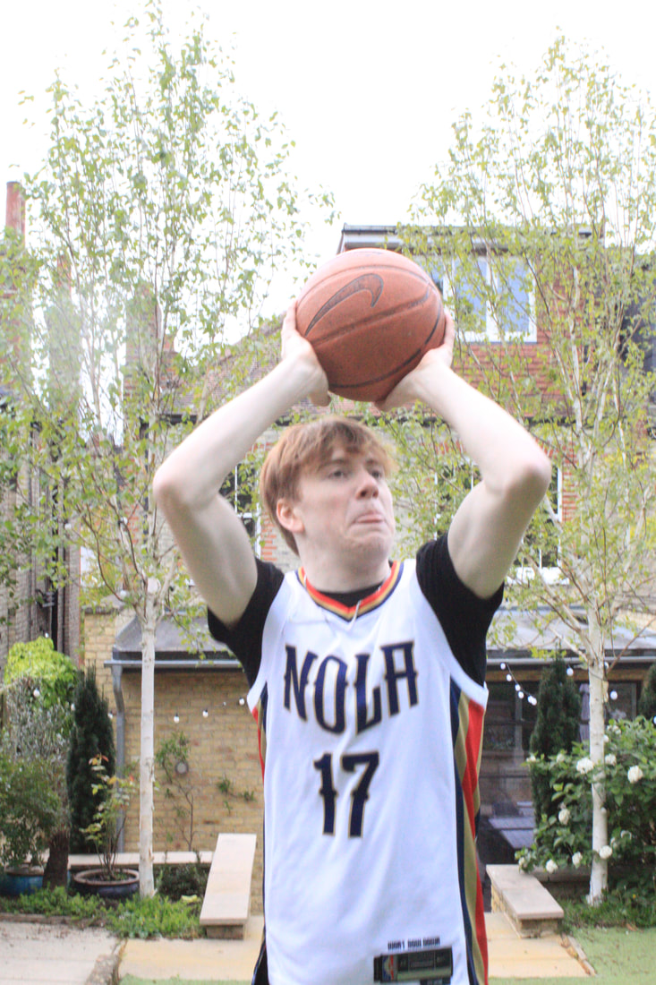
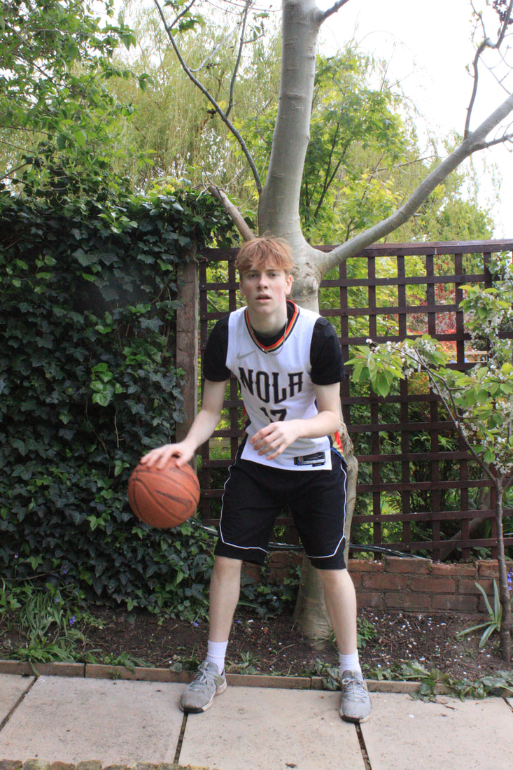
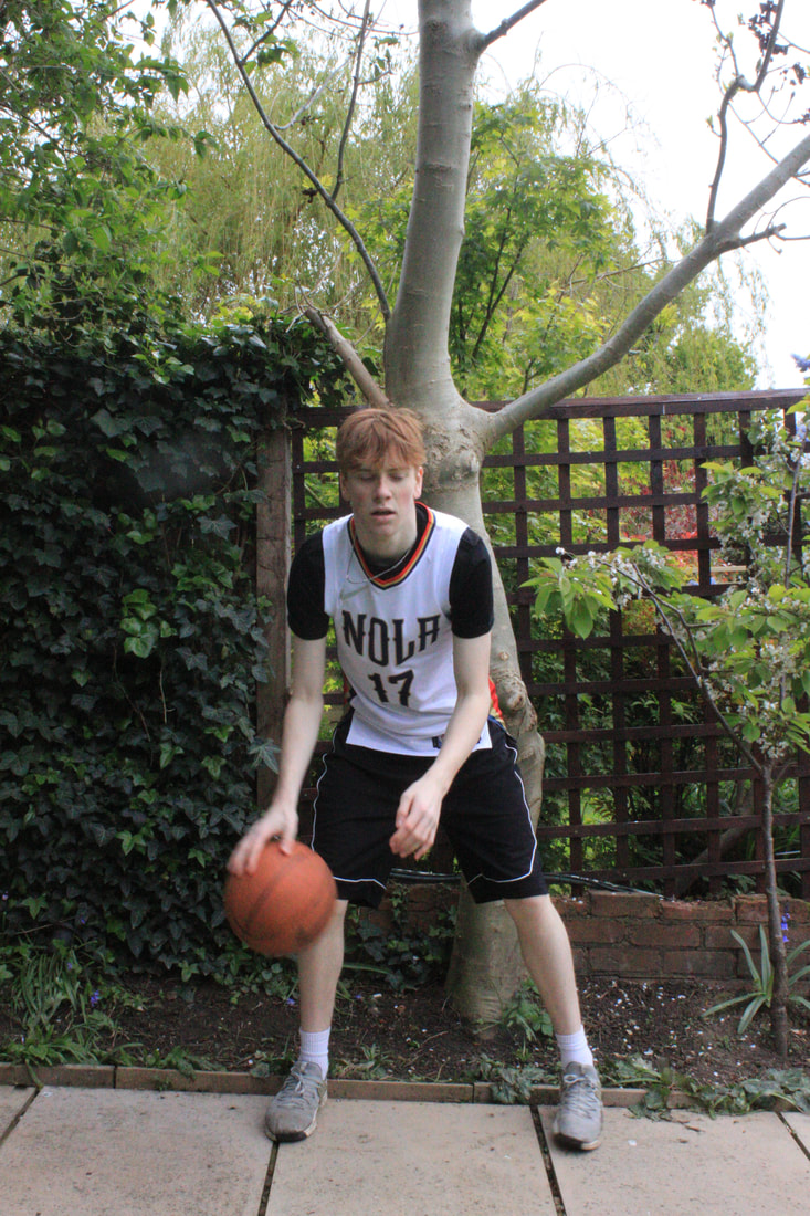
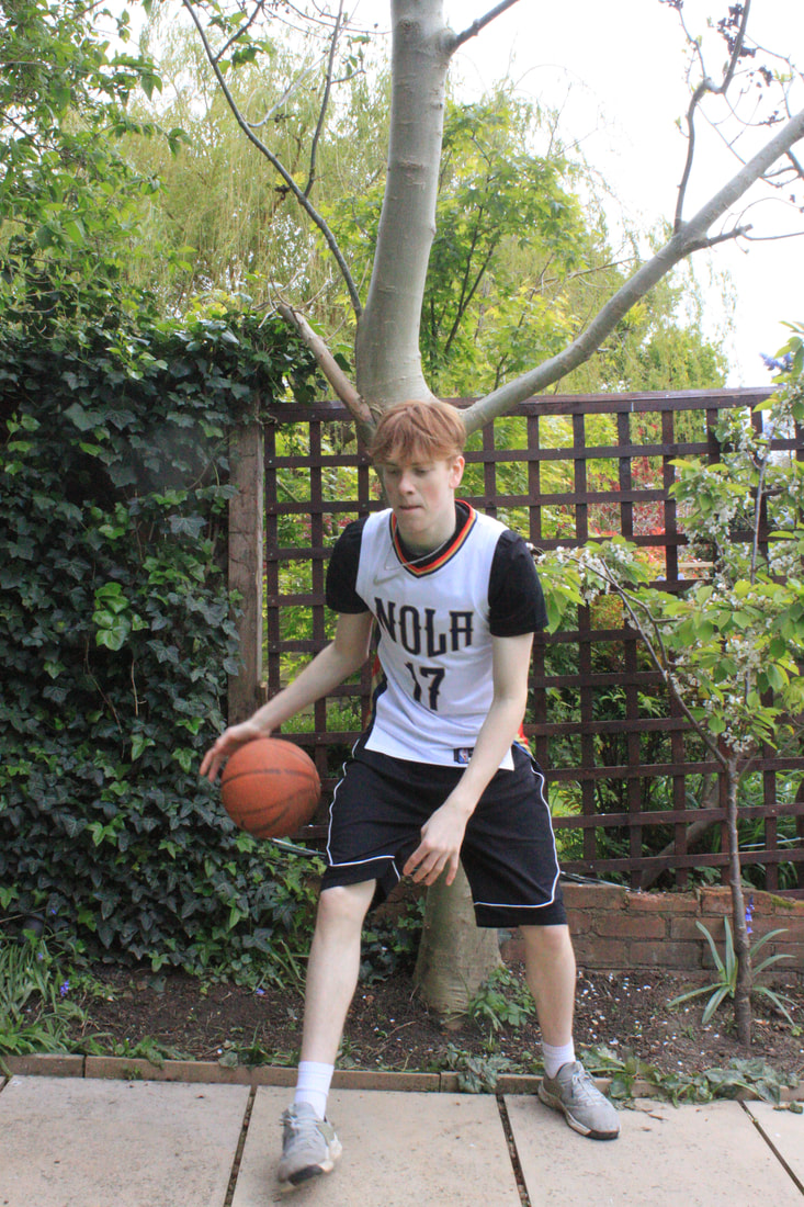
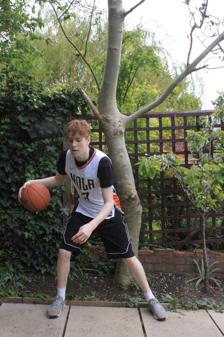
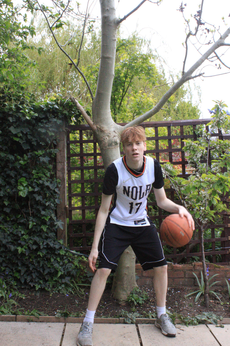
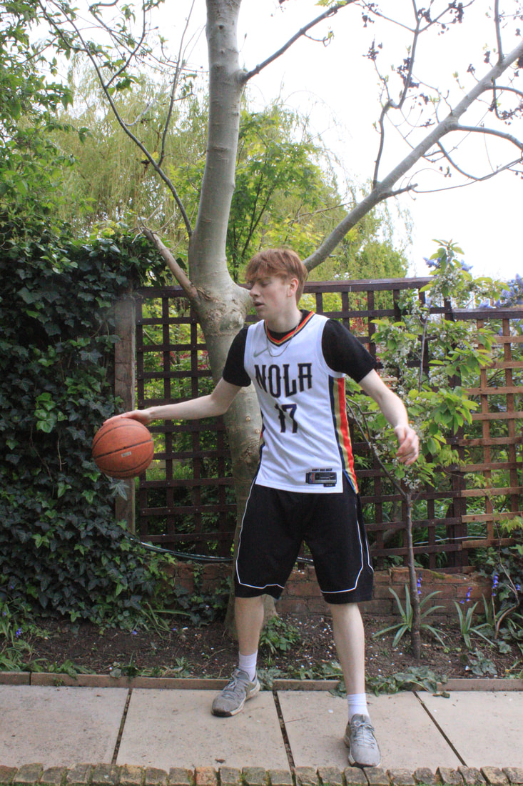
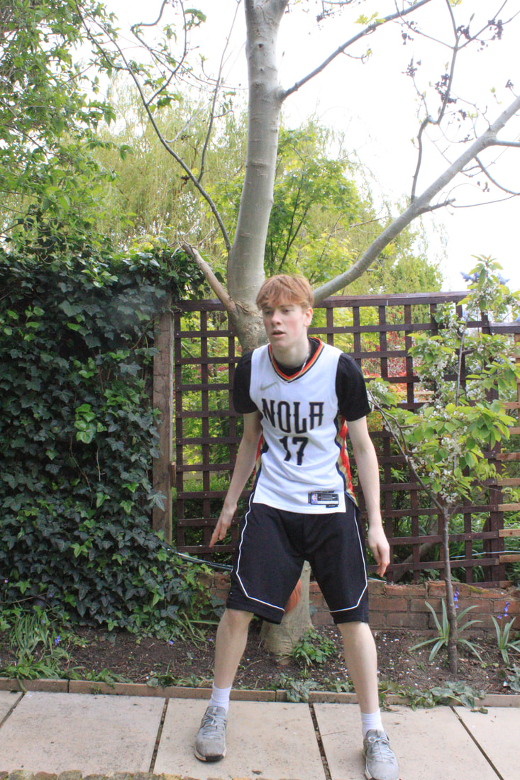
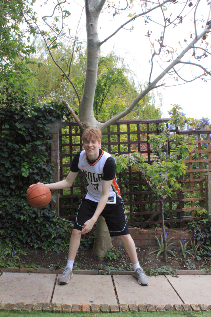
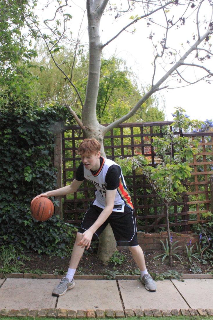
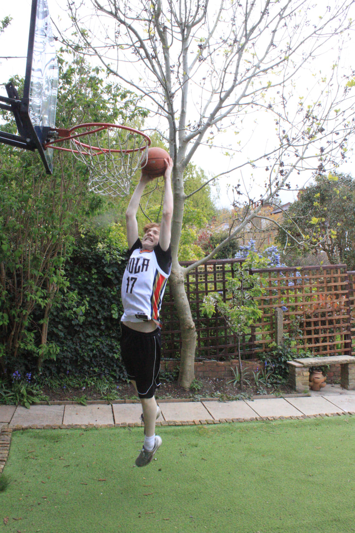
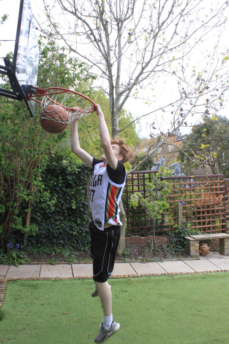
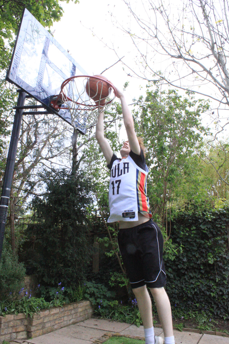
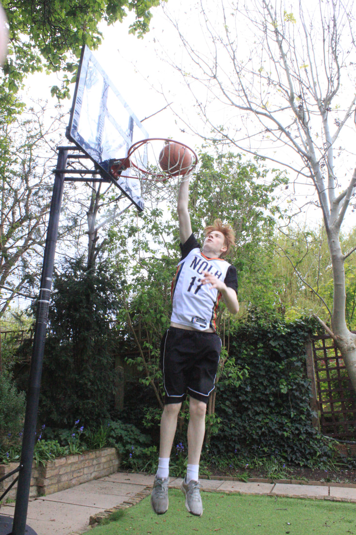
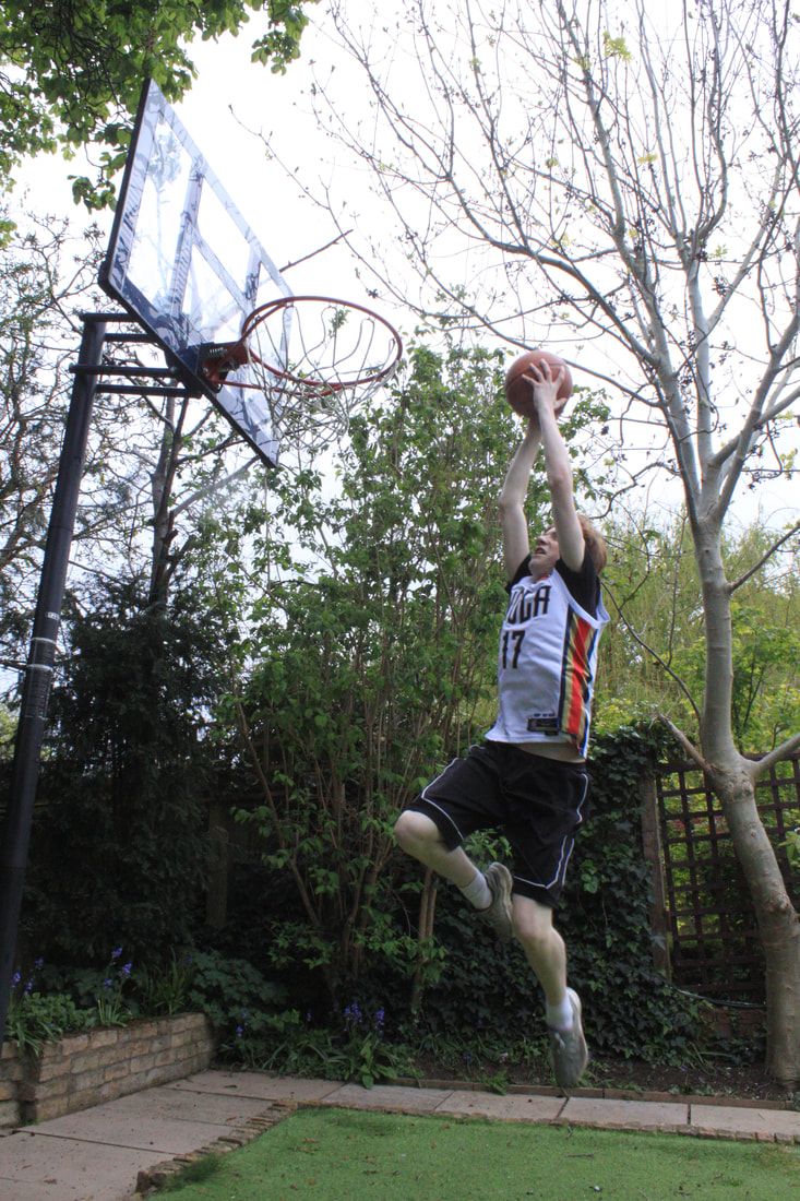
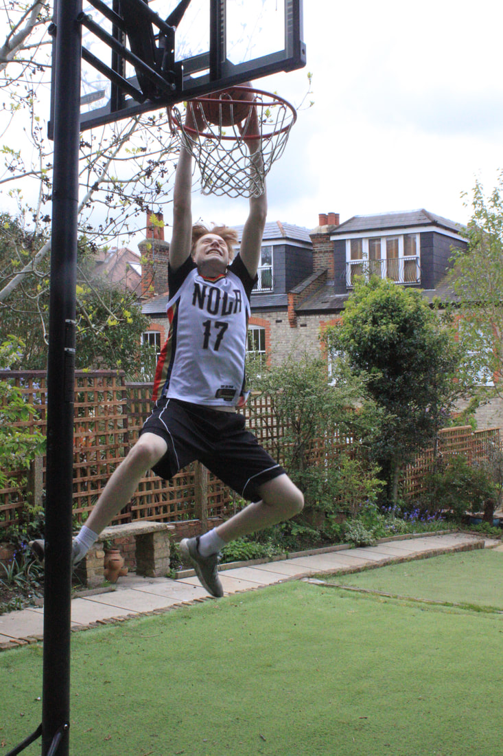
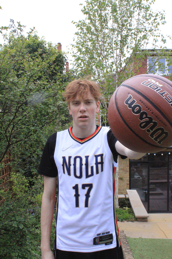
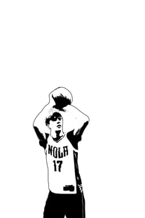
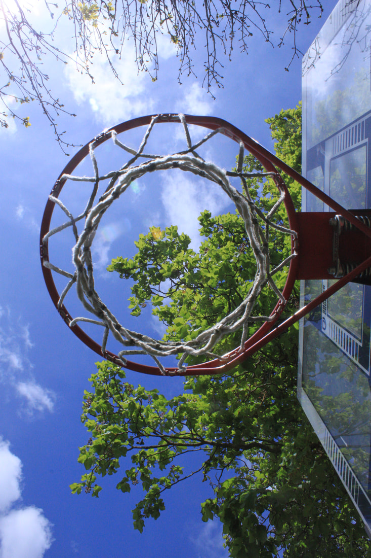
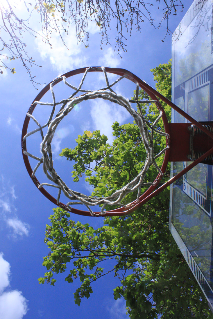
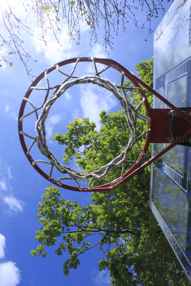
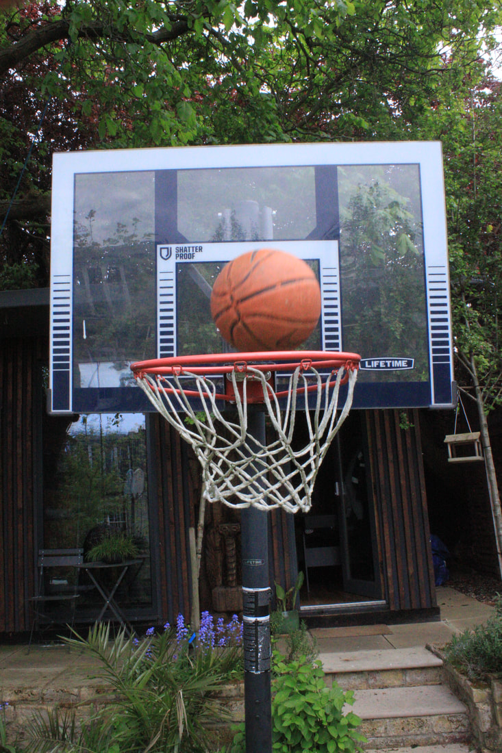
3rd MULTIFACETED MODEL IMAGES (cycling, basketball, revising):
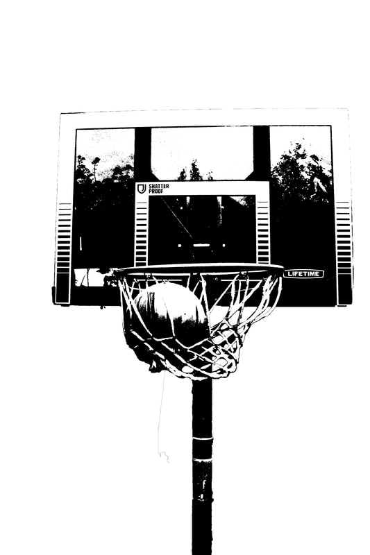
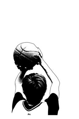
My final model to photogrpah was my friend spike, his chosen activities where cyling, baksetball and revising, things that almost revolve around his life. So i set about photogrpahing accordingly starting with basketball.
|
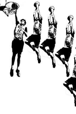
Model playing basketball:
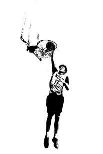
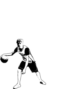
photogrpahing spike playing basketball i wanted to try and capture him in all of the motions of playing basketball such as dunking a basketball so that after when designing the gelli print i could stitch all of the images together to seem like one motion.
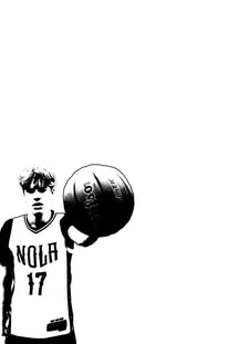
Chosen image edited ready for gelli print:
|
Objects/environment of basketball:
Chosen objects/environments ready for gelli print:
|
Chosen face and objects/environment combined ( layered ) for gelli print:
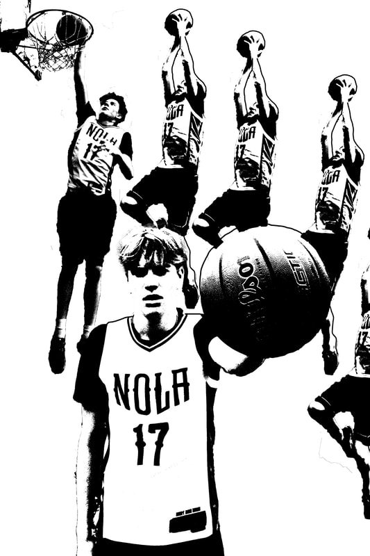
final gelli print of basKetball:

Next gelli print images:
|
model revising:
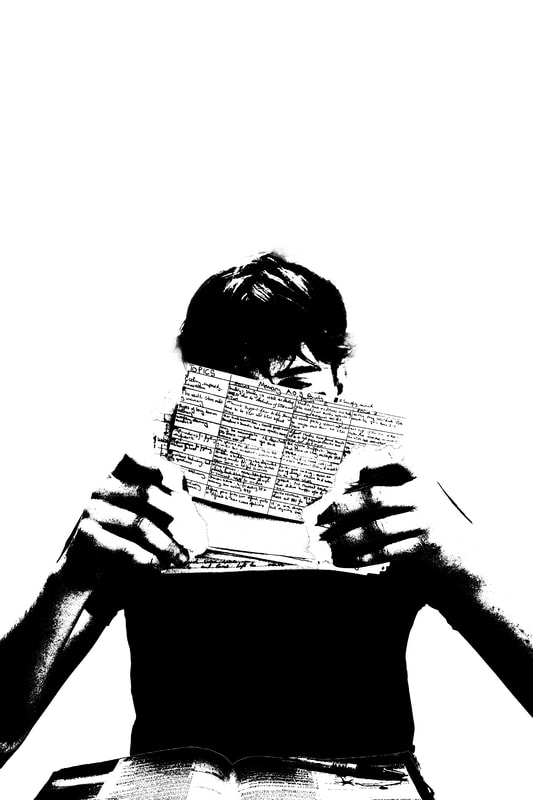
Edited face for gelli print:
|
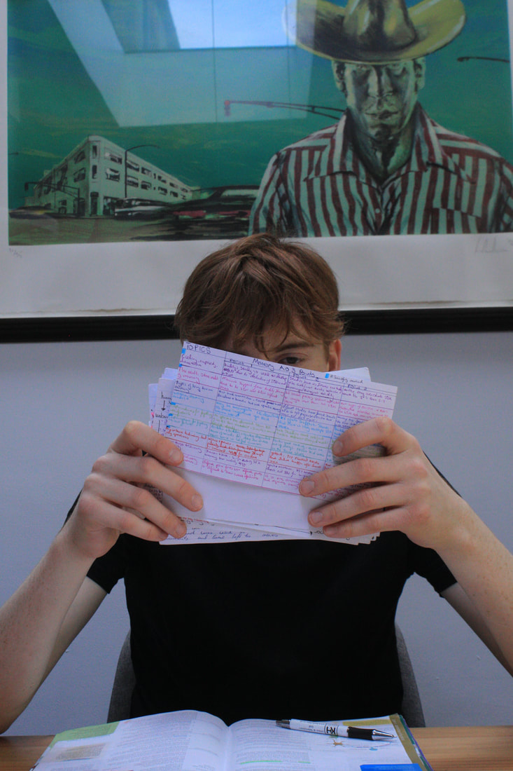
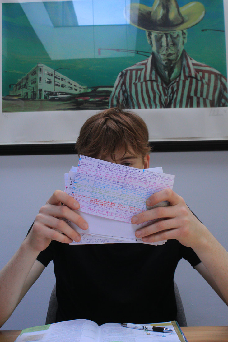
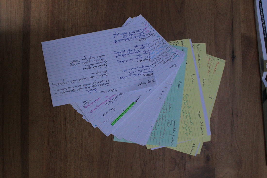
Objects/environment of revising
Objects/environment for gelli print:
|
Chosen face and objects/environment combined ( layered ) for gelli print:
Final gelli print of revising:
Next gelli print images:
|
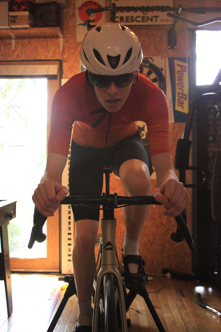
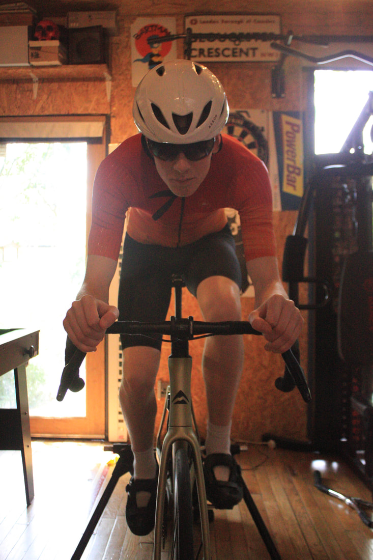
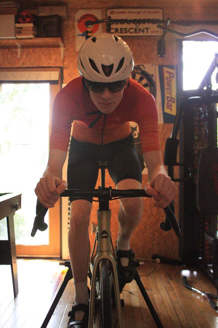
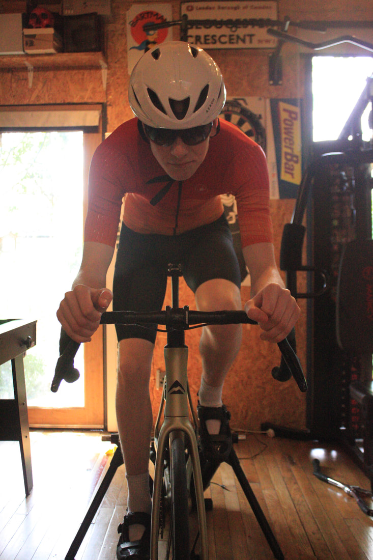
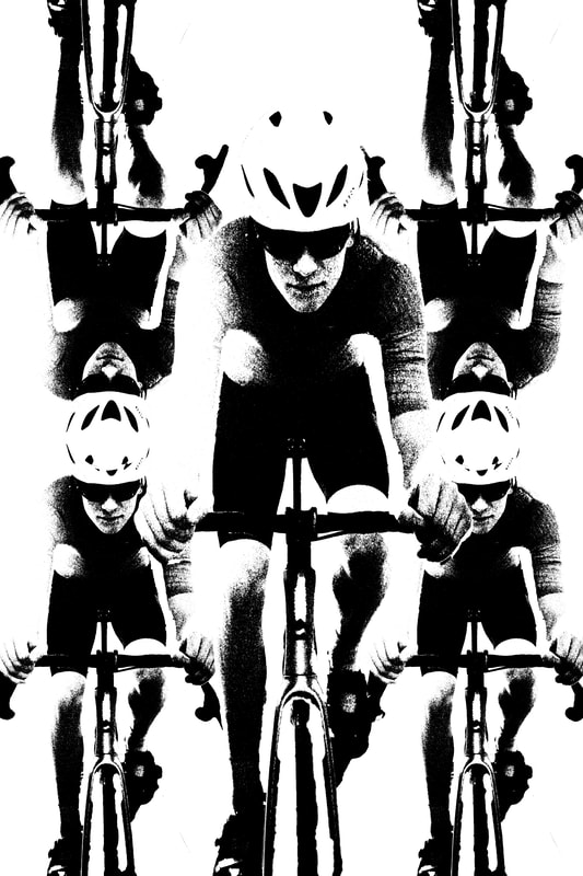
Model cycling:
Model cycling for gelli print:
|
cycling objects:
|
Chosen face and objects/environment combined ( layered ) for gelli print:
Final gelli print of cycling:
For this Gelli Print i wanted to use yellow orange and red to seem as if he is cycling quicker and quicker as you look up. Also placing the main image of my friend cycling as a second layer so that it covers the other images of him cycling.

Although some of this image was ripped apart, as it stuck to the Gelli Print as i tried to transfer it onto the Bristol paper, i think it actually works with the yellow, orange and red throughout the image as if he's burning up the paper because he's going so quick. Next time I would try it again to see what I could have looked like if it hadn't ripped apart in some places.
THE 3 GELLI PRINTS COMBINED TO PRESENT THE MULTIFACETED NATURE OF A PERSON:
|
|

|
Being my last set of gelli prints I felt very confident in my ability to add more and more detail to the prints adding more risk. For example the basketball gelli print I tried to make sure the basketball hoop net was included to give an even more detailed image. If I could do these images over again the only thing I would probably change would be the colour on some of them.
All 9 final pieces presented:
Here I wanted to show how the prints should be presented so that the viewer can grasp the whole idea surrounding these prints. The idea that each Three triptychs that how we transform ourselves throughout our daily lives and yet take those transformations for granted. Which i wanted to present in a further transformation by using gelli prints and transforming the environment to express it.

|

|


|
Development Summary: