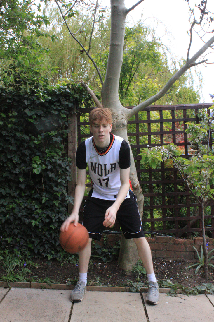
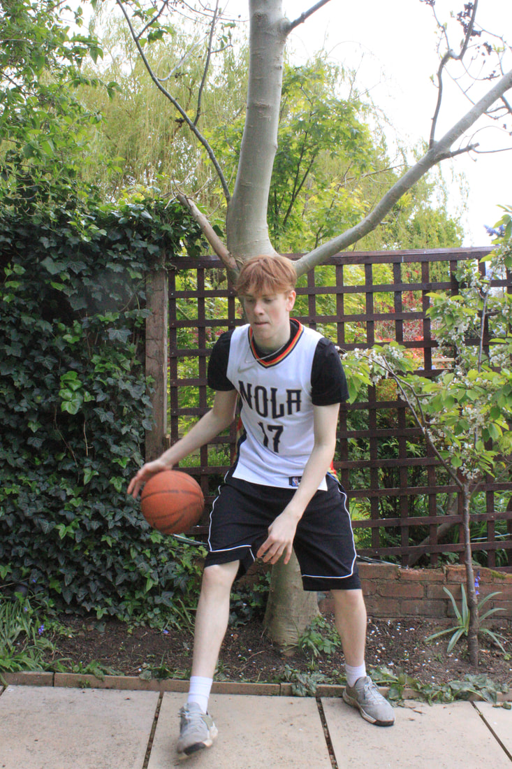
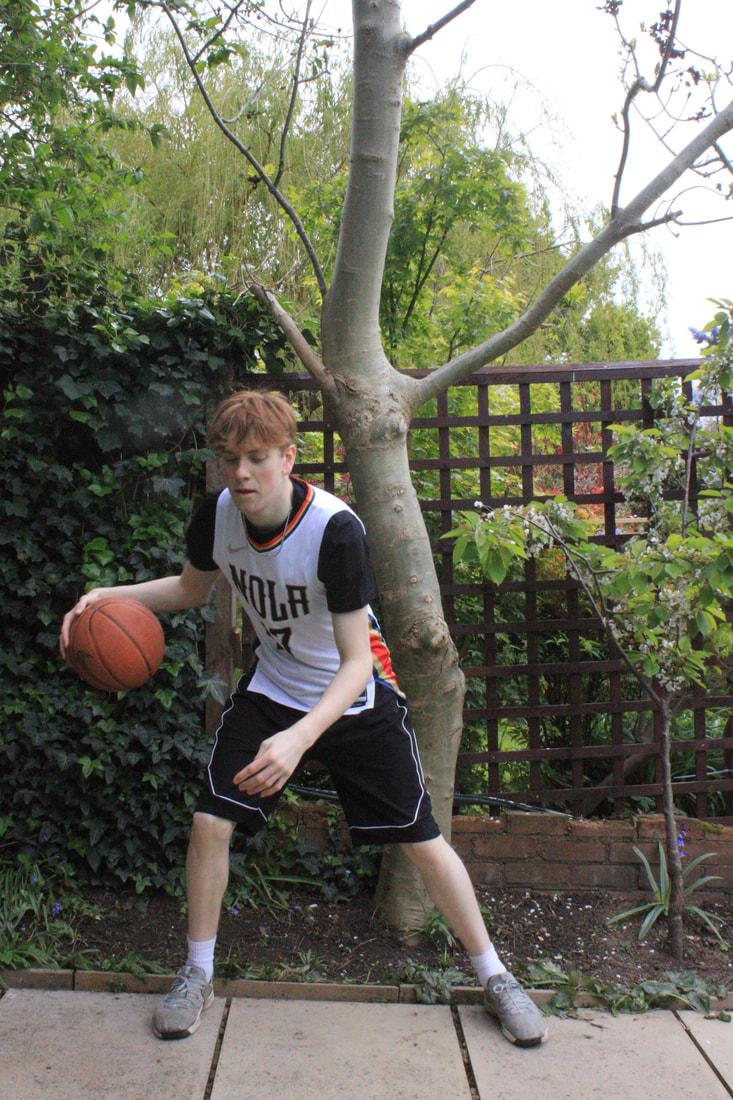
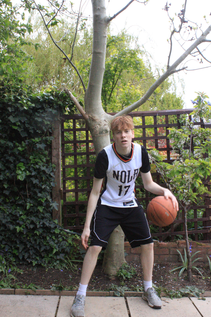
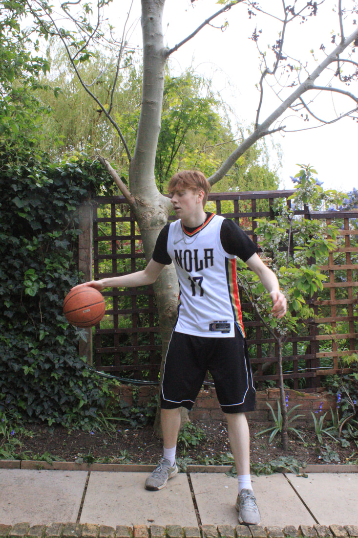
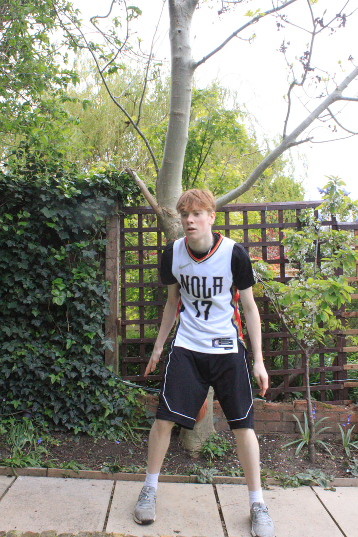
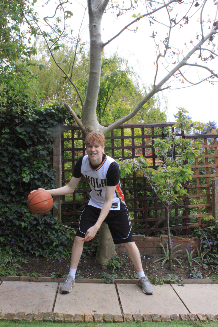
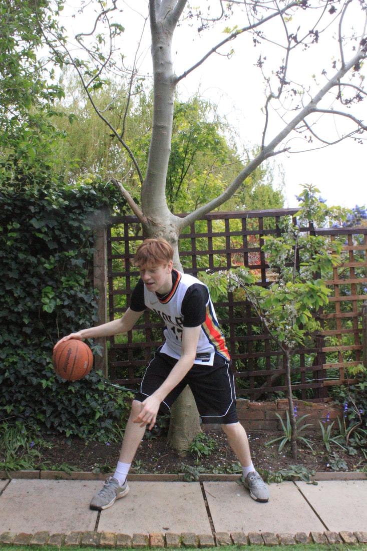
My Word List:
- Line
- Textures
- Shape
- Abstraction
- Colour
- Contrasts
- B&W
- Landscape
- Architecture
- Layers
- Highlight
- Refractions
- Shadows
- Silhouettes
- Illustrations
- City
- Textures
- Shape
- Abstraction
- Colour
- Contrasts
- B&W
- Landscape
- Architecture
- Layers
- Highlight
- Refractions
- Shadows
- Silhouettes
- Illustrations
- City
chosen words:
1. colour
2. refractions
3. Figures
Colour
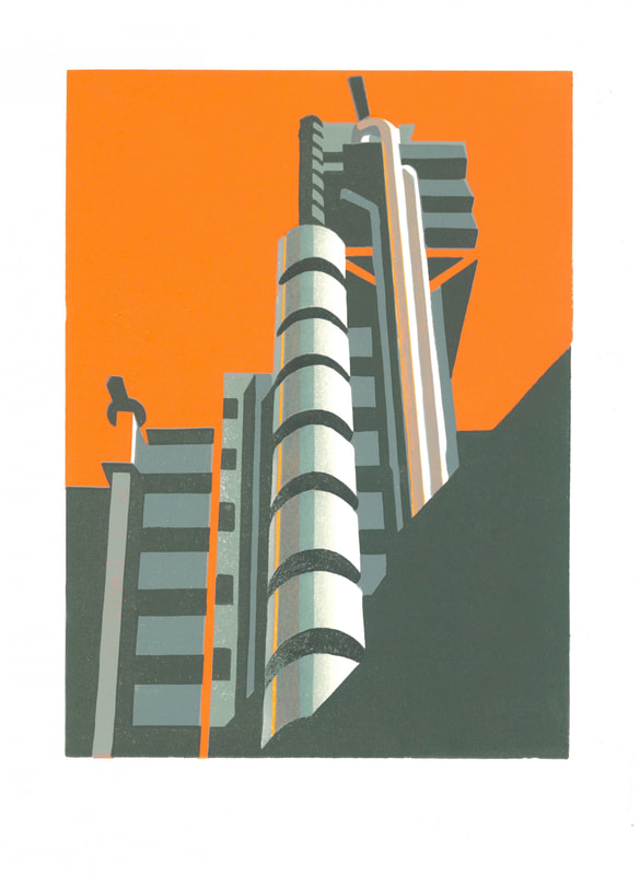
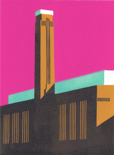
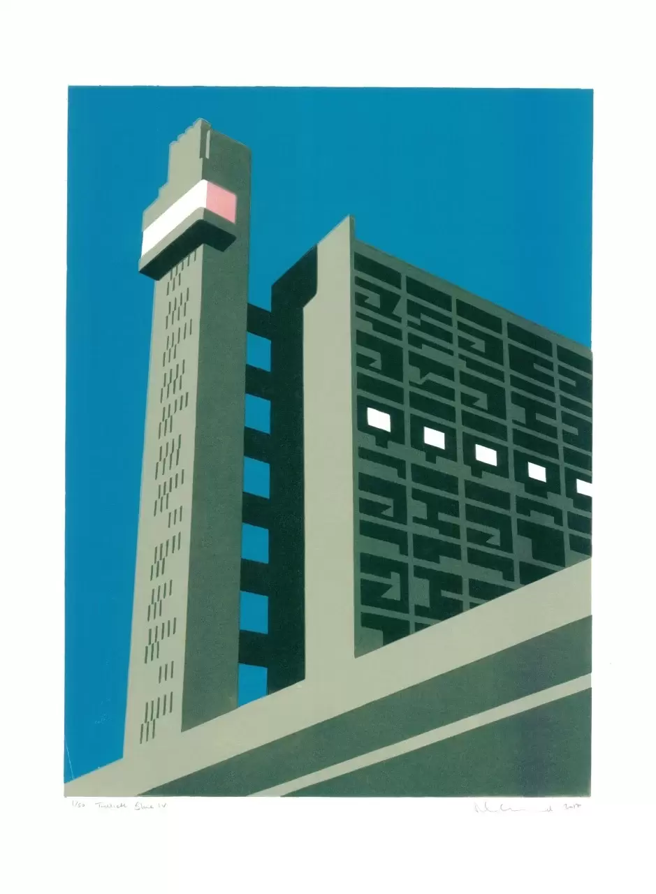
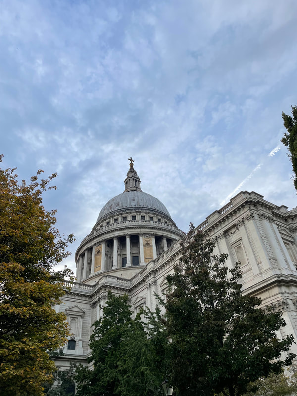
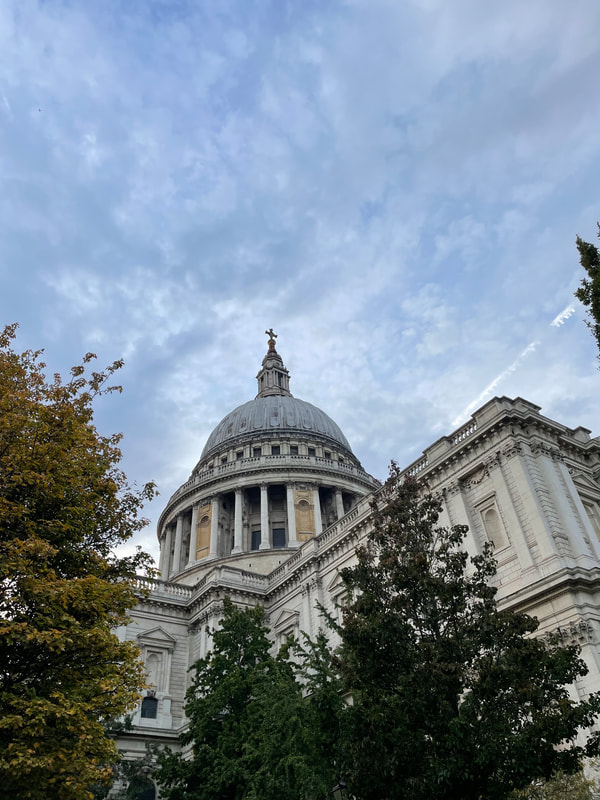
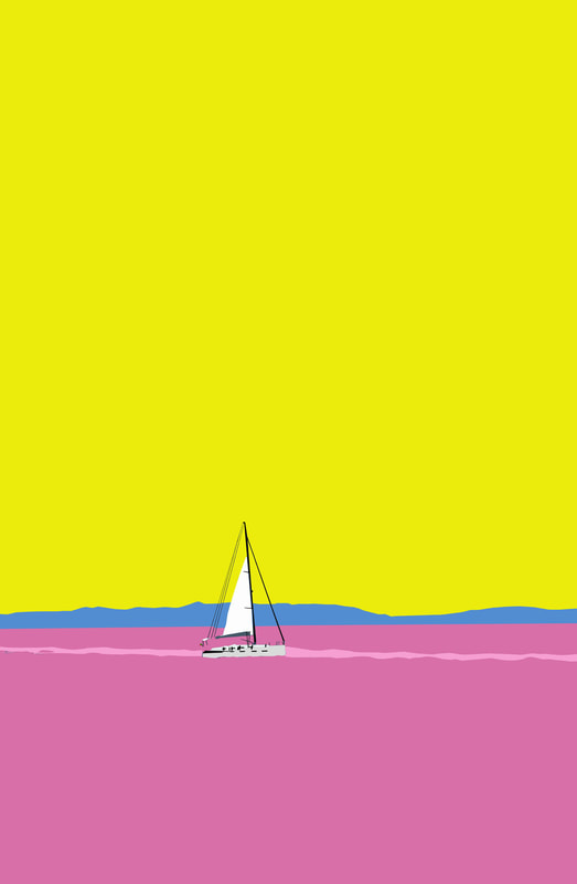
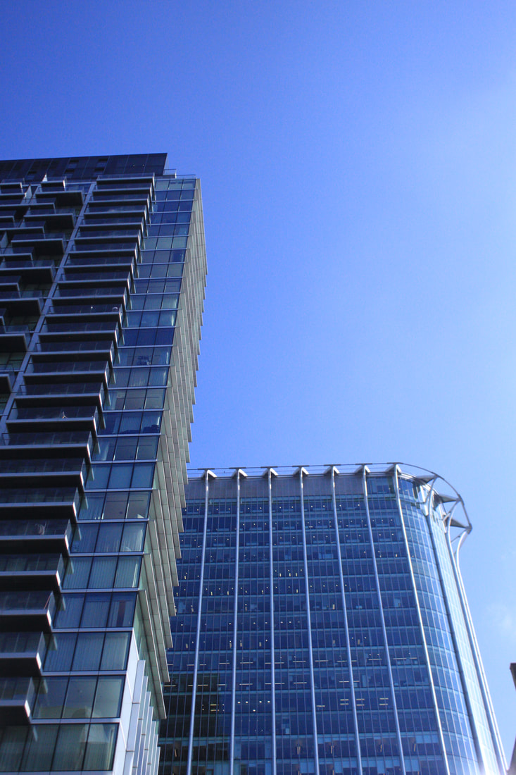
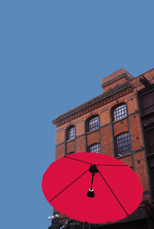
My first chosen word was colour, for this theme I am going to go out into the city and take pictures of different buildings that have a simple structure. These structures should have simple lines overall shape will stand out after editing. Then I will edit these pictures adding colour to different parts of the building or sculptor, mixing colours seeing which colour works and which don't. I'm going to try and add a sense of surrealism to these photos . I have taken inspiration from Paul cathedral.

paul catheral:
Paul Catherall is a London based photographer and print maker. From the late 1990s he has worked predominantly in linocuts. His work builds up seemingly abstract blocks of colour into perfectly balanced compositions which unite as one representational whole.
He cites a trip to San Francisco as a turning point, when he encountered a poster series by American illustrator Michael Schwab, whose work inspired him to take a gamble and start producing his own linocuts.
He cites a trip to San Francisco as a turning point, when he encountered a poster series by American illustrator Michael Schwab, whose work inspired him to take a gamble and start producing his own linocuts.
|
|
|
My response :
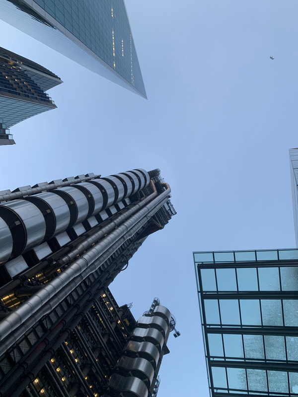
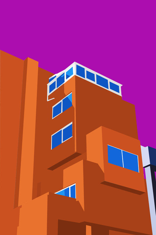
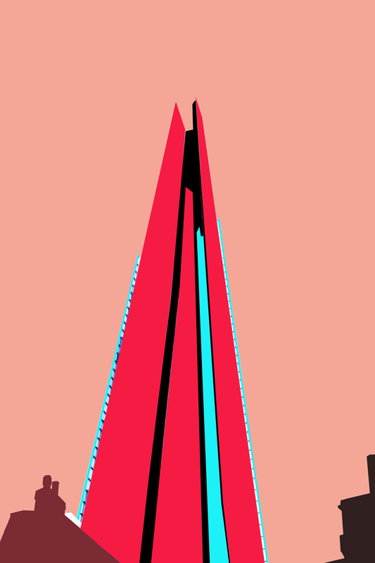
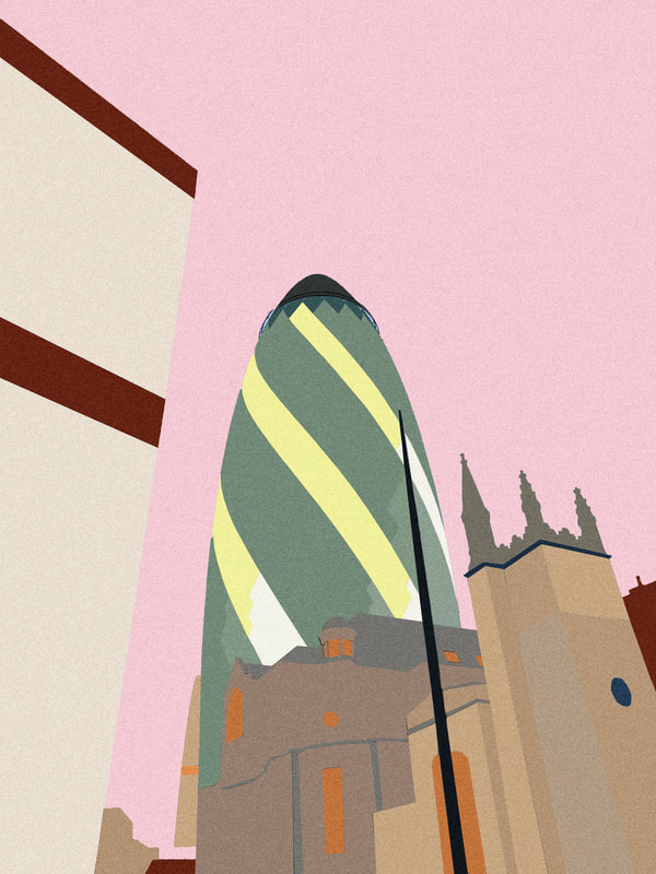
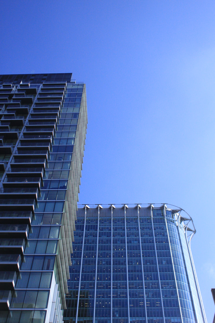
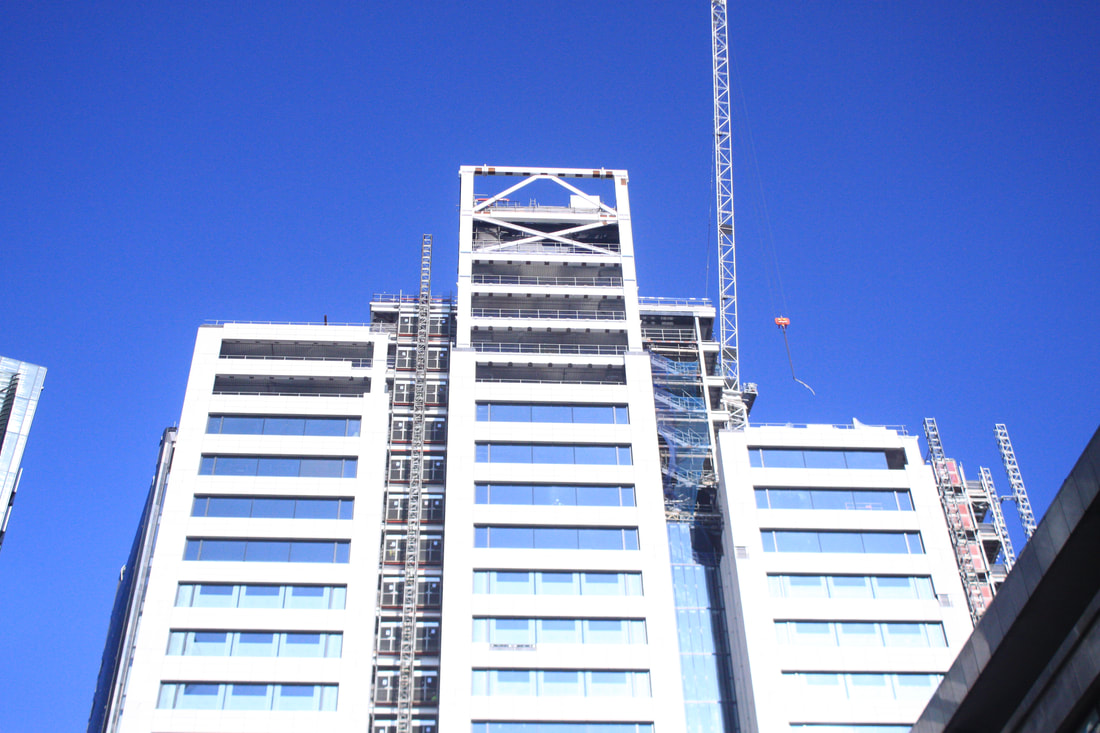
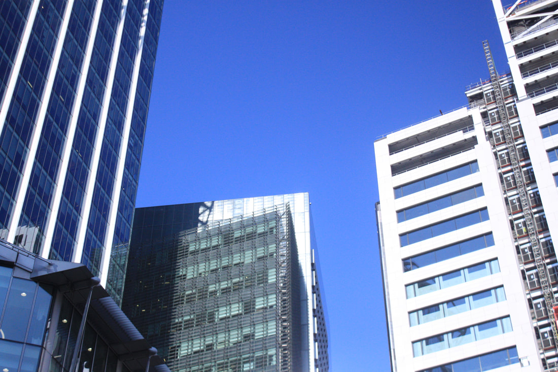
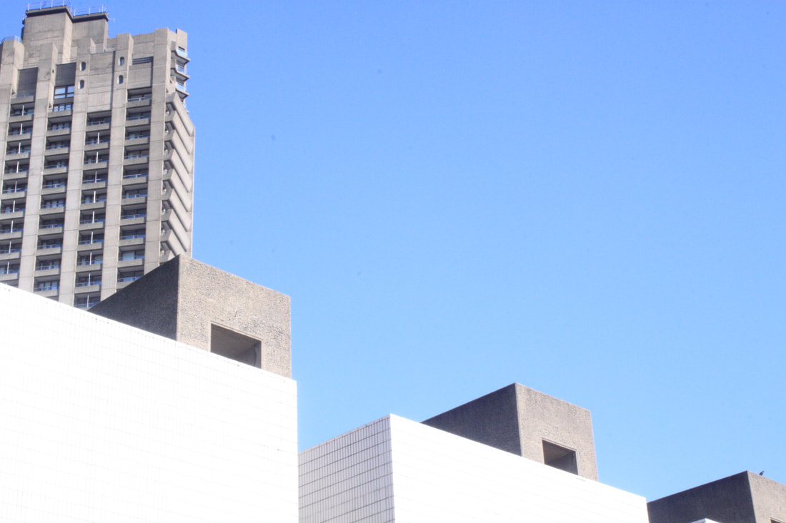
For my response I was looking to photograph some London landmarks for example the shard and also other buildings I see around London. When taking my photos I'm going to be careful in choosing how far away I photograph the building from as i also wanted to include a broader landscape of London in one image.


Best edits:
For my edits I am going to experiment using different colour combinations and try bring shadows into the photos to give it abit more life. I'm also going to experiment trying to make the photo more grainy like Paul catherall's prints
|
|
|
For these images I gave them a white border as a frame and also added a filter called noise, which gives the image a print feel like Paul catherals work.

|
|

|
EDITING PROCESS:
I'm very happy with the outcome of my photos. The white frame and adding noise greatly correlates to Paul Catherals work - I believe I succesfully expressed how colour can change an image entirely and how different colour combinations can also effect your view of an image. Next time I would probably photograph more of London's famous landmarks to include.
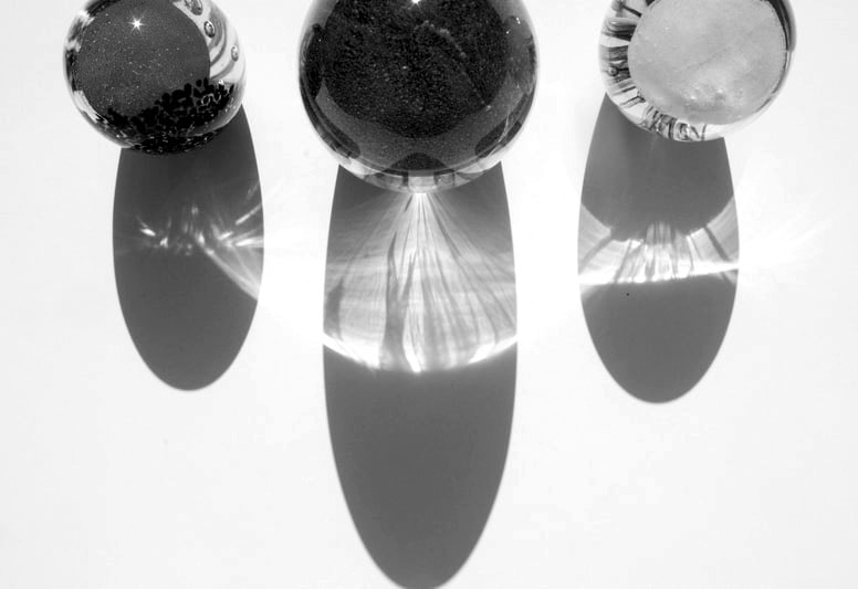
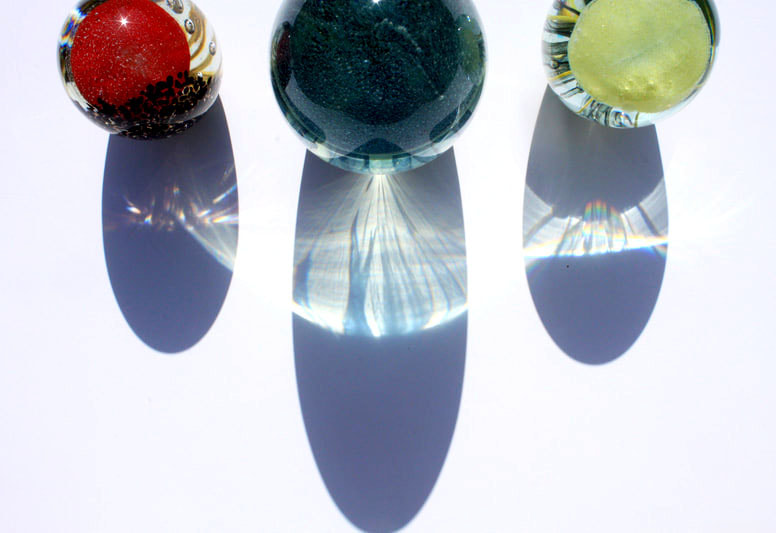
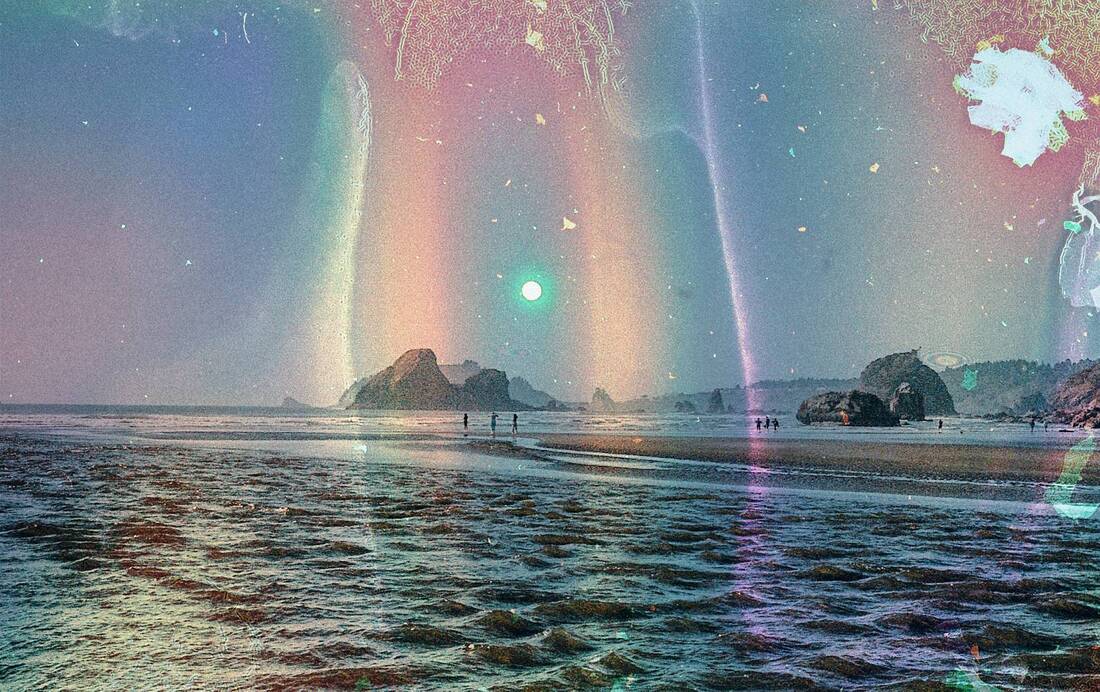
Refractions
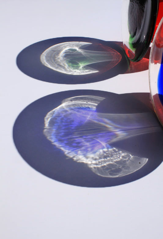
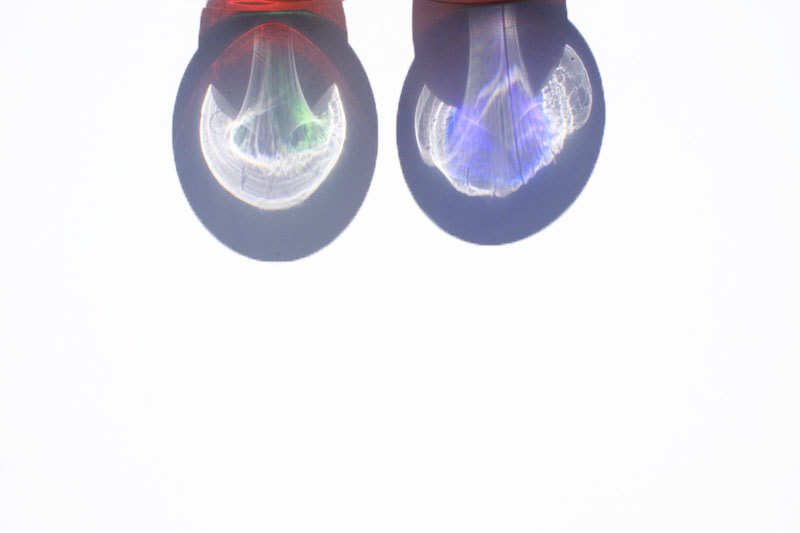
My second chosen word is refractions. For this theme i am going to wait for a sunny day so that the refractions coming of the glasses are a lot more clear. I am also going to use coloured glass and use food dye in water to see how the light would refract onto the white background and if the colour would enhance this effect further.

My response:


Best edits:
When editing I wanted to try and focus on the refractions as much as possible, using contrast as well to separate the refractions from the background further. I also used acblack and white filter on some images to see how the refractions would look like.

|
|
I am very happy with the patterns and colours I achieved in the images, however next time i would experiment with placing my camera at different angles, for example from the ground as a level eye view to see what difference that would make.
textures
For my third word project I chose the word theme texture to photograph. Texture is the physical feel of something — smooth, rough, fuzzy, slimy, and lots of textures something in between. I want to try and photograph this feeling, closing in on certain objects and noticing textures that go unnoticed most the time. Also focusing on the visual quality of the surface of an object, revealed either through variances in shape, tone and colour depth. Texture brings life and vibrancy to images that would otherwise appear flat and uninspiring which I hope to capture in this series of photographs.


Best edits:


|

|
I believe I was successful in capturing textures through both light, colour and shape. My favourite response was the top left image, it was rain reflecting of a window against a wall and because of the luminosity of the moon it created this lovely textured with bright shiny spots and dark dreary spots. Next time if I were responding to this theme again I would probably try and set up some textures and try and think of ways I could physically create a texture that could be picked up in a photo.
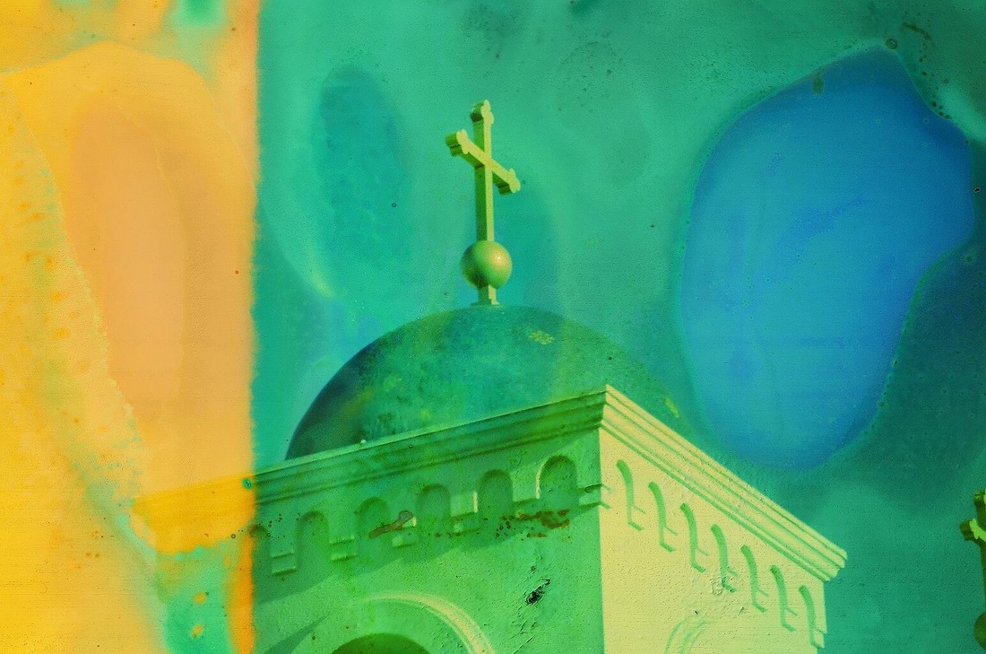
Chosen Theme: colour
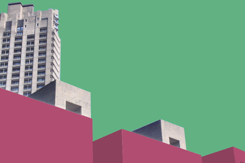
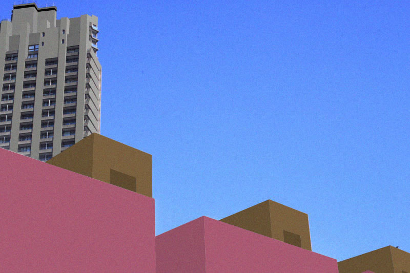
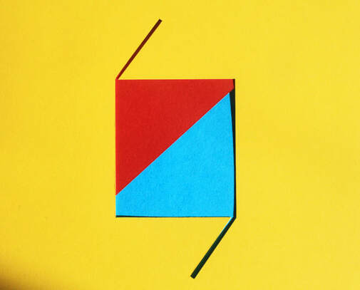
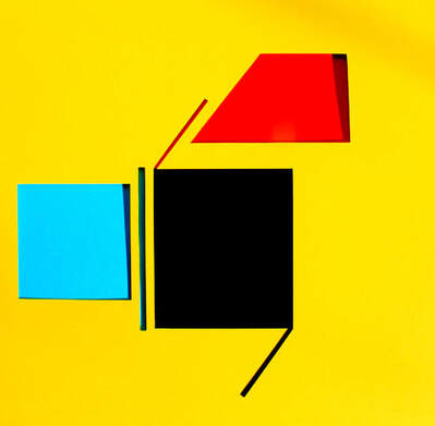
my chosen word for development is colour, I chose colour because it was firstly my favourite to respond to and I have had some ideas about how to photograph colour differently. I firstly wanted to use the same technique that I used in my first response to colour whereby I simplified the structure of an object or building and took it to just colour, whilst also using different colour combinations to match each other whilst also giving it an abstract look. I am going to call this strand stand out colour.
4 STRANDS:
Strand 1: stand out colour
For the first strand I am going to photograph every day life in London for example a London street or shop etc, and then I will pinpoint a certain object in the photo and simplify it to a simple colour whilst also keeping its structure so you can know what the object is. For example one idea I had was photographing a street that has puddles, to which I will edit in photoshop to a simpler colour i.e. yellow. I'm also going to try it out at night and see the difference it has on how the colour stands out. I think this will look great and will be another way to photograph colour. unfortunately I couldn't find any specific photographers for this strand.
first pictures:


edited:
the editing is the main part of completing these photos so i had to think about how i should edit them. I decided to stick to having a building mostly normal (not coloured in) then select either a part of the building or a sperate object to colour into a single colour, which I think perfectly depicts that idea of stand out colour. Also choosing colour combos that would work together and actually giving a mood to the photo. I wanted to photograph buildings that had repetition in them, for example the image in the bottom left because it would help present the colour and make it stand out even more to everyday buildings see with our eyes.

|
|
Overall I was happy with my final edited images. I believe I presented my strand idea of " stand out colour" by for example photographing buildings that had repetition in them, which helped present the colour and make it stand out even more to normal coloured buildings next to it. Next time I would try and think of another way of presenting stand out colour, either by experimenting with black and white next to a brightly coloured object/image etc or use abstract techniques instead.
Strand 2 : TEXTURED COLOUR
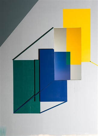
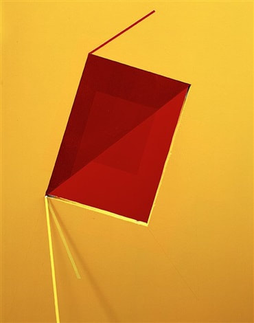
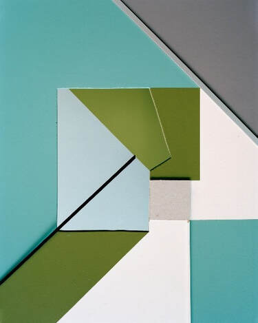
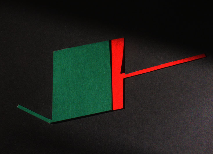
Continued from my last strand I wanted to pursue flat colour however I wanted to implement aspects of line, shape, texture and abstraction. To do this I gained some inspiration from the artist Tamara Lorenz. With this strand I wanted to experiment with colour further using light and shadow on coloured card cut-outs, creating abstract shapes and forms to compliment each colour. Also I wanted to experiment with they way different textures effect the presentation of colour, for example the grittiness of card or the smoothness of coloured glass has on the presentation of the colour. Furthermore by adding an abstract aspect to colour I hope it directs all attention to the shapes and so the viewer is only occupied with the business of looking at the forms and not at the conventionality of it. The way I was able to successfully do this was by layering these cut-outs on top of one of another cut into different shapes.
Tamara Lorenz :
German artist Tamara Lorenz creates various constructions which she then photographs to exploit their abstract properties. The addition of strong planes of colour provide another source of contrast in addition to those of line, shape, tone and texture.
Rather than photographs of things, each image seems to create its own reality. Consequently, the viewer is unable to recognise a conventional subject.
|
|
|
My Response:


Best edits:
|

|
Overall I believe I successfully created textures with the cards and using different colour combinations to work together. I also think through my use of adding shadows by lifting the card up, helped exaggerate the texture giving it a 3D type of from compared to some other images which are 2D. Next time i would probably try and incorporate my own idea with inspiration from Lorenz's work and try and create my own work expressing texture through colour.
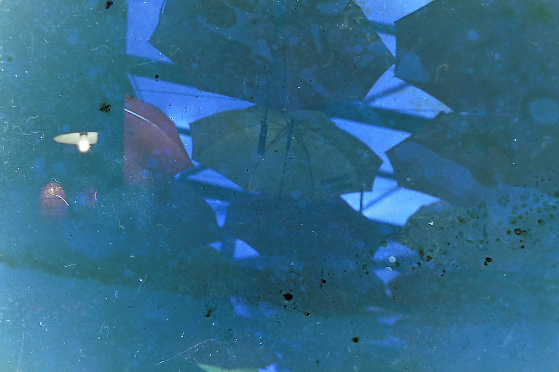
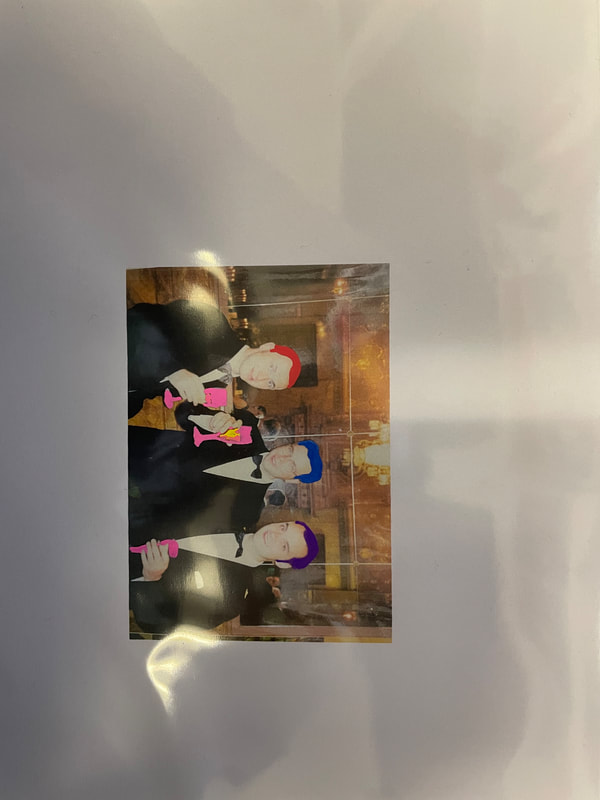
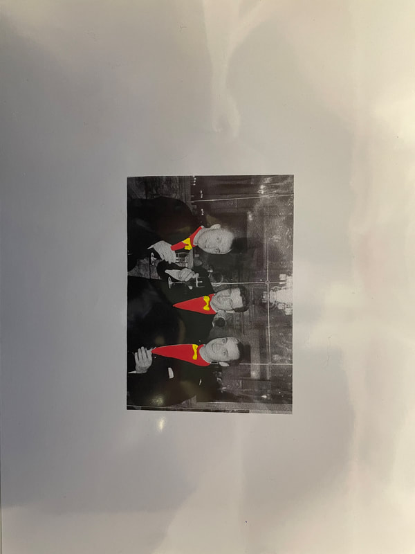
strand 3: Colour v.s non-colour
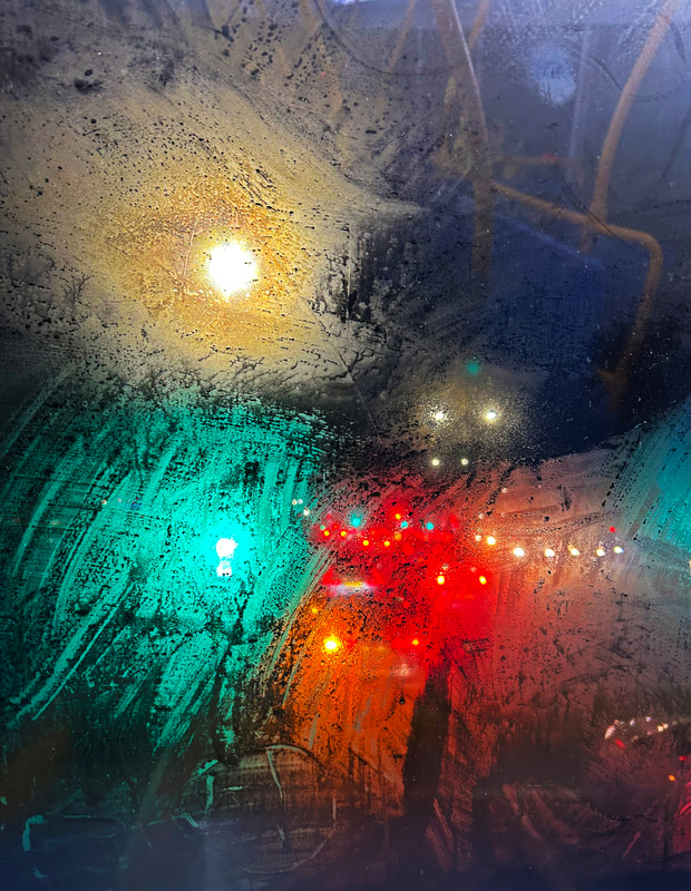
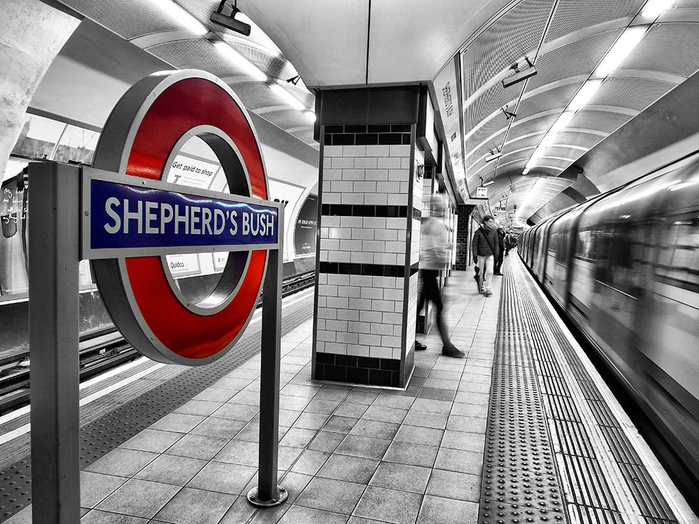
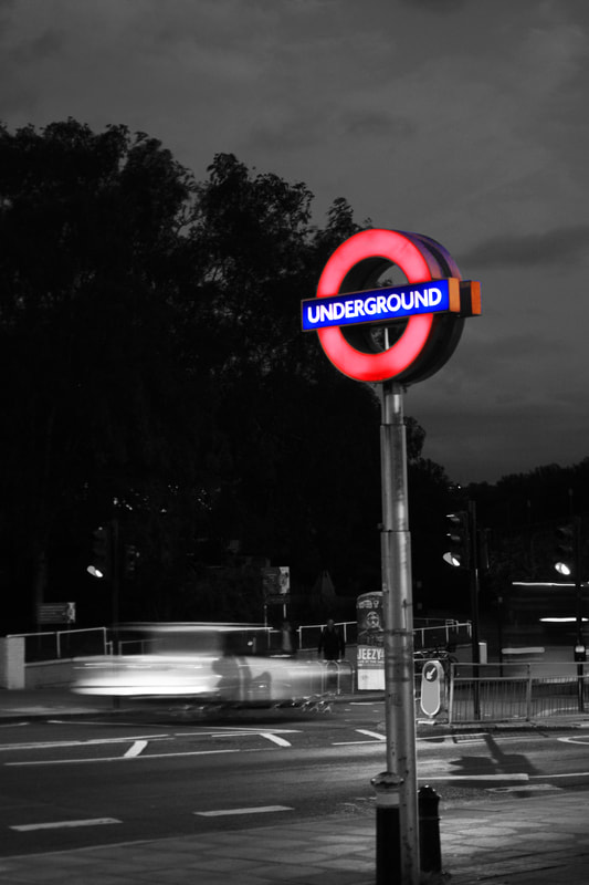
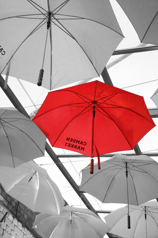
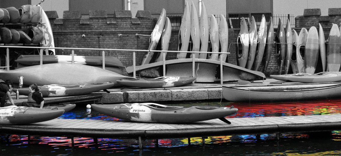
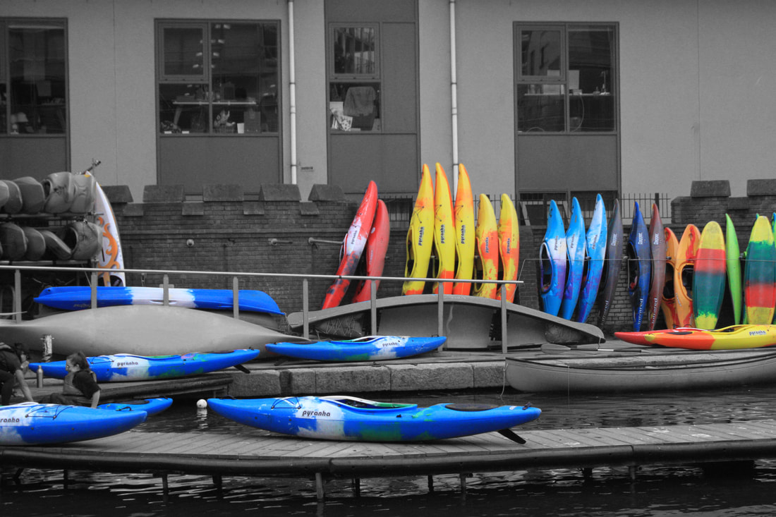
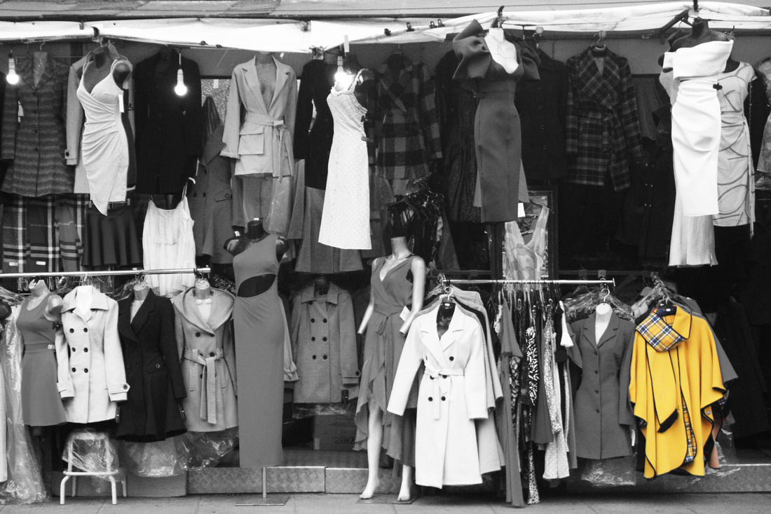
For my 3rd strand I wanted to explore and capture the idea of how we take colour for granted, how we are always surrounded by bright and colourful objects that mostly goes unnoticed in everyday life. With this strand I wanted to experiment this idea by photographing everyday scenes in and around London and then deleting all the colour in the image except for one object, that being graffiti or a sign.
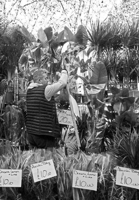
I found a photographer who greatly corresponds to my idea of work I want to create, his name is Nicholas Gooden and he photographs London's city centre and then selects certain elements in his photo to have colour and the rest with none, this type of photography is called selective photography photos. his photos below:
I found a photographer who greatly corresponds to my idea of work I want to create, his name is Nicholas Gooden and he photographs London's city centre and then selects certain elements in his photo to have colour and the rest with none, this type of photography is called selective photography photos. his photos below:
NIcholas Gooden:

|
|

|
first pictures:
My main aim when photographing was to capture bright colours either by themselves or surrounded by other brightly coloured objects. For example the underground sign which is brighter than its surroundings gives a nice effect after editing.


edited:
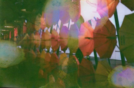
When editing I wanted to experiment with the same photos to see what colours to stand out would effect the picture for example colouring in different umbrellas to see what effect that has.
|
|
|

|
I am very happy with the results, the way the colour stands out perfectly exaggerates the colour making you guess the colour of the other objects in the photo. I also believe I successfully captured that idea of how we take colour for granted, as from looking at the images above you are just acquainted with this bright colour that is so different from the rest and you almost cant keep your eyes off. But if the image was a normal coloured photo, you wouldn't think much of it either that's to do with the images colour who just the overall image taken. My personal favourite photo was the one with the coloured reflections, I think it could make a could follow up project focusing on colour in reflections.
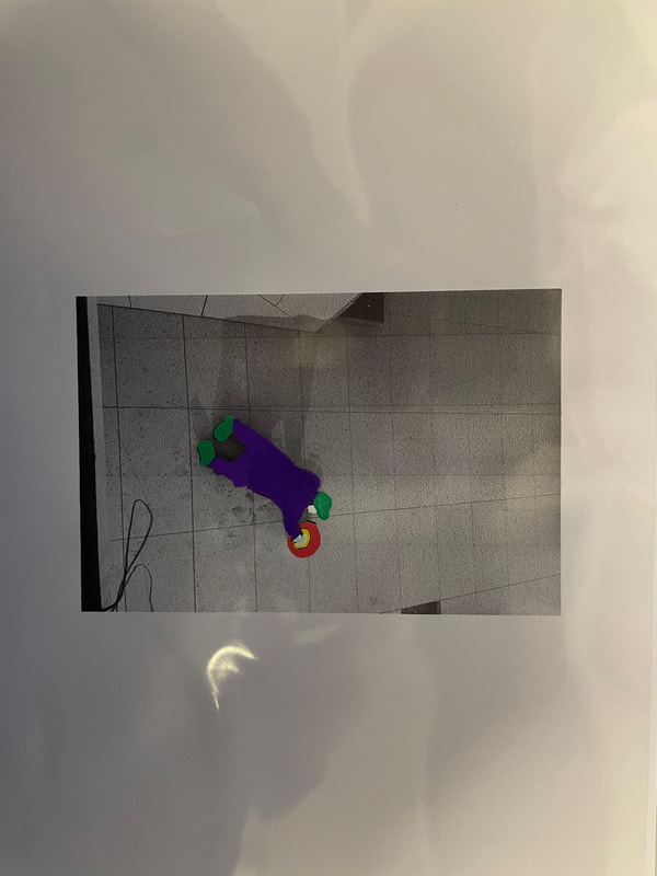
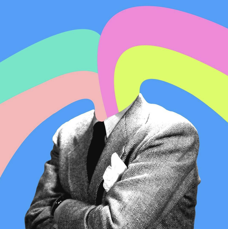
strand 4: abstraction in COLOUR
Finally, I am going to use a film camera to express abstraction in colour and how it can create a surreal unworldly effect. To do this I am going to take photos of all different types of landscapes, people and texture etc, then to bring the colour factor in I am going to use a film soup. This involves placing the non developed film into different soups of liquids for example lemon juice, this will give the film a coloured distort abstract effect all over the film. Tom Evans is a soup artist shown below. I like Evans work as although the picture is simple the actual distortion of the film which adds the colour brings the photo into a whole other perspective and dimension.
Tom Evans:
|
|

|
first pictures:
My main aim when photographing was to capture all different types of things for example textures, people, buildings and nature to see how the film soup would look on all types of images and scenes.


Souped:
To soup the film I firstly developed it, then selected a couple photos to experiment with first. I used lemon juice, bleach, sugar syrup and other chemicals to see the effect on the film. The bleach had a big effect on the images as it is the strongest chemical. I then placed the Film in a mixture of liquids in a bowl:
|
Film in the chemicals: leave in there for about 5 mins

|
|

Results:
|
|

|
|

|
|

|
scanned straight of film:

|
|


|
I'm very happy with the outcome of my film soup. The way the soup brings out and distorts the colour in the photo adds a very different feeling to the photo. For example adding the bleach to the photo created a haunting effect with a dark blue colour coming out of the image. Next time if I would soup again, I would soup the film straight away of the film, which would give it maybe a different distortion and also brighter colour effect on the images.
Favourite strand: Abstraction in COLOUR
1st development
For this further development I was told to choose from 1 of my 3 strands and work further on them into a different idea/project to create. To find other approaches, ideas, variations to what I photographed before. The strand I have chosen is abstraction in colour, as I still wanted to keep the whole idea of colour in the development. The idea that I want to portray through my developments is the way colour can be used to create abstract and surreal pieces of photography. Exploring how adding colour can create abstract and surreal pieces of work after taking a photograph.
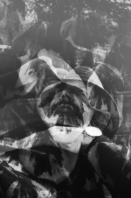
Double exposure ARTIST INSPIRATION: Christofer Relander
This self-taught photographer especially known for his multiple exposures, reveals the in-camera technique that he has used in most of his projects since 2010. Christoffer Relander's passion lies in shooting double-exposure pictures that dive deep into the human connection with nature. The artistic photographs showing human silhouettes are "filled" with nature at its finest, including leaves, delicate flowers, tree trunks, and even houses, gardens, and streets.
|
|
Relander creates his art using a process called double exposure, in which two opposing pictures are overlaid over one another to striking effect. Simply defined, the final image is a combination of multiple original photos that portray timeless settings and unassuming people with whom we have a strong emotional connection.
THE PROCCESS:
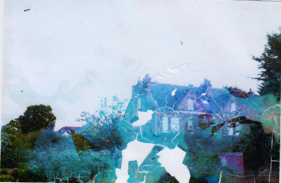
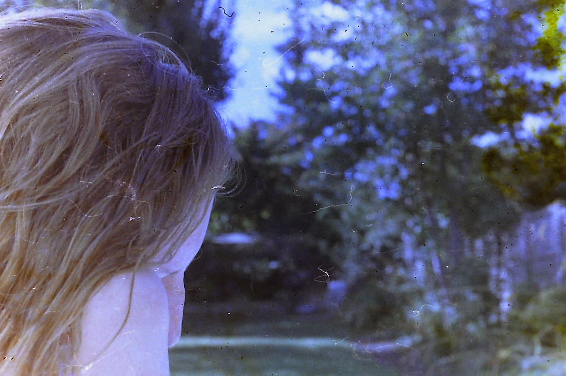
The way I am going to photograph this is going to be a little bit different to Relanders work. For my twist in his work I am going to still keep the flowers as one exposure but then I'm going to exaggerate the idea of nature vs. man made where the bright and colourful flower juxtaposes the man made building with my first abstraction with colour. Firstly to do this I am going to take the first set of film of just buildings and man made structures and then taking the film out (carefully) and rewinding back into the camera. Secondly I will retake the film with pictures of flowers so that it will get exposed onto the buildings create this ghost affect with the flowers on the building. I also need to make sure I don't over expose the film as I am exposing it twice with light.
RESPONSE:


Sadly, not all of my photos came out the way I wanted, due to the fact that when i took the second exposures of the flowers my aperture was to high. Which meant the flowers didn't come through on the first exposure, not creating the effect i wanted. However some did turn out how I wanted like the ones above.
EDITED:

|

|
Overall I am happy with how the images that worked came out. The difference between the flowers and the buildings perfectly portrays the abstraction between the twos colour and also identity. Next development I am going to experiment with digital double exposure to get a more consistent outcome.
2nd DEVELOPMeNT: Digital double exposure
For my next development i've decided to take images digitally of flowers and people instead of buildings and flowers to create a double exposure with. With these images I wanted to using colour and also not using colour for some images to see the effect it would have on the photograph. for example colouring in the background of the image giving a more abstract feel. Furthermore, i wanted to try and implement the style of double exposure into the digital to create a more natural feel also like CHRISTOFFER RELANDER’S work shown above.
First images:
First images:
|
Models:
|
Flowers.
|


|
Edits : For my first set of edits I tried to respond directly to CHRISTOFFER RELANDER’S work shown at the start of this development. I turned them black and white then created the double exposure effect with different flowers. Also for the last edit i tried to re-create

|
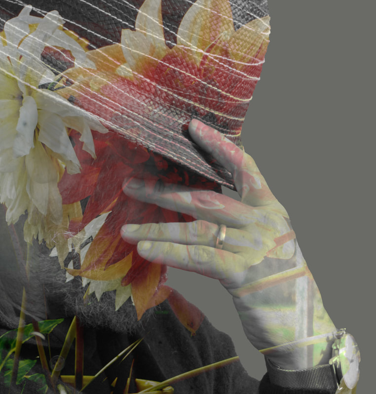
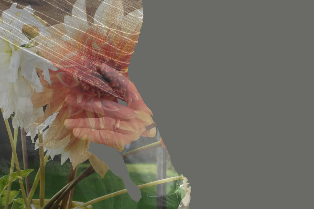
Edits: for my second set of edits I wanted to implement colour vs non-colour, where the colour is the double exposed flower on the models face which is black and white. This is definitely my favourite set of edits, as the flowers don't over power the face where you can still see the outline.
|
|
Edits :

|
Edits :

|

|

|
Overall
3rd development : 2 For 1
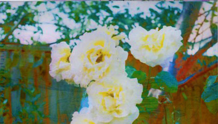
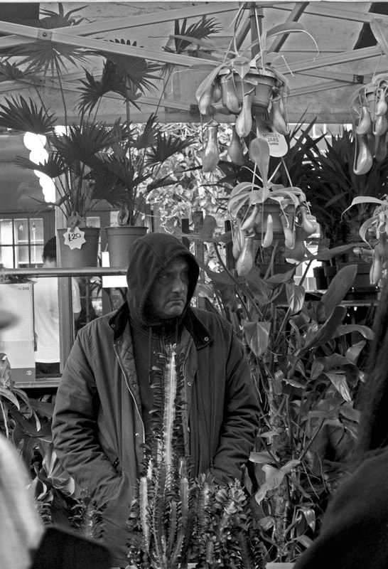
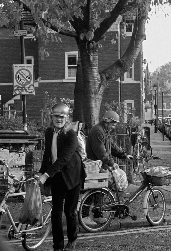
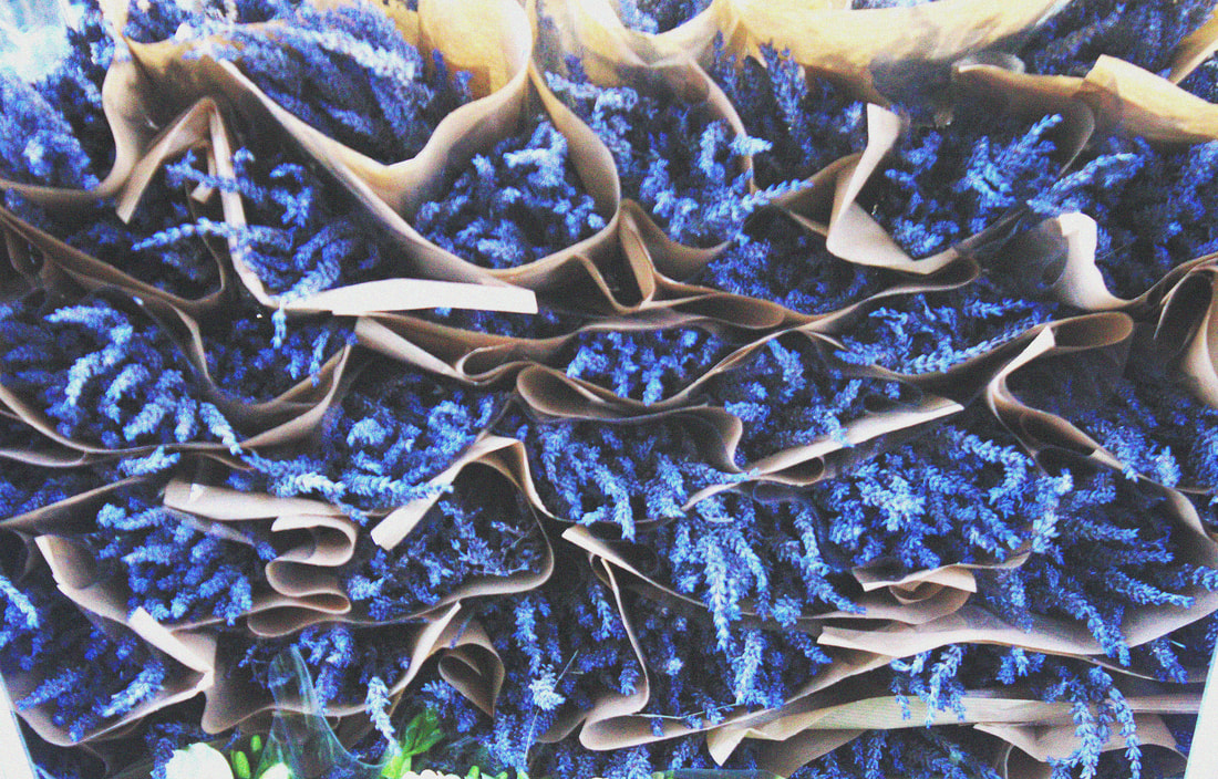
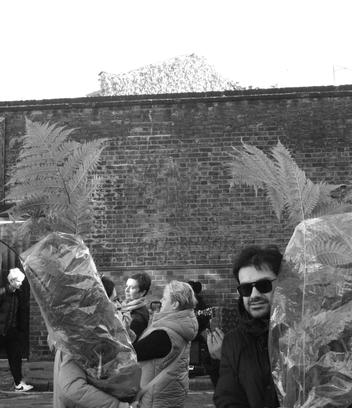
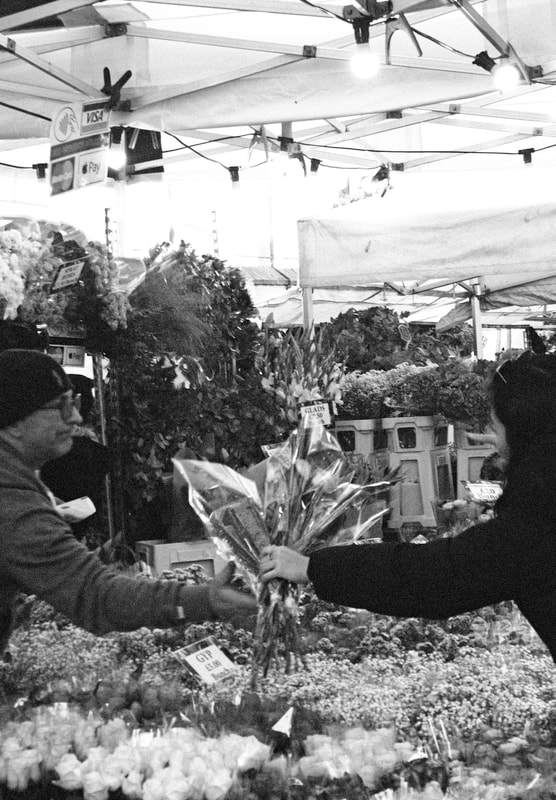
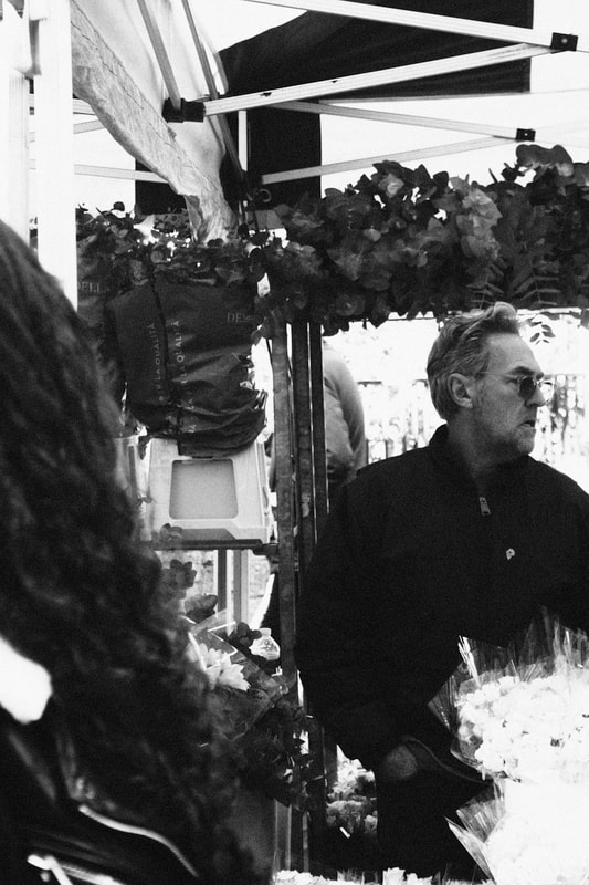
Next I wanted to steer away from double exposure and document people at a flower market instead of double exposing the flowers onto a person. With this development I wanted to capture ordinary people surrounded by flowers in hopes to portray the bright colours of the flowers surrounding the people instead of me as the photographer editing an image and implementing my own way of presenting abstract colour. Focusing on a more natural way of photographing colour without the strong editing in my previous images. I want to lead this development on to bringing another type of way to present the colour of flowers and their abstraction in a different form. I visited Colombia Road which hosts a flower market every Sunday. Capturing people working there, people visiting and the produce around them.
Response:


Best edits:
for my edits I found that black and white worked very well with the style of photos that I had taken. But I will add another sectin expressing the colour the flower market had. I also used the noise filter to add an age to the photo almost like film or an old camera.
|
|

|

|
|
|
|
|

|

|
|
|
The Vibrancy of The Flower Market:
Overall I am happy with the images I had taken. Although I had chosen to develop from the theme of abstraction in colour I wanted to steer to a more realistic point of view where the colour of the flowers are just set up next to a person and how its a lot more genuine. I also believe I captured the idea of the difference between the natural world and ours, with these strange shaped objects with unique colours contrasting the metal and plasticises surrounding them. next time if I would try and ask a stranger to pose in a certain way next to the flowers to really connect the two.
4th development: unconventionality/abstraction
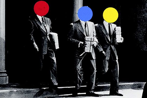
For my next development I wanted to continue photographing people, but coming back to ways of presenitng a combination of colour and abstraction. In my last development I was photographing people working and visiting a flower market instead of adding a flower to a photo using double exposure. To develop on from this I still wanted to photograph people but then instead draw onto the image digitally and physically in an surreal and abstract way. By this I mean presenting the person and the things around them in unconventional ways i.e. using flat bright colours. So now I am experimenting in a different way with the idea of using colour to add abstraction to a photo and how a first image doesn't have to be the same, also how as the photography having control over an image and what that means. I hope that my final images portray the idea of abstract colour through the use of different shapes. I got inspiration of how a this can be presented by photographer and artist John Baldessari, who uses this type of technique his work with flat colours in shapes and different forms.
John Baldessari:

|
|
John Anthony Baldessari was an American conceptual artist known for his work featuring found photography and appropriated images. Circular adhesive dots covering up the faces of photographed and painted portraits are a prevailing motif in Baldessari's work from the mid-1980s onward
Response:
For my Response I first wanted to experiment with Baldessari's work, using posca pens to draw on acetate with and also using digital techniques as well. I used some of my older images that I have previously taken and also some old photos of my parents back in the day to really express the idea of unconventionality.
Posca pens
|
Digital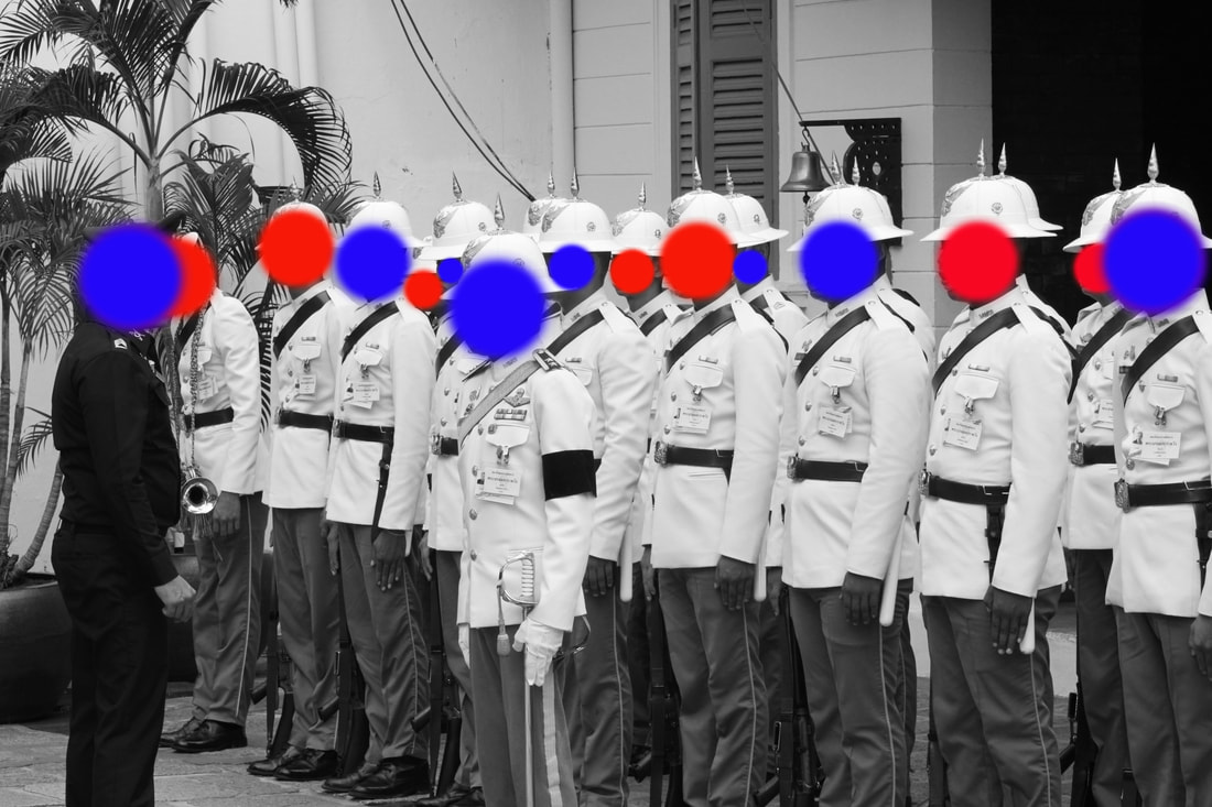
|
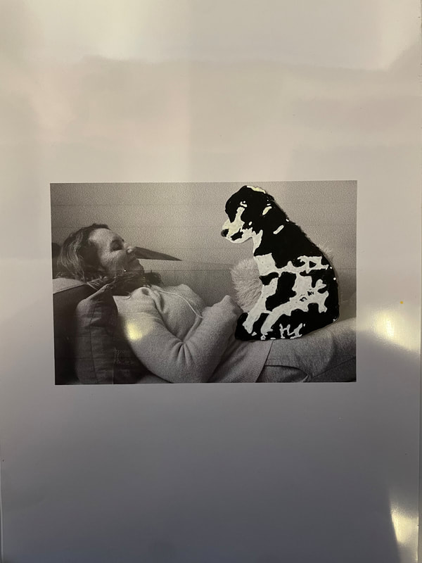
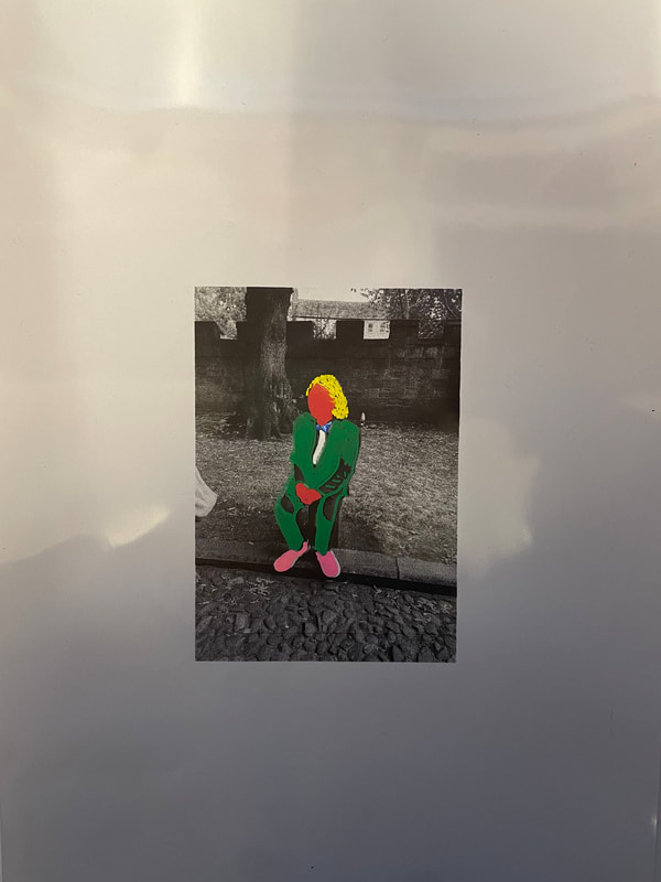
overall I am happy with my posca pen creations as well as the digital ones. I enjoyed drawing on the images creating my own abstractions, creating unconventionality through colour. I believe i responded well with inspiration from Baldessari with how he uses images from films and old famous photos to which he draws onto. Next time i would probably try and take more digital images.
5th development: coloured abstraction
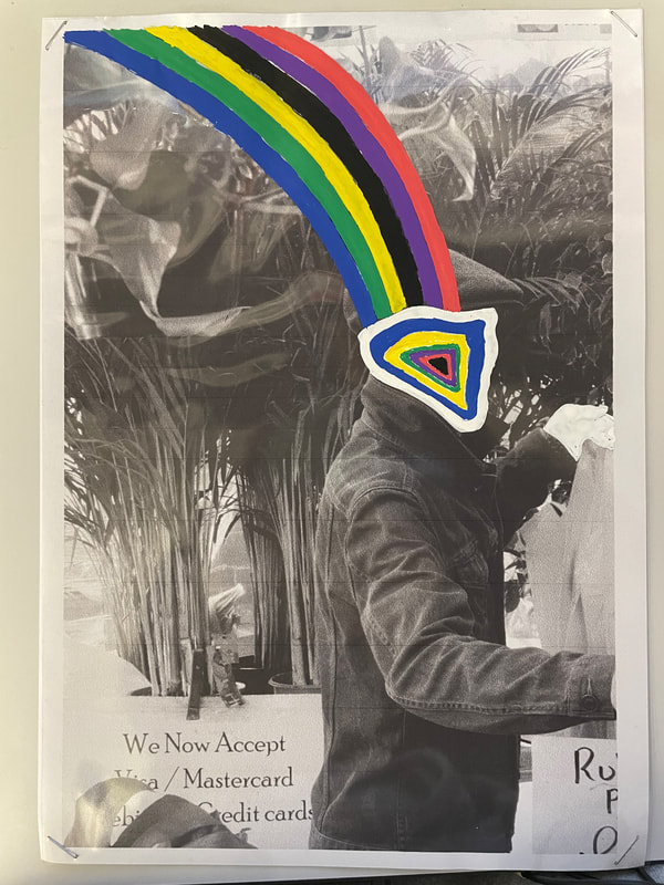
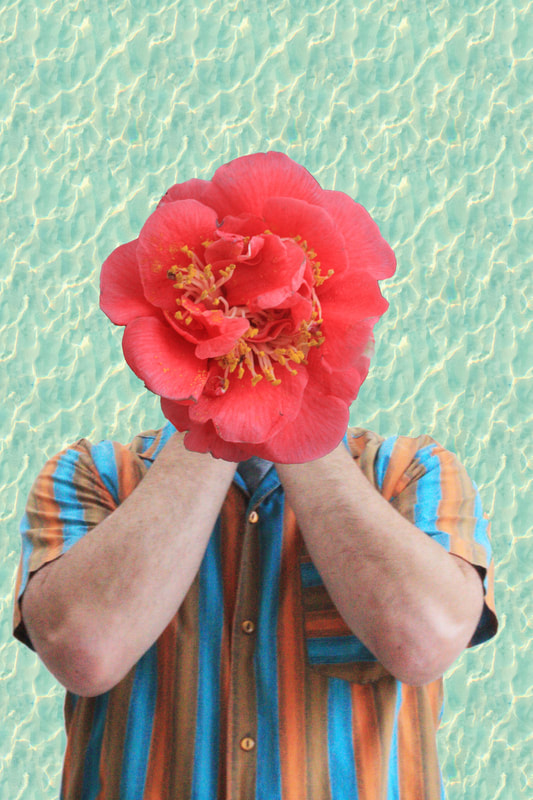
To continue from this I wanted to use more colour in abstract ways on an image. John Baldessari only added colour to certain objects in his work, but I wanted to continue experimenting with adding colour to an image in an abstract way. For inspiration I found an artist named Tyler Spangler. Tyler's work focuses on the formalist relationship between images removed from their original context. He explores the connotations of colour, form, and photography through digital collage. His designs are colourful and chaotic. I wanted to use Tylers style of photography in my aim to show abstraction in colour for example by adding colour shapes, forms to a black and white image to express that abstraction in colour and how it can create this world of unconventionality.
Tyler Spangler
|

|
My Response: To successfully achieve my idea I had to be creative in the positioning, lighting and clothing of my models, in so that afterwards when I add my unconventional abstract colour it can either correlate or oppose that coloured art. I wanted to use props like hats so that i could be more creative in adding colour to the image and


My Edits:

|

|

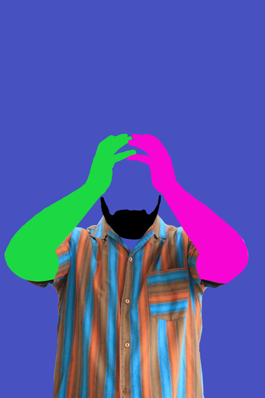
Overall I am happy with the result of my images, I enjoyed having to come up with abstract and unconventional ways of expressing colour onto an image that had none at all. I learnt lots of different editing techniques through editing each one which I'm going to use for my next development from this. Next time I would take more images of models and use different props within the image as well, also the angle in which I take the photo i.e. further away or closer up.
6th development:
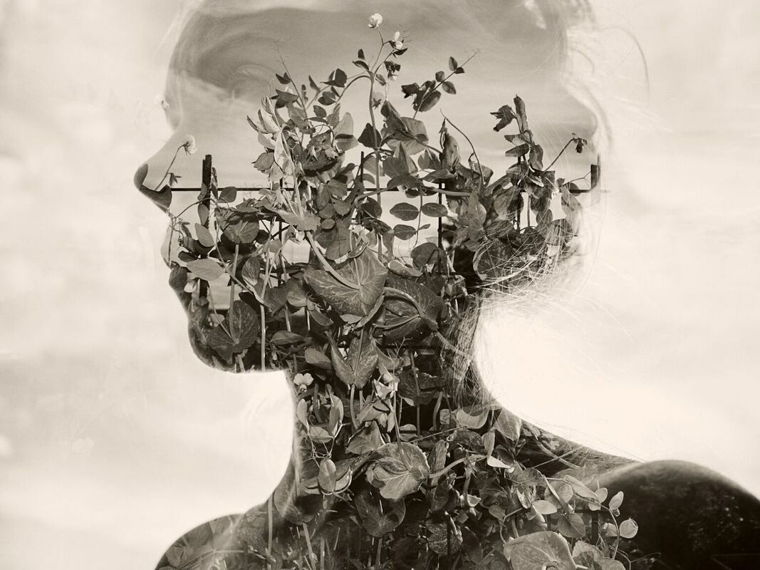
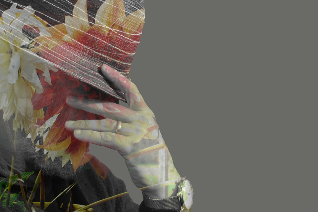
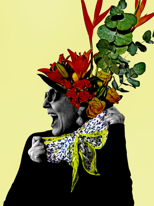
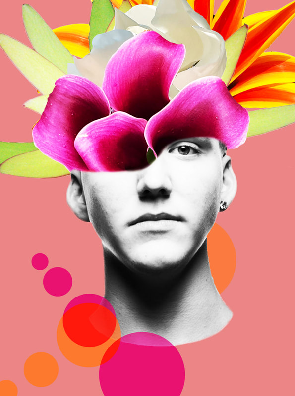
For my 6th development I want to try and incorporate my first few developments which contained the usage of flowers using double exposure. With this development I really want to exaggerate the colour of the flowers in my images whilst also using digital techniques to present them in a surreal and abstract way. I began by combining together different flowers and plants together to form different florals. I then took multiple images of a model to use as the base of my images. I wanted to expand on my idea of creating a surreal image through colour with these shots. When editing these images I really wanted to explore the contrast between humans and nature, especially in this modern day of climate change and how humans are slowly destroying Mother Nature. So when taking my images I really wanted to try and push that idea of contrast through the use of colour being exploded over/behind a black and white model. Whilst looking at ways I could express this idea through editing I came across a photographer called Marcelo Monreal, a Brazilian artist who creates series of surreal portraits, to inspire how I could create my images.
Marcelo Monreal
|
Marcelo Monreal , is a digital photographic artist, from Brazil. He takes mostly head shot photographs of celebrities, both male and female and makes digital collages from them, by deconstructing the face and using colourful flowers and foliage as the construction. His process is to study a photograph and decide where he can make cut-outs. Monreal wants us to consider through his work how people often don't show who they really are. Instead, how they keep parts of themselves hidden, especially when it comes to celebrities and icons of today's modern world. He uses his collages of beautiful flowers and foliage to open them up to reveal the beauty that’s behind their appearance.
|

|
|
First images: flowers
|
Second images: models
|


Edited:
|

|
|
|
|
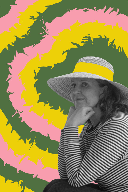
Overall I am happy with my images, I responded to Monreal in my own way, I decided on layering the flowers behind the half head cut off. I'm also happy with how the colour of the flowers perfectly contrast the black and white model. Furthermore my idea of placing the flowers where the eye is worked perfectly, it allows the image to flow more easily and also interact more with the model without just being placed randomly, which I think really helps exaggerate that surrealism.
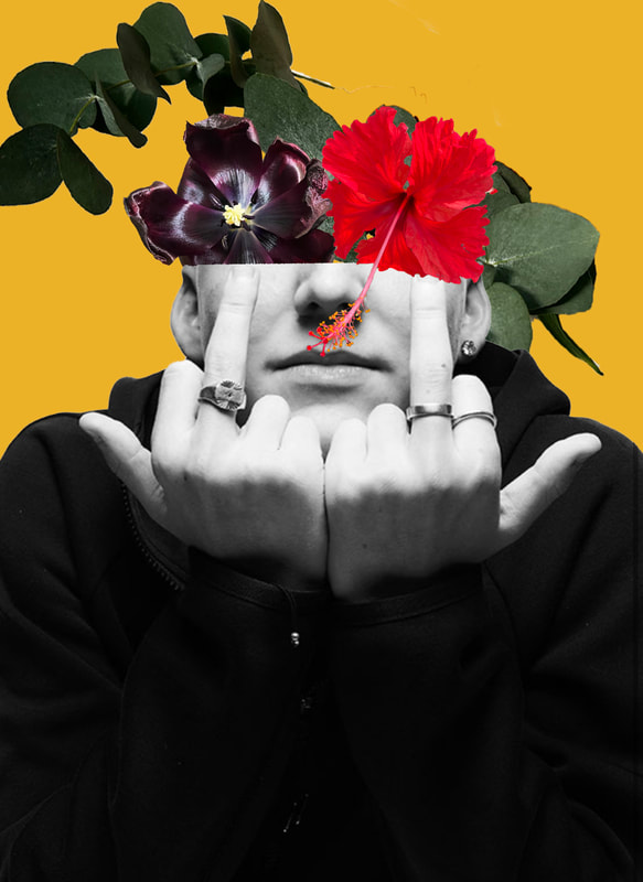
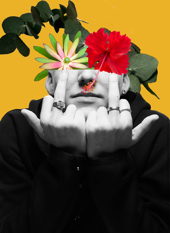
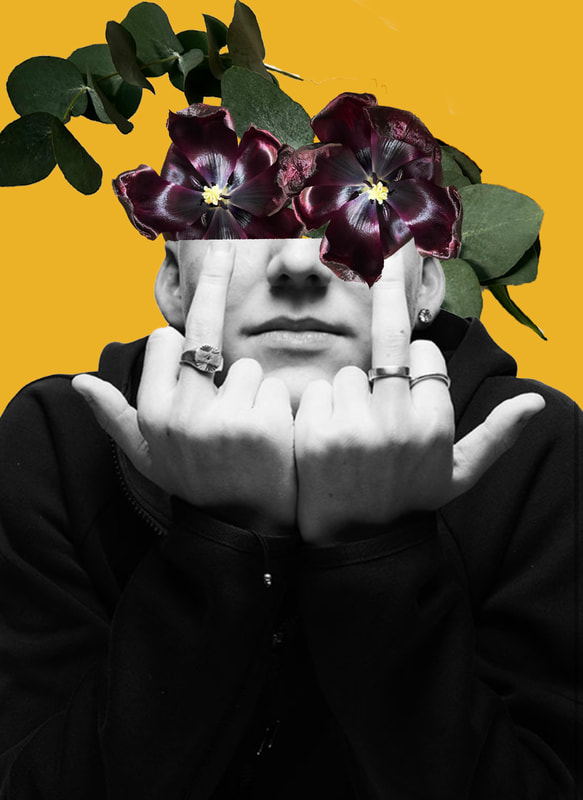
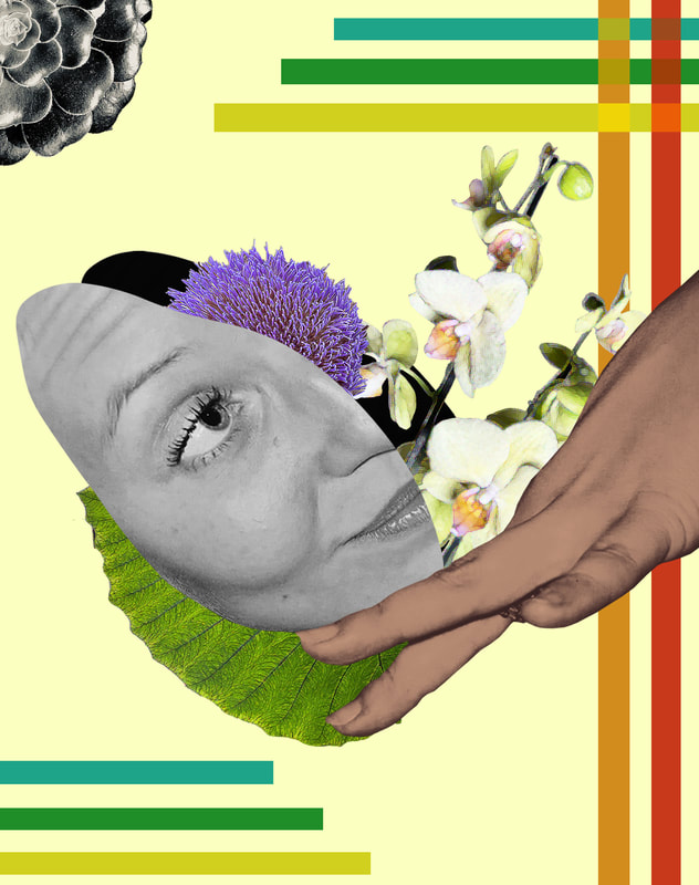
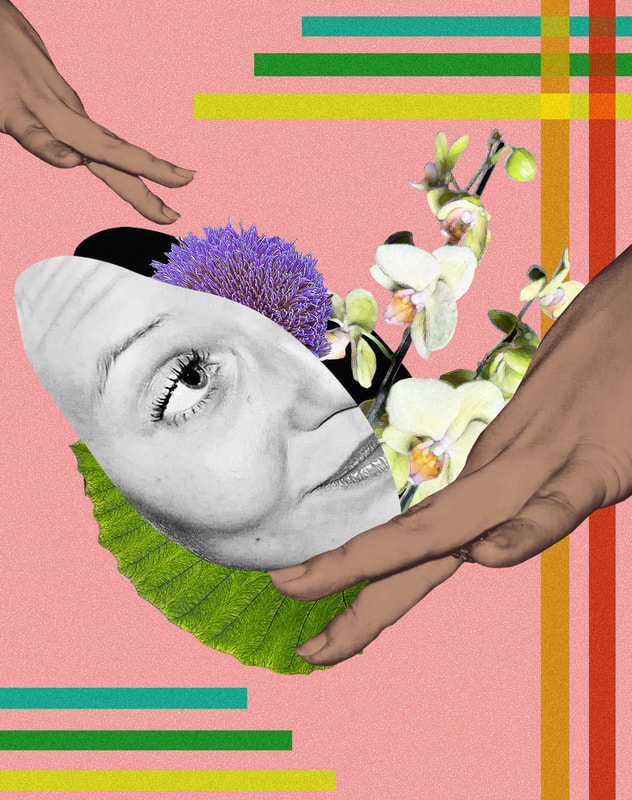
Final Piece
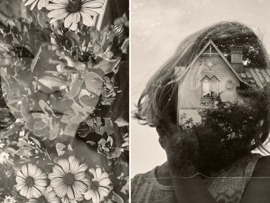
For my final piece I wanted to combine all of the digital techniques that i used for my earlier developments. I mainly wanted to include flat colour into my image, as well as shapes and flowers of course. I hoped that with the use of some of my earlier development techniques would bring out the most surrealism and with the use of flat colour as well as bright flowers it would create an abstraction but also a sense of comfort in the chaos of the abstraction. I also wanted to use more cut - outs more like Tyler Spanglers work to bring this idea out. I firstly went out to kew gardens to take pictures of all the different plants and flowers, when taking the images of the flowers and plants I wanted to try and capture the whole flower/plant so that there where no cut-offs anywhere so it would be easier to edit and look. better. I then went home and photographed my family members as the models. I mainly aimed to photograph the face area for the photos.
|
First Images : Flowers
|
Second images : Models
|


Best Edits
The editing was the main aspect of my final piece as its how i would combine all the chosen images together. Having mainly focused on how digital techniques can create abstractions through colour I had learnt many editing techniques which I wanted to combine for my final Piece. I decided on mainly using cutouts of face, floating in the middle and having the colour of different objects etc, exploding out of the cut out. Through the editing process I tried to incorporate layers as much as possible, for example to see what it may look like to layer a flower over the face or layer the face over the flower in hopes to increase the surrealism and abstraction

|
|
|
|
|
My aim at the beginning of my developments my idea was to experiment with different ways colour can make us a feel and how the use of colour can create amazing surreal and abstract images. I had experimented with this idea through the use of digital mediums throughout, using collages, double exposure, flat colour and experimenting with layers. Overall I am very pleased with my Final Piece. I believe I successfully combined all of the editing techniques I had used in previous developments, perfectly depicting the surrealism colour can create. I think my use of starting with a black and white image perfectly conveys this idea through the contrast between bright colour against black and white. Furthermore I loved how whilst experimenting with colour I could pick and choose different colours to set a mood or tone to that image, another way how colour can influence an image. Next time if I could improve on my images I would probably try and really isolate the colour against a dark image and see what effect that would have on it.
