White Paper Test.
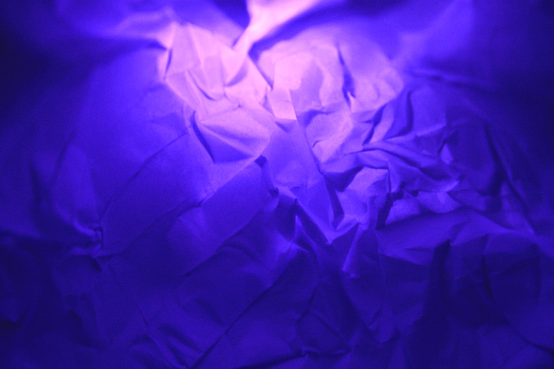
In this task I was required to take photos of paper that was creased folded and scrunched. Manipulating Light, shadows and forming the paper to give an abstract look to start of this new project. This made me consider the different ways I could shape the paper, and I created both smooth curves and sharp lines when the paper was folded. I placed the paper on a black backdrop to create a clear contrast and make the paper stand out. Using a torch and also my phone flashlight, I used the bright white lights to create further contrast, and also to make my images crisper. Whilst photographing, I moved the light around my paper to create different shadows and shapes, as well as turning the paper in different directions; which resulted in a variation of images of the same paper

|

|

|
|
Abstraction Development
For this task, we had to look at two artists, and their visual practice and then respond to them, trying to recreate their work in our own style with our unique characteristics. We still used the studio with the plain white background so that the main focus was on the shadows, lighting and the objects we were using. Similar to the first exercise, we still used the spotlight and different coloured filters to create different effects with the lighting to change the tones and atmosphere of the images. I personally chose Brendan Austin and Tamara Lorenz as I found their work the most interesting and thought i could recreate it in a unique way.
Tamara Lorenz
German artist Tamara Lorenz creates various constructions which she then photographs to exploit their abstract properties. The addition of strong planes of colour provide another source of contrast in addition to those of line, shape, tone and texture.
Rather than photographs of things, each image seems to create its own reality. Consequently, the viewer is unable to recognise a conventional subject and is occupied with the business of looking.
Rather than photographs of things, each image seems to create its own reality. Consequently, the viewer is unable to recognise a conventional subject and is occupied with the business of looking.

|
|

|
My Response
For my response I tried to use a range of lighting such as natural light, yellow light and white light to see the effect of each shade of light and the effect it could have on the coloured paper and shadows.
Best Edits:

|

|
Edward Weston - Ordinary To Extraordinary.
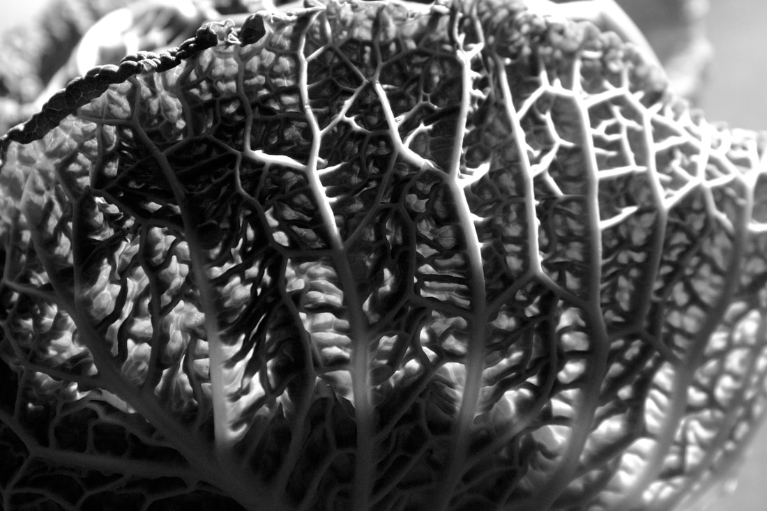
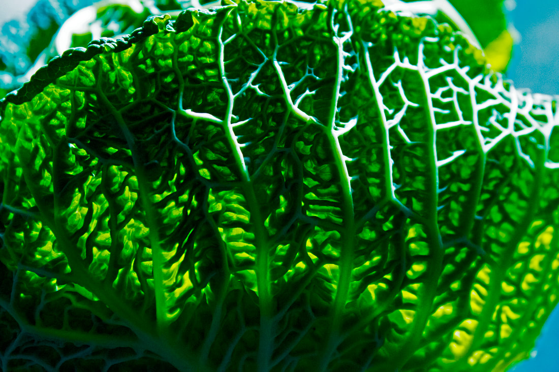
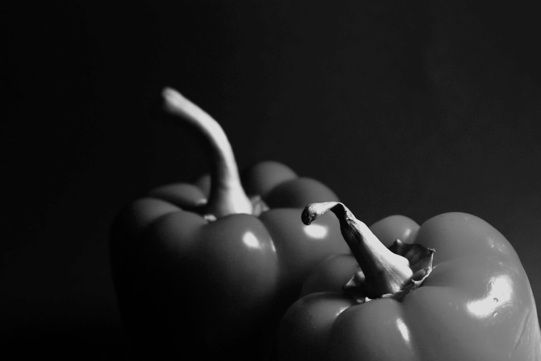
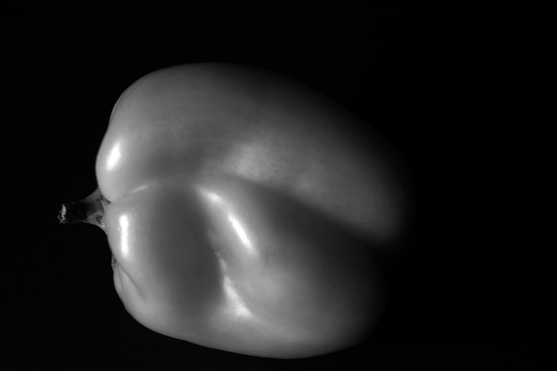
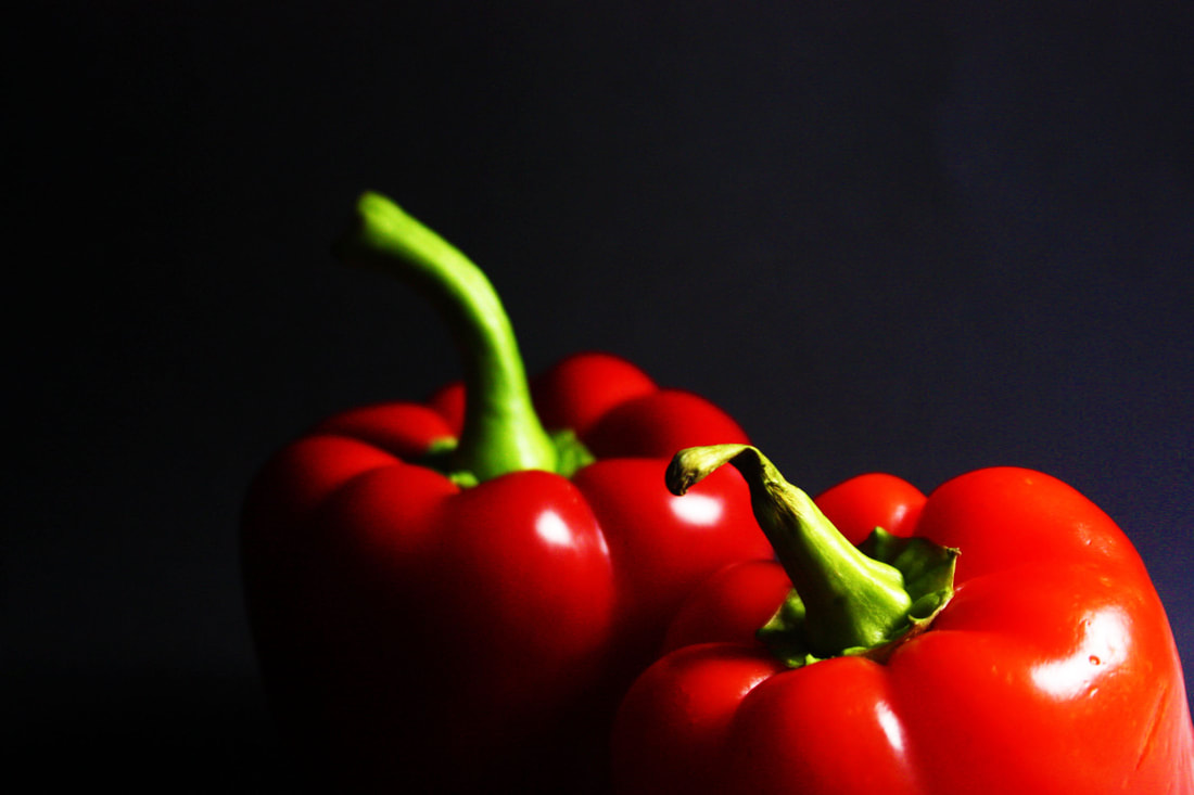
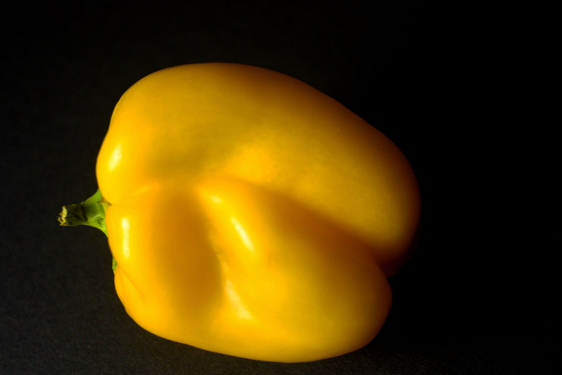
For this task, we were required to photograph ordinary objects, in our case, fruit and vegetables, and try to create an image with texture, depth and structure to create "ordinary to extraordinary" in the style of american photographer, Edward Weston. Edward was a 20th century photographer who photographed a range of subjects including, landscape, still life, portraits and genre scenes. But one of Edwards most favourite peices of work was the 30 pepper.

|

|

|
My Response.
Natural Light:
|
|
|
Best Edits:
|
|

|

|

|

|
Artificial Light:
|
|
|
Best Edits:
|
|
Abstract Comparisons: Body and Nature
Alicja Brodowicz
Visual Exercises is a photo project by Polish photographer Alicja Brodowicz, who hunted for similarities between the human body and nature and then created diptychs of her findings.
“I photograph nature – the macrocosm,Surface of water, grass, tree bark, dry leaves. I combine the two images, looking for converging lines, textures, similarities in layout and analogies in composition between the microcosm and the macrocosm. I look for unity between the human body and the nature.”
“I photograph nature – the macrocosm,Surface of water, grass, tree bark, dry leaves. I combine the two images, looking for converging lines, textures, similarities in layout and analogies in composition between the microcosm and the macrocosm. I look for unity between the human body and the nature.”
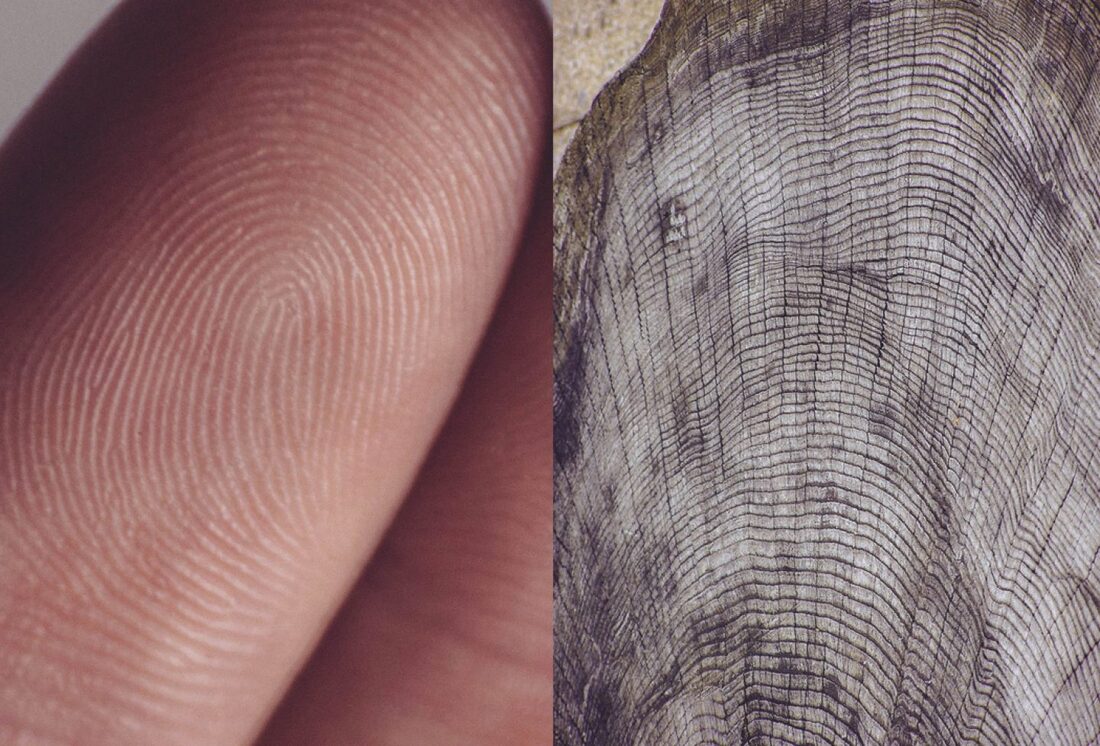
Agnieszka Lepka - Human Vs Nature
In her ongoing series titled "Human Vs Nature", Lepka works with the similarites between the human being and Mother nature. Veins are put into relation with Topographic maps, fingerprints resemble a tree trunk and cacti are compared to scrubby beards.
|

|
My Response

Nature to Body

|
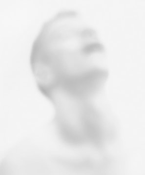
Abstract Portraits: Bill Jacobson
Bill Jacobson (b.1955, Norwich, Connecticut) is widely known for his out of focus photographs of both the figure and the landscape.
Jacobson began his signature, indistinct images in 1989. These early works, titled Interim Portraits, feature shadowy, pale figures that evoke the loss experienced by many during the height of the AIDS epidemic. The blurred subjects underline the futility of capturing a true human likeness in both portraiture and memory.
Jacobson began his signature, indistinct images in 1989. These early works, titled Interim Portraits, feature shadowy, pale figures that evoke the loss experienced by many during the height of the AIDS epidemic. The blurred subjects underline the futility of capturing a true human likeness in both portraiture and memory.

|
|
My Response 1
Best Edits
Erwin Blumenfeld
Erwin Blumenfeld is regarded as one of the most influential photographers of the twentieth century. An experimenter and innovator, he produced an extensive body of work throughout his thirty-five year career including black and white portraits and nudes, celebrity portraiture, advertising campaigns and his renowned fashion photography.
Born in Berlin in 1897, Blumenfeld drew early inspiration from the Dadaists, incorporating experimental techniques like solarization, multiple exposures, and photomontage into his darkroom practice
Born in Berlin in 1897, Blumenfeld drew early inspiration from the Dadaists, incorporating experimental techniques like solarization, multiple exposures, and photomontage into his darkroom practice

|

|

|
Best Edits

|

|

|
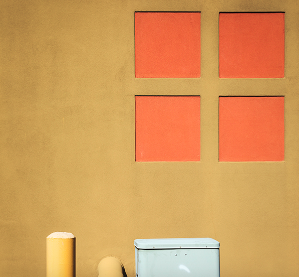
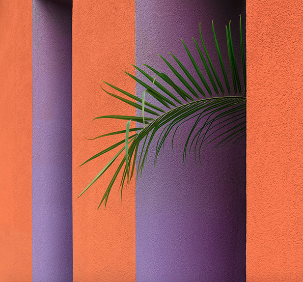
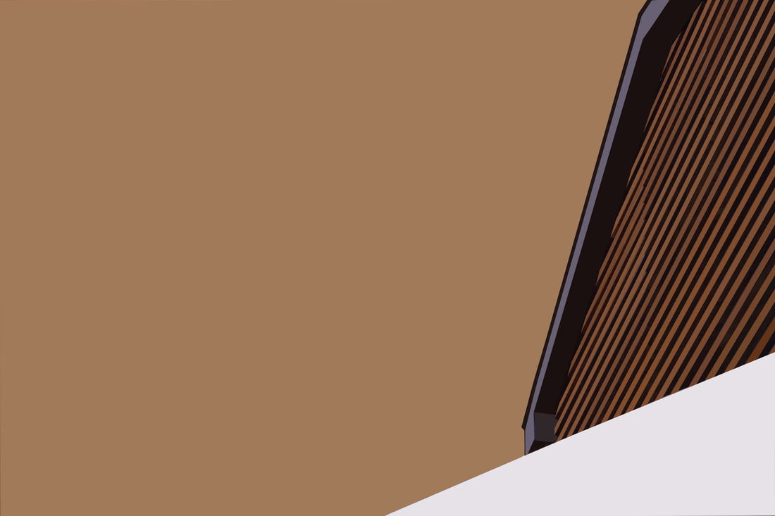
Johnny Kerr - Ambiguity
Ambiguity is a sustained investigation of Antoine Predock's Nelson Fine Arts Center in Tempe, Arizona. Kerr spent hours photographing, waiting and observing how the lines, shapes and forms changed as the sun moved from morning to late afternoon, revealing new relationships of harmony or tension.
The ambiguous forms, shapes and textures of the almost featureless stucco exterior intrigued Kerr as a designer.
By observing how the structural lines intersected from various vantage points, Kerr was often able to confuse the visual perception of foreground and background. The pastel colour palette is inspired by the building’s southwest geography and was a challenging visual departure from my previous monochromatic approach to abstract architecture.
|

|
|
My Response
|
1st Shoot
|
2nd Shoot
|
Abstracting The Environment
|
Saul Leiter Since he first arrived in New York, Leiter has been documenting street life in black and white, intriguing the eye with his use of obstructions, blurred movement and half-concealed details. In 1992, his work came to the attention of the curator Jane Livingston, who included him in her “New York School”: a group of noteworthy midcentury photographers, including Robert Frank and Diane Arbus, with a film noir vision of the city.
Leiter was also a pioneer of colour photography: He developed a distinctive, dreamy style that played with shallow depths of field and a vibrant palette. Erb argues that these images are closely related to his love of painting. “You can see influences of abstract expressionism in his colour work,” |


|
My Response:


Stephen Calcutt Stephens unique form of street photography is a consequence of frequenting bus stops and shelters around the City of Birmingham. Graffiti can be great art, however he feels the graffiti scratched into the plexiglass windows of the bus stop feels like a violation. He has yet to see any of these etchings that look great in their own right. The graffiti etched and scrawled in the bus stop windows seem to be expressions of frustration, anger, love or hate. However, unlike its cousin the more colourful graffiti that is emblazoned across the walls of buildings and is often seen as art, it is very mundane. He feels a windows full potential as a clear barrier between yourself and the elements are compromised when the view beyond is obscured, distorted and blurred by the scratches. Stephen uses the graffiti etched windows as a lens. he merges the graffiti and the view beyond, focusing his camera on the etched lines putting the
view beyond out of focus.
view beyond out of focus.
My Response:
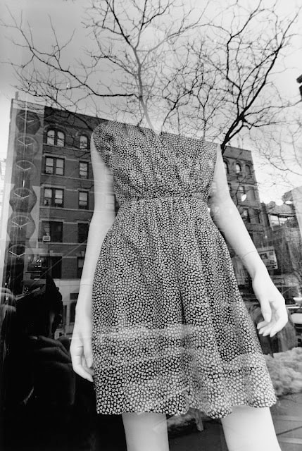
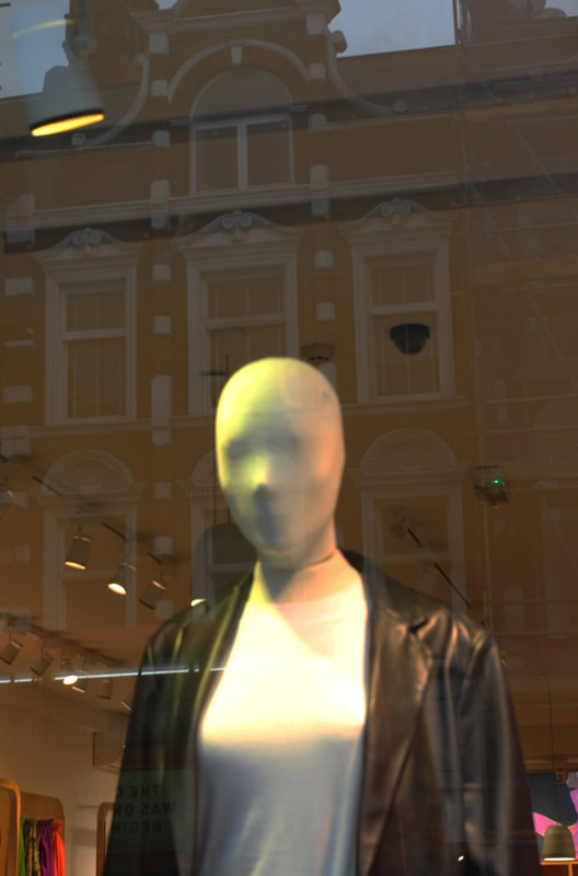
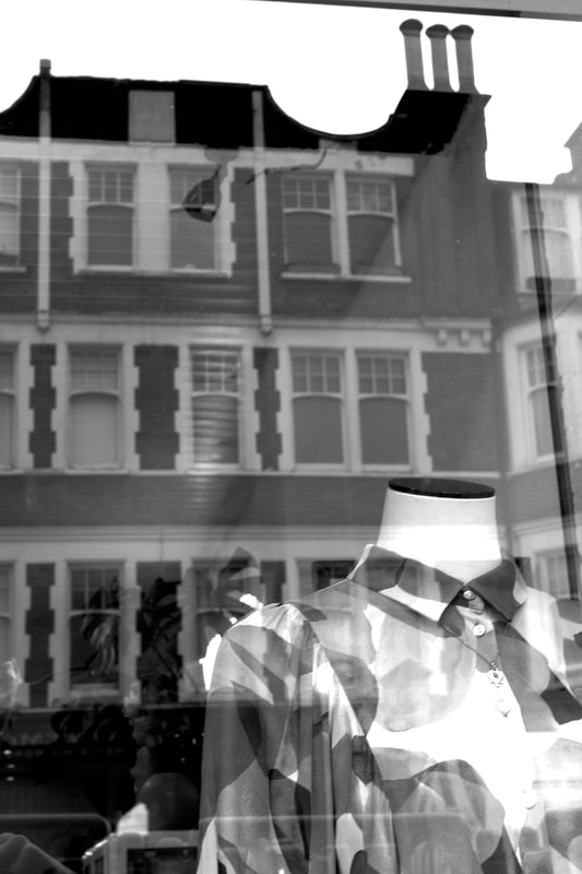
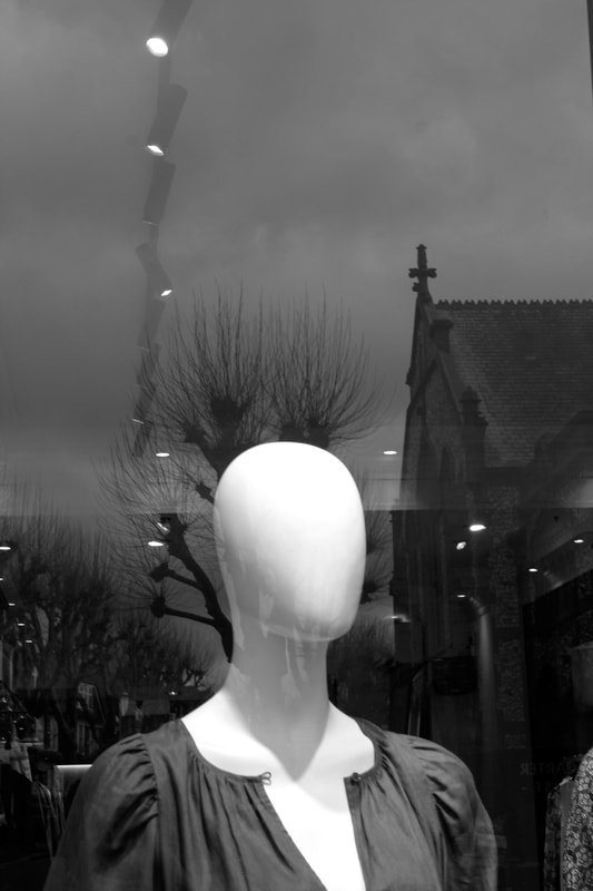
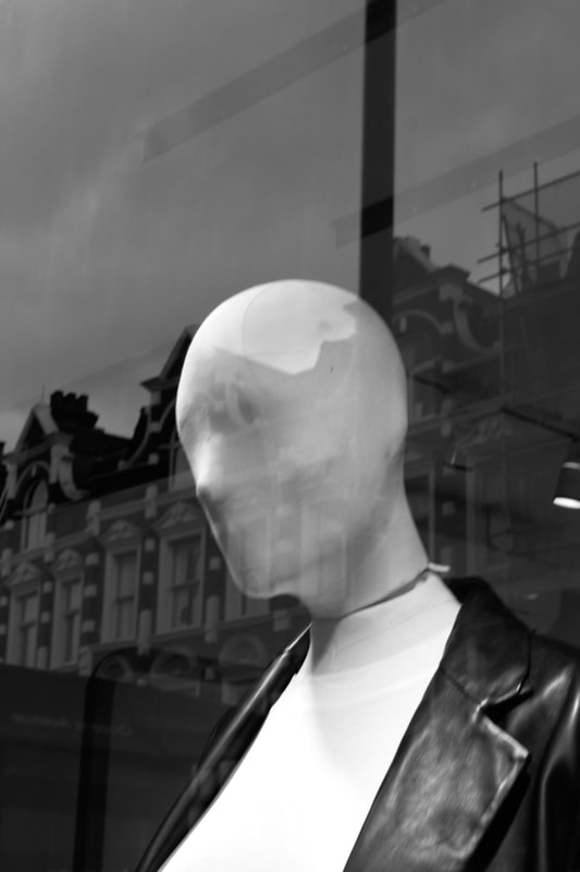
Lee Friedlander: Mannequin

|

|
|
My Response:
Edited:
|
|
|
INDEPENDANT: 3 STRANDS DEVELOPMENT
FIRST STRAND: Johnny Kerr - Ambiguity
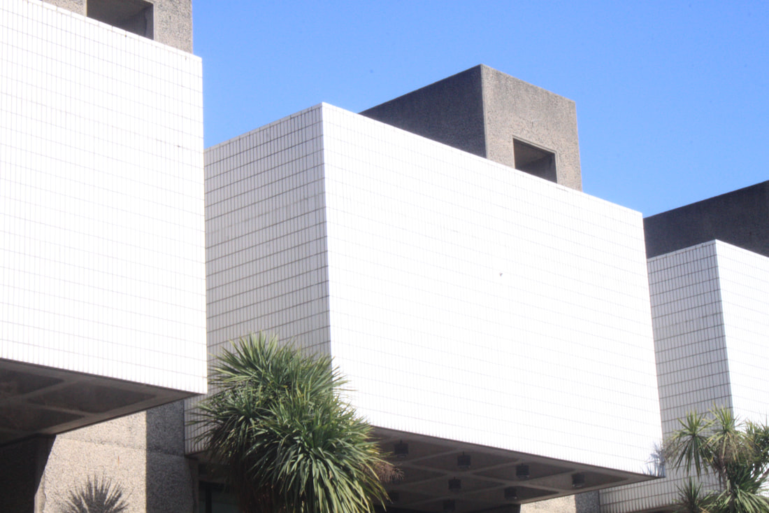
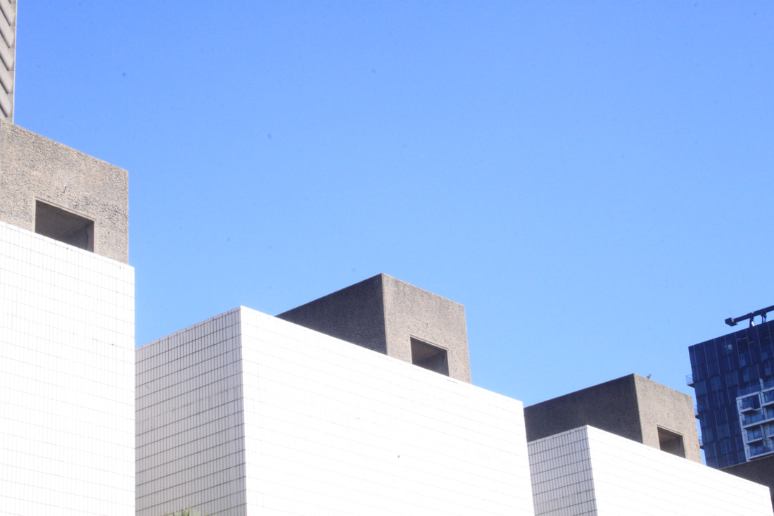
For my first strand development I have chosen Johnny Kerr- Johnny Kerr is an American artist and art educator, best known for his abstract photographic arrays that reveal the colorful poetry hidden amid a seemingly mundane Arizona metropolis. Self-taught in the craft of photography, Johnny cites his lifelong study of art, his graphic design experience, and his appreciation for minimalism as having the largest influences on his work. The reason I have chosen this photographer is because I find the use of colour extraordinary in his photos and the simplicity of the forms his photos create just really stand out and they can almost loom like a painting.

|

|
For my response i am going to go out on a sunny day and start to find compositions of colour to photograph mainly looking up at buildings to try and get that blue background of the sky. Then edit my original photos to bring the colour out in them and crop any things out that dont fit the image etc.
Original photos:


Best Edits:

|
STRAND 2: Architecture - mirroring and flipping
Michael Shainblum -
Shainblum created 'Mirror City' in 2014, and it is a montage of clips from cities such as Los Angeles, Chicago, San Francisco, San Diego and Las Vegas. He filmed these cities in their original forms, many at night, and then edited them to create the kaleidoscope visuals seen in his video. Shainblum wanted to photograph these cities in a way that was unique and abstract - not seen before. He mixed 'man-made geometric shapes with elements of colour and movement to create less of a structured video, and more of a plethora of visual stimulation'.
Shainblum created 'Mirror City' in 2014, and it is a montage of clips from cities such as Los Angeles, Chicago, San Francisco, San Diego and Las Vegas. He filmed these cities in their original forms, many at night, and then edited them to create the kaleidoscope visuals seen in his video. Shainblum wanted to photograph these cities in a way that was unique and abstract - not seen before. He mixed 'man-made geometric shapes with elements of colour and movement to create less of a structured video, and more of a plethora of visual stimulation'.
|
or this strand, I was first inspired by Kerr's work on abstract architecture, and wanted to expand on photographing interesting buildings in my environment. I travelled into the city and visited areas including Barbican and Liverpool street. I focused on photographing tall buildings where I could include the blue sky - which I found was very effective once I had edited my images. Michael Shainblum was my inspiration for the edits, as I wanted to achieve the kaleidoscope affect he created in his video 'Mirror City'. To do this, I started off with my original image in Photoshop, and then created a copy; first flipping it downwards and then repeating the process with two other copies, mirroring them until I had four images in a square to create one final image. I also used the threshold editing to create an even more abstract look. Overall, I think my edits were successful, and I was able to make them appear seamless.
|
|
My best edits:


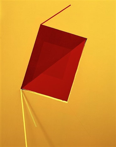
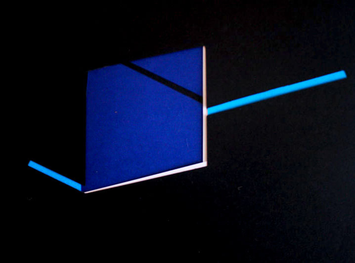
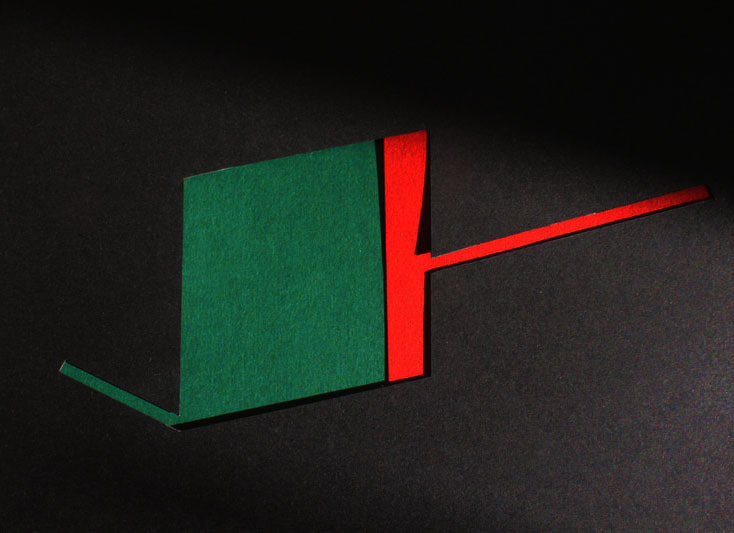
STRAND 3: BRENDAN AUSTIN/
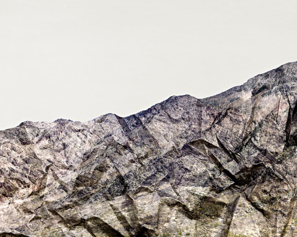
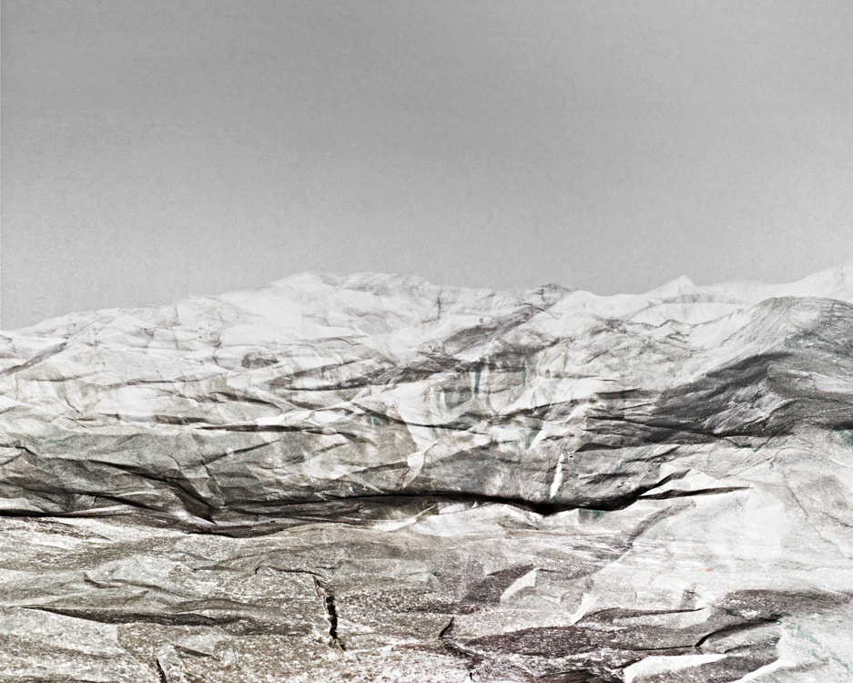
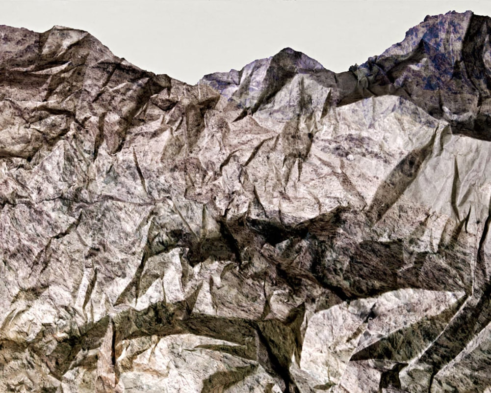
creates imaginary landscapes out of crumpled pieces of paper. He calls them 'Paper Mountains'. Austin examines what we mean by nature and the way humans have impacted upon it. "The isolated desert city running on oil generators, the mars like landscapes of a volcanic environment and the mountains made from paper all attempt to start a conversation concerning the loss of meaning and reality." The resulting images appear both recognisable as landscapes but also suggest a sense of artifice. Humble materials are made to carry an important message.
|
|
|
For my response i used a mixture of tin foil, paper and paper with print on it. I also used different coloured sheets over the light to create different shades of colour across the foil and paper.
My Response
Best Edits:
Development of Strand - Architecture mirror and flipping - Johnny Kerr
My favourite strand was the Micheal Shainblums mirror and flipping of buildings, so for my development I decided to use a mixture of Matthieu Venot but in my own way into the mirror and flipping to give the photos a mixture of colour and abstraction from the mirroring of the buildings, and then also add the colour into the buildings using a certain tool.
I thought this was a good development to do because I like doing the mirror and flipping and i feel like the colour will make quite bit of a difference to the photos. For this development I had the pleasure of going on a school trip to Athens, so Im going to use it to take some photos of Athens for this development.
I thought this was a good development to do because I like doing the mirror and flipping and i feel like the colour will make quite bit of a difference to the photos. For this development I had the pleasure of going on a school trip to Athens, so Im going to use it to take some photos of Athens for this development.
To capture the images I wanted in my head I had to really focus on negative spaces, colours and compositons`s . luckily enough for me Athens has a lot more brighter colours and the weather which will also help create negative space (blue sky) and the sun making the colours brighter and stand out more when edited.


Edits
|
original

|
colours
|
flipped

|
Second Development - More Abstraction
For my second development I wanted to use a mixture of making some things graphic and leaving other objects in the photo as it is.
